Research into Constructivism

12th/14th October – Weekend Research

The brief was clear I had to research Constructivism. I had some knowledge on this prior and the lecture within the week lead me to know the larger main facts, but I wanted to know more to design my own poster.

I knew that Russia was in a civil war after several attempts of invasions and all the royal families being murdered. The people pleaded for change through their protests but one way that artists demanded change was to create a new futuristic style. These designers aimed to seek the re-organisation of society as well as a giving hope to the public. The artists rejected the classical illustrated style and the over exaggerated Art Deco movement. Instead they experimented with type and image creating a geometric feel, similar to the up and coming cubism style of that time.

When researching into the posters, I drew the most relevant designs. Through reinventing them I noticed that all the designs are at a 45 degree angle and most things are perpendicular to the main focal point. I also noticed they used geometric shapes to promote the joining of the ever dividing country. All the art work had a same colour schemes, which included black, white and red. These colours could be seen as representing the different armies and their political stance.


From there I began to draw my own small sketches that would fit in with the designs of the historical work.


The websites used to gather knowledge and inspiration:

http://www.designishistory.com/1920/constructivism/

http://www.designishistory.com/1920/el-lissitzky/

https://creativepro.com/russian-constructivism-and-graphic-design/

http://futurology.gr/2017/10/20/h-symfonia-ton-sirinon/

https://www.lomography.com/magazine/237637-under-konstruktion-constructivism-and-consumerism

https://creativepro.com/russian-constructivism-and-graphic-design/

http://rosphoto.org/events/photomontage-in-russian-constructivist-posters/

Poster Task

Tuesday 9th October –  abstraction metaphor task

To begin with we had a small lecture this is where we gathered the last of the information about the assignment. I have to create an A3 poster in the style of constructivism.

Once we were divided into our groups of about 6 people, we worked on looking at original pieces of that time period and re-imagined them to be more modern. Pinterest was a good way of showing the modern twist on the original work. Another website I discovered was filled with information and art work that was made at the time of the Russian civil war.  http://www.csun.edu/~pjd77408/DrD/Art461/LecturesAll/Lectures/lecture07/Constructivism.html

As a group we began noticing patterns across the poster layouts. One pattern would be that nothing would be on a straight line down instead it would all be at 45 degree angle. Also the colour themes would all be similar and have that emphasise on the black. We would assume that the colour scheme represents the armies and the loss of lives. The typeface is also sans serif and bold to show that the people want to be loud and ask for change.

20181009_201101-e1540295471733.jpg

Using the style of constructivism20181009_201044 I cut out card to create my own designs. We linked with another group and went over the details of what constructivism is. This solidified my knowledge of the topic, preparing me to draw my own designs.
 

Design History

Monday 8th October – Design History

To begin with I had a lecture on all the major topics for Graphic Design throughout history. I learnt a lot about how the style has adapted to a different society across the world. An example of this would be the War and Propaganda movement. In World War I the use of posters had a curtail role as there was little to no other way to get any messages to the public. Thus forcing Governments to spend a lot of money into poster design, development and printing. Through out Europe, the poster style had to be adapted depending on what the government wanted their country to believe or do. For Britain, we had a entice the men to fight for the war, so the government used the slogan  -“Daddy, What did YOU do in the Great War?” The British government much like America used the family values to endear the public which is common knowledge. However, what I didn’t know was that the German Government used a very different style through using old myth heroes and medieval knights, but the German government wanted the same thing – for the general public to fight along side them in the war.

In contrast to the very illustrative past a new art form began mid way through the first world war. This was Constructivism. It was created in Russia where they were torn apart with the invasion and the monarchy being overthrown. I learnt that this style was created to promote the re-organisation of the society, along with the hope for a better more prosperous future. The designers experimented with type and image, keeping with geometric shapes almost in the style of the up and coming cubism style of that time period.

Overall I have gathered information that I would not have found out, such as the Viennese Method within the Isotype Viennese Movement (1925-1934) inspired the The London Underground map.


Mini Bibliography

David Presentation – Tutor

https://www.bl.uk/collection-items/daddy-what-did-you-do-in-great-war

6 Word Feedback

Friday 5th October

I was apprehensive to show my work in the class but with everyone’s work I felt it fitted in well with the skill level of the group. all 6 full good

The feedback I received was overall positive. The group praised me on the detail of each individual character and the understanding of the brief. Another thing that I didn’t pick up on was that the curve of the “f” from the last word; this lead the eye back around the design and enhanced the thought of a real waterfall on the page.

One thing to work on would be to not over fill the page, also to have one or two main focus points not three or four. An additional point that the class taught me was to look at portrait as well as landscape. By changing my design I could have added some more negative space to off balance all the positive.


Six Word Poster

Monday 1st October

We have just received our first project; this is to create a poster with only 6 words to illustrate a book of our choice from 4 different authors. The aim was to only use black and white typography. The fonts we had to use must be hybrids, so a combination of more than one typeface.

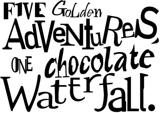
With this project I was unsure how to go about it so I began to look into one of the authors, which was Roald Dahl. I quickly decided on the 6 words – “five golden adventures, one chocolate waterfall.” This is from the famous story Charlie and the Chocolate Factory.

The hybrid fonts were easy to do as I feel confidant with Illustrator. One challenge was the placement of each individual letters. This was due to Kerning of the letters and the previous exercises within this practice. 3 word

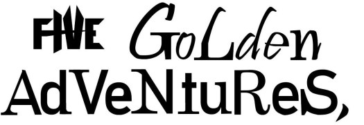
I began to add the same words in different typefaces, overlaying them then cutting out the parts that I didn’t like – thus creating a hybrid letter.

Once all six of the words were complete I began to adjust the sizes of the characters and the leading between the lines. From there I began to make the letters a unique size and tiled them at funny angles to emphasise the crazy story line of the Willy Wonka’s life.

all 6 full good

Work Shop Friday

Work shop – Friday 28th September

I was unsure how much I knew in Adobe Illustrator but by the end of the workshop I left feeling that I knew almost all of the software.

To begin with I should say that for the past 3 years I have work along side Adobe Illustrator and Photoshop but I have never got along with them. However, with moving to uni and talking to other students I am slowly growing to appreciate software.

my rocketshipIn our hour workshop we created our own rocket ship. I knew how to use everything on Adobe except the anchor point tool. This was a revelation as I can now adjust the path of a shape easily with out having to re-do the whole shape. Within this hour I anchor point tooldeveloped and adjusted the lines so that they look painted instead of the plain, classic lines.


Typography Continued

Cardiff City – Tuesday 25th September

This was another adventure, not of the mind but exploring the city. Our task was to find the best style fonts from our provided list. One typeface was a lot harder to find around the city – this was Italics.Dr PepperThe style font was difficult to find as many of the shops used bold or script fonts. However, I found a bottle of Dr Pepper which had an italic font. The other fonts where Roman, Majuscule and Miniscule. These were easier to find as Roman is very common among old fashioned pubs and restaurants, while Majuscule and miniscule are just capital and lower case letters which chain retail shops use often.
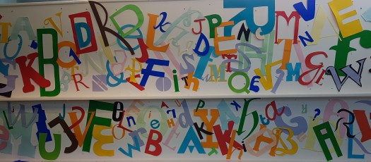
Once back at the university we began to create our fonts that we took photos of. This meant that we were drawing and cutting out the letters. After cutting out 4 different letters of our chosen fonts we began to tack them all onto a wall as a collective class. I feel that the final look has some good areas and some needed more attention due to the open space and lack of interest there. On the other hand, your eye as the viewer is drawn across the display as it has a good link with colours. letters wall

Introduction to Typography

My first lecture for the course – Monday 24th September

This was an exciting moment I was finally training to be in an official Graphic Designer. The first tutor began to talk in depth about typography. This was very intriguing as I never thought that something as simple as one word or a letter could affect a person’s thought process so deeply. For instance this would be the style of serif, which include the size, shape and if they were even present. Another, example would be the spacial awareness of each individual letter. To develop our skills we were asked to draw our names with the spacing embedded in our minds.

Kerning Practise

My first name was too spacious, so with the second attempt I pulled them tighter. For my surname I feel the letters are good on the base line but again to far spread. Thus, when I went onto my second attempt my name has a good consistency with the kerning and base line.

Later on in the afternoon we had independent study. This included around 20 different type faces which we had to hand draw, research and bullet point the main style.


Early Days

This has been an interesting week. I moved in on Sunday 16th of September, of which I was so please to have a lovely flat and flat mates. The next day I met my course leaders and fellow pupils.

To begin with on Monday the tutors spoke about the overview of the course and future activities. Then became the fun part; this included two balloons, one egg and several sheets of card. Our mission was to keep the egg whole for as long as possible when dropped from a height. I found a team then a table and began to assemble a form of parachute with our equipment provided.

When finished we congregated around the front so that the end products would be thrown from a height. The first round the designs were dropped, luckily ours survived but so did everyone’s egg. In the next round the eggs were thrown down and each round after that thrown with a greater force.

So far the day was going very well. It ended with a lecture with 200 other students by the dean of our university.

The next morning we had a bit more of a lay in, starting at 10 am instead of 9.45 am. Tuesday was used to present our summer projects. This was our “Me, Myself and I Presentation.” I was intrigued to find out what everyone’s interests are and who inspires them.

Wednesday was our freshers fayre at the other campus in Cyncoed. I believe I signed up to three different clubs.

Thursday, this was filled with information to prepare us all for the year. Some information included how to use moodle, what our day to day expectations were and the introduction of constellation. This all filled me with hope for my future experiences.

Learning Journal so far

The Past: College - Interactive Screens
I’m Fiona Fraser and I have lived in Basingstoke my whole life. I began graphics in secondary school, through that I experienced Adobe Illustrator and Photoshop for the first time. This continued though my college education. I began to understand simple quick techniques that helped me create art at a basic level. In my final year I have developed skills that I was unsure of at first. Overall I have a well-rounded knowledge of Adobe but could go even further. My work ethic has always been high which shows with my qualifications of B grade in GSCE and A-Level.

The Present:

At fresher’s fair at Cardiff Metropolitan I learnt a many things through talking to a variety of people in different societies. One stall was the Fab Lab, which was show casing many different objects made with many different materials, such as copper or plastic. This engaged me to listen to the expert as he spoke about the challenges and accomplishments that the team has made. I most liked that fact that they helped people create their dreams from a 2D image to a 3D construction. My favourite designs was the dog as it is an everlasting memory of a well-loved animal.

The Future:

In the future I wish to learn about how to use a more old fashion style of printing and really get into the hands on style of graphics. I want to challenge myself to be more creative and adventurous, maybe try to get the more vibrant colours to work. I am excited to meet and interact with my class in upcoming projects. This week has opened my mind to many number of things, such as graphic communication doesn’t just have to be as simple as a poster or logo but can have development into reasoning behind why the design works or doesn’t work.

Design a site like this with WordPress.com
Get started