Starting the inside with the new design was great and it allowed me room for experimentation.
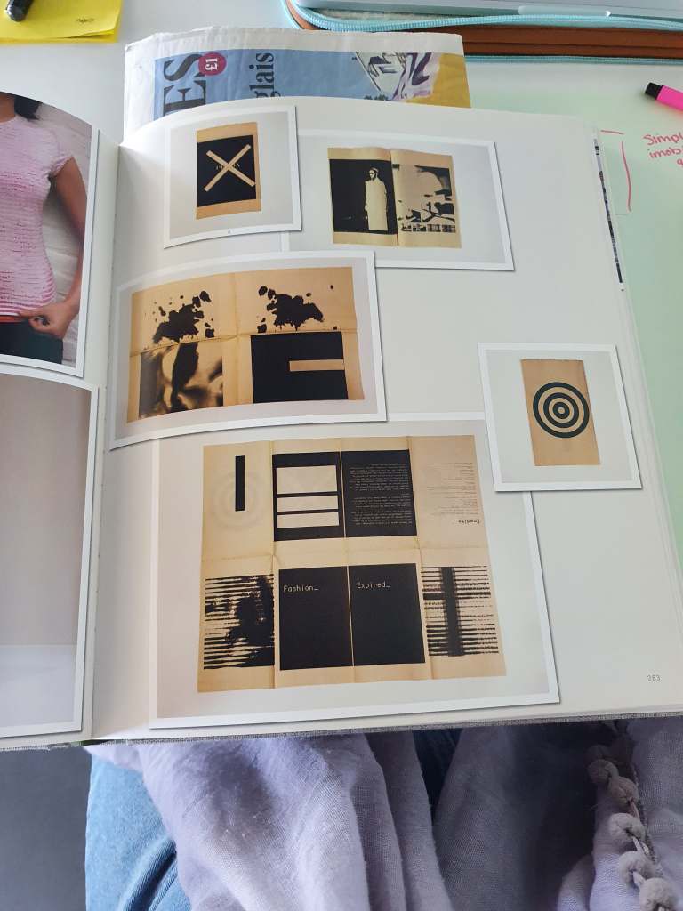
These designs felt better and had more spirit however, they were lacking connection. I added imagery but in a sinister and thought provoking way. However, in feedback the images seemed basic and random in comparison to one another. To over come this I removed all knowledge of people. For instance removed the glasses from the first image and removed the person from the next page.
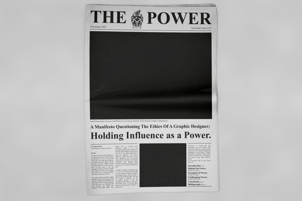
My initial thoughts were to use scale as an emphasis on the power. I thought by using a smaller paper size this could work with the limitations. However this was bad.
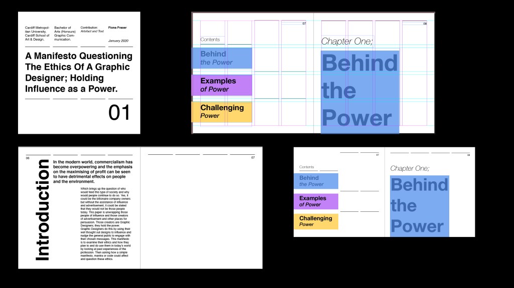
To progress with this idea of what can be powerful but simple I added blocks around the key areas and then sectioned designs out with these blocks. In this design I used scale more to emphasis the hierarchy and draw the eye to the most important areas.
However, this design lacked personality and joy. I decided to redo and research more and find better ways to get my idea of powerful design across.
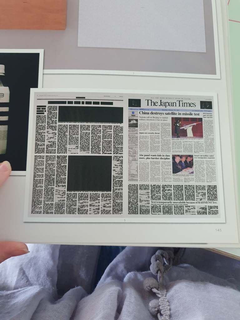
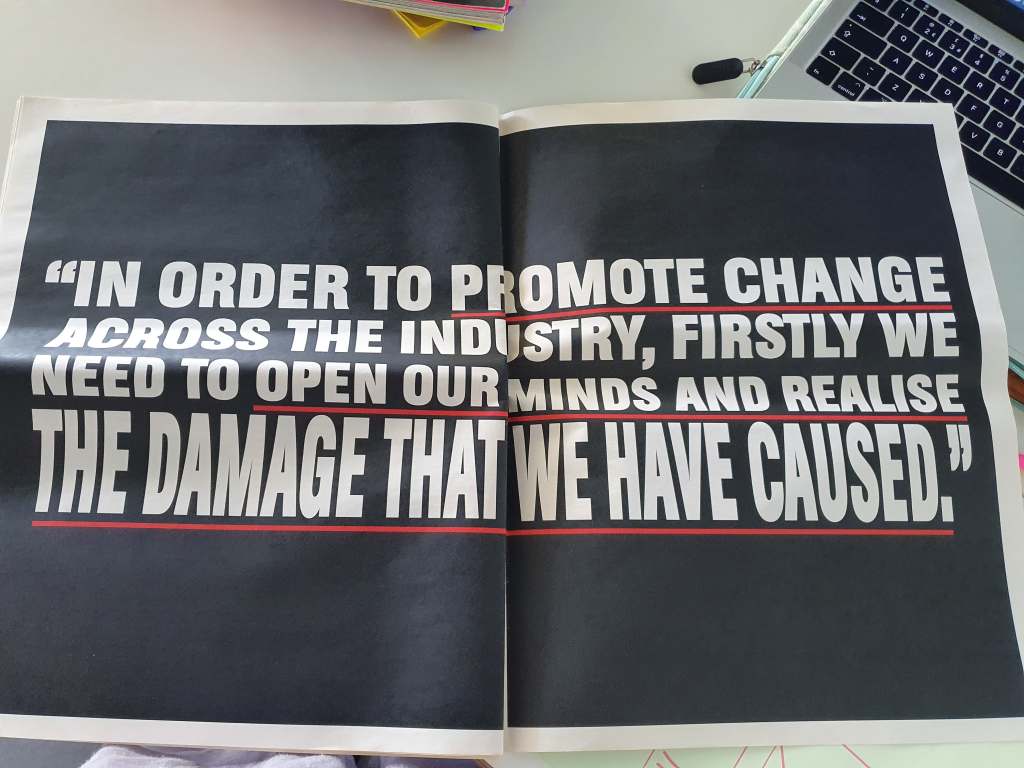
I still liked the idea of using scale but I was wrong I needed to go bigger. Newspaper size. The idea that some designing is bad for instance in the dissertation it mentions how over designing washing detergents is pointless and wasteful but designing good way finding or promoting a charity is more likely to be ‘good design’. So in a newspaper you have pages of ‘pointless’ advertisement design but some pages of informative helpful design.
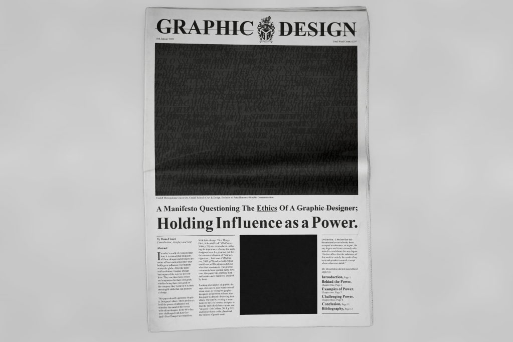
I wanted to create the cover with importance and be different to the traditional. So I removed the images so that the text and layout would be more noticeable. With some feedback it was said the black square looked like the black lives movement so the viewer filled the space with meaning. They also felt that the power could be of anything and that I needed to be more about the Graphic Design.
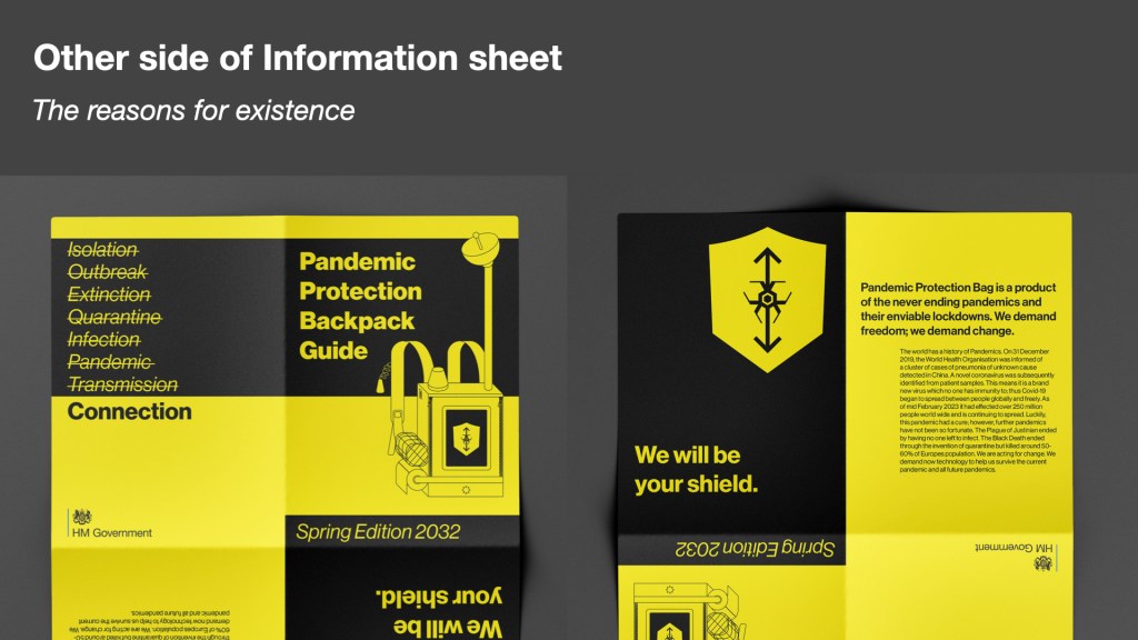
This book was produced by Margaret Thatcher’s government during the Cold War in May 1980. It advised people on the safest way to stay alive after a nuclear attack. I had used this as inspiration before. It helped my type out the paragraph on the information sheet.
This booklet also has an action checklist much like my early ideas of leaving and returning home checklist. This makes me think that it would be a great idea to add this concept within my work.
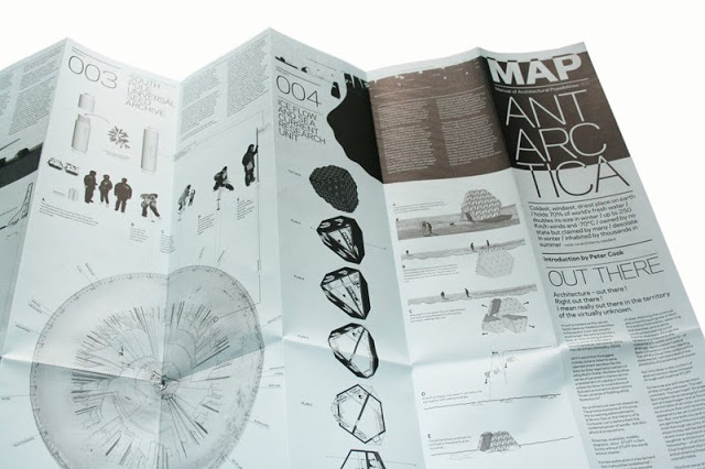
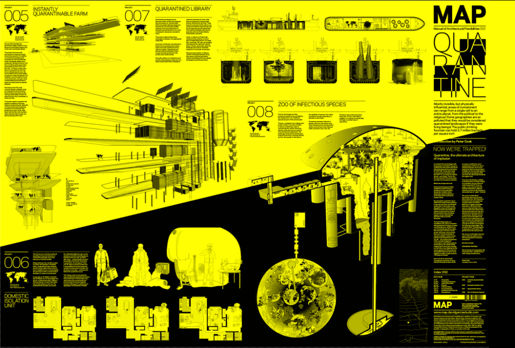
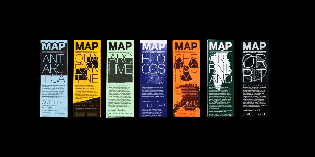
MAP (Manual of Architectural Possibilities)
This is a collection of speculative double sided A1 manuals on individual issues. I had looked at these before but not in great detail. They use real information then add a twist to exaggerate the impacts and implications, which is exactly what I want to do with my work. However, the detailing and time spent on these MAPs create a new level I only wish to slightly achieve.
I believe my changing my concept to a booklet will allow me to explore more areas of interest and can help me map out my future world in a more clear way. This will look less like the MAP which I cannot stand against but instead I can sit with the more real life informative booklets.
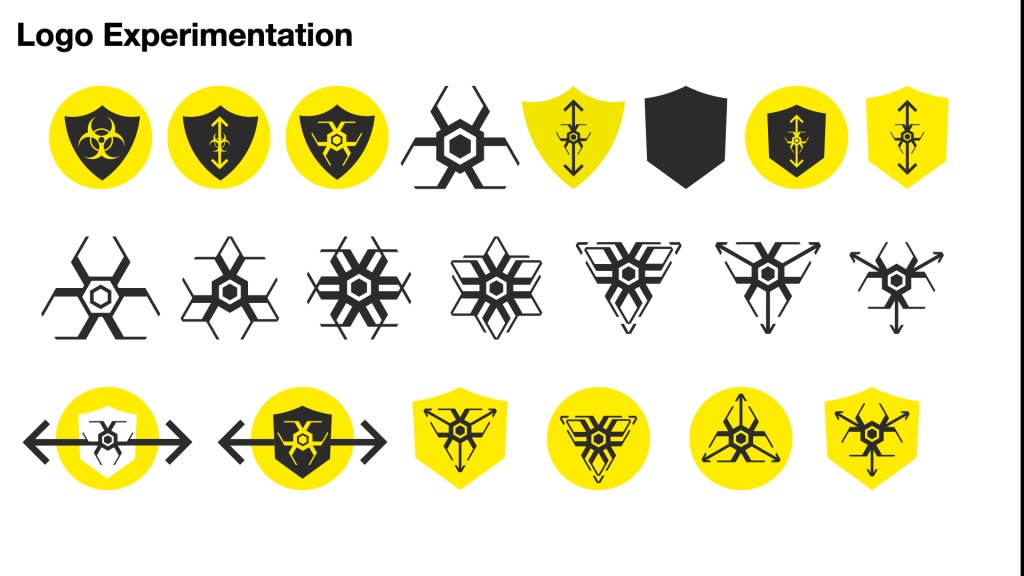
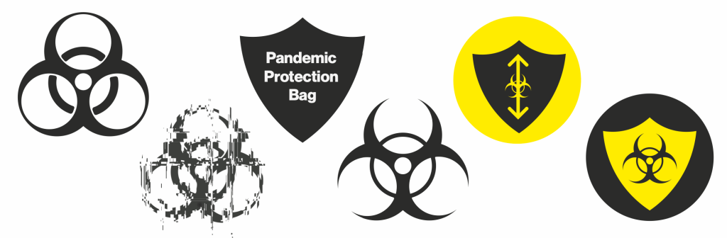
My feedback was a little confusing at the time and I didn’t really have any idea of where to go and what to do. So I took some time off to get my head together and figure out what is needed. The feedback mentioned the logo seemed disjointed to the rest of the styling. It needed structure and panic. The arrows worked the best. I recreated the shield with sharp cutting lines as if it was protecting us more from the greater evil, creepy biohazard virus.
This had a stronger response but the bottom right logo utilised the arrows and the feel of pushing away or spreading like a virus.
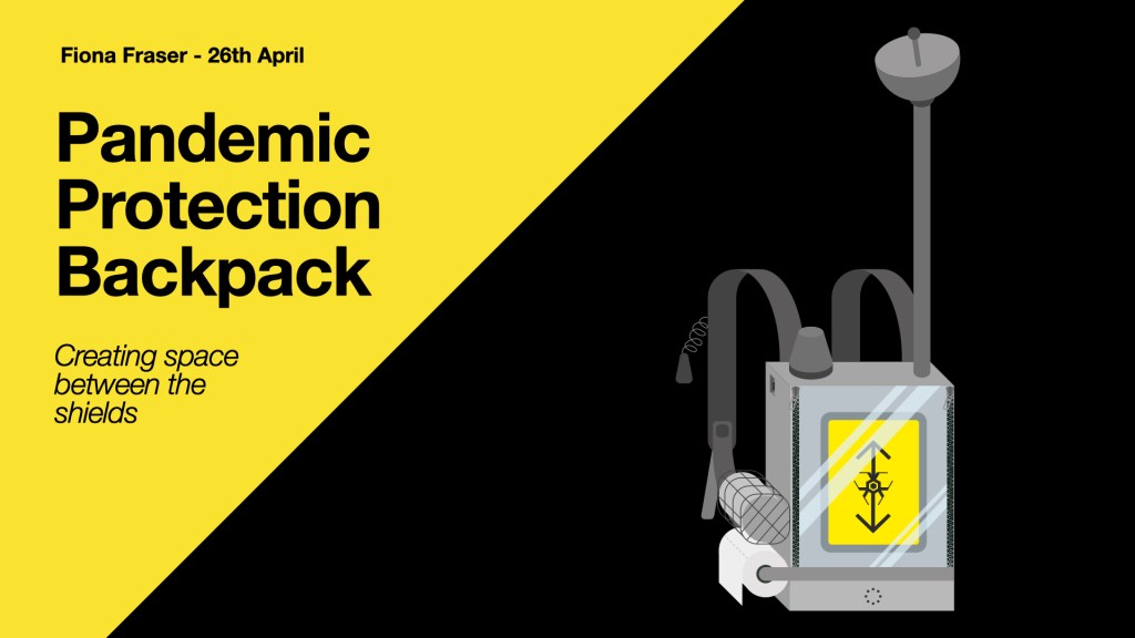
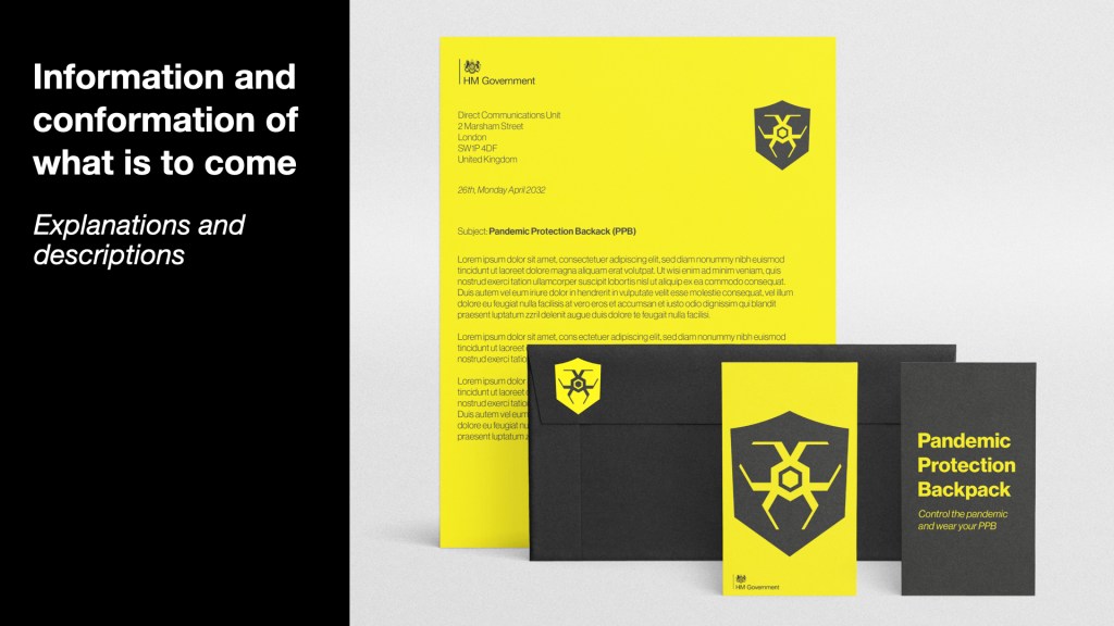
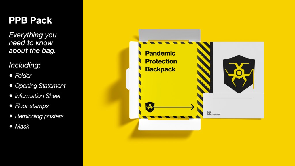
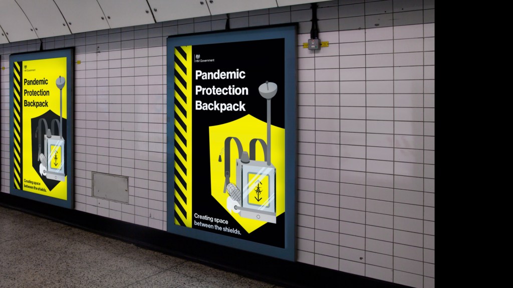
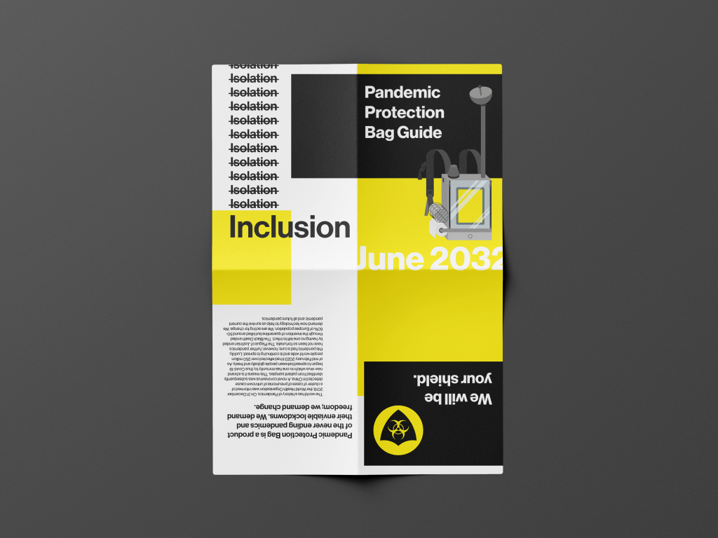
I then thought about the pack. The idea of having an information print out was greatly liked however, the design was off. I needed something easily recognisable and cheap to mass print. I took the idea from Suits and seeing tip sheets from stock markets only printed on red paper so that they cannot be copied easily. So what if all my print was on yellow sheets to be easily replicated and for a Government ran scheme the print will only be in black ink for the cheapness.
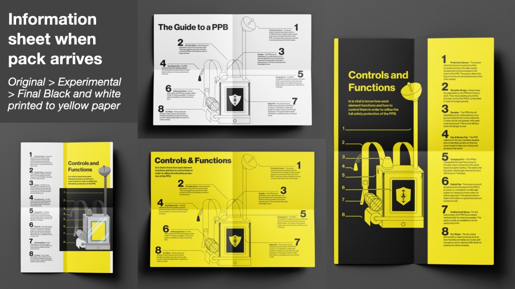
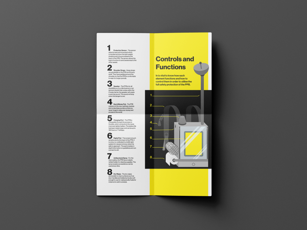
In the formative feedback it was said that I needed to adjust the hierarchy of the functions and controls page. By removing some elements and making the information travel directly to the backpack the page flows better.
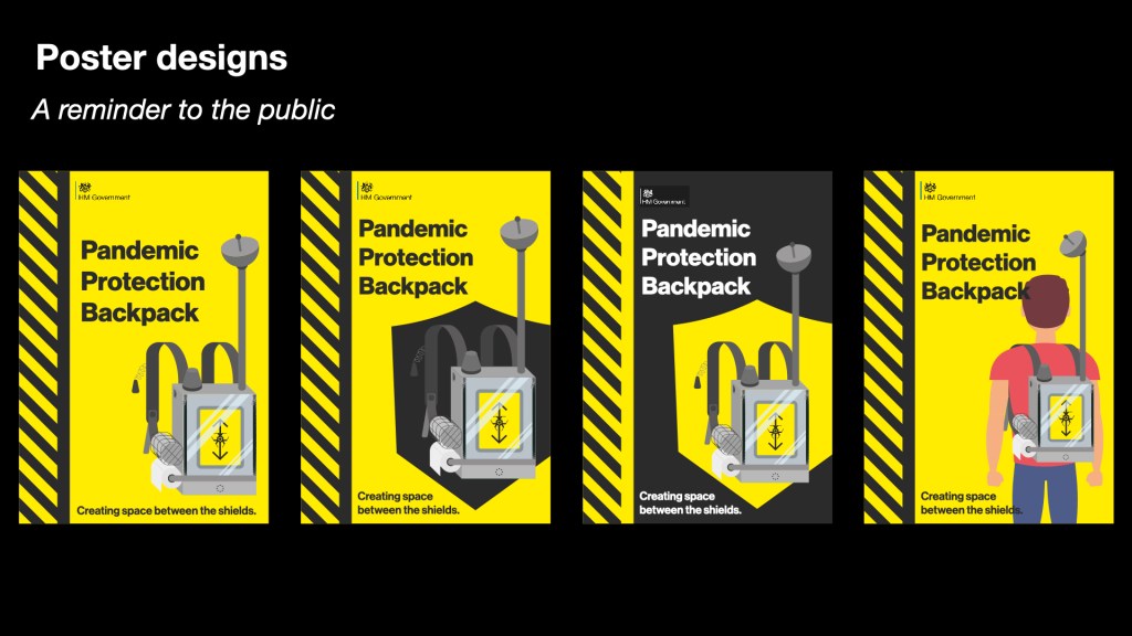
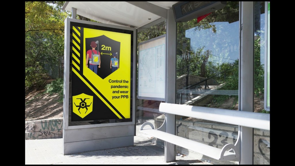
I kept thinking from my other projects add context, bring it to the real world. What better way than posters. These are used as simple reminders in public places to wear the PPB, such as public transport where they are crowded.
So far I haven’t shown how the bag can actually be used in real life situations. I needed to show how the bag will be worn so created these red and blue men walking to the supermarket. When the men get too close the PPB acts changing colour. With more time I will add sounds and other elements.
Overall, I know I can push this project further and experiment with other visuals.
Gareth seems to be a free thinker and has found his place in the design world. He was real in his experiences. At the start of his career he struggled to find a job that fit him. Continuing his story, burn out hit and he over came it by taking a trip to Thailand. Then he remembered his love of “play” & “typography with no rules.”
He has passion for his new job with wework and his freelance. He has strong beliefs that his and everyones skills are at their best when collaborating. He explained that working with others allows for specialist abilities to shine and thus make the best work.
This passion to engage with people made him set up ‘open studio’ which is a place for students and new designers to come together and help each other along. On a one-to-one mentoring system to enhance the link between the industry and university. I will most definitely be reaching out when I have something substantial to show.
Unsure about the logo, I created this shield idea that the pack will protect against enemies such as the other people with their illnesses. This sparked the idea of how PPE is a shield we must wear thus the PPB was created.
I wanted to be sure on the styling of my FMP as the more decorative broken style was more interesting yet the sans serif is clearer and is simular to other government campaigns. Going back to design fiction it uses what is out there (the facts) and adds the the speculation (with fiction). The simpler design holds to that stable core of criticality so that my idea can be read easily.
This is an A3 foldable leaflet. The idea for this outcome is to join the bag to explain what each element does. I spent some time on the wording of each element on this sheet so that they could fit into the world of survival and information booklets.
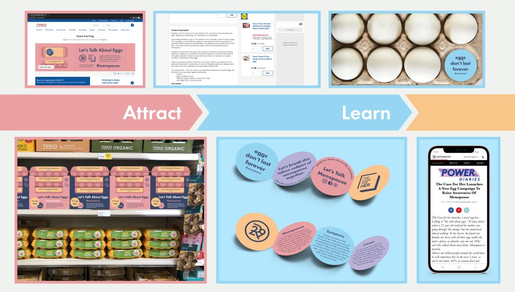
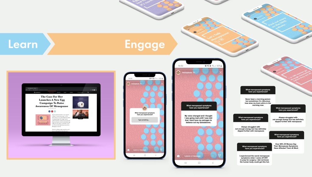
For the competition submission I was really nervous as we had to condense all my work into one video and 4 images. Once the video was created I became a little more relieved as that is the main outcome. These images I wanted to use a user journey to show off as many images as posible in a contained environment but then the messages are easily red and visuals are clear.
Overall, I am extremely happy with my outcomes but I do feel the social media isn’t what I can do as well as the video has a few hiccups. My idea is clear and focuses on menopause and how it can be happy and lighthearted. I have spent the most amount of time on this project compared to all others so far and I think it shows in the branding and concept.
The main feedback comments are that my designs shows my strong belief in the need for change and that I have a nice core idea which is strong and fresh. My design document received compliments for the layout and styling but I need to check spelling as well as depersonalise the wording to keep it professional.
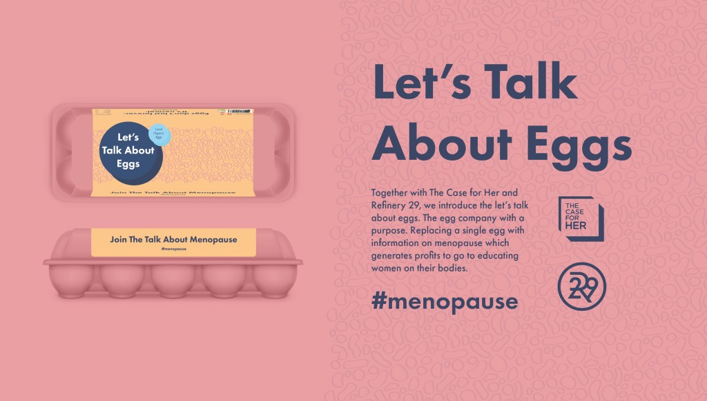
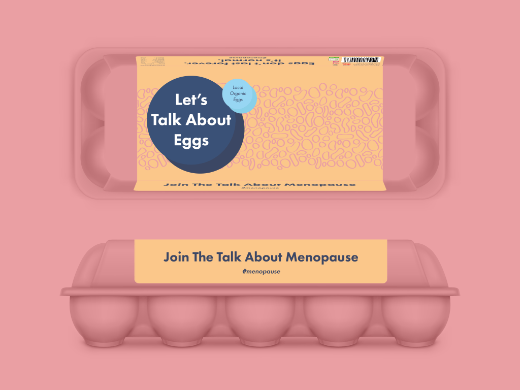
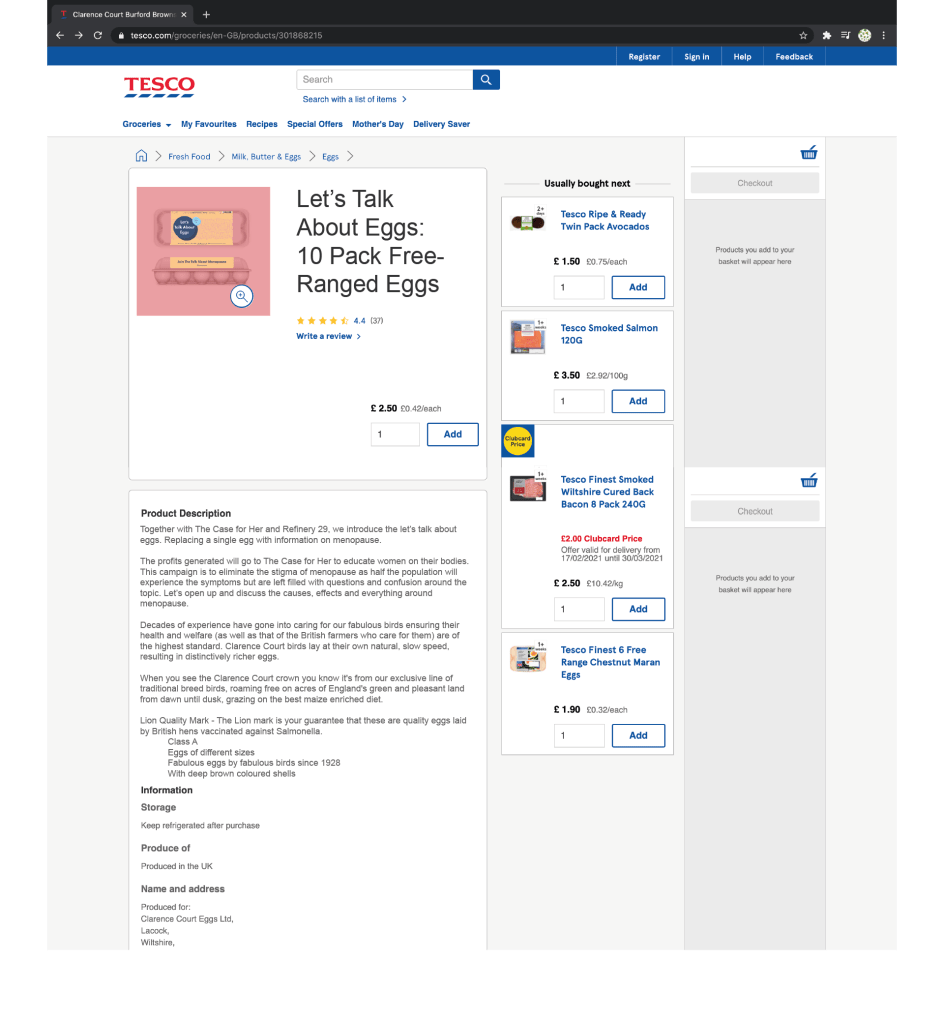
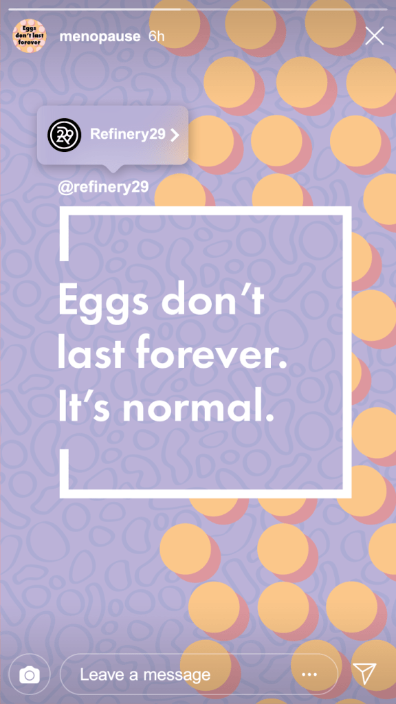
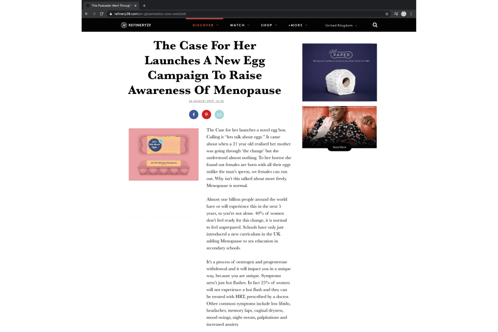
They were also concerned that the hens eggs were taking over and my menopause theme needed to come through more. I need to remember I’m not selling eggs, I’m de-stigmatising menopause.
To begin reinventing my idea, I needed to get the message clear and as feedback said forget about normal eggs and disrupt the traditional packaging. I should be pressured into what is happening now, I can use the word menopause and use it boldly. The main title is contextualised by using the word menopause. It is inviting public into the female world.
The feedback also mentioned that there was no connection to the real world with my designs. Yes, there is social media but for the egg box to shine it needs to go the extra mile.
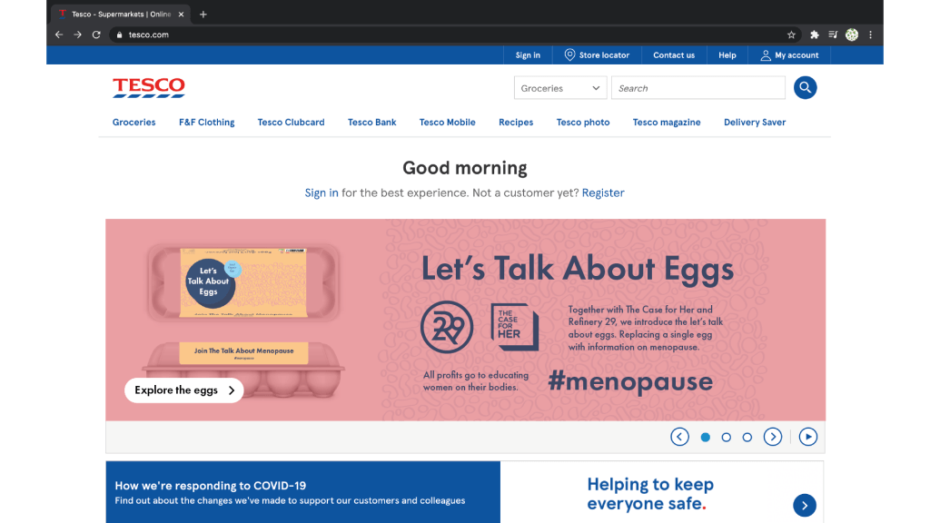
I wanted it to be only because the conversation is online; Refinery29 is online. Also in the current situation going to the shops isn’t an option for everyone. However, I was reminded that going to the shops is seen as everyones weekly outing so they are more likely to go to the shops for a conversation.
All the feedback I received praised the booklet idea of replacing an egg however felt the idea wasn’t translating well enough as some didn’t understand whether it was replacing an egg or just within the box. To over come this I spent some time on my video. This must have been the 50th attempt to get it right and for everyone to see the idea and understand it after watching this short video.
Once I explained the egg box and booklet I needed to lead the excitement to the conversation and keep their engagement. This will be through the social media especially on instagram as the audience are going towards this media and then can be shared across Facebook and Twitter for more conversations to happen.
In one to ones, the tutor felt the social media needed the most readjusting. It was a little clumpy and needed cleaning up.
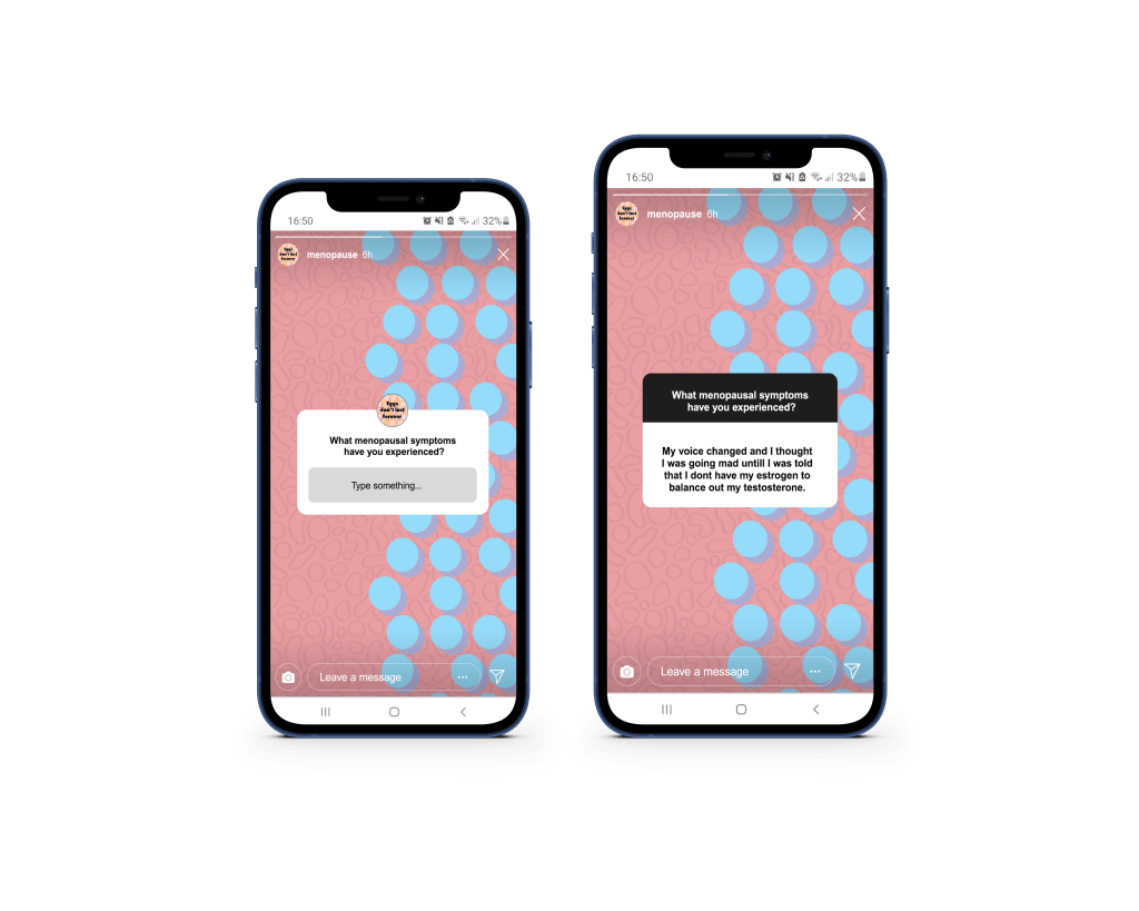
I wanted to emphasise the communication power that instagram has. I wanted to show the Q & A element of the story posts. Having my video show the potential answers can tell the viewer it can be possible for people to see answers and normalise the all symptoms and side effects of menopause.
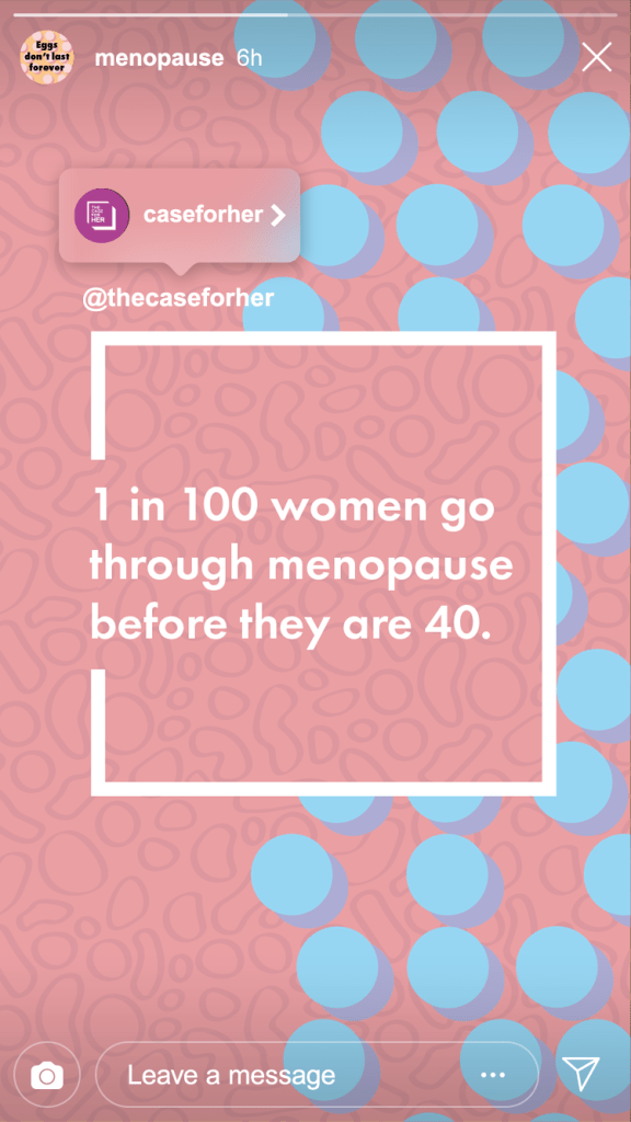
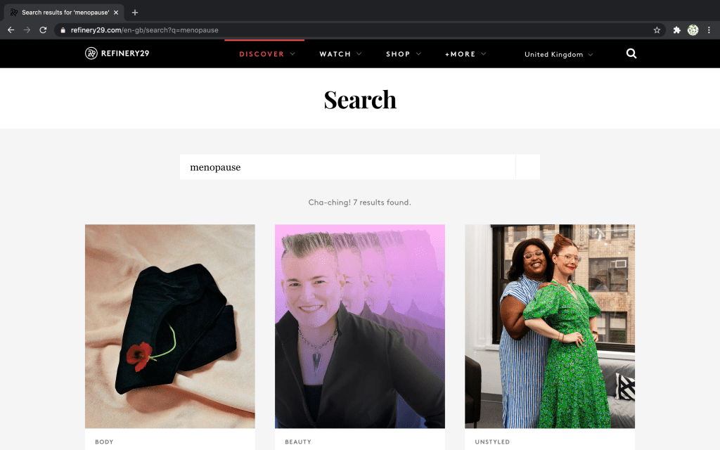
None of my feedback spoke about the articles so I questioned whether I explained the issue enough. So taking this further I drew attention to the fact there are only 7 articles about menopause in contrast to the hundreds of period stories.
Soak up meaning and show that meaning in the best way. Paul Fenton’s session talked about his process of design, which is all informed by his research and ability to keep asking why? He talked about the curious drive we need for success. Tell a story and take out subjectivity, give reasons so that the core idea is always shown.
His talk was very different to the others previous. Many of the other spoke about the outcomes and why the final piece was like it was but not with common curiosity. He showed us a few pages on the ideas and his process. I saw the art boards from an illustrator file. It made me comfortable in the way that I work. I want to push myself to experiment more.
He challenged the idea of not working on a computer for ideas. This reminds me of ‘make your mark’ a challenge to draw 100 marks with a short deadline. I needed this to remind me to take a step back and just draw.