Initial Plans

Wednesday 5th to Friday 7th December – Independent study 

logo ideas

These are the logo designed by all the group including me (bottom left four). We decided on the top left styles, which gives a temporary and sleek look.

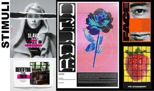
When looking into designs similar to the style I can across a book cover that includes the slave trade within the garment and overall fashion industry. I like the simplicity of the layout through using a symmetrical layout with a small component of asymmetry. The creator uses black and white photos with one simple pop of colour, which can be more emotive as you are not drawn away from the message portrayed. http://www.safia-minney.com/slave-to-fashion.html

The other images are from an Instagram page by Lucas Grassmay, shown to me by my group. All his work is very up to date, with a clear grid system throughout. He breaks up images to create depth and frames them with the text creating a pleasing visual. https://www.instagram.com/lucas.grassmay/

stimuli

When looking into more research and talking to the team we decided to use photography and type based graphics.

The outcomes we plan to have are posters, gifs, video/clip and a social media page or banner. When creating these we will each have one aspect to take forward.

One worry we each have is how coherent the designs will become and how well all the aspects will come together for one brand. To try to overcome this we quickly chose black and white colour scheme but debated over the fonts. So made a short list of the fonts we each liked and highlighted the differences.

fonts2

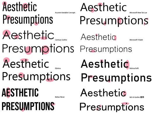
As a group we decided on the bottom two font styles. One for headings and the other for body text.


Other resources I looked into for quotes and visual inspiration;

https://www.canva.com/learn/best-email-designs/?fbclid=IwAR3Bze1HlP_F5VdajkR5_2PyBhH-yN58y_vVXfFfMAqDXWag-GMBmhYPj9g

http://marketinghire.com/archives/employers-rate-importance-of-physical-appearance.html

http://www.pretty52.com/topical/real-life-does-your-appearance-have-an-impact-on-getting-a-job-20170219

Design as Activism

Week of the 3rd – Design as Activism Brief

Our brief is to create a series that will explore the role that graphic designers can have in enlightening, persuading and provoking a viewer to engage them with a particular subject matter or moment in time. This 2 week project is going to help us figure out what roles we play within a group, how well we work with others and where graphic design sits within the world of art.

Our group of 5 immediately brain stormed ideas and random concepts that effect us and the general public in today’s times. We looked at some main objectives of social, cultural, political and environmental issues. Some ideas we came up is the mistreatment of the NHS and other emergency services, government corruption and their budgets. Through a group conversations we all had leaned more towards the inequality concept.

To go further we needed research and a more in depth plan, so another member and I created a Lotus Blossom thinking technique so that we can start our creative flow and start to link ideas. Another created a mind map of different sub topics we could specialise into. While the other two members researched the overall topics that helped us to move forward. By doing this it allowed us to explore and be more creatively. This also made us think about what is already out there as we don’t want to repeat a very similar concept.

Creative thinking - Lotus Blossom

With a lot of our ideas laid out we can up with the concept of inequality based on physical features such as looks. To narrow this down we looked into the job and recruitment as well as educational implications a certain physical attribute has.

Going forward we found it had to find a name that would fit. Our idea is contemporary and hard hitting so we need the name to reflect that. At first we came up with Opportunity without inequalities or OWI for short. We were not sold on this idea so discussing with our tutors we all had time to reconsider and change the name. Through talking through as a group we decided upon Aesthetic Presumptions (AP).


Collaborate

Morning of 3rd December – First Things First Manifesto

After a short lecture on the expectations for this new project we were given a small 3 hour project on ethical graphics. This is small project included the ideas and development of these concepts. We assigned our own groups and our task was to “develop an idea that promotes and provokes the design community to take responsibility for the work that they put out into the world.” – tutor presentation.

At first we talked about the rejection of commercial work; through removing this style of graphics we can engage the public to embrace empathy, consideration or our position in the world. We continued to discuss elements such as the ideal of good vs evil/ yin and yang/ devil against the angel. This could be represented by having only just positive and negative space, then finding the grey area within a mini animation/ gif.

When looking into research we all came across all the pop up adds, which we all found generally irritating. At that point I came up with the concept that the graphic designers could take control to stop all the pop up adds. For this to work we would have to also target the major companies that use the pop up adds but then take small digs at the designers.

We began to look into how we could create this concept through a movement piece. Our group drew up some initial sketches and came together  picking ideas from each designer. We wanted to use visual metaphors so began to draw a backdrop which is a shopping centre style. I suggested that we have the perspective of the viewer which represents the view of the screen while online shopping.

Going along the animation we have the viewer walk out of a shop and onto the high-street, which would be the same as closing your current tab and opening a new one. while the character is walking he encounters some pop ups in the distance then these popups become louder and closer. We all wanted these adds to be animated and human-like so we drew on arms and legs in an aggressive style.

Through having a simple frame style story board we were able to showcase our ideas methodically and the viewers understood our message. When presenting one comment was that there was no conclusion to the idea. We had created a story that finished half way through so to improve the concept we would have had to have a few extra clips that shows the user being overwhelmed and then cuts to a conclusion that the graphic designers or general public can do.

Overall I learnt that I work well in a team and I am able to take the lead in decision making. I can use other peoples work and ideas to create a mashup concept that can become very good with further development.

Movement Reflection

Tuesday 27th November – Hand In Day

This project has challenged me in many different way – to use brand new software, to be creative and just to pull all the different aspects together.

I am really thankful about the creative thinking workshop as it turned up my imagination and I came up with some weird ideas. I really liked the concept of the 6 hats and the metaphorical thinking which all made me look at this project from a different perspective from the beginning. Through using this I was able to understand the brief a little bit more and draft my first story board.

My favourite part was designing the story board and making ruff, quick sketches of my ideas because I had creative freedom. With my final story board ready to be presented I was unsure how to go forward but with the help from my tutors I was able to improve my work. I made it more metaphorical and using the balloons as the people, ready to create the animation.

I have learnt a lot over the past month especially with the After Effects software. This was a new program to me and I had to quickly dive right into. I have learnt how to animate a simple image, how to blend background, how to add audio and many other simple tricks. I will continue to improve the more I use After Effects and will work on my knowledge about a wider variety of effects and presets.

Feedback and Improvement – Constructivism

Tuesday 23rd October- Formative Submission Type and Image

This was the day of my formative submission – it was great to learn about all the

1Capturedifferent topics that the class had been studying for the past month. I found the movements that were around the same time period as mine really interesting through seeing similarities and differences.

Constructivism is all about structured chaos and how that has meaning. I feel that my design conveys that message with all different elements going in to the main title, giving the illusion of a 1910/1920’s Russia.

Tuesday 20th November – Constructivism – Type & Image Formative Feedback

Overall I am pleased with my work and am happy with the outcome. I understand now what I need to do to improve and how I can take it further within the brief.

A conclusion that the tutor mentioned is that my work is too similar to the original style of that time period, whereas the brief is asking for it to be re-imagined. One way he suggested was to “Explore more contemporary graphic design research as well as more insight into posters of the time.” To achieve this I looked at my research already done then I looked at some very modern posters. These new posters are using geometric 2D lines and adding shading to create an illusion of 3D work in a minimalistic way. Within my own work I began to take away the heavy bold lines from the Constructivism style and adapt then into a more modern setting.

With these designs I thought about the negative space so that it can balance out the filled space. At first I wanted something simple and not overwhelming but after a conversation with a few tutors they pointed out that I should consider having different shades of the colour.

Another aspect was the text. It almost appears as the text was placed within the shape not the text holding their own power. I thought my alignment it would make them pop more but it wasn’t aesthetically pleasing. So I changed around each paragraph so that they all have their own status. I began by lining them up within a 6 line grid system but then the paragraphs didn’t sit right within the image. I decided to place each image in its own position without a grid so that it would flow better.

Capture4

I feel that my final piece has been simplified, yet still has the Constructivism feel.

Overall the feedback was really helpful as I can use this for my next project. This also gives me a chance to go back and reflect on what I have done, in both my work and learning journal.

Finalising My Movement Piece

Monday 26th November – Studio support 

Today I asked for opinions on where to go and how to make final tweaks to my piece. Overall the comments where positive.

One aspect mentioned was that the sound of the balloon popping. This was because there was only one balloon pop. To rectify this I simply copied another two of the same sounds.

Another improvement that was stated is to change the design and colour of the word “poxism.” They suggested that I make it look as in its been infected. I changed to colour to a pinky-skin colour. Then added spots as if the words had chickenpox.


Overall I am happy with my piece as it has some comedic value but doesn’t overpower the message. I believe that if it were to become a real YouTube style advert the public would be entertained and drawn in by the bright colours, style of the design and the actual content.

Adding Audio

Week of the 19th November – Independent work

I wanted to keep my animation without actual words spoken out loud. So for the audio I was unsure whether I needed to use music or just sound effects.

To start with I wanted to add in happy party music or loud children running around and having an over all great time. I listened to many different child-like party music but they didn’t truly fit what I wanted. So I went with children outside playing in a school playground. This is paired with girls giggling so that the mood is overall very joyful.

Next is the balloons popping which was very easy to add. After this it is the sound of adults cheering, which is meant to illustrate the parents being happy that their children are going to be cured from the virus. This is followed the children laughing. Over all the sounds add to the chaotic nature.

Capture

I added all my audio from http://bbcsfx.acropolis.org.uk/ and http://soundbible.com/free-sound-effects-1.html which were both easy to use.


Smells like Teen Spirit

22nd November – week 7 Postmodernism : Bricolage – Harajuku Street style

In the lecture we went over Bricolage, Harajuku style and how they did a ‘mash-up’ of many number of different styles across the century. Then we continued to figure out what we are doing for the learning journal (which I am still apprehensive about).

At first I was unsure on what Bricolage was but the tutor explained that it is the concept of adding deliberate combinations together for the style. This is a post modernism approach as it is reworking old ascetics to create a reconfiguration of ideas. Much like a retro style bricolage is relying on the viewers knowledge of the past and prior function to understand their new outcomes.

Linking this to the classic harajuku style they use a random mass-produced items such as the stereotypical bright pink Hello Kitty toys and accessories that they attach to themselves. The harajuku girls could be seen as the ultimate ‘mash-up’ because of the amount of styles they use, some of which are the traditional Japanese dress, the avant-garde culture, Tudor and Elizabethan feminine attire, goth, steam punk and hyper western modern style. All of this is created to look exaggerated and it seems to cover their identity instead of showcasing who they are. This is a different concept to all the others we have looked at, as those are showing off where the fit into society and what group/ gang they belong/ adhere to.

Another aspect we looked into was the key aspects we need to write for our learning journal. The tutor gave us questions for our minds to think over, as well as overall guide lines. She wants us to relate what we have learnt back to our own individual practise such as how I have learnt how to look as a large block of text and know who to paraphrase which will help me when I research into a brief and need to create a presentation of my findings.

Movement Development

Monday 19th November – Discussion over outcomes

I wanted to keep the animation simple with very few add on but had a continuous feel. So I decided to redo the animation as it was static and I wanted to follow previous critiques. I did this through out the week.

To begin I took away all of the characters. The removal of the child characters meant that the balloons can now be a visual representation of the children at the chickenpox party. At first I just had the 3 red balloons that would be the children but then with showing my group I added 5 different coloured balloons in so that it could be more of a party scene. These new balloons would the move away ready for the 3 main ones to explode.

Continuing on the balloons exploding is well illustrated and everyone was very happy with this effect. The only aspect that I changed was the speed so that it was a more realistic pop.

I the added the text this included the title “Poxism” and the words “A party for happy children and caring parents.” With the title I wanted to make that different through using a text preset. Going though the different effects I can across a magnifying style. This gave the illusion that a glass is going over the top making each letter stand out in turn. However this effect does not allow me to remove the base layer as each letter increases, thus giving the illusion of having 2 of the same letters at the same time.

The second set of letters are show so that the slide up from the bottom and appear after you have read the previous word. This should allow a viewer of all ages to read the text.

This slideshow requires JavaScript.

Over all the colour tones are bright and clashing to illustrate the vibrancy of a child’s party. I added a background colour of a gender neutral turquoise, so that all can be included. When looking through and showing my animation to the group one single colour was not enough so I added colour changing at the beginning ti set the tone. This emphasises the chaotic nature of a party scene.

After Effects Introduction

Wednesday 7th – After Effects Introduction

I had never used after effects before the workshop and was very unsure of how things worked but I was certain that I would figure the overall aspects of the software.

By the end of the workshop I had created a few little animations that look half decent. These small moving aspects taught me that the first over whelming software is similar to most adobe programs.

This slideshow requires JavaScript.

Wednesday 14th to Sunday 18th – creating first animation

Through using the online videos created and my Capturememory of the workshop I was able to recreate the simple spinets of my storyboard. I developed my techniques and by the end of the week I was able to use around 5 different techniques to create a basic full animation.

One aspect that I was unsure about was the explosion of the balloons. To create this effect I had to mess around and find the spilt effect. This meant that I could break the balloons into many pieces. Continuing on my concept where the balloons release the disease I wanted to use a confetti style breakout. Using YouTube tutorials on how to create a particle world effect I managed to make 3 different eruptions.

This slideshow requires JavaScript.

Design a site like this with WordPress.com
Get started