Placard

Monday 28th January – Placard

The new placard brief was simple and to the point so my group and I wanted to keep the designs simple.

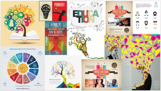
Looking back over this project we decided that we hadn’t kept to one specific style. With this new week we wanted all the work to be in the same aesthetic. This meant picking colour scheme, typefaces and style. To begin with I created a mini collection of the style of work so far. Due to the random style of our work we made the decision to add on the graphic type and contemporary work that one member work with.

1

We each brainstormed began to list creative slogans and phrases that we thought of – picking the best and removing the worst.

As we progressed I looked into Stanley Green’s placards and their style. The elements that I liked are the one word per line and the level of readability. In response to this the illustrators felt that this would suit their style and created placards with paint and through screen printing. 2
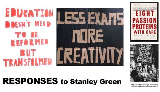
https://workplaceinsight.net/stanley-green-protein-wisdom-perils-sitting/

Through using the illustrators work as inspiration us graphic designers quickly decided on the colour scheme but were very unsure about the type faces to use. Going separately and then coming together, someone suggested Oswald Bold and Titling Gothic FB. We went with these because they fit the contemporary design and many great artists are using them currently.

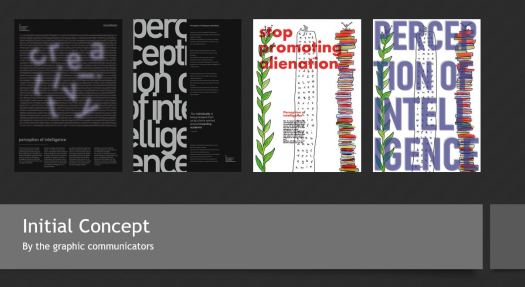
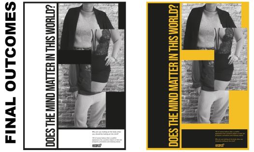
My designs are the 3 on the right. One idea I had was the idea that everyone is individual but we all are forced to live very similar childhood, especially when it comes to the schooling system. We are placed within a bubble that we are students so we must act in this way and must have a goal of such a thing. Another concept I had was the graduation cap and how that is made individual with each student designing and hand crafting the top with a design but overall the shape and meaning is the same.

4

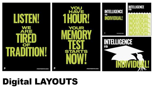
The overall look of these posters looks unfinished and we all thought they needed an extra element to push them even further. Also I thought that this was an almost harsh graphic based design so almost wanted to personalise it and bring to life with a subtle and unique illustration or pattern.

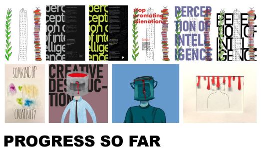
When printing these out for the Monday presentation I realised that the graduation cap didn’t show up as much as I wanted it to. To rectify this I reprinted the designs with a less opacity placed upon the elements.

Oxymoron Feedback

Monday 28th January – Presentations of Oxymoron Project 

The presentation could have gone better as the group didn’t fully discuss what each of us was going to say but overall the delivery went well.

One feed back we got was that the designs needed to link to more schools and education. To over come this it was suggested that we change the clothes of the guy to make him look like he has a school uniform on. Another aspect we discussed during the feedback was including other people with different heads. This would enhance the feel of the individuality and different styles of learning.

I believe that the style of graphics goes well with the theme so if I were to progress  further with this I would keep to the same style of textures.

Oxymoron

Monday 21st January – Visual Metaphor + Oxymoron 

With an in depth and visual lecture on visual metaphors I realised that the straight forward metaphors work the best because its more understandable.

The brief was simple; pick an oxymoron and draw each word separately then bring them together in one image. We quickly chose “Creative Destruction” because it links well with the manifesto of how schools are damaging out creativity and willingness to learn new things.

I designed the eye with the axe because the axe represents the destruction of life, where as the eye can be pictured as the spark of imagination. I did this as the eye is bleeding away the creativity from the person behind. Another thought I had was the tree are so free flowing almost creative in the way they grow, all individual. Then a multi-million company come and destroy the trees – much like the government coming across children and deciding how they will live their next 18 years, almost destroying their childhood.

Over all the group felt that the oxymoron needed to be linked back to schools and education. With this decision we went with the person with a paint head as this represents any creative pupil. Then the bullet wound represents the creativity leaving their mind.

To develop our idea we wanted to keep it digital and create a GIF. Each of the illustrators created a design for the look and we all decided on frames with the placements.

I created a mock up look of the character. The design is simple with no out lines, which I thought would increase the illustrative look even though its make from vectors.

paint head1

When talking to an illustration tutor she suggested that adding layers and increasing the 3D effect would make this design pop.

Through combining the textured fabric and metal it gave the design life and makes the red of the blood pop.

paint head2

The final out come was a GIF so another member of the group created a glitch like animation.1

Manifesto Feedback

Over all the comments were positive. The criticism being that all our work looks different and we needed to pull all the designs together.

Moving forward we need to create a logo or one thing that pulls the outcomes together.

I decided to recreate part of my design as some of the feedback included eligibility. You are unable to see all the illustration as well as the type.

I decided to push the illustrations to the front because they had the deeper meanings. Also the type is clear so can be legible. I reduced the leading so that the illustrations had some negative space for them to pop. I believe that the characters at the top are now more visible and over all the design is more eye catching.

Manifesto Designs

When working the group decided to split up so that we could brain storm and come back together after to fine tune the work.

The first image is the illustrations. I sat with one of them and talked through concepts that could be progressed along side my graphics.

5

I took some of the illustrations, scanned them in created a line image. Proceeding to lay them out and add text. When talking to the group we decided to remove the faces and use more metaphorical because this meant that the viewers could think more deeply about the meaning.

6

Manifesto

Week of the 14th January – Manifesto

Perception of intelligence. This is the general public’s opinion of the way of how they look at and rate their own and others level of cleverness. The idea is to change the way of thinking about how they test the intellect. We came to this concept easily as our group communicates well together.

I researched into some examples within education, most of these were basic illustrations or an over bearing information page. The ones in the PowerPoint are simple, thus you understand what they mean. This is what we aim to achieve in our outcomes.

1

When talking to an illustrations tutor she mentioned a ted talk that looked into the issues with the schooling system that complied with our manifesto. He had some great points and really went in depth and felt passionate about this topic.

One point he opened up about is the idea that creativity is just as important as literacy. Also schools “stigmatise mistakes” which is where children are more likely to look into the areas that they are bad at and pick up that we are incapable of doing those areas. In reflection to this I thought about how adults look at their past and see their mistakes and are more likely to remember their regrets over their successes.

Continuing to watch some of Robinson’s other talks I thought about his points and began to realise that if you are curious about a subject then your more likely to teach and apply yourself to that area. Overall he points out that we need to rethink our schooling system to cultivate creativity and curiosity through acknowledging the different types of intelligence.2

3

At one of your group meetings we discussed how we can progress to create a poster for the brief. 4

Collaboration with Illustration

Tuesday 15th January  – Launch + Workshop – Manifesto

To begin with I had a lecture on what illustration was in comparison to Graphics. I learnt that illustration is from the word illuminate, where the piece of work illuminates the viewer. An illustrator will use visual representations of a piece of text and then usually given to a publisher to take forward. The art is different as Graphics is more based on projecting experiences and ideas in a contextual and visual way. I then realised that is why communication is more key in graphics as I (a graphic designer) am demanding attention instead of offering the representation like an illustrator.

Later we were placed into our groups along side the illustrators, where we did a simple team building exercise. After that we showed some of our best work to our smaller team of 5 but only 4 of us were present. Through showcasing each of our works I learnt that the illustrators preferred the hands on approach where they had the physical objects; whereas us graphic communicators preferred the digital aesthetics.

We were given the brief, where we have to protest against something we believe in. After a long thinking process the idea of how the education is out of date. This is a broad spectrum so did some quick research on our phones into what topics this could be. The exams are a good concept to go with as they have any disadvantages. Some examples are being if you have an off day that is your future messed over, another it is just a memory test so if you cant remember the topic then you are not likely to pass, on top of that the actual courses that the students take are very outdated.

To go forward we have to create a few posters of our manifesto so to begin with I have created a mood board of the better graphics out there that I can use as inspiration.

mood board

Presentations

Monday 14th January – Formative Critique

1capture

Over all I am happy with my out come as it fits well with the theme of how people’s looks can affect assumptions before anyone gets to know you.

However, I now realise that I did not share enough of my work with the team. I could have sent a few more of my initial ideas and poster styles to our group chat.

To improve further I should have thought about what sizing is needed. Such as a square for Instagram or something that would fit on to a social media page.

Development

Christmas Holidays – Independent Study 

Having taken and already messed around with the images, I needed to create a layout for them. Looking back at my research and sketches I started to use a simple three column grid system, that is used in some of the previous artists designs.

The font used is the same as the two we previously discussed as a group as well as the black and white themes. However to begin with I did start with the coloured design and then realised the group wanted to fully remain black and white, which I agree is a good decision, due to the attention not being taken away from the images.

Initial designs

Week of the 10th – Independent Study

I began to sketch ideas down, visualising the style of photos that I wanted to take. My concept with the female character is that she is wearing different items and is perceived differently throughout, even though its the same person in the same scenario. The other main thought I had was that the male character just had disadvantages due to the scruffy nature and people judging him before they meet him.

With the male I learned that if you cut out parts and exaggerate areas you can create an over the top style. I tried to scale up the hair to exaggerate the scruffy style.

With the female model I wanted to create an overemphasised illusion for each persona. I am not very confidant with Photoshop but I cut out the model and adjusted each image so that they looked the best. Then I proceeded to place her on a background free from the internet – https://www.pexels.com/photo/closeup-photo-of-brown-brick-wall-1227511/   After some consideration I realised that just placing the images on top of one another did not sit right so I burned areas in the background so that is looked like shadows. This makes the image look more realistic.


Design a site like this with WordPress.com
Get started