6 Word Feedback

Friday 5th October

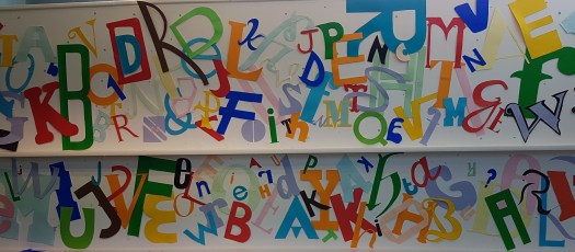
I was apprehensive to show my work in the class but with everyone’s work I felt it fitted in well with the skill level of the group. all 6 full good

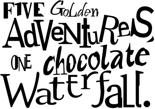
The feedback I received was overall positive. The group praised me on the detail of each individual character and the understanding of the brief. Another thing that I didn’t pick up on was that the curve of the “f” from the last word; this lead the eye back around the design and enhanced the thought of a real waterfall on the page.

One thing to work on would be to not over fill the page, also to have one or two main focus points not three or four. An additional point that the class taught me was to look at portrait as well as landscape. By changing my design I could have added some more negative space to off balance all the positive.


Six Word Poster

Monday 1st October

We have just received our first project; this is to create a poster with only 6 words to illustrate a book of our choice from 4 different authors. The aim was to only use black and white typography. The fonts we had to use must be hybrids, so a combination of more than one typeface.

With this project I was unsure how to go about it so I began to look into one of the authors, which was Roald Dahl. I quickly decided on the 6 words – “five golden adventures, one chocolate waterfall.” This is from the famous story Charlie and the Chocolate Factory.

The hybrid fonts were easy to do as I feel confidant with Illustrator. One challenge was the placement of each individual letters. This was due to Kerning of the letters and the previous exercises within this practice. 3 word

I began to add the same words in different typefaces, overlaying them then cutting out the parts that I didn’t like – thus creating a hybrid letter.

Once all six of the words were complete I began to adjust the sizes of the characters and the leading between the lines. From there I began to make the letters a unique size and tiled them at funny angles to emphasise the crazy story line of the Willy Wonka’s life.

all 6 full good

Typography Continued

Cardiff City – Tuesday 25th September

This was another adventure, not of the mind but exploring the city. Our task was to find the best style fonts from our provided list. One typeface was a lot harder to find around the city – this was Italics.Dr Pepper
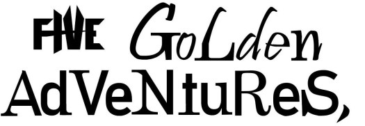
The style font was difficult to find as many of the shops used bold or script fonts. However, I found a bottle of Dr Pepper which had an italic font. The other fonts where Roman, Majuscule and Miniscule. These were easier to find as Roman is very common among old fashioned pubs and restaurants, while Majuscule and miniscule are just capital and lower case letters which chain retail shops use often.

Once back at the university we began to create our fonts that we took photos of. This meant that we were drawing and cutting out the letters. After cutting out 4 different letters of our chosen fonts we began to tack them all onto a wall as a collective class. I feel that the final look has some good areas and some needed more attention due to the open space and lack of interest there. On the other hand, your eye as the viewer is drawn across the display as it has a good link with colours. letters wall

Introduction to Typography

My first lecture for the course – Monday 24th September

This was an exciting moment I was finally training to be in an official Graphic Designer. The first tutor began to talk in depth about typography. This was very intriguing as I never thought that something as simple as one word or a letter could affect a person’s thought process so deeply. For instance this would be the style of serif, which include the size, shape and if they were even present. Another, example would be the spacial awareness of each individual letter. To develop our skills we were asked to draw our names with the spacing embedded in our minds.

Kerning Practise

My first name was too spacious, so with the second attempt I pulled them tighter. For my surname I feel the letters are good on the base line but again to far spread. Thus, when I went onto my second attempt my name has a good consistency with the kerning and base line.

Later on in the afternoon we had independent study. This included around 20 different type faces which we had to hand draw, research and bullet point the main style.


Design a site like this with WordPress.com
Get started