A Reflective Statement

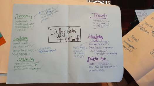
Sites, Spaces and Public Places

At first I was unsure how to approach a makers brief and it confused me to think so differently as I like to know my outcome and know my process I want to take to get there. This challenged my way of thinking and at first I struggled coming up with ideas/ outcomes that I had no idea how to achieve. Finally settling with my strong suit of graphics with typography. Through doing this I learnt more about my personal style and preferences, knowing what I do like and what I am capable of. This should help me when I come to branding myself as a graphic communicator and how I can go about showing my skill set within my portfolio.

Usually I would never think on a large scale so I pushed to do at least one experimental idea within the chosen concept, leading to a second. I will take this forward into future projects to push myself to achieve at least two experimental ideas. Then if some these don’t work show why and how they helped to develop my concept, but if they do take it further and truly take the experiment forward for the final evaluation.

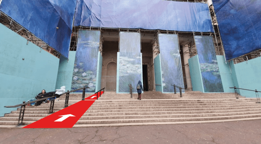
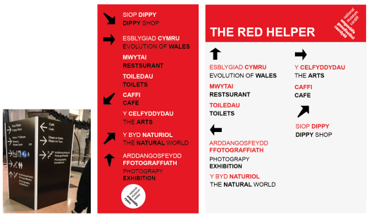
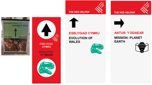
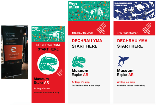
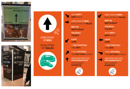
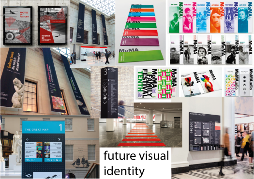
When at a talk we discussed the impact design has on the wellbeing of anyone who enters the space. Meaning we need to feel safe and secure both with the people surround us and the setting we are in to be able for ourselves to have the freedom and exploration to play. Becoming aware of this idea of play helped trigger the start of this project. When I visited for the first time I got lost so had a slight uncomforted feeling so I was unable to play or have the want to explore and learn more about the artefacts. By going back with the university learning where everything was I enjoyed my time and became curious and read into some of the artefacts. Thus creating designs that would even hypothetically help the visitors gave me joy and knowing this made me want to continue doing designs like this in the future.

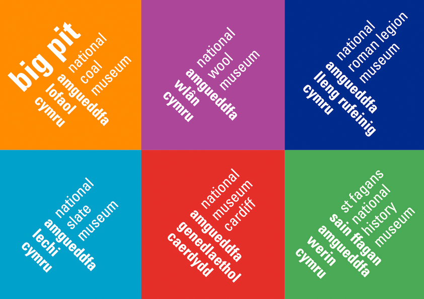
I am proud of my visuals and have contacted two members of the design team for all six of the museums asking the way they introduce new designs and who it is that has to approve these concepts. But also is it themselves who design for each museum or is it somebody who they bring in? All of these questions will help me create a link with these people in position to help me in the close future. Although, I am still waiting for a response.

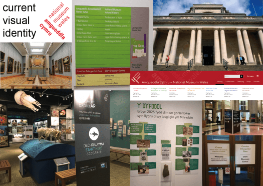
However, I struggled when understanding the task of asking for a budget. The museum has financial reports as a collective for all six museums. When reading the report noting was mentioned about the designs and signage so I asked within the email about how much of a budget they have as well how they break it down.

Experimental Ideas

After discussing elements within a group tutorial they all wanted to push me and be slightly experimental and push what else can be red. How much can be red?

Screenshot 2019-12-11 at 21.00.06.png

I came to the conclusion that I could change the front as you walk up the steps coming into the grand opening. Unfortunately wheelchair access and pram access is to the side and out of they way – thus those visitors don’t get that first wow of the main entrance. By simply adding a ramp they can use the main entrance. Designing it of course red was used. then I added arrows for the welcoming bight-side and maybe you can only go up and the lift to the side is the exit?

Moving forward the idea of having designs spread all over and embracing the ‘RED’ I went back to what others did. My research shows floor designs leading the public around. This meant that the visually impaired has something to follow to get to the main collections, such as a texture floor or a big and bright print.

Screenshot 2019-12-11 at 21.02.36


Putting things into motion

The tutors are continuously on top of the idea of put theses ideas into motion. This concept scares me a lot as it means getting my work out there but what if I’m not fully happy with it and so on. However, I took there advice and wrote out a feedback form explaining what I was doing and then I asked to speak to someone in charge of design and management.

From the lady, Clair, she gave me emails to the officials who run the six museums. As well as a lot of knowledge on the way all the designs have to go through a vigorous critique before being placed within the space. This is because everything is welsh funded with a few donations as well as being under the public domain. The building is also listed as historical so all fittings have to go through lots of regulations hence why not many things are on the walls.

Overall the quick chat was very helpful and now I am just awaiting a response but have been told to be patient as they are on a large current project.

Placing Designs within context

Developing this design further I asked a few of my friends with dyslexia and one that is visually impaired for advice. One suggested my design was too bight and too much for the a dyslexic eye so they were looking at the red and white backgrounds not the words or arrows. Thus I dulled down the white to a light grey.

Having a welsh friend look over the work they were also happy that the national language was first as well as being the brighter colour. Keeping this idea throughout means the ‘RED’ is a symbol of the dragon and is apart of the National Museum Wales.

When talking to some museum staff they have plans in progress with using imagery more throughout the museum. Instead of using photography like they originally have I have used almost cartoon characters showing each individual space. This should help children engage as well as visually impaired people for the ease of looking at a glance with the arrows.

Some of the exhibition spaces have a dimmer light so the signage cannot be seen at its highest potential. Through having the lighter, brighter tones changes the appearance to a well-lit area without having to install the proper lighting.

Design Development

Independent study – Expanding the brand

Looking at other museum and there designs they incorporated their own brands and printed this on everything. Using this I look the red logo created and ran with it.

Screenshot 2019-11-29 at 11.25.01

The colour red stands out from the typical museum signage and labelling the sign as a helper will humanise the bold sign. By knowing where they are and having a non-aggressive sign should make people feel safer and allow them them to have that idea of play.

Screenshot 2019-11-29 at 11.25.23

Using these styles and templates it unifies the identity and makes the place seem whole and not with lots of independent collections. The museum becomes a place instead of a building holding these.

Screenshot 2019-11-29 at 11.25.37

Idea Development

one to one – discussing moving forward

Coming from a Maker view I was encouraged to think bigger, better, brighter. I meed to tell the tutors as if they were the museum what needs to change as if I worked within the space. Saying I will design further, I will push the bar and make the change.

We discussed the idea of changing the brand – running with the idea of orange every where and challenging the current designs in use. The museum itself does not have a well known logo so they are using the national museum of wales or just leaving it out. Peter Smith created the logo design for the nationals however the individual logos are not used even if they do look great on their own. I worry that they do not work within the space as they need more designing implemented into the spaces.

https://petersmithdesign.com/National-Museum-Wales

Seeing these designs I can look more into the branding, with Cardiff being the red museum and out of these logos take that forward. A colour scheme is important and red has the meaning of hunger and the need for energy much like the need for knowledge that every museum pride themselves on. paring it with white should balance the harshness and anger from the colour and can brighten the dramatic power of ‘red.’

The tutor and I also discussed moving out of the museum and how the outside world would see the space. Passing by they currently have maintenance work on the roof so the building is just cladding with a plastic wrap. Moving forward the everyday pedestrians can see there are stairs up assuming that wheelchair users must use a less grand entrance almost second class, not worthy of a classic ramp or lift that would ruin the aesthetics.

Initial Concepts

Weekend starting 15th Nov – Independent Study 

For the idea I need to know how to help stimulate the mind for a visitor coming to the space. With the lecture on creative spaces and well being it set me on a path looking deeper into the idea of a space bringing happiness. The idea that curiosity sparks happiness and pleasure within the mind.

As a designer I can lock into this and stimulate the mind in exploring the museum. The concept of play is key to spark these feelings of joy and exploration. Thinking laterally you need to feel safe and secure to ‘play’. You need freedom, spontaneity and not to worry to be able to play. Linking this to the National Museum Cardiff, the signage needs to be ‘playful’ but yet informative. Personally I feel safer when I know where I am and where I will go next. when visiting there was a level of uncertainty as to where I was within the space and found it confusing to wonder around. Therefore even with my curiosity of the artefacts the idea of me ‘playing’ was out of the question as I felt unsafe.

The workers within the space seemed to know the answer before we even questioned them with directions, concluding that something needs to be changed.

One sign I found helpful was the direction to the evolution of wales. However, this was a minuscule stand alone A4 page which was hard to spot and we would have never have visited if one of our group spotted it.

Another sign was disorienting with different things on different sides. I had to walk around this blocky sign to find what i wanted instead of being given it plainly and simply.

Screenshot 2019-11-27 at 19.56.15.png

In challenge to these current elements I wanted a large bright sign stating exactly what I would want as a viewer wanting to explore the space with a simple knowledge of it for the safety factor.

When visiting we used AR to show the space in a new light. To begin these experiences we had to stand in the correct place. Finding these places were hard as the sign was not catching to the eye and some of the colours were boring and understated. So I created a bight continuous design. The Dippy on Tour is already in use and I liked the designs but needed incorporating with the museum. I designed 2 others in a similar style to make it cohesive.

Screenshot 2019-11-27 at 20.37.29.png

Research into National Museum Cardiff

Independent study – Visualising the space

After a lot of self debating and trialing ideas I decided upon the changing of the National Museum Cardiff, where I recreate the way finding systems.

The museum is part of a larger, national scale presence within wales so the place focuses on their ideas and their bands. The website includes all the other areas so doesn’t have a true focus on the one museum or even an about page.

I also looked at research including looking into the current systems of way finding within the space. It is apparent each collection has its own personal styling and nothing is cohesive. there has been other students take on this museum before showing that there needs to be slight changes within the space.

http://www.studentshow.com/gallery/7937473/Cardiff-National-Museum-logo-flyer-and-website

Making a basic mood board of the current visuals you can see the difference across the museum. How somethings are mounted onto the wall and others free standing.

identities-01

Looking into other museums and how they style the space for the visitors. some have way finding on the floor so that a person can follow the simple design to the space. others have hanging items showing what is on as well as what direction they are. Cardiff museum can incorporate all of these traits as one whole museum instead of a smaller collections taking up the space. They can be able to create a brand, an identity that is memorable and making the public wanting to come back to the museum not just the items within.

identities-02

Ideas

Week starting 12th Nov – Independent Study 

The initial idea I keep going back to is the idea of personalising a hospital for one patent and their family. A while ago my graphic tutor showed a 6 minute video of how it would be like to be laying in a bed all day with only the nurse or a family member to keep you company for a short period of time but that patient would mostly be alone. With having friends and family members in and out of hospital I know how much they dread going in even if it is for a day or two.

My thoughts are having a poster or banner on the ceiling above these places. Some other thoughts to develop this are;

  • colour therapy – make the patents happier and calmer
  • design stimulation – get the patents better quicker and give them motivation
  • have it night and day – have change though-out the day?

Another Idea I have is the way finding in the National Museum of Cardiff. The current state is very chaotic and has no set plan that is used through out the museum. The idea of way finding I feel it would not challenge me as much as the hospital concept.

Overall I will continue to research both and decide soon on what path I would like to take forward.

Inspirational Trip

Thursday 14th Nov – Dyffyrn Gardens + National Museum Cardiff

First up was Dyffryn Gardens. This was a beautiful grand manner with hidden gems throughout the extensive gardens.

Talking to the staff they feel dedicated to the place with restoration and progression of the place within the world. Being a national park the place has rules and regulations as well has strict budges. Having this talk first it lead me to think through the ideals and logistics of creating a design/ art work there.

When moving around the garden’s space the use of exploration was great however the likely hood of the public (mainly children) of loosing one another is great. looking around there was little to no signage of what the nature is as well as way finding. For this space I felt as if my work skills can only be used in that manner for directional signage.

Changing from this peaceful, explorational space to the National Museum where I found this chaotic and distracting. When looking at the art I found myself distracted by the signage and shire scale of writing. This was because the art was surrounded by words and everything was distracting with 3 tones of lighting creating more shadows as well as the overall designs of the space. The sight lines were over powering and there was no room to breath and just look at one artefact and one time. I could recreate the space with more negative space for that balance. This should allow the children to not be overloaded thus not disinterested or allow for more time spent within that space instead of being over whelmed and wanting to leave half way though.

77234344_587214505348989_5069210678103900160_n.jpg

Over all the idea of taking the art and artefacts within NM Cardiff is more engaging but I want to look as more idea that I have come up with.

Design a site like this with WordPress.com
Get started