Independent study – Expanding the brand
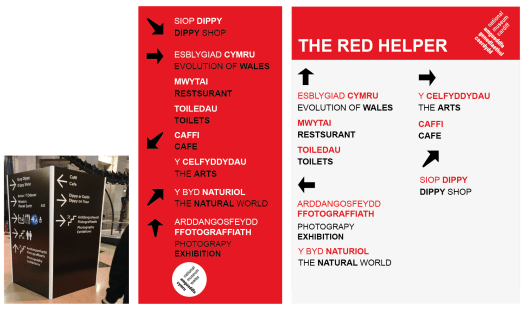
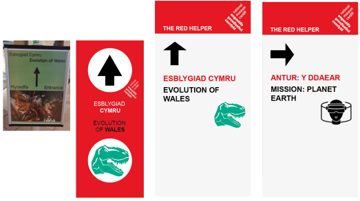
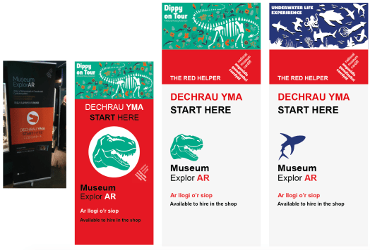
Looking at other museum and there designs they incorporated their own brands and printed this on everything. Using this I look the red logo created and ran with it.

The colour red stands out from the typical museum signage and labelling the sign as a helper will humanise the bold sign. By knowing where they are and having a non-aggressive sign should make people feel safer and allow them them to have that idea of play.

Using these styles and templates it unifies the identity and makes the place seem whole and not with lots of independent collections. The museum becomes a place instead of a building holding these.

