Tuesday 7th May – Presentation + Feedback


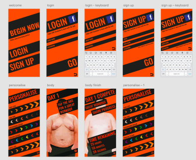
We were only allowed 3 minutes to show off our app in our presentations. Due to me being flustered I ran over time and was unable to show off all my app. When listening back to the recording I noticed myself saying the same points over and over again. So to over come this in the future I will note 5 or 6 different points and go though each one starting with the most important so that if I ramble on too much I can cut out the less important last points. Another way to cut this down is to have only one or two slides in the build up explaining the ideas then go straight into showing off the final piece – where I can talk over and explain the steps.
The feedback for the app itself was very positive with comments on how the concept is really funny and can be seen within the industry and the group can see themselves or others using it. They liked the off kilter idea and the brighter colours along with the personalisation. The tutor mentioned how ironic the changing of the nipple size was as it is so pointless but the users would love it.

However the main factor that I need to change is the logo. This looked rushed and as if it was done by someone else just copying the style. At first I thought by having a black and white design with highlighted areas this will exaggerate the idea of wanting the perfect body. However this has not paid off as it just looks off.


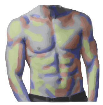


 From these websites I was able to create a base/start look and a final look. I used the image trace tool for the cartoon style and photoshopped the body parts together. This allowed me to make the personalisation elements such as the nipple size, trouser colour and so on. This also helped for when I had to make the person smaller as the app progressed.
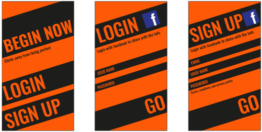


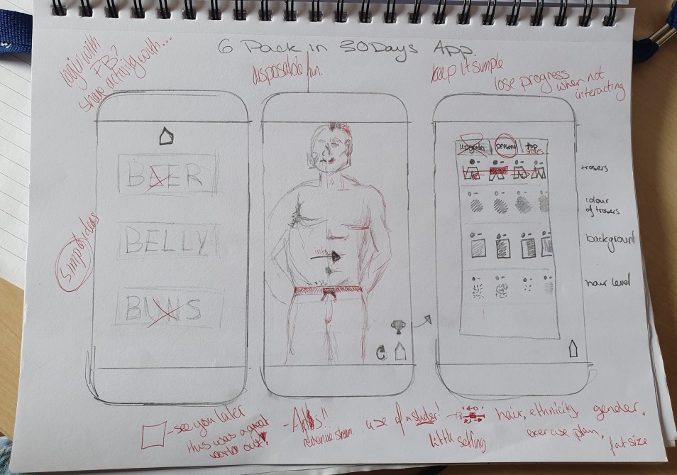
 Through using the ruff sketches I managed to create a simple design that used only two colours. I started with black and white to perfect the silhouette and the overall design. I began to use lowercase letters but I felt that the design needed to be more crisp and some how more bold. From this I decided to make the main parts capital letters for extra impact/ ‘power’.