
Protected: 3 Concepts
Visuals Development: Part 3
I realised I needed to showcase how the notes can be uploaded and found so through using the #MyCreaiveNotes on social media both the public and NHS members can get involved and have that mindful moment. This is broadening the audience that can partake but still aiming towards the NHS. For instance, this would be where the creative work would be found to be placed into the following months NHS work booklet.
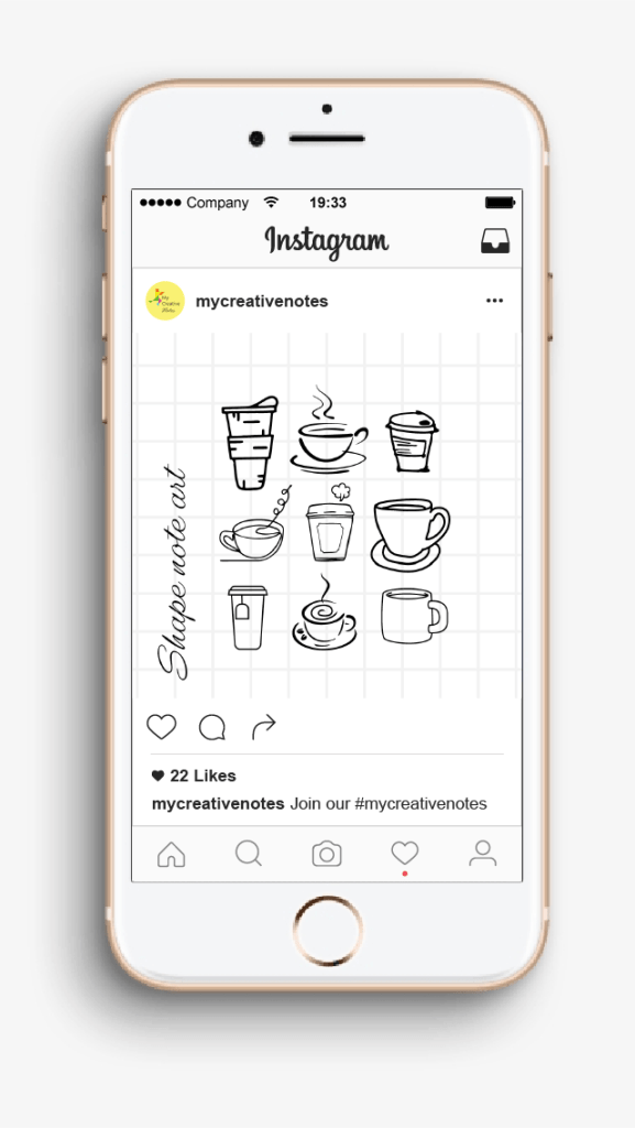
Instagram would be the prefect place for this as they are used to create a community through sharing of creative information in a square image; which is an online version of a sticky note. To develop this, the idea could be placed across many varieties of social media, such as twitter.
Visuals Development: part 2
Mentor feedback
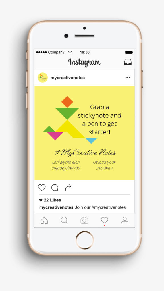
With these as a final piece, I decided to email my mentor and ask for feedback. He said that the idea needs greater emotion. The idea is for people to take part, share messages of hope and inspiration – I need to contextualise the work, show how it can progress.
To enhance the booklet I have changed and added the wording so that it is more engaging and you want to pick it up. As well as better explaining what has to be done.

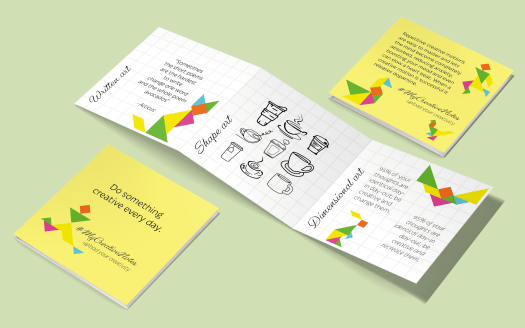
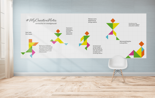
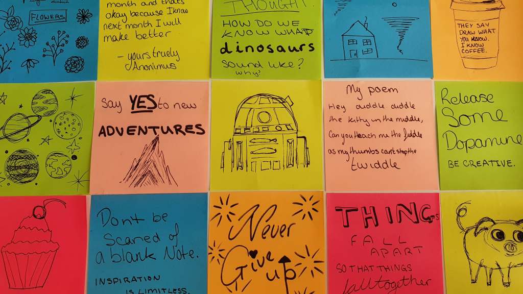
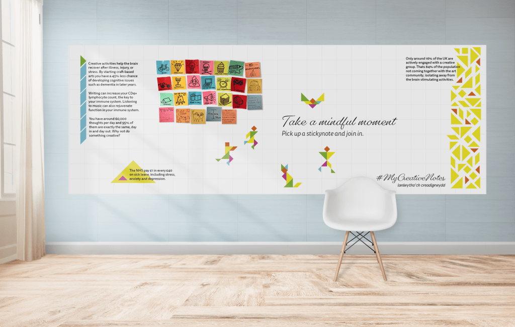
I struggled on how to improve the board. I knew I needed to add science to it and a better key message. I started by shrinking but not eliminating the tangrams and adding a more direct message. Then I decided to play around with the shapes to create infographics to show that only 16% of the UK population are activity engaged in the art community. To add to the tack-tile feel I drew on actual sticky notes with the help of some house mates to have fun with them and create nice art pieces.
Research
Who is the client?
My client is apart of the Cwm Taf Morgannwg University Health Board (UHB) and the council for arts. Her goal is to bring the health board to see the benefits of art and the community of opportunities it brings. There are funding schemes available for the client to use but they are hard to get so what is produced needs to be well thought out and ready to be sent for acceptance.
Who is the target audience?
We have debated this in the group and although the outcomes will be for anyone within an NHS building the presentation will be for the health board members so I need to keep the work highly professional and factual. To narrow this down further I have decided to mainly target the health care professionals over the patients as the care starts with them
“NHS staff off sick costs the £2.4 billion, with 10 million days taken off in one year. The NHS pay £1 in every £40 on sick leave, including stress, anxiety and depression.” – Creative Health Inquiry Report 2017
What is the Science behind the brief?
A study of 50,000 people found that regardless of skill level, taking part in activities like painting, pottery or music helps people manage their emotions, build confidence and explore solutions to problems.
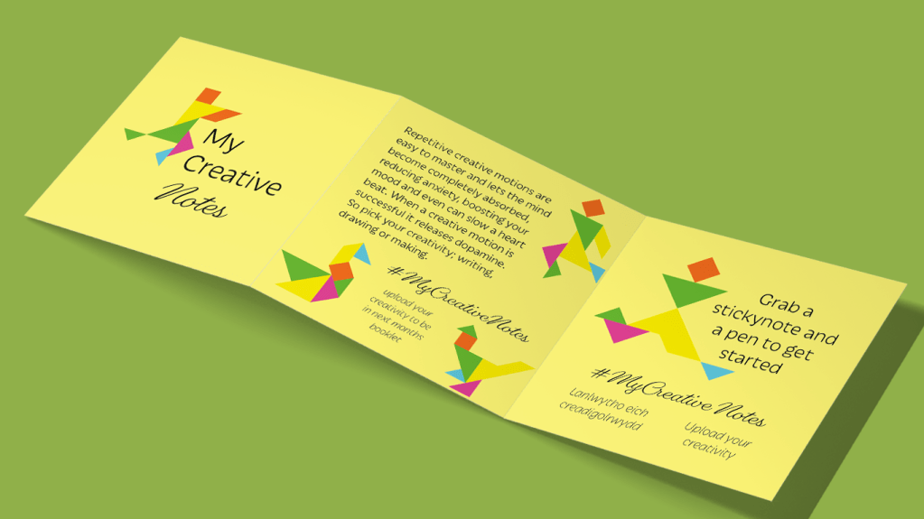
Repetitive creative motions are easy to master and lets the mind become completely absorbed, reducing anxiety, boosting your mood and even can slow a heart beat. When a creative motion is successful it releases dopamine, a feel-good chemical that helps motivate a person.
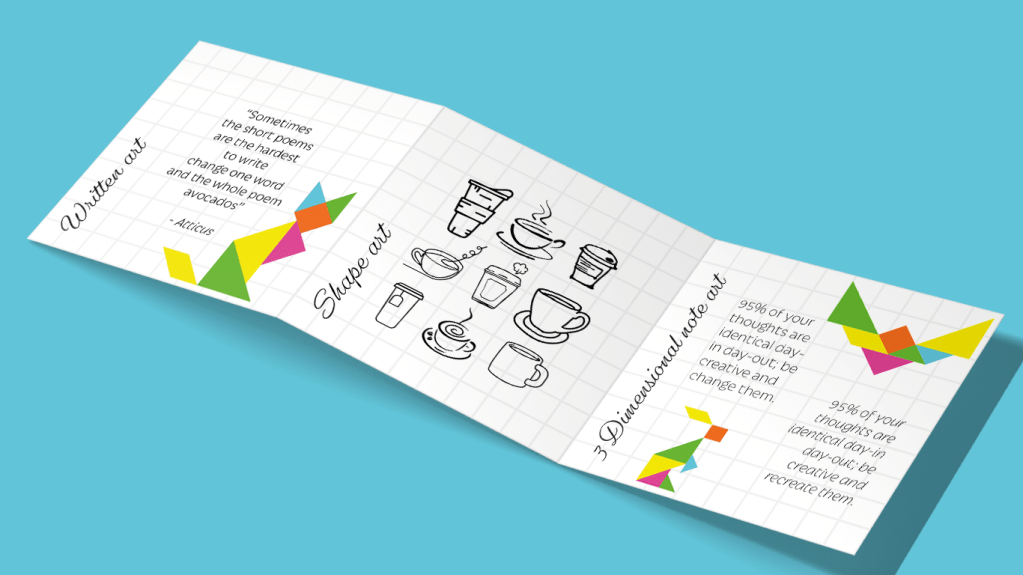
An average person has 60,000 thoughts per day and 95% of them are exactly the same, day in and day out; By immersing yourself in a creative activity changes these thoughts and a mind can engross themselves in the activity where they temporarily forget their troubles and worries.
Persuasion: Final Thoughts
Looking back at the project I am happy with the outcome I have produced. I feel I have gone down lots of different routes and experimented with several different styles. I taught myself many things such as how to perfect the drop shadow effect and feel I have improved on how I go about creating my hierarchy on a design.
I have also learnt that when I’m singing, I’m not annoying people I’m improving my wellbeing.
The client seems very happy with the outcomes from all the team. I am very grateful to be the main communicator as it boosted my confidence and capability to talk to clients in a professional manor.
Experimental Ideas
After discussing elements within a group tutorial they all wanted to push me and be slightly experimental and push what else can be red. How much can be red?
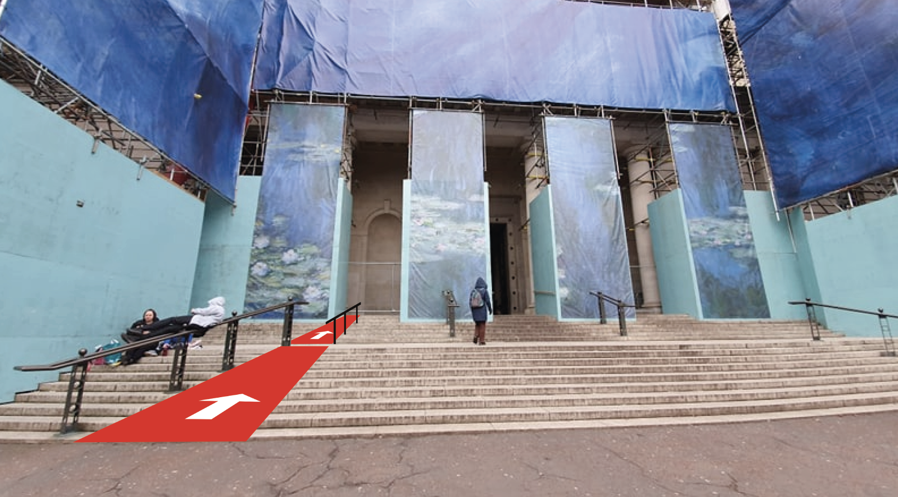
I came to the conclusion that I could change the front as you walk up the steps coming into the grand opening. Unfortunately wheelchair access and pram access is to the side and out of they way – thus those visitors don’t get that first wow of the main entrance. By simply adding a ramp they can use the main entrance. Designing it of course red was used. then I added arrows for the welcoming bight-side and maybe you can only go up and the lift to the side is the exit?
Moving forward the idea of having designs spread all over and embracing the ‘RED’ I went back to what others did. My research shows floor designs leading the public around. This meant that the visually impaired has something to follow to get to the main collections, such as a texture floor or a big and bright print.
Placing Designs within context
Developing this design further I asked a few of my friends with dyslexia and one that is visually impaired for advice. One suggested my design was too bight and too much for the a dyslexic eye so they were looking at the red and white backgrounds not the words or arrows. Thus I dulled down the white to a light grey.
Having a welsh friend look over the work they were also happy that the national language was first as well as being the brighter colour. Keeping this idea throughout means the ‘RED’ is a symbol of the dragon and is apart of the National Museum Wales.


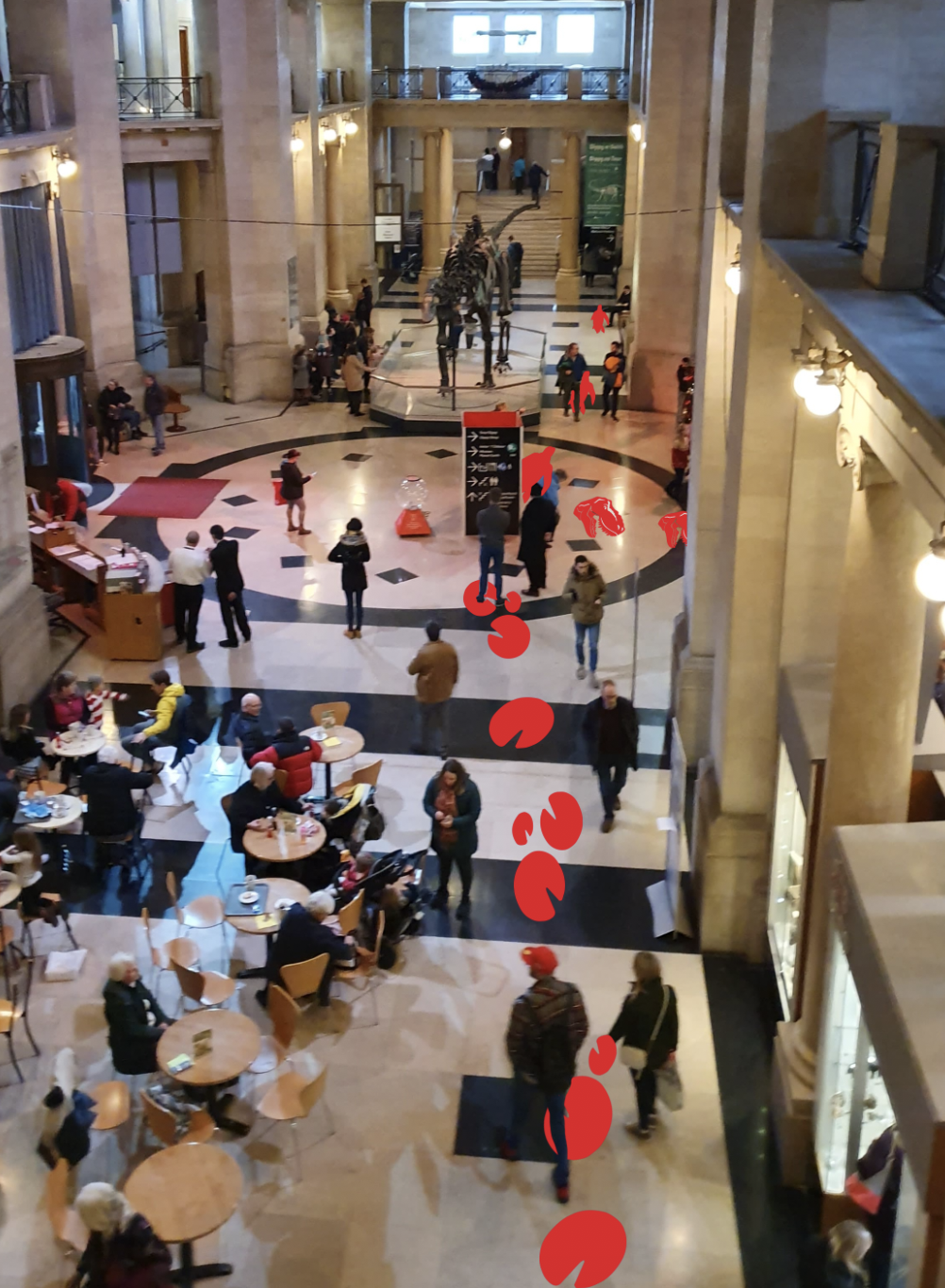
When talking to some museum staff they have plans in progress with using imagery more throughout the museum. Instead of using photography like they originally have I have used almost cartoon characters showing each individual space. This should help children engage as well as visually impaired people for the ease of looking at a glance with the arrows.


Some of the exhibition spaces have a dimmer light so the signage cannot be seen at its highest potential. Through having the lighter, brighter tones changes the appearance to a well-lit area without having to install the proper lighting.
Research into National Museum Cardiff
Independent study – Visualising the space
After a lot of self debating and trialing ideas I decided upon the changing of the National Museum Cardiff, where I recreate the way finding systems.
The museum is part of a larger, national scale presence within wales so the place focuses on their ideas and their bands. The website includes all the other areas so doesn’t have a true focus on the one museum or even an about page.
I also looked at research including looking into the current systems of way finding within the space. It is apparent each collection has its own personal styling and nothing is cohesive. there has been other students take on this museum before showing that there needs to be slight changes within the space.
http://www.studentshow.com/gallery/7937473/Cardiff-National-Museum-logo-flyer-and-website
Making a basic mood board of the current visuals you can see the difference across the museum. How somethings are mounted onto the wall and others free standing.

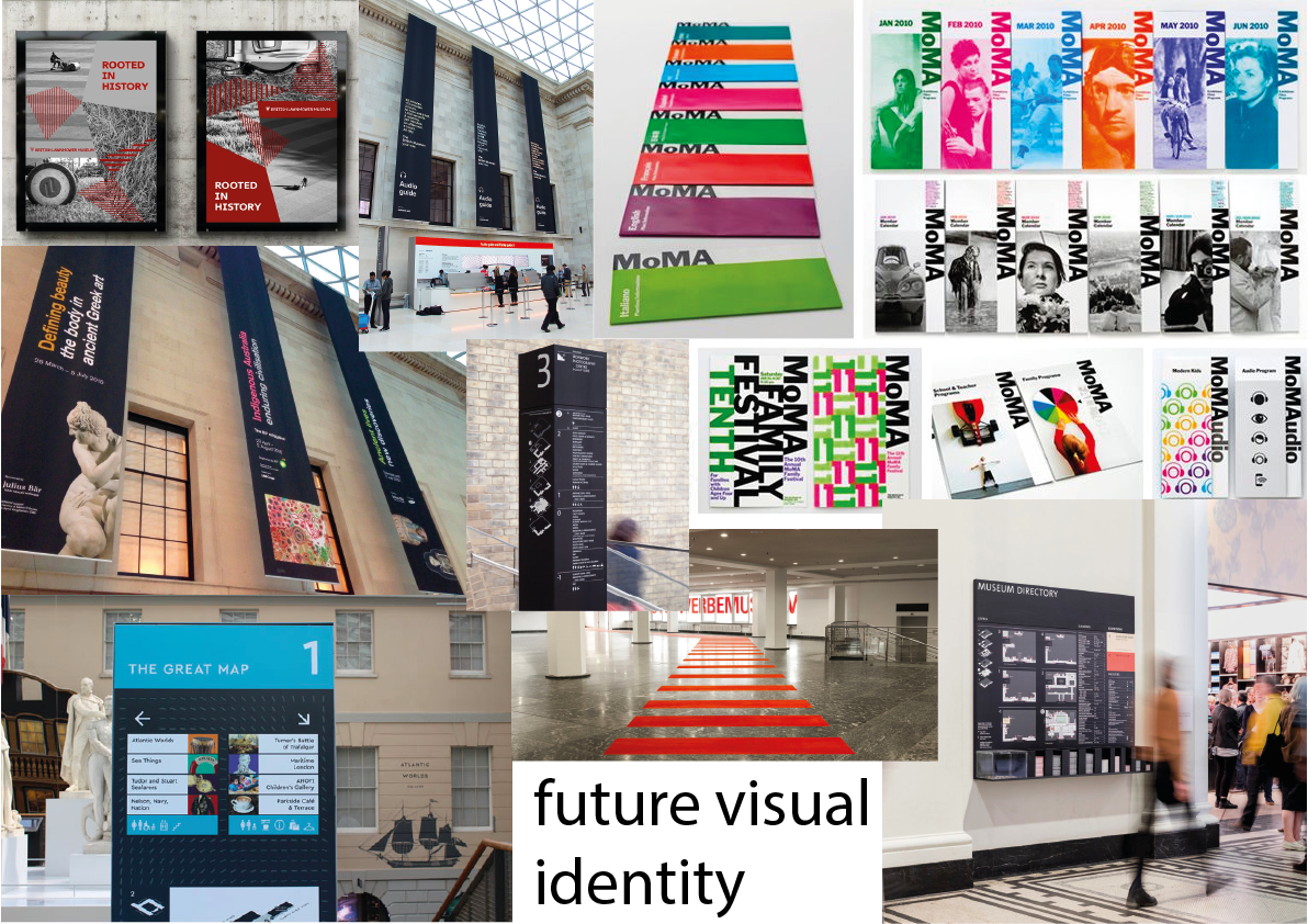
Looking into other museums and how they style the space for the visitors. some have way finding on the floor so that a person can follow the simple design to the space. others have hanging items showing what is on as well as what direction they are. Cardiff museum can incorporate all of these traits as one whole museum instead of a smaller collections taking up the space. They can be able to create a brand, an identity that is memorable and making the public wanting to come back to the museum not just the items within.
Summer Branding Research

Rudd Studio – https://ruddstudio.com/project/itv-rebrand/
The creatives in Rudd Studio won over the ITV company to work with their in house team for a large scale re-branding of the television company. The brief was clear to be a “positive part of people’s lives.” This means that their use bright colours were thought through along side their playful curvature of each of the logos letters.


This very visual based company had their logo designed so that it could be versatile within each genre of their shows. Such as the moody dramas had a darker toned down almost cold colours of blue and greys. This compared to the main logo used on the happier chat shows like this morning as well as laid out across the headquarters and merchandise. This communicates that the company is versatile for all audience members.
The designers made a new typeface which reflects upon the full title of the company being Independent Television. Each of the 3 letters touch, so by using ligatures the design is showing how the content from the business brings all sort of people together. The letter font is also sans serif, which is modern and clean. This helps for the versatility and fresh new look as well as showing the global audience that its bright and friendly to be the “heart of popular culture.”
The placement of this variable logo is always in the same position and always has the same dimensions with in the different designs. This will allow the brand to be in unison as it is all produced and broadcasted by them showing the audience that they are proud to be all together.
Super Union – https://www.superunion.com/work/bbc-two/
This design agency linked with BBC creative team in an effort to update one single channel. BBC 2, much like ITV, is a versatile TV channel which will have a range of programs however they all have a message and meaning behind each program.


An advert free channel meant that between each program had the ability to either intrigue the view or make them switch so it was important that the designer thought about a great way to grasp the viewer with the next program. However, these programs could be very different with the genres and thus the target audience watching. Luckily all the audience should be enticed by their emotions so that was the main theme throughout their rebranding. The designers thought would be to use “one unique shape” which structures the overall look and allows the viewers to be brand loyal. This shape is in constant state of movement with many different variations so that the mood can be reflected from the next program. The theory being that the audience is attached to the feeling of the short animation and thus continuing to watch.
This sense of emotion is continued through the sound affects. Different to their competitors, like ITV, they had a key focus on the acoustics, hiring a composer. This meant that the viewer not only could watch for the emotion they could hear it giving a better experience, which the BBC is expected as the UK’s longest run television company.
When I visited Little Hawk in London I remember them saying that the worked with the BBC designing Doctor Who’s new branding. They mentioned the strict guidelines that the BBC have created to uphold their integrity and brand loyal customers. From this I believe that the main companies logo is always in the middle not to add more emotions but to inform the viewer that the program is made by a larger scale company not just BBC 2, thus encouraging the audience to look up other parts of the company, online as well as on the tv screen.
Pentagram – https://www.pentagram.com/work/building-cycles
Being one of the largest design companies Pentagram create both digital designs as well as physical ones. Using this experience the business designed the interior and rebranding of the independent, non-profit company called Storefront for Art and Architecture. This place was created to show what the power of a good design has for a community and the future of a city. The new spring exhibition had the theme of the of cycles. This could be interpreted in many ways, one being a life cycle or as simple as a bicycle. All these elements are in a constant state of movement so the designers wanted to keep that fluidity going throughout their designs.
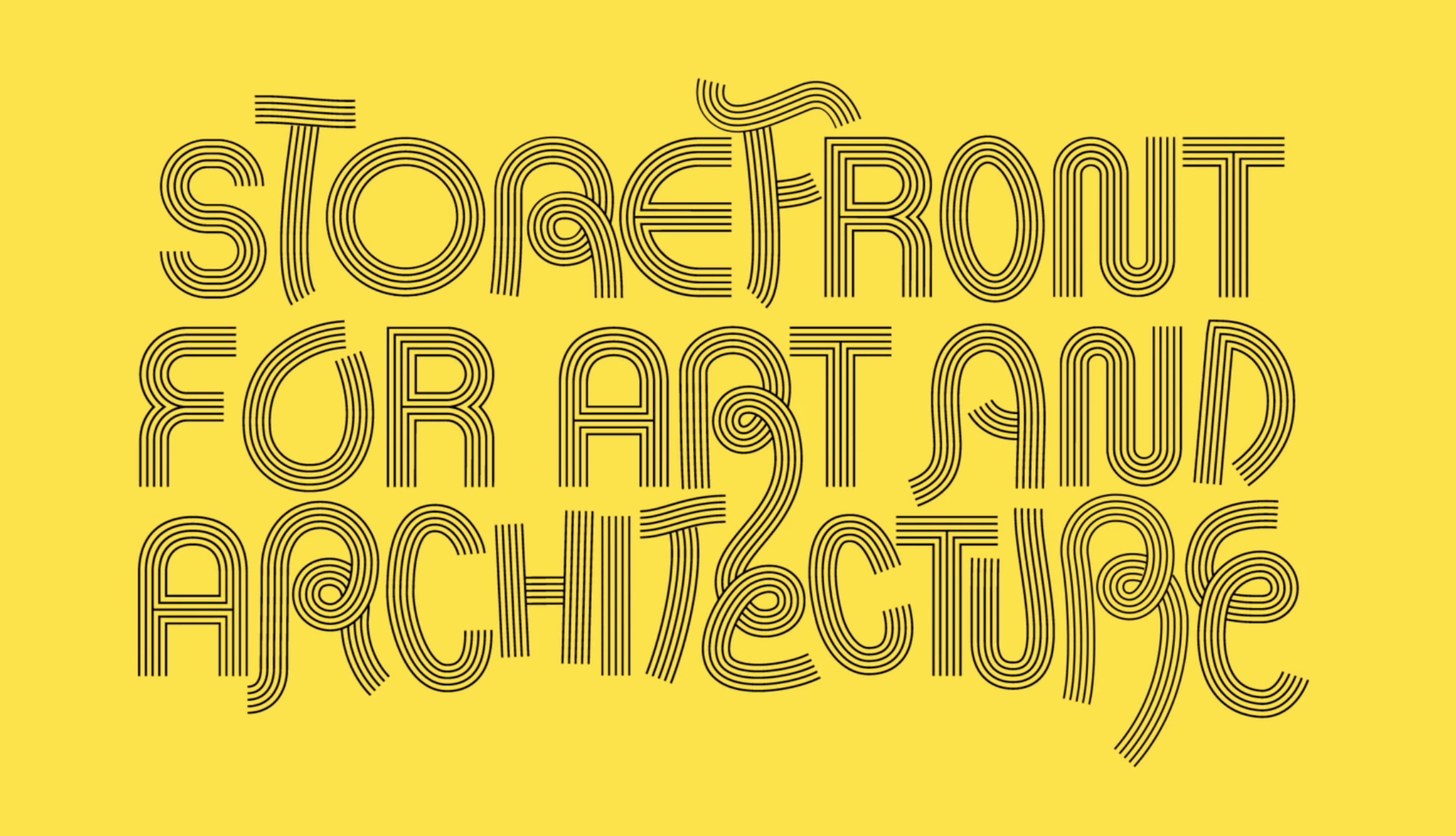
Their unique typeface created shows the movement of 4 lines in unison making up each letter. This can imply that the viewers can work together for a greater meaning, much like the individual lines built together creating something solid and impactful.
The single colour background also emphasises the type allowing all the emotions to be expressed fully. Another impact the colour has is being yellow with black almost stripy type is a visual metaphor of a bumble bee. This tone is what spring is about and the bee hive working together for one goal.
