The beginning of the end. After this project I will pretty much be finished with my degree. What! This is my last chance to be creative, let loose, be free before starting official my journey in the world of jobs and clients. I need to find something I enjoy, I’m good at. I need to be ambitious, be bold.
The end goal is a 10 minute presentation in under 7 weeks. Easy! It has to show where I sit as a designer and be the definition of who I am. It has to look good in my portfolio, show off my strengths and management skills.
Honesty was her theme. “Graphic Design is mental” – Maris Latham. She gave her real story of her struggles and successes. It was a great opportunity to get first hand knowledge that from my course I can be successful and find my feet.
Her expectations were high when leaving university as she has several awards and a job lined up. However, she spoke about her plan wanting to go from A to B but in reality it jumped to E. She explained how it is great to take a break and slow down from the high pressure of uni and jobs. Burnout is a thing and that is ok. She explained her overcoming this through the start of lockdown because she had a breather to gather thoughts and it seems like she came back with a purpose.
She asked thought provoking questions on what each of us want to do with our degrees. This is when I thought I want to do idea and creative thinking as that is what I love. Maris then spoke about keeping options open and go for everything. It is a learning curve. She mentioned portfolios and how everyones can be the same with D&AD briefs or the same uni briefs so to challenge myself to try personal projects. This will be a great place to show my interests and my personal strategies.
I have developed my mind set on this project. I fully understand where I sit in the world as a designer. I make things look good, which can draw people’s attention. I can use my skills to influence which is what my dissertation is about. I create brands that are constance. This project is no different. I have a colour scheme, a typeface, an image to change peoples perceptions. Through knowing this I took logos and other major brands into the world of criticality to twist preconceptions. As my manifesto says this work has a purpose, is innovative, is responsible, is humane and most importantly I am staying pure to myself. I like outcomes, I like logo design, I like typography and I like comedy. That is what I have done.
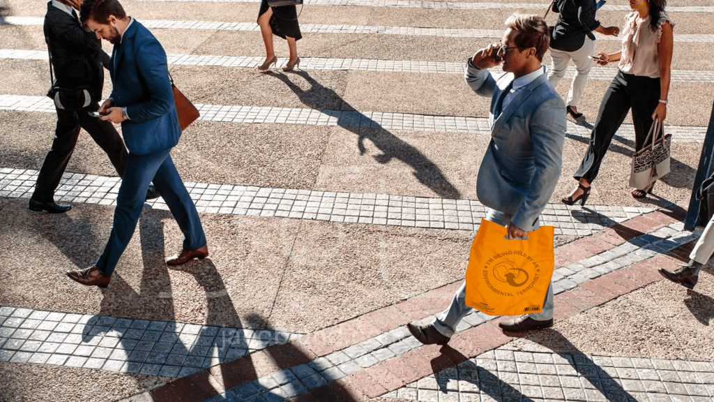
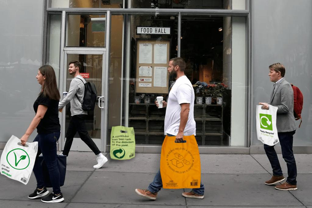
My only downfall in these outcomes are that the mockups are male based. From a google search I almost found it impossible to find a woman walking without her hand in someone else’s or as the main character. I would have liked different ages and different genders but being in lockdown restricted me to online images and it is a shame that it is mainly men in their 30s being photographed.
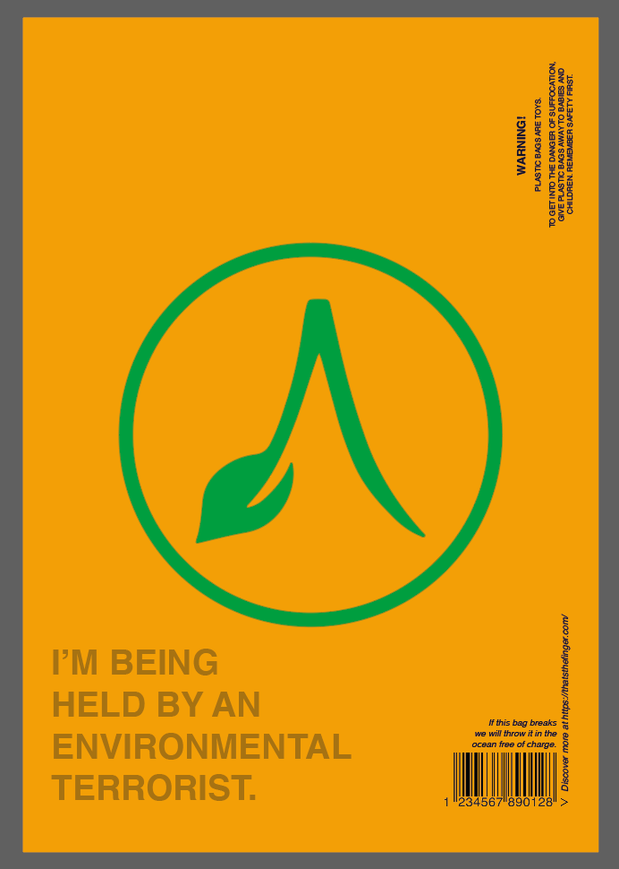
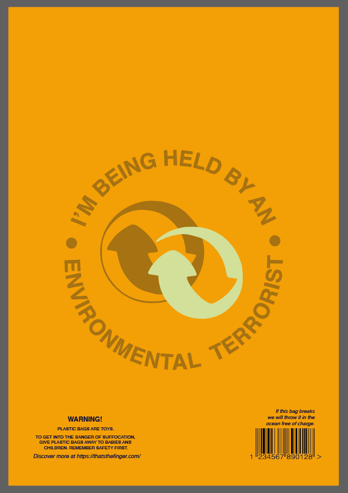
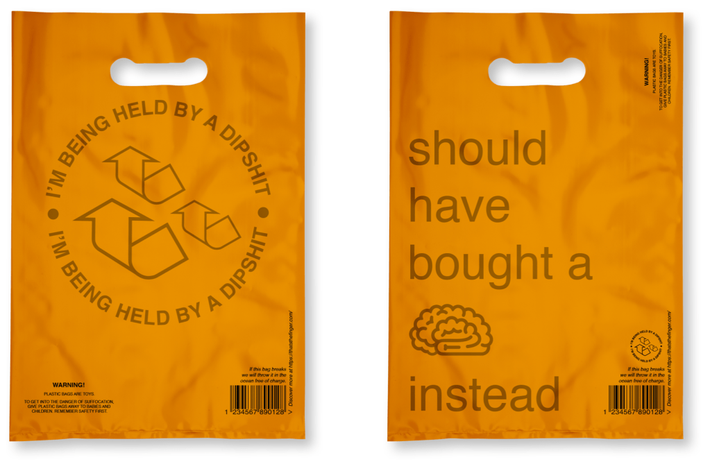
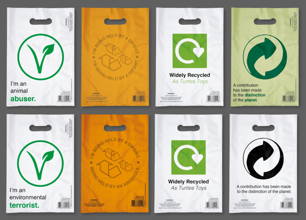
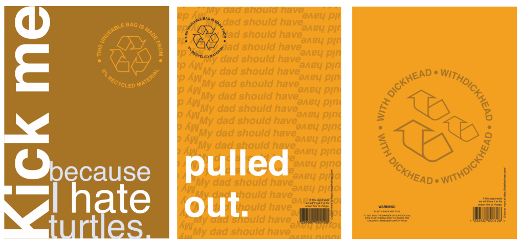
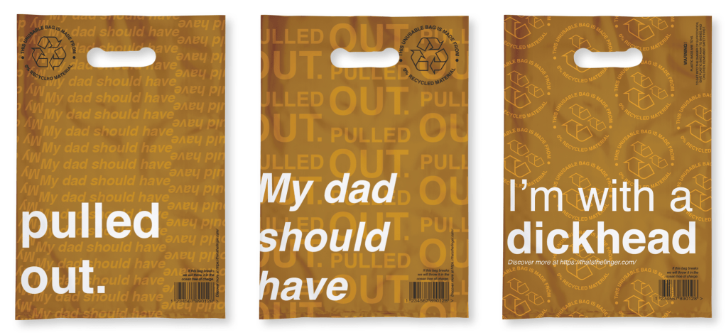
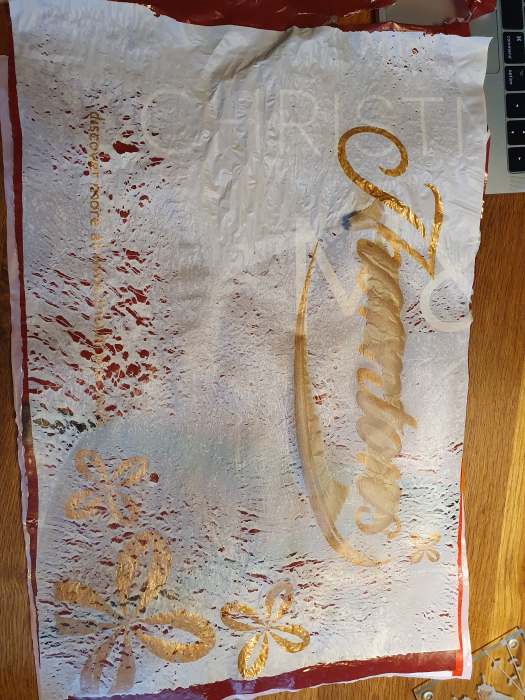
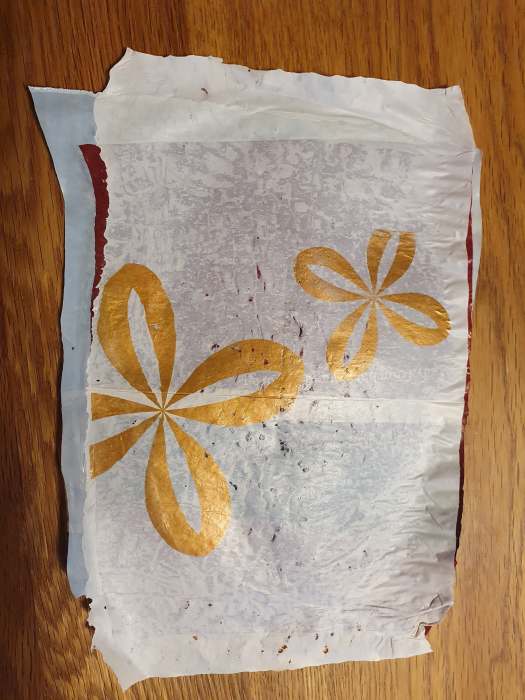
I began to think about the orange bag and why it was effective. It used the logo of the recycling but it was adapted in the notion that it was no longer being recycled. I then thought about the image or branding of my designs and wanted to go down the route of being more cohesive. Using the orange bag and the idea of “I’m being held by…” I have created my brand image.
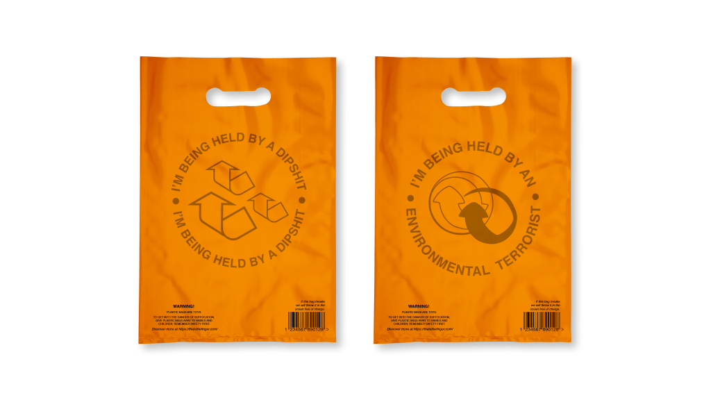
My tutor also mentioned that less is more and that it is ok if I reduct my outcomes to only show the best. Thus I have decided to only present the best 2 bags, cutting several other variations.
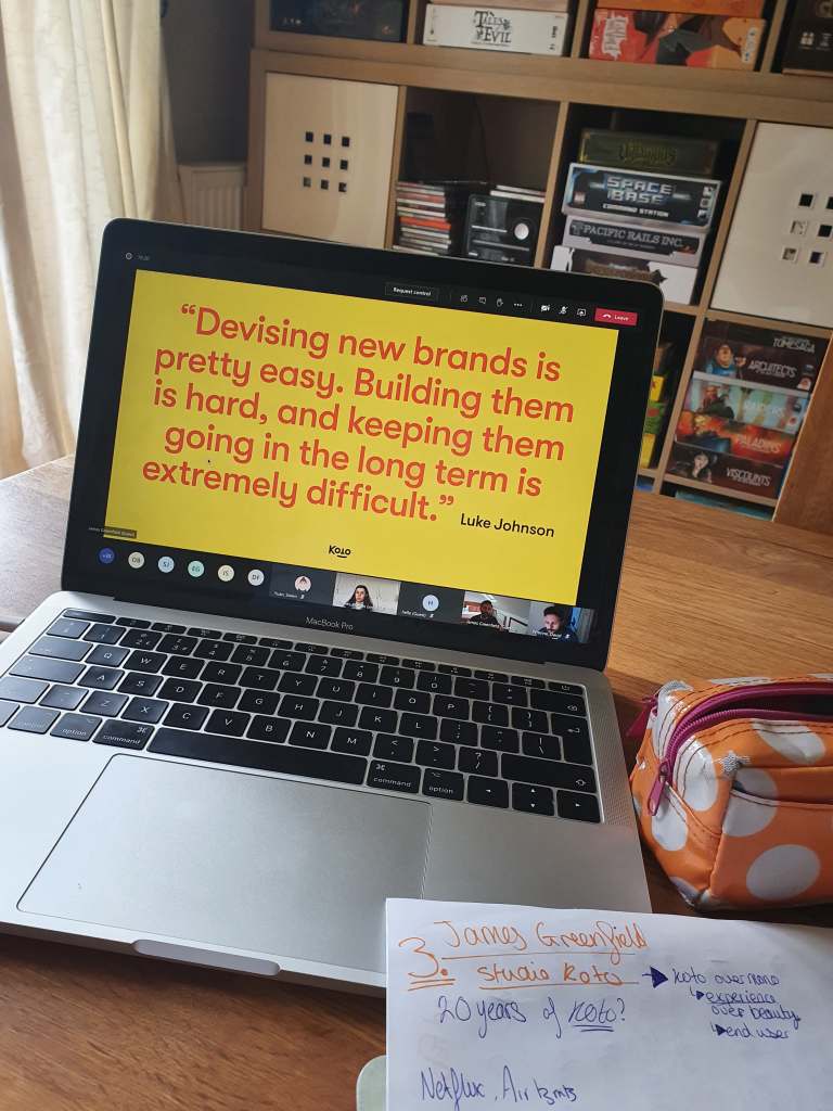
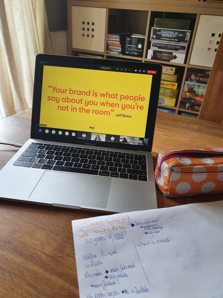
Perfectionist, knowledgeable, passionate; are the main words when I think about the talk. He wants to help people and share his excitement about design. He even was excited by the name of his company which I’m sure he sees daily. Koto; meaning experience or more in depth engagement/ use-ability over beauty.
He has worked with some huge brands and I was intrigued by his work for Air B&B. The way he spoke about branding was compassionate and light-hearted. He says brand is the way people think about the company without them there. Our role is to utilise this conversation, make it our own (or the brands). We can use culture and stories to make these brands. For instance Air B&B is an experience in someones home, to travel to a new destination – not the basic this room to rent like a hotel.
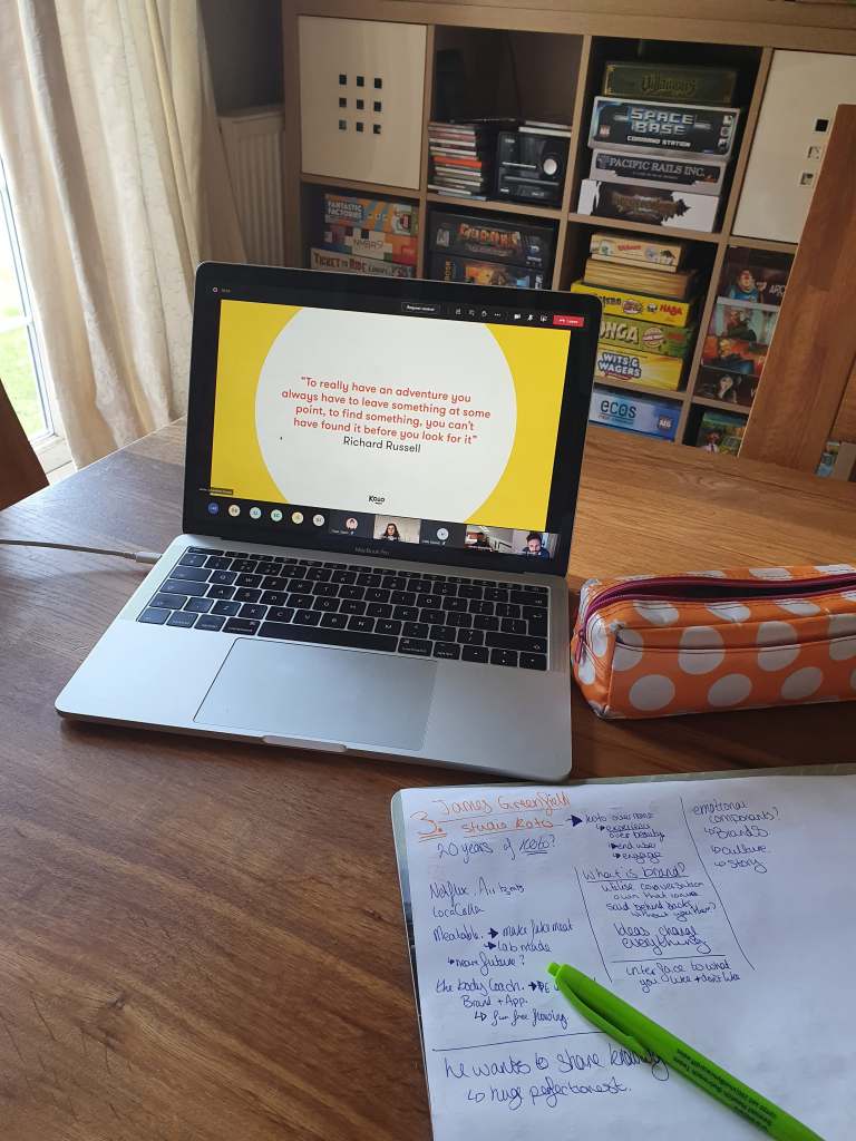
In his talk he used many quotes to explain his thoughts and where he stands in the world because unlike many other designers he holds his moral and perfection as the most important element of his life. He believes to design you should follow 4 simple steps. Talk. Write. Design. And Sell. This means he holds collaboration as one of his prides.
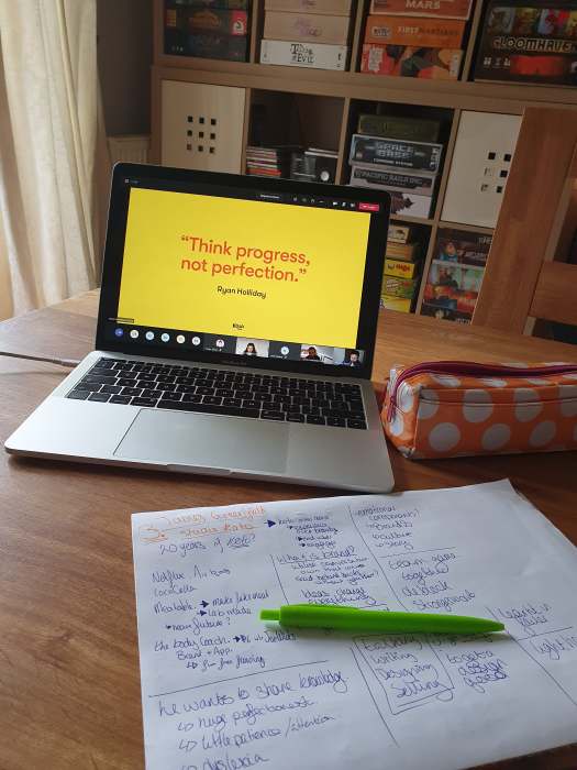
My favourite quote he used was “think progress, not perfection.” I need to hear this more often. I want to progress my work and capability but more often than not I get caught up in the look. I only wish I truly listened to this idea in penguin and some other projects.
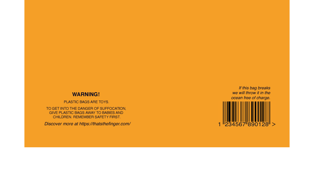
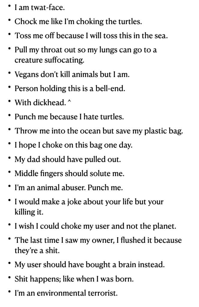
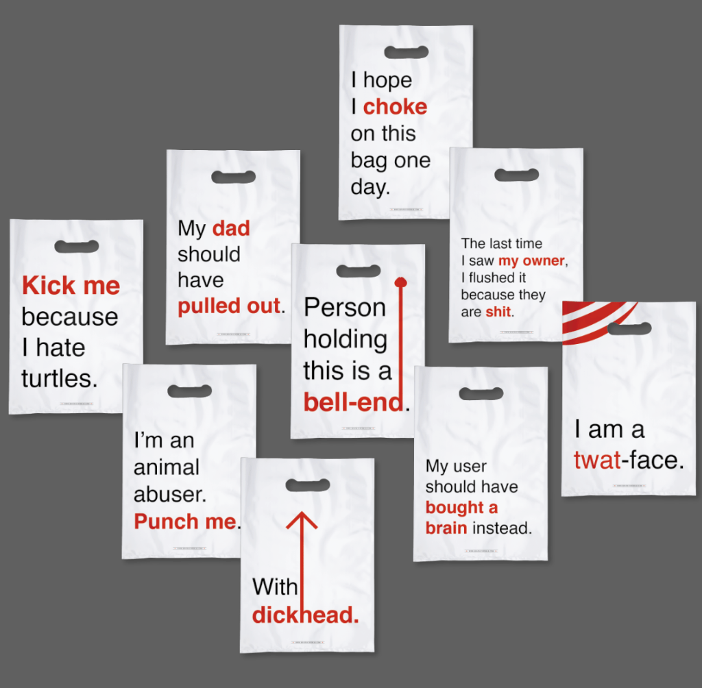
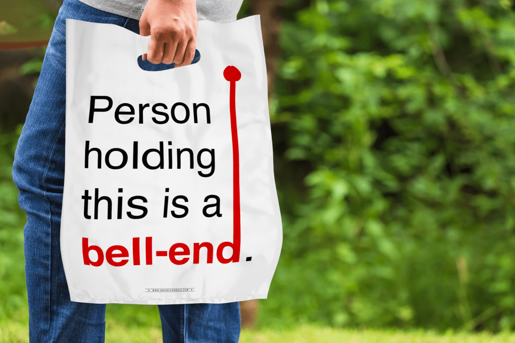
First from the feedback, I needed to change the wording to be more appropriate. The tutors straight away said use the “dipshit” bag, we don’t like the other one. The arrows are recognisable, yet distorted with their weights.
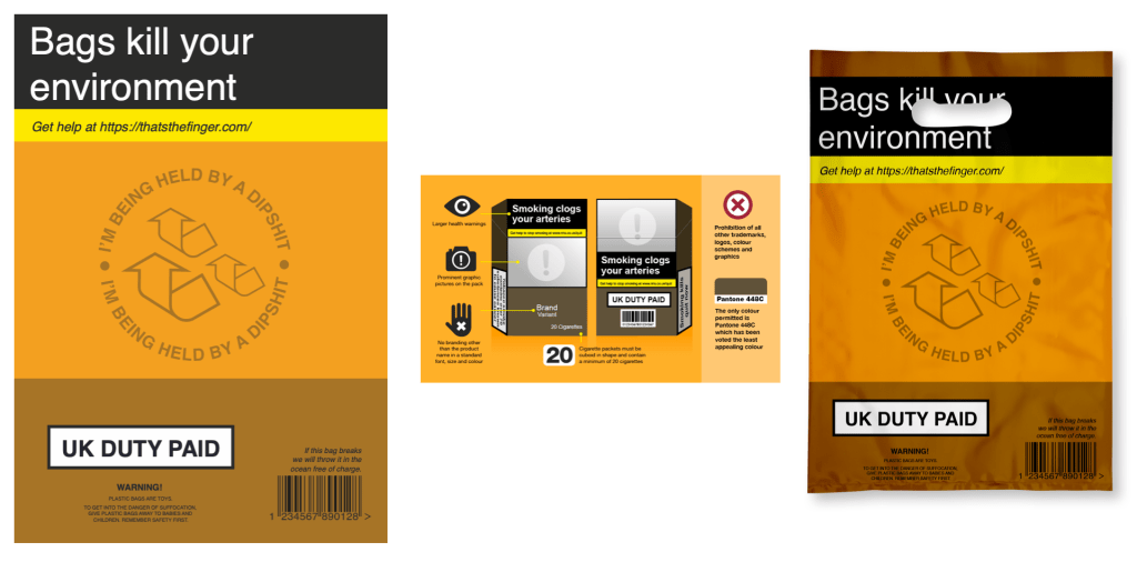
I knew I needed to go over the top with this idea that a bag is harmful so I went with the cigarette packaging and making that into a bag with my language. However, it just wasn’t as good as before.
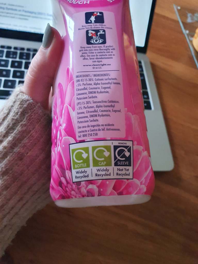
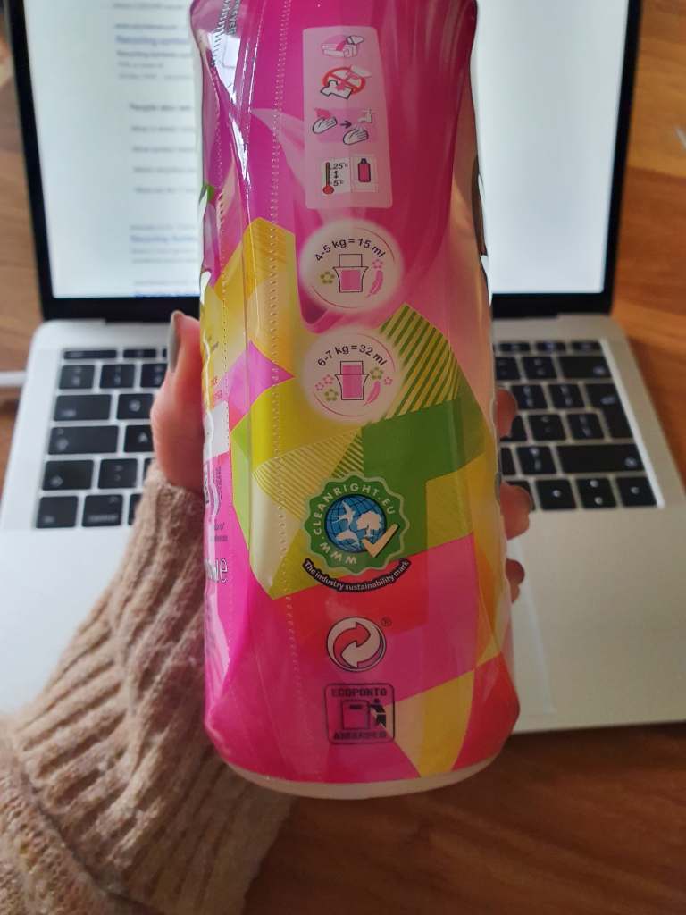
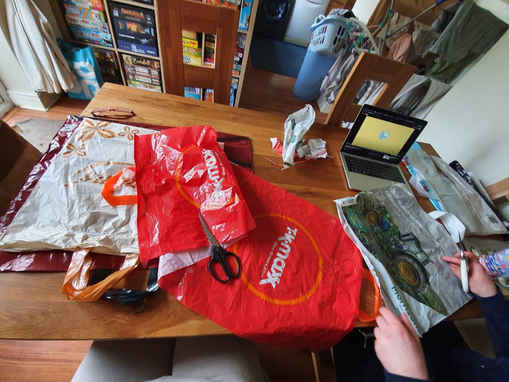
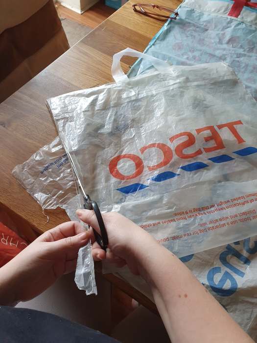
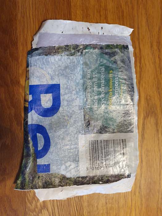
I went back to the ideas of taking recycling or good logos but changing the context. When doing the mundane task of the washing I noticed the recycle symbols on the bottle. I wanted to do something with that and other symbols with good connotations. Such as the Vegan icon saying I don’t kill animals but if you have plastic bags they kill animals. Thus meaning animal abuser.
I think each of these are strong but need something extra. Even in mockups they needed adjusting.
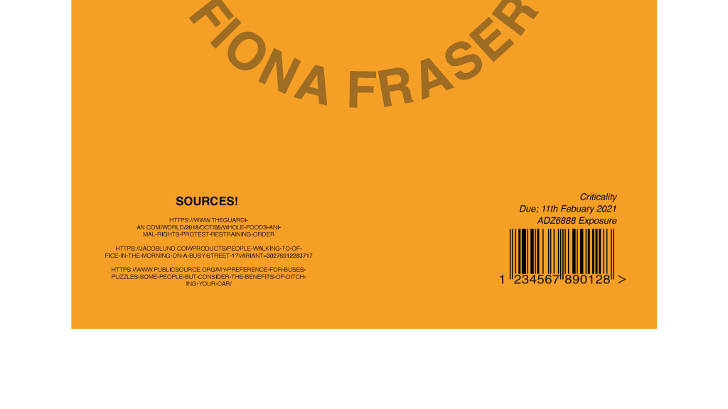
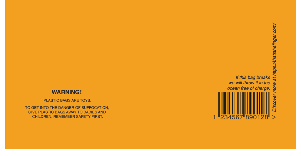
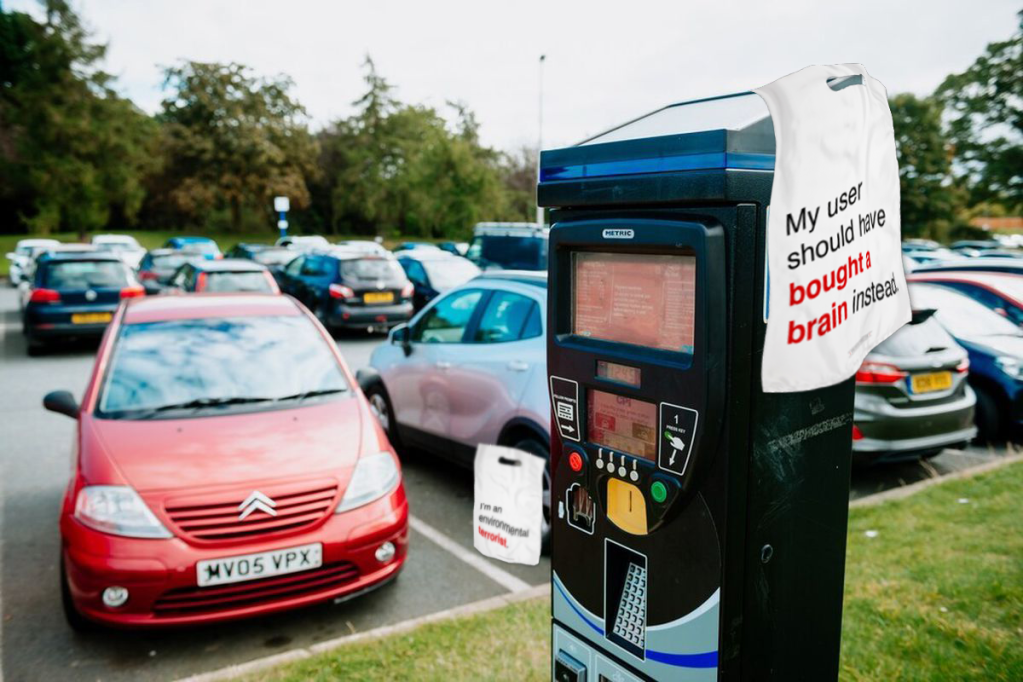
My ideas were liked but they needed refining. I learnt that criticality is about using what is out there and twisting it to raise an issue. So I looked at the collection of bags we have and used the working on it like the “WARNINGS” or “Love me until I fall apart, then swap me in the store for free.” Changing these to mocking words such as the “Get help at https://thatsthefinger.com/” – a website that is just an animated middle finger.
I also wanted to use what is seen as an ugly colour. This being simular to the UK cigarette pantone. Meaning the bag will be even more unattractive.
I showed my family the quotes and they felt most attracted to these. I continued my search with what is on a bag and realised the recycling logo is on almost all. Pushing with criticality I arranged it so the arrows point to the user calling them the rude words.
Overall the tutors felt the insults were heavily male oriented and needed to be thought through not use targeting one type of person.
He immediately said he hates graphic design. WTF! Well he continued he has a love hate relationship with the concept. In his view design is commercial art; you get paid to achieve a brief. This is his hate element and he wants to find the perfection in the ugly. He said “design needs character.” I completely agreed with his analogy of this but I disagree with his belief on design.
In his short talk I learnt a great deal. His story is so passionate and he understands that people have power. He has such a vast network where he has built a mini empire. He recommends finding advocates for your work, do good work for good people.
He talks with emotion and it shows in his work. He talked about finding inspiration in things other than graphic design. He inspires people to do their own thing and find their own way. I want to now go out into the world and be inspired by the every day things. I want employees to see something different and exciting. I want people to see me as passionate in my work.
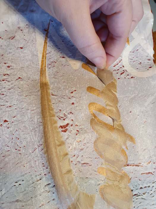
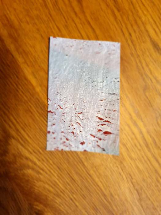
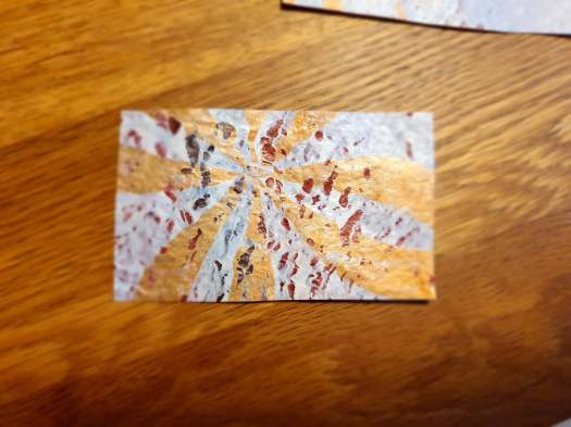
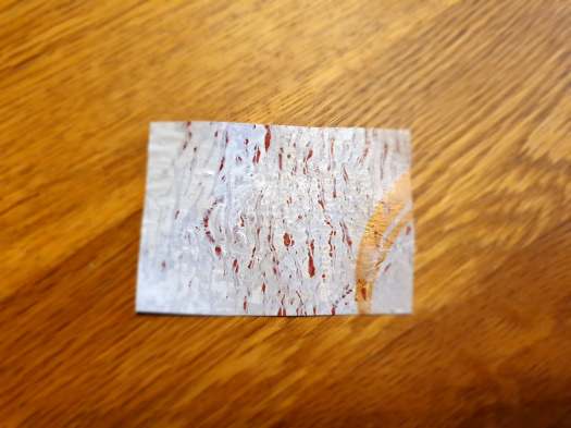
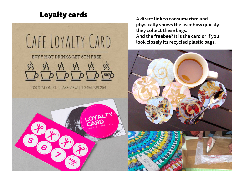
To start with I wanted to experiment with texture and the physicality of a plastic bag. However, it did not do well. I had this idea that I could use the plastic a the prize for the loyalty card. The card being the prize as they don’t need any more bags. I ironed layers together. The layers were not shining through and the plastic kept burning even through parchment paper and a tea towel.
So, on to the next idea. Digitally made, printed Cards.
This didn’t have the kick or criticality I wanted so I went back to the ideas and with a discussion with my tutors they suggested the rude bag idea. I have to make it different to what is out there not make it embarrassing make it soul destroying. They also mentioned that I need to challenge the idea that I am a kind person? Reflecting on the first lecture, I need to not expect opinions I do not want. I come up with ideas. That is what I like to do. I want people to know that.
So I wrote a list. I don’t want people to hate me so I will not be using some.
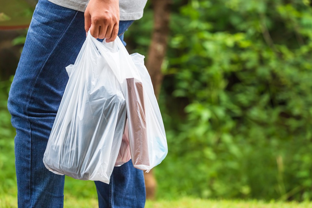
I wanted to use Helvetica on a simple backing because the text is the most important and it needs to be timeless. I highlighted the main words from each to emphasise the actions or opinions of the person holding that bag.
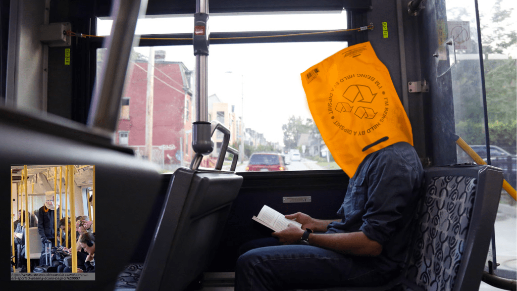
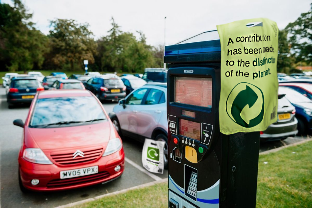
I wanted to add context to these bags and show how they could be used. For instance, a middle class man walking with these and he is being called rude words.
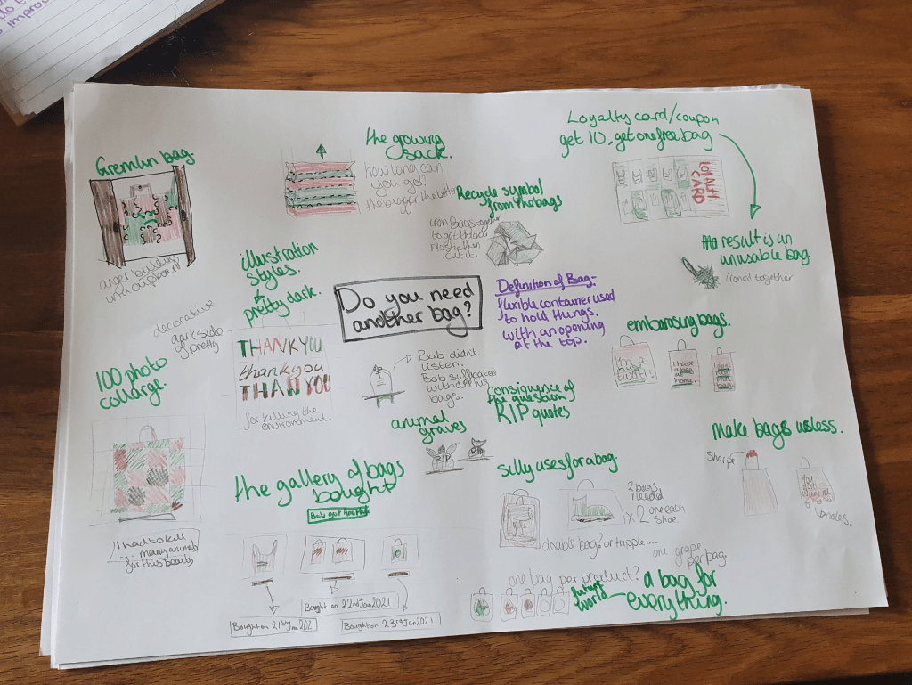
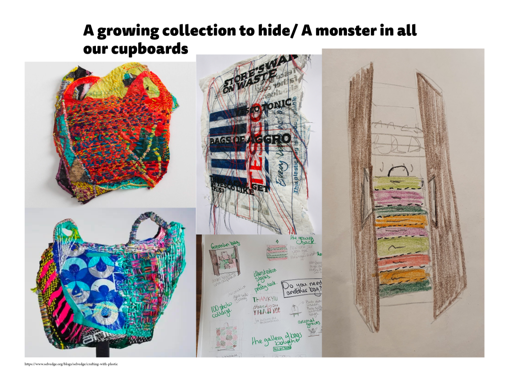
Before my research I noted my ideas down, adding to them when the research inspired me. These included a woven Frankenstein bag, a collage of tones of different single use bags. Bags that are useless and are unfunction-able or impractical, bags that are every where and use a bag for everything (one item one bag) or bags that yell abuse at you (“I’m a twat”).
I discarded my favourite embarrassing bags as they had been done before so I went and picked my top 3. This includes the monster in all our cupboards. Using the line do you really need to feed it.
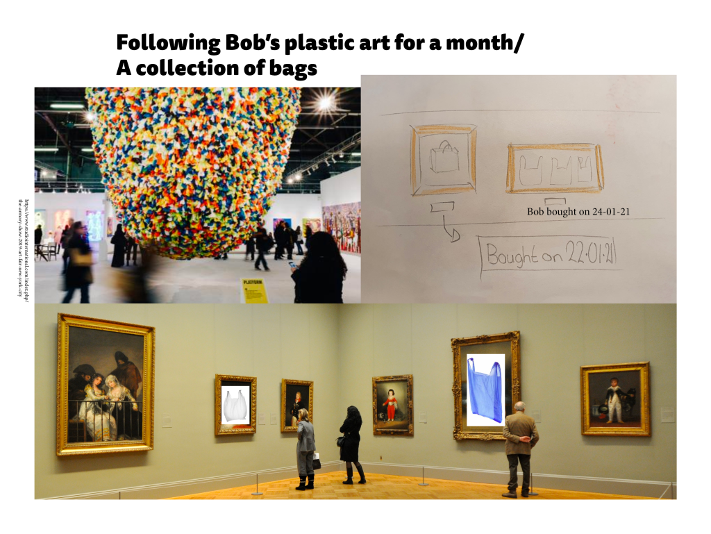
This idea was when I was asking where I would find critical design. Well a gallery or art studio. So I could make a protest, following one person (my family’s collection) and display it with a plaque.
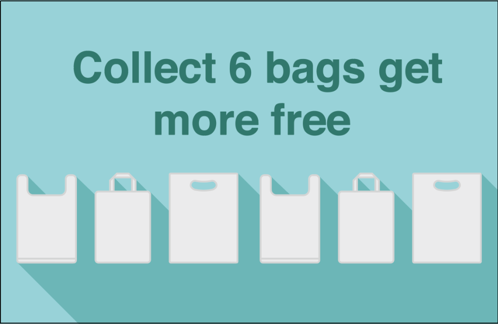
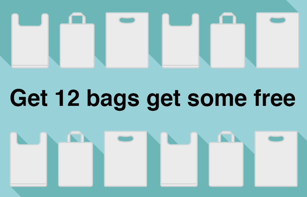
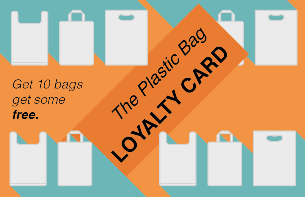
This is simply a loyalty card where you get free bags to mock the over consumerism.