My initial thoughts were to use scale as an emphasis on the power. I thought by using a smaller paper size this could work with the limitations. However this was bad.

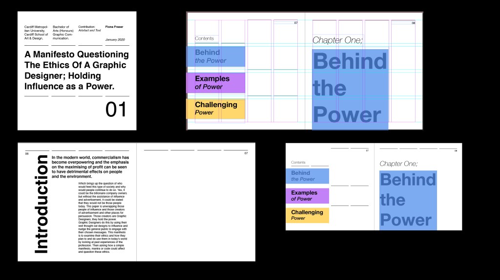
To progress with this idea of what can be powerful but simple I added blocks around the key areas and then sectioned designs out with these blocks. In this design I used scale more to emphasis the hierarchy and draw the eye to the most important areas.
However, this design lacked personality and joy. I decided to redo and research more and find better ways to get my idea of powerful design across.
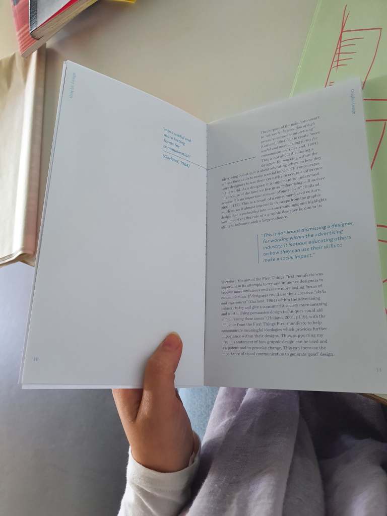
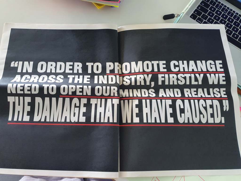
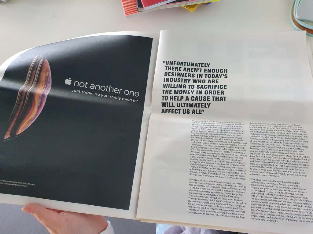
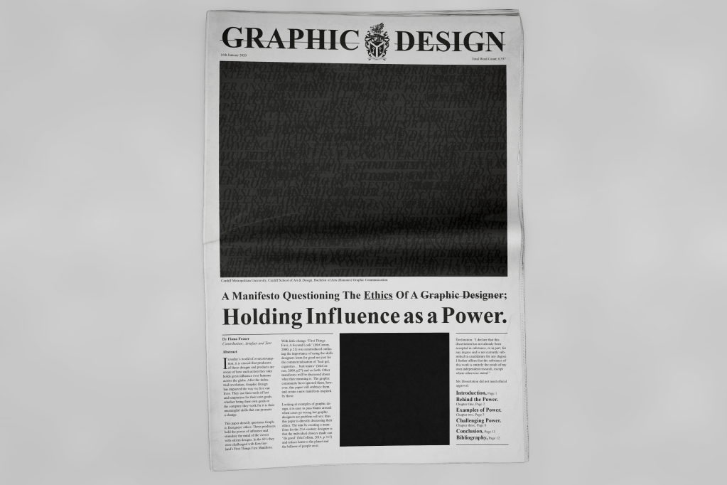
I still liked the idea of using scale but I was wrong I needed to go bigger. Newspaper size. The idea that some designing is bad for instance in the dissertation it mentions how over designing washing detergents is pointless and wasteful but designing good way finding or promoting a charity is more likely to be ‘good design’. So in a newspaper you have pages of ‘pointless’ advertisement design but some pages of informative helpful design.
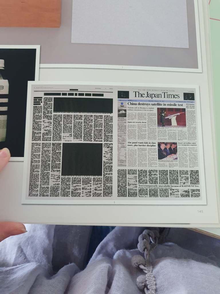
I wanted to create the cover with importance and be different to the traditional. So I removed the images so that the text and layout would be more noticeable. With some feedback it was said the black square looked like the black lives movement so the viewer filled the space with meaning. They also felt that the power could be of anything and that I needed to be more about the Graphic Design.