
Week of the 25th April – Independent Study/ Review Initial Visuals
For the idea I first thought about having 3 different types of 6 packs, such as beer, abs and so on. however, when telling other about this they said that it would not work as the design needs to be simple and almost as if the app is a one liner.
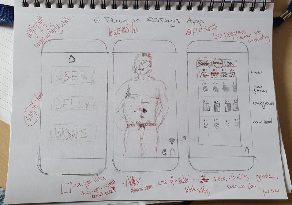
I then thought about that the users should be able to personalise much like the app I downloaded, but this would change colour, tones and to make the person more human and seem like the user or the user can make up a dream look for them. I initially want a slider for this as the user can get more of a range of personalisation, but I’ll have to figure out how Xd will allow this.


I knew I wanted darker tones so I began to sketch up some ideas with colour pallets. I sketched up ideas of the first page so that I can just get the design idea to copy across the rest of the design. Through this process I realised that the design doesn’t need more than two or three colours so as I sketched more I lost more and more colours as well as details. I lost like the look of the second page of designs, which just have straight lines with strong angles. This design should fit in well with the target audience of younger men, due to it being modern, easy to navigate and had an urban feel.
