Cardiff City – Tuesday 25th September
This was another adventure, not of the mind but exploring the city. Our task was to find the best style fonts from our provided list. One typeface was a lot harder to find around the city – this was Italics. The style font was difficult to find as many of the shops used bold or script fonts. However, I found a bottle of Dr Pepper which had an italic font. The other fonts where Roman, Majuscule and Miniscule. These were easier to find as Roman is very common among old fashioned pubs and restaurants, while Majuscule and miniscule are just capital and lower case letters which chain retail shops use often.
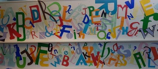
Once back at the university we began to create our fonts that we took photos of. This meant that we were drawing and cutting out the letters. After cutting out 4 different letters of our chosen fonts we began to tack them all onto a wall as a collective class. I feel that the final look has some good areas and some needed more attention due to the open space and lack of interest there. On the other hand, your eye as the viewer is drawn across the display as it has a good link with colours.