Nudge and Budge workshop

We already understand that graphic communication uses signals and meaning that influence the viewer. This workshop is to introduce and understand the relationship between these expressions and the real effects that the designs have and their consequential actions. I learnt the 6 styles that interlink explaining the behavioural insights and psychological nudge that factor in the consequential responsibility we as designers have.

The 6 systems are as follows;

  1. Systems thinking > Fast and Slow – Fast being unconscious, effortless – Slow being rationals and responsive
  2. Information design > Visual Language – Either textual or imagery, tonal etc.
  3. Information actions > Cues & Reminders – Triggers of emotions to lead to an action/ responce
  4. Information actions > Planning – to make simple actions, reducing procrastination
  5. Framing > Loses and Gains – Social Comparison – Choice and Incentive – Gains and Loses
  6. MINDSPACE

This was beneficial as I am using this thought process within my dissertation to explain the ethics of a single designer when influencing the masses; and how the gain/ hold power over a viewer. Is it ethical to influence a person that would not understand that they are being influenced?

Writing with the senses

Friday 4th October – Looking at art (study visit)

Visiting the space made me think about what it means to look. The tutor explained that as a viewer we look at objects and interpret the meanings/ uses of these but as designers and creators they supply a meaning and want the views/ us to think what they think/ feel within that moment or their journey. So looking is all about getting the balance of supply and interpretation right.

Linking this theory to Graphic Communication we design for instance a poster – a highly visual thing that ‘supplies’ information to that viewer. Although interpretation is limited the viewer can always think differently to another. Thus concluding this theory with looking is never pure.

When in the space I was drawn to one piece which my first ‘interpretation’ was that this hole in the ground with a small almost reddy, orange and yellow shiny almost glass like blob is an inverted volcano. However, once knowing the title of the piece I was shocked to find that the name was Portal. And one of the students sniffed the central mass clarifying the central mass was in fact jelly. Through using all her senses she was able to get a better interpretation than I was from just looking. This shows that looking isn’t just a visual thing, much like the name of the constellation looking is about all the senses. But the question I ask is the 6th sense the others around us and is the 6th the supply?


100 Ideas

Tuesday 24th September – 100 designs

The brief is to create 100 designs in a week. This is simple yet time consuming and will need a lot of brain power. When creating these designs I knew I would not manage within one sitting so I started with a plan to create 25 in each sitting. Once completed the first 25 I found it hard to get back into the rhythm of the designs. Thus the ideas were not the best or excited well enough.

With my 100 designs I was confident with a few of the designs, but looking at a few others I know they thought about the layout a lot more.

Discussing and placing marks next to our favourite the designs we noticed that bolder more bright designs stood out. This meant that the designs in pens and colours and overall bigger had more of an impact when looking at the whole class.

If I were to do this again I would create some more digitally as well as having some hand drawn elements.

71293330_472013136719705_7150651936843235328_n

Writing The Senses

Friday 27th September – The Frame and the senses within.

The ruff and textured red brick is a contrast to the lighter brown of the soft wood. A sharp metal nail sticks out ready to catch anyone who wonders past as it blends into the rustic surroundings of the bar.

The room is heavy and has an aroma of beer and other alcoholic beverages. With each breath I can taste the stale air of morning coffees and last nights drinking.

The sudden sound of the chairs moving echos the room making ears wince but the overall noise is busy with distance chattering from the other cafe.

All of this is framed by a single sheet of paper ripped out of a sketch book.

This piece is a short 100 words on the simple framed photo that I wrote. Going back to class after this we analysed 2 other pieces. The way we looked at it was interesting with different peoples interpretations. The learnt how all the experiences we go through we learn and continue to learn as the answer is never final.

Work Experience with Hex Week 1

Week starting Monday 24th June

This week has been a whirlwind of exciting elements – some that I am familiar with and others that are brand new to me.

As the first day approached I was told the essentials but little did I know that I was diving straight into client work. Monday morning was relaxed with a meeting discussing last weeks progress and this weeks aims, where I met the whole team. They were really chill and easy to get along with. The team has a lot of knowledge that they shared throughout the week so far. 

As I’d only ever worked for one client before I was apprehensive to work with a digital agency but with the calmness of the team I was able to understand the brief and get straight to work. This being a research task on the competitors of one of their clients, discovering the patterns of the social media posting. Leading onto the making of a spreadsheet including the caption, image and date of release which would then be pitched to the client.

Next I was tasked with working with another colleague – Jai. This project was very interesting with new elements, being that the company had strict brand guidelines. Jai was able to talk me through these regiments and keep me on track. I was able to design and create 3 pull up posters from the website information and the guidelines. The task followed through and lead onto the making of banners, which I found simple as the design was already made. 

On one day I was invited to join a client meeting – this is where I had no experience. From the meeting I learnt the ways of talking to a client correctly, which means that I have the ability to go forth through uni and into my career having an advantage over others without clientele experience. 

This meeting lead onto my next task to create a catalogue with all of his products. Through using the clients website (created by Hex themselves) I was able to easily find the information on each product placing them within my design. Due to the original order form being a little off from being sent over various different softwares I really struggled finding the correct balance to fit in with the catalogue. I asked many questions mainly on the order form that goes on the end page to be ripped out and sent back to the company after handed out to the customers. Once designed the whole Hex team came together and offered suggestions and tips to adjust the finer details for a more impactful design. They all helped with deciding the fonts, the colour scheme and how to go about the pixelation within the client’s logo. With all of these features thoroughly examined we were ready to send to the client. 

Awaiting for approval I was set another task to help out the company quickly with their up and coming project. I had to do a very basic task of re-arranging some words so that it fits within the design Hex has created. This proved to be more difficult as the main typeface chosen was not compatible with the software I was using. After finding the secondary font I was able to create an almost cluttered infographics of words placed within the given measurements. This fast pace work has given me more of the idea in what a real world work environment would be not just a simulated version within Uni.

Overall, I am excited to start another week within We Are Hex and get stuck in more with each project. I have learnt how to brand myself when talking to clients, keep on track in a fast pace environment and how to be around other creative minds on an intellectual level instead of the tutor and student style at University. Therefore, I feel more confident as a designer going into the dangerous world of creation.

Photographing Practice Workshop

Wednesday 14th May – Photographing Practice Workshop

This work shop was very simple showing us how to take the best photo of our own work. This will prepare us for the future for when we have to photograph our editorial in a few weeks as well as for further projects that are in need of placing in context within the real world/ market place.

The tutor spoke about the way the lights have to be positioned, the different elements within the lights, such as the brightness and the colour. This means that the image can have whiter whites and blacker blacks, instead of the grey glaze that normally happens. Also the lights are soft to remove any harsh shadows.

For our work we needed to place the camera on what seems like a hoist angled to a flat board which holds the 2D work. However, I became curious about other screen. This was the place for all the 3D objects. The area is fitted with an infinity screen in the back and a main light that made it look like day light.

Way Finding Research

Friday 10th May – Way Finding Workshop

60311549_412205192666839_3040461675879727104_n

We were introduced to two Ukrainian designers, who teach at a linked university over there. They also both do their own projects with companies in their country; one being the development of way finding. Way finding is the way you orient yourself based on the physical environment around you.

They went on to explain that everyones views on this is vastly different, due to each person looking at different things, visiting different places and remembering different aspects. These lecturers have looked into this and how design can help orient people better. For example one showed a photo of Ukraine with hundreds of sign posts, billboards and advertisement. Explaining that if your phone was dead and you didn’t speak the language or just forgot the directions it is so easy to get lost and disoriented, but through good design you can find your way.

They went on discussing how the world isn’t perfect but to figure out how to navigate through you need research. They looked at how everyone lives in a “fast world” meaning in context people just want to know their way when they want it not in 5 or more minutes. Through using a smart phone this has sped up our standards, so they brought up why we can’t just use technology. We still need road signs clarifying that there is a turning up ahead or you have to give way at that point; technology can not do that, thus we as designers have to create good signage.

When the lecturers did their research they noticed that London had 32 different systems for finding your own way around. However, since 2012 with the Olympics London had a deadline where to create an international map that can help others around. This is called Legible London – https://tfl.gov.uk/info-for/boroughs/legible-london

From here they explained how they over came these challenges through looking at the user (the fast world), they want it there and then. They looked at the space, including the structure, function, names, danger areas, the light – all which effect the design. This design is looked at in fine detail when moved on to the production of it. They needed to test it in the real life. They are continuing to expand and take care of the designs making sure they work efficiently and updating when the world around expands.

60181547_842107089457366_5472539082502438912_n


For a little workshop we had to create a map of the campus from memory. Now this was a challenge as many of us haven’t been around all of uni. so I took it upon myself to use the campus map around, however I think this made it a lot harder as I was more interested on the precise parts instead of the over all function of the map.


Overall I have learnt that a good design can work across countries and can help people but on the other hand one that is not good hinders people more than it would without.


Fine Art Chinese Calligraphy

Wednesday 6th – Chinese Calligraphy

I was made aware of a 3rd year student in fine art was holding an exhibition of her work in the city centre. Alongside this was a calligraphy workshop, that happened to be in Chinese. This was highly interesting as it linked very well with my current work I was doing. I learnt about the culture within the style. This included the way the brush is held, the different ways to paint the stroke and how the script came about.


To start with we had a mini PowerPoint on the history of how the dialect came about. The Chinese culture had a lot of different dialects and through the centuries some came together and created a better and more diverse language with easier to read symbols. This was then adapted for the newer digital typeface styles that is now used for the majority of people’s handwriting.

When we began to paint the letters we had to learn to keep the paint brush upright and hold it with the tips of your fingers instead of the more European slanted and resting on your hand way. Through copying the woman in charge I managed to draw my own in the correct style. Starting with a slant and ending with a twist, which became more therapeutic as each stroke of the paint went down. I ended with several phrases, one being happy new year and another good luck.

Overall I learnt that different cultures still have the more than one style of writing such as the “a” can be written differently as well as the “g” or “z” depending on the typeface or style of handwriting used.


InDesign Workshop

Friday 22nd February – Sign up InDesign Workshop

I struggle with InDesign because although it is very similar to things such as Illustrator I feel that you have to be more precise with everything you do as it is usually the final stage in the industry.

One element I could never seem to hack is all short cuts and simple ways to do things. A new random technique I learnt and am currently loving is the two finger scroll although this is used across hundreds of different softwares it has just been so helpful with designing and researching my project. Some other random tips I learnt are;

  • for a quality image you need at least 300 pixels for every 1 inch square
  • you can use photoshop to convert between CMYK and the other colour combinations depending where the final product will be (digital/printed)
  • make sure the InDesign work is all in one folder so that it doesn’t lose the inserted design
  • for printing standards leave a 3mm bleed and if you want to send a message to the printer do it outside of this
  • if you have too much text with in a box a red cross will appear and you can drag it to create another box. These will become linked.

Another thing that I learnt, which was very new to me, was when the type tool is selected there is two different sections that can be altered. Knowing this has come to be a great help as I can now set my own paragraph style which means that I can now keep my styling consistent throughout my project.


Work Shop Friday

Work shop – Friday 28th September

I was unsure how much I knew in Adobe Illustrator but by the end of the workshop I left feeling that I knew almost all of the software.

To begin with I should say that for the past 3 years I have work along side Adobe Illustrator and Photoshop but I have never got along with them. However, with moving to uni and talking to other students I am slowly growing to appreciate software.

my rocketship
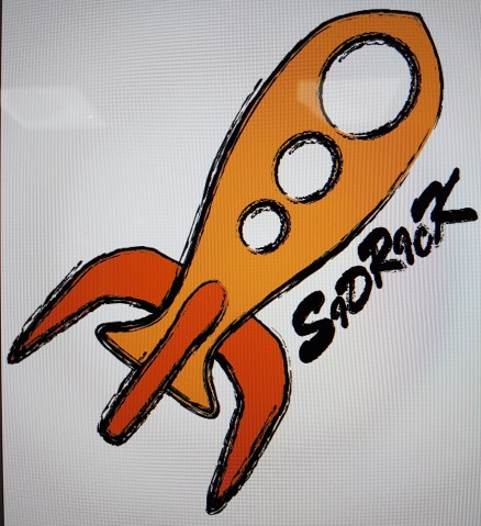
In our hour workshop we created our own rocket ship. I knew how to use everything on Adobe except the anchor point tool. This was a revelation as I can now adjust the path of a shape easily with out having to re-do the whole shape. Within this hour I anchor point tooldeveloped and adjusted the lines so that they look painted instead of the plain, classic lines.


Design a site like this with WordPress.com
Get started