M.Y.O.B. – Summery

Prickles Overall

Screenshot 2020-01-19 at 11.56.06I am very please in the way the project went. Working with others from different fields taught me a great deal when it comes to my future. Being with non-graphic designers but still artists made me think differently and explain my methods not using technical terms but in meanings. For instance, the typography chosen was due to the feelings or emotional reactions not just this is the style that links well the cartoons own style.

However, I was not please due to personal reasons I had to take time away. Finding this a challenged I still managed to realise I can still do my job under strong pressure and thrive. Such as having to do the slash screens before I went off and to come back to complete all 50 stories to go on the passports.

I mainly used Adobe Illustrator and decided not to take on the digital stitch workshop as I tried to be a team player and told others take on roles they had not yet grasped at. Upon reflection, I regret handing my place over as I could have taken this skill into my own practise for when I design logos to place on materials. But one skill I have learnt is the Adobe software Premiere Pro. Asking a fellow Graphic Communication Student he taught me the basic steps to create a flowing video. I then experimented and created the 30 second advert with ease. Being able to take this back to my field will give me an advantage or a personal skill that can help me in the future.

I am also glad that I painted some pots showing others and myself I am capable of more than just simply the digital aspects. When painting it became apparent that we are a happy team with few disagreements. In reflection I believe this was because of the happy products; making joyful things makes you joyful yourself. The concept shone through on sales day as customers always left with a smile on their face. Whether that was from the cheep pricing or happy staff, it can’t be determined, but without a good idea we wouldn’t engage with each other or to the customers. Taking this forward I would keep to the most engaging briefs or twist them so they become engaging and fun for me.

If I were to redo this project I would make sure we have more products to sell. Leading up to the sales day we were unsure on how many will sell and then all of a sudden lots of team friends asked for certain orders. This took about half of our stock for pre-sales only leaving around 25 products to sell on the day. At first glance this is great as we became sold out extremely quickly but means we should have calculated how many our friends would buy and then calculate how many we needed to sell to others. Over all I am still happy with our achievements and our means to get there.

M.Y.O.B – Sales Prep

Week 5 – Stall Preparations 

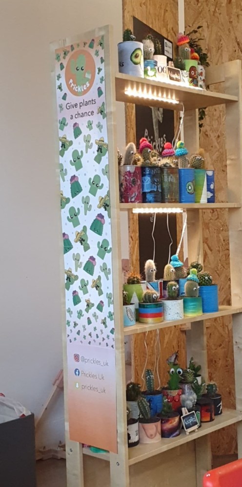
With all the products to go we only had to present them. Having the stands brought in from a team member meant it was easy to ensemble. We decided to add a banner that stretched down the side of the stand. This could be seen across the whole room so by having it there showed people the level of care and detail going in the whole project.

84827324_2478407509087828_7651158400130088960_n

We wanted a family tree of all of the cacti showing off what we created. So a took an image off a google search then traced it in illustrator so that we could have our own image quickly and swiftly. So I proceeded to print and cut out the main cactus then helped cut out the

84764862_169424531162348_5263760636344532992_n

M.Y.O.B. – Finalising Products

Week 4 – Lending a Hand + Customer Surveys

After realising the tins were highly time consuming and only one person was in production of them, I decided to paint the background ready for detail to be added at a later date. Just under 15 of these I created in a day it was taking much longer to complete the final sellable pots. By doing this relieved some pressure from the product designer painting and meant that I was always doing something productive for the team.

Within a survey the target audience wanted geometric patterns as well as words and splattered paint designs. Not being able to do the detailed requests it was suggested that I paint simple geometric designs using tape to keep it professional and sellable.

The survey also suggested pricing to us. We had greatly over estimated the pricing for the cacti; therefore we had a short team meeting with a few members discussing our new strategy. We immediately scrapped the idea of selling glitter pots at a higher price. Then we took away the biggest pot for a raffle so more money could be donated to the Alzheimer’s Society. Leaving the small pots to be sold at £3 and the main pots at £4.50. We spoke a lot about the power of giving money back; for instance if a customer hands over a 5 pound note and not receive change they can feel like it isn’t worth anything. Through giving change as well as a product they feel like its a better deal and more likely to tell others. Thus helping to promote our brand though word of mouth.

Screenshot 2020-02-06 at 23.08.16

All 50 hats fully created and finalised today by fashion and then the passports laser cut and waiting to have the final check over – the last thing is presenting the cacti and our business on both sales day and hand in day. So far I am pleased with how we took the mad idea and gave it life much life personifying a cactus.

M.Y.O.B. – 30 Second Video

Week 4 – Creating The Video

With all my work completed already, I was tasked with helping create part of the 90 second video. We discussed together of what we want – having a happy song in the background with us singing to it then a montage of all the cacti.

In reality I wanted a sad cactus to set the scene then add the team working and singing as requested to become a happier sellable cactus. First videoing the sad cactus and then the singing parts, I took two others to help film the rest. Not having all the cacti finished we took the best 9 to film placing them in different environments.

Next I signed back the rented camcorder and began using Premiere Pro as earlier that day I had a friend teach me the basics. Later that night I finalised the video.

I wanted to add the logo at the end but realised that a second video is to be made that will play after this so adding in would limit the time used to show off the products.

M.Y.O.B. – Passport Sticks

Week 3/ 4 – Concepts + Designing of Passports

The idea behind the passports is that a buyer is adopting a cactus or two and the cactus needs to have their identification, for instance a passport. We thought of a book but this wouldn’t be on display with the cactus. So the team decided on craft sticks to be wedged into the pot.

With the initial design created by the product designer, it was a simple case of digitalising the design.

Screenshot 2020-02-06 at 21.38.44

I copied it letter for letter in Adobe Illustrator but when looking at it I thought to add a few things such as the date of adoption instead of the date of birth as we would have no indication on this. I also changed the passport symbol to a silhouette of my logo designed earlier. Also creating a signature for all the cacti would almost be impossible and too time consuming so a solution I suggested was having the customer sign and be a parent to the cacti. The team agreed to all these changed.

Screenshot 2020-02-01 at 21.24.23

Next was to write all the stories! 50 stories and many spell checks from the fashion student later, I was able to complete the task and send it off to the fine artist student for laser cutting. 

84336399_882677448817438_8945822600123121664_n

M.Y.O.B. – Products

Week 3+ – Creating The Products 

The products are simple and only come together from 4 items and the optional packaging. A team member selected what they wanted to do so everyone had something to do.

Itinerary 

  • Tins – sustainable and repurposed to be painted and planted
  • Cactus – unwanted, cheep cacti – rest bought from Ikea
  • passports – personalised hand-crafted to be on a stick leaning out of the pot
  • goggly eyes – humanises the products brings them to life.
  • Packaging – optional paper bag held with a simple sticker.

All collecting tins we passed them over to the product designer to paint up. While others looked for cacti and small businesses willing to donate. Unfortunately, not many were willing, with one cactus donated and an another luckily gave 13 for £10 – which only 10 were high enough quality to sell on. Leaving 39 more cacti to collect.

The goggly eyes were easy to find and cheep to get – at 75p for 50 eyes. Then all the hats were hand knitted by the fashion student. Which left the passports, so I took this on – writing the stories and creating design and then passed the laser cutting on.

83776500_107359194159605_8773713197464027136_o

M.Y.O.B. – Posters

Week 3 – Posters

Being home for the first half of this week I had to make sure I still was communicating well so emailed all my work over that I had completed to be handed in at the appropriate times and correct places.

Making the poster was simple as I simply rotated the design keeping the colours and elements the same. I added the instagram hashtag for the advertisement to find us easily. I also made the image a lot larger to get the idea of what we do easier to understand. posters-01

M.Y.O.B. – Splash Screens

For Week 3 – Making of splash screens

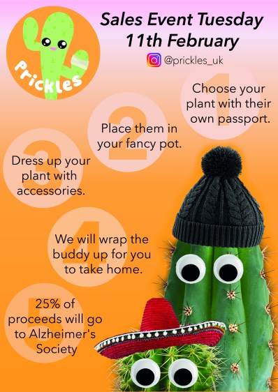
The need for this is to add to the idea of drip feeding our potential customers of our brand and what we do. Taking our ideas of how we are going to sell the story and push the story of how we take an unwanted cactus and then sell them on. To brand this I wanted a story line to flow and take a customer through the story.

I created this simple layout of a flow of a story ending with the sales day. I sent this to my team making sure we have good communication throughout this process. Staying open minded as I knew this was basic designing I took honest criticism to improve. The team liked using orange and was not a fan of the arrow or the blue in contrast. However did like the idea of the story and what will actually happen on the day.

From the team I took out the blue and added numbers instead so that it flowed and made sense. Changing the ending to the donations of proceeds to the alzheimer’s society, it makes our company look more human and generous, instead of come and buy products on that day. This has been changed to 25% of the proceeds as we felt we wanted to be more generous.

Screenshot 2020-01-22 at 19.29.46

Keeping up with our communication I sent this to the group and awaited a response. Meanwhile another team member made a real life visual of what the cacti should look like when finished. Immediately, I added it to the design so we have all the info but the design is not just words but has our products within.

Screenshot 2020-01-22 at 20.46.39

Due to family commitments I could not make it to the uploading and saw it on photos then a week later viewed the screen checking if all was visible and I am happy with the outcome.

M.Y.O.B. – Business Cards

Week 2 

From making the logo I was tasked with moving forward with applications. Looking at the other designs the better cards were simplistic with the meaning clear and visible. Another aspect we looked at was the usability and how we would hold the cards so the main aspects would be at the top and in the middle so that a thumb or finger wouldn’t cover areas. Discussing these the product designer drew up what both of us were thinking.

Creating the design I was unsure it had a clear meaning like we wanted. So decided to create some other designs. To make it personal and friendly which is what our company is about I decided to create some other characters to place on. This was inspired by the product designers drawings of the cacti products we will sell. And I developed these further to be made digital.

I then created a collage of the cacti and asked for feedback from the team, comparing both cards. They liked the collage but not the pick card as things would be blocked off and not presented the best.

Screenshot 2020-01-22 at 12.42.20

From this I decided to keep the many cacti but added blue circles to fill the spaces more and so that it can be more gender neutral. It was also suggested that the eyes will be placed on the cards after printing for a fun 3D aspect.

M.Y.O.B. – Badges

Monday 20th – Making the badges

Screenshot 2020-01-19 at 11.56.06

The logo already created I arranged the sizing at 58mm circle – with an extra 5 mm around the edge of the badge. When coming in we then found out the badges needed to be 75mm so with a few clicks the sizing was corrected and printed. After one great first attempt and many, many failed attempts we decided to use the smaller designs till we figured the machine out. Realising we left a vital metal piece out I was then nominated to create the rest of the badges and did them quickly and efficiently with others cutting them out.

83172583_1039048666450135_3716236455912144896_n

The reason to have the badges so early is so the the team can wear them and we can walk around uni (the place of sales) showing potential customers what micro businesses we have coming their way. They can start up conversations and lead to direct engagement with a customer.

Design a site like this with WordPress.com
Get started