
Asking for feedback I realised the images were all over the place and needed the most work. However I was still not certain on the front cover and gallery page.
I updated the cover image to more look like an English garden with a banner image. Next I decided the gallery pages needed the images to be the main focus and pushed for the banner feel. Changing it to green and removing the pink overlays means that it links to the work pages and cover image. I updated the images to add curiosity and they better represent the projects within.


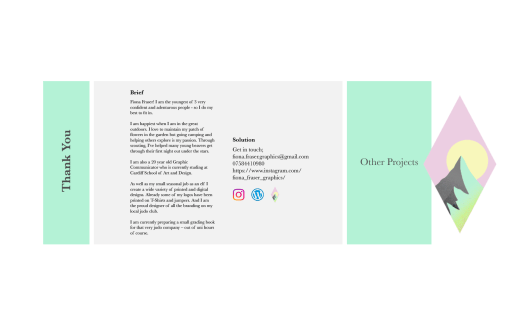
The back was a simple change to link to the first page with the logo.
With the feedback I cut back and looked at what the images meant. I took out the images that weren’t the best. I focused onto the main point of the project. I removed the captions for if an image cant be self explained what is the point in it being there. I spread out my images so they can breath so I have given them more pages with each page having a clear set out purpose.


I am happy with this outcome and feel I have refined my portfolio throughout my pages.
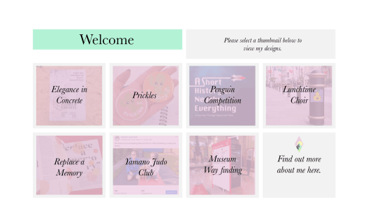


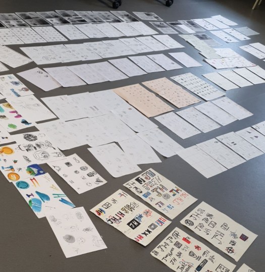


 Moving on from my first mock up I retrieved all my work so far and placed them in order, being the best at the start and end with a few others in the middle.


