Penguin; Final Desions

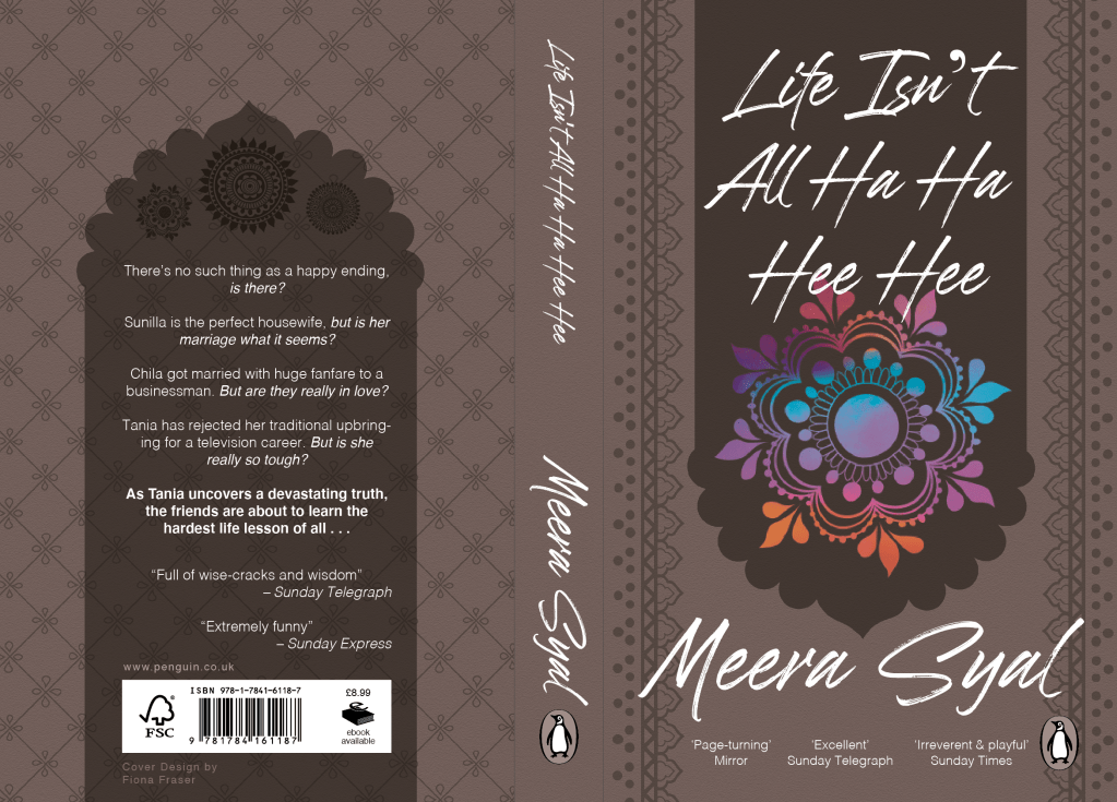
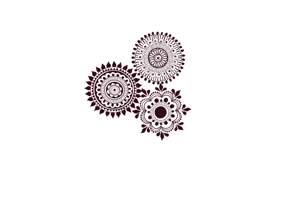
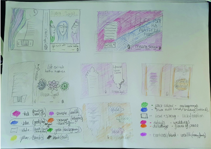
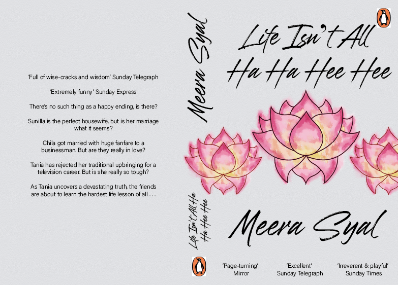
After some consideration on finding the meaning, I decided that I liked it pretty and purple. It focuses on the balance of making things look nice to please people. Thinking about my dissertation and manifesto on being an ethical designer, I have not listened to it. I have created a non-innovative piece that’s main purpose is to look nice. This week has challenged me as for once I am unsure, I am questioning my decisions and have no real answer. Is that a bad thing? I don’t know and it’s ok to say I am unsure.

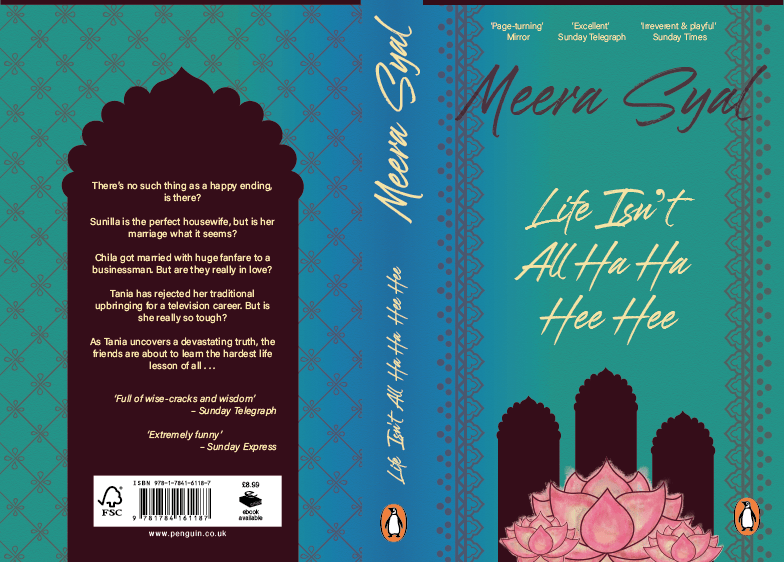
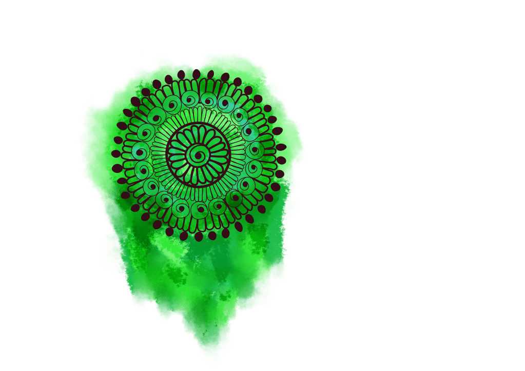
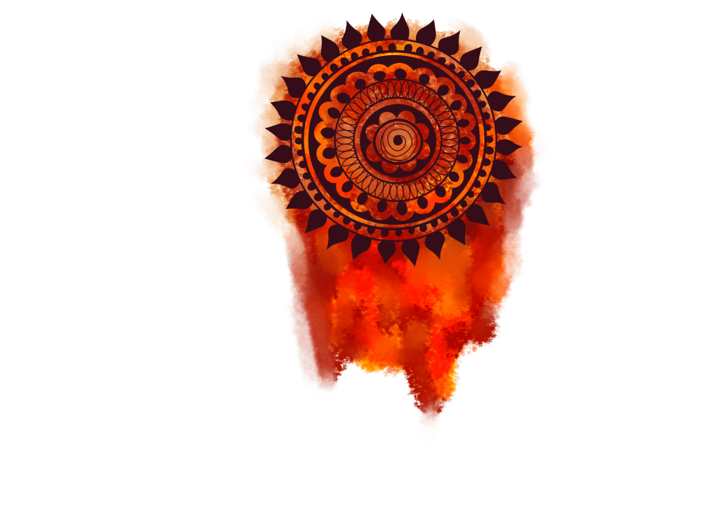
I did play around with it adding vibrancy, and life of a wedding scene but adding took away from the calming, delicate design.

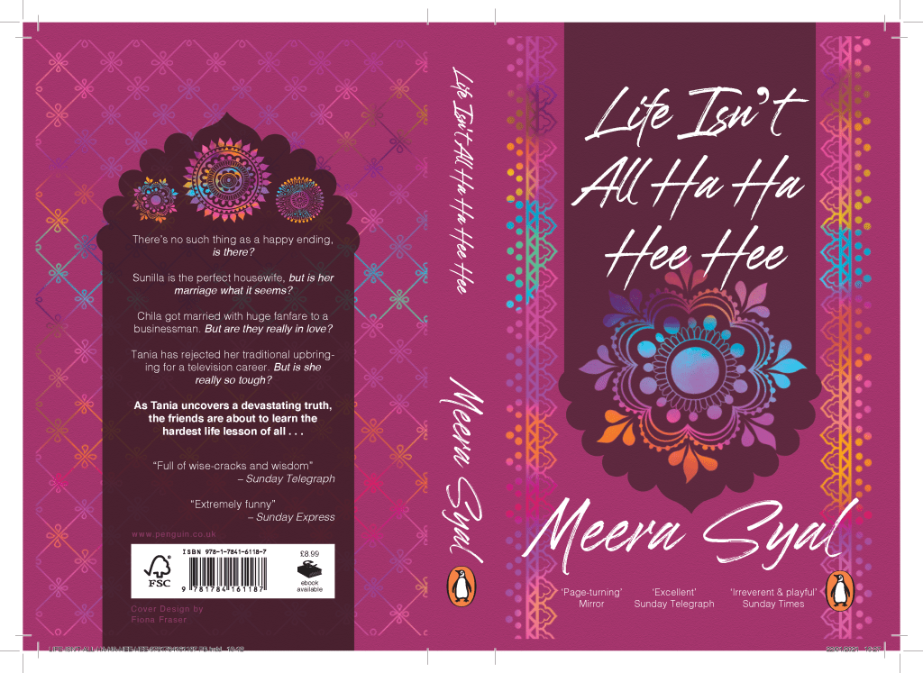
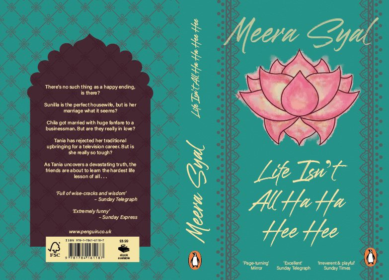
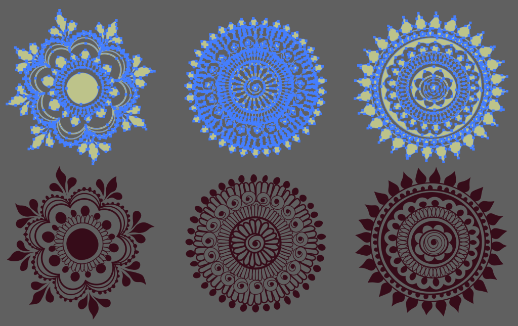
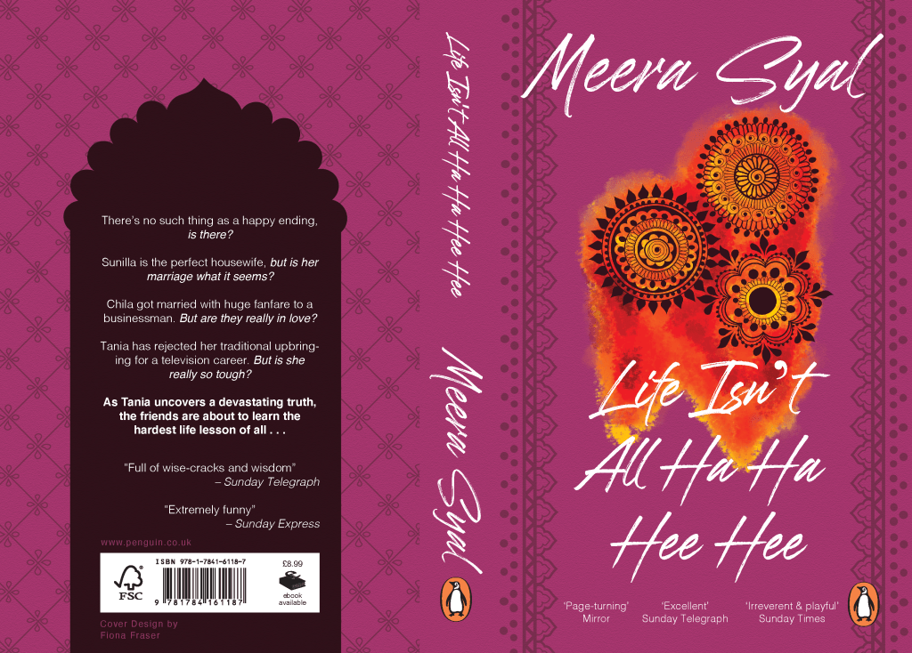
To make the colour pop I tried this. I don’t think it works as there is no balance. If it did work then there could be greater meaning with the lives are a bit dull (black and white) or for better words set in their ways until Tania comes along and turns everything upside down with the explosion of colour.

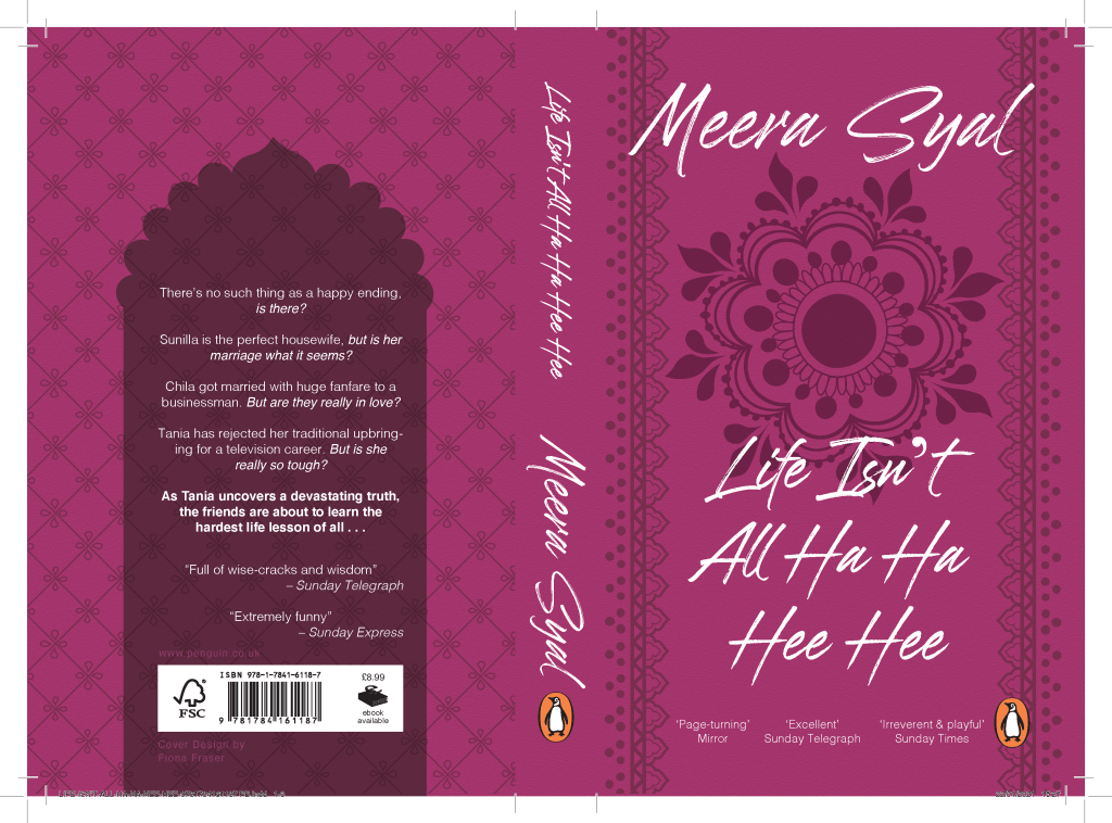
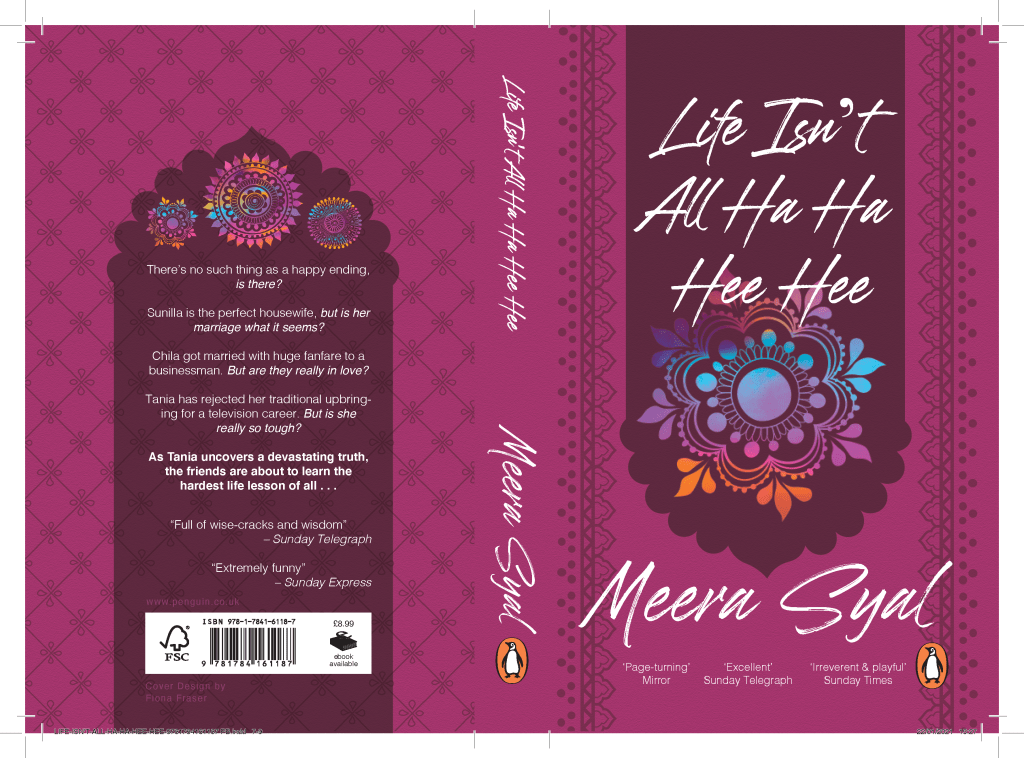
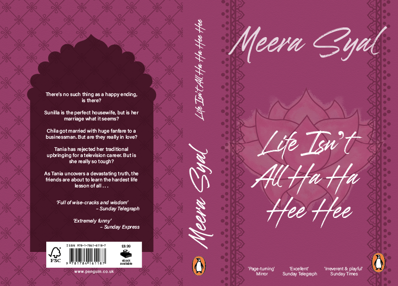
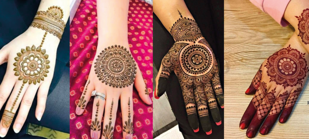
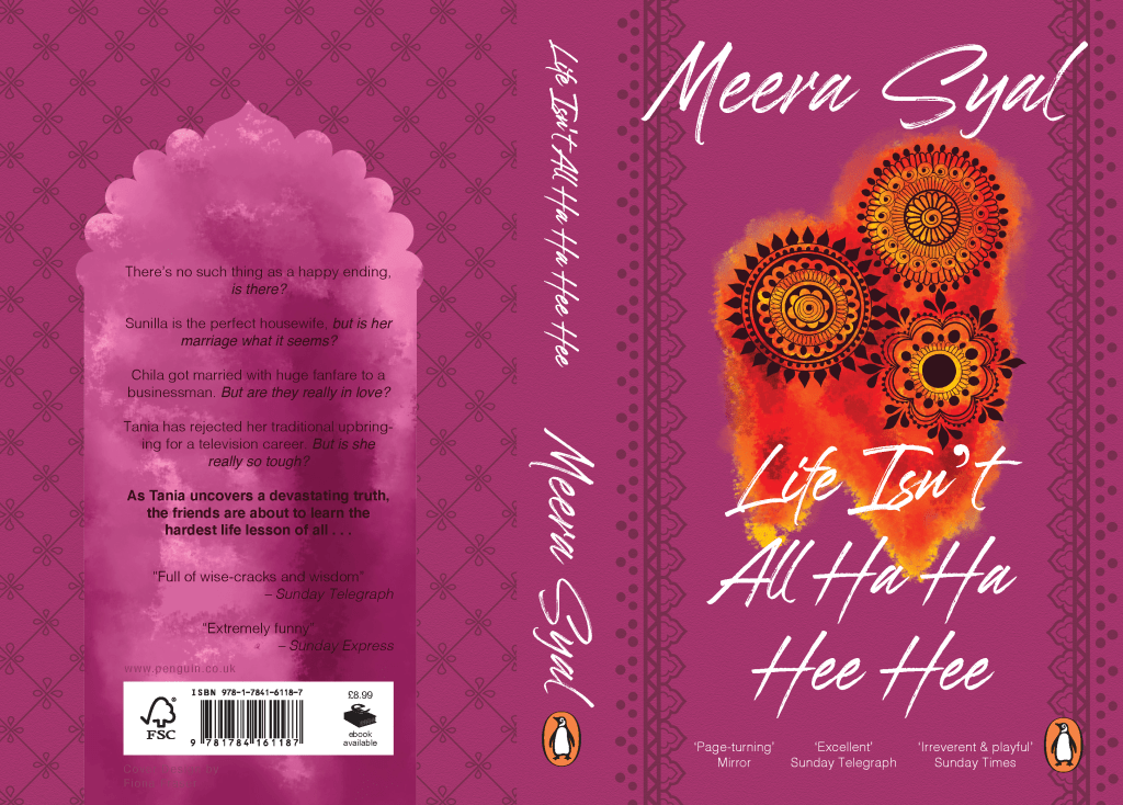
I didn’t like this design so reverted back with the calming presence and I like the feeling of safety and so did Chila and Sunita in the book.

Penguin; Development

My feedback was some what positive. I needed to add more depth and meaning to the design. It feels safe and what you’d immediately think of. I initially began to play with colours and shading.

I felt there was something missing so looked back at my first drawings and realised I wanted to go back for the rule of 3. I researched henna tattoos and drew 3 symbols from them to represent the 3 women. I liked the watercolour effect so added that in for texture.

In the past, I have not experimented enough so I wanted to try new things with these. I experimented with the text on the back because in my feedback they hinted that it was basic. I highlighted a chunk by making it in bold. I remembered that I was told to reread the sentences and pull the meaning out. Each sentence ended in a question so I wanted to bring focus to each of the nudging questions.

However, I am no happy with my cover as it doesn’t bring me anything. All my past work has had meanings but with this I am struggling to find any. Yes it is pretty but whats behind it. The book has so many emotions and I want the cover to show that.

Penguin; Ideation

Having a week project means I needed to get started right away and not think to crazy so I get onto my designs (this always takes the longest).

My first idea was to have rules of 3 as there were 3 women but after talking to the tutors this is what others talked about. I wanted to be different and use 3 visuals, so I looked at the idea of the henna and Indian decorations instead of the women themselves which opens the book. I began to look into and recreate the patterns on paper.

I quickly drew up the lotus flower as that holds a lot of meaning of purity and rebirth/ regeneration, which the book is about 3 women changing in their lives. I added the water colour element as the lotus flower lives in the water.

I placed 3 of these within the cover of the book and found this script font to go along side it, called Brushwell.

I thought this was plain and needed detailing to the back, as last years designs were simple and based around the typography I wanted to push myself to focus on my other elements. I added to the decorative theme by including a textured background.

Penguin; Book Reviews

Life Isn’t All Ha Ha Hee Hee by Meera Syal

Ahimsa Supriya Kelkar- the story of an Indian 11 year old bride in the 1857.

http://neilswaab.com/portfolio/ahimsa/

This book immediately tells the viewer it is about an Indian girl. It flows nicely with the symmetry and has balance with no over crowded spaces. The illustration and colour scheme is seamless. Its minimalistic tone makes it contemporary and youthful for the audience aimed at teens and adults. For my cover I need to push for an older audience and do this through the details.

The Family Tree by Sairish Hussain – the story of British Muslim family living life after losing the mother

Sairish Hussain on Twitter: "The Family Tree 💓 @HQstories @MsLisaMilton  @whitehorsemews @EmilyKitchin @LilyCapewell… "
https://twitter.com/sairish_hussain/status/1219282358307905536

Again the colour scheme is simple and uses the same colours. This book however has more autumnal tones using the blue/ green tone as the main colour. Overall this book is looks more for the older generations, which I believe is from the finer detailing and script lettering of the authors name. This cover has great hierarchy too but is a safe design. For my cover I need to think away from the first ideas and try not to be so safe.

The Vanishing Half by Brit Bennett – a story about identical twins living different lives in the 1950s as their skin colour defines them.

The Vanishing Half by Brit Bennett: 9780525536291 | PenguinRandomHouse.com:  Books
https://www.penguinrandomhouse.com/books/576782/the-vanishing-half-by-brit-bennett/

This contemporary design uses bright and colours that is only really used with female high-end fashion brands or Refinery 29. Instead using the fades to introduce the merging of sisters yet keeping their colours very different much like their opposite lives. The font is simple with no difference between the book and the author. But the image overpowers the text. This is a very stylish cover but holds a greater meaning. For my design I need to think about the greater meaning and rational behind my design.

We Should All Be Feminists by Chimamanda Ngozi Adichie – A short, effective essay about gender, the wrong ideas many people have about feminism, and why it is important.

Most of these books have different varients but one always stands out over another however, this book has 2 very different styles both of which are for sale. The right has an almost African feel to it with the complimentary colours and painted pattern style where as the left has geometric, almost futurist or constructivism style. This raises the question of how much I should add in the Indian styling to fit the book and the current market?

Taking these ideas forward I need to keep to bold type with good hierarchy. A simple, lighter colour scheme – no one used black but all use white? A repeatable pattern or style.

Penguin; The Book

Life Isn’t All Ha Ha Hee Hee by Meera Syal

Meera Syal best known as a comedian wrote this book in 1999 and then later published with Penguin in 2012. I recognised the actress from Doctor Who back in 2010 but she was most famous because of her culture and background as an Asian British woman finding success in many areas such as; comedian, writer, playwright, singer, journalist, producer and actress.

The book is about 3 Indian women in their mid 30s living in England. In a Bridget Jones style book it plays out their journey of stress and discovery. Chila, a nice Punjabi girl married Deepak in the first pages then we meet her 2 childhood friends; Sunita, the former activist law student, now an overweight, depressed housewife and mother; and the beautiful Tania, who has rejected marriage in favour of a great career in television and life in a trendy apartment with her English boyfriend.

Chila, Sunita and Tania grow as people as are expected to revert to being obedient mothers and wives but their world explodes when Tania makes a documentary, starring Chila and Sunita, about contemporary urban Indian Life. The result is an impactful story of friendship, marriage, betrayal, and the difficult choices woman face.

The book has many cover versions and the most recent is the textile, illustrative cover. I believe this to be more childish and not aimed at the adult audience. Whereas some of the others are very outdated and I could see fade into the background.

https://www.penguin.co.uk/books/1004976/life-isn-t-all-ha-ha-hee-hee/9781784161187.html

Book Cover – Final

Last week – Finalising Design 

Screenshot 2020-02-26 at 23.47.25Having gone to the last tutorial not many things were needed to teak. The only suggestion given was to place the planets better. They need to link in with the page not just be placed on top of everything. I keep going back to depth and layers like the book building on the readers science knowledge, adding steps and curiosities to the go further your own education. My design is showing the layers of research Bryson has put into the book from the blue background then adding light and stars then the typography, vector images and all coming together for a cohesive easy viewing. 

Moving the planets solidified my design and took the white line back behind the blurb and behind the planets. This changed the hierarchy so the ‘Best selling….. Century’ typography is the main feature at the back.

Screenshot 2020-02-27 at 18.24.15

The last element was to export with bleed and crop marks then send it in and now I’m just waiting in anticipation.

Book Cover – Development

Going into week 2 – Developing and Detailing 

Screenshot 2020-02-26 at 23.29.17

With the feedback given I looked into Screenshot 2020-02-26 at 23.46.02
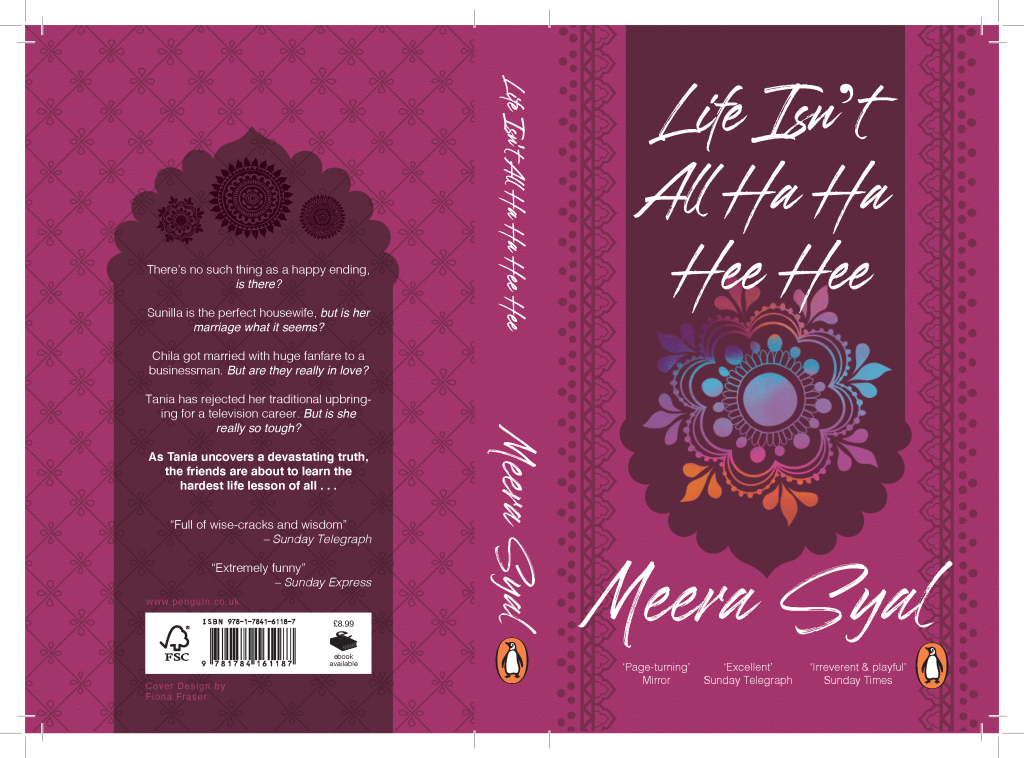
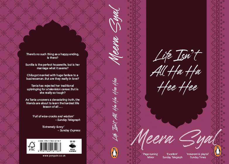
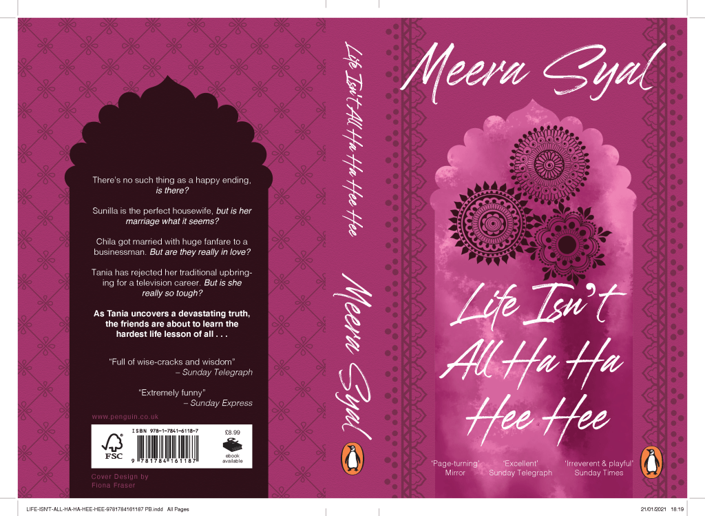
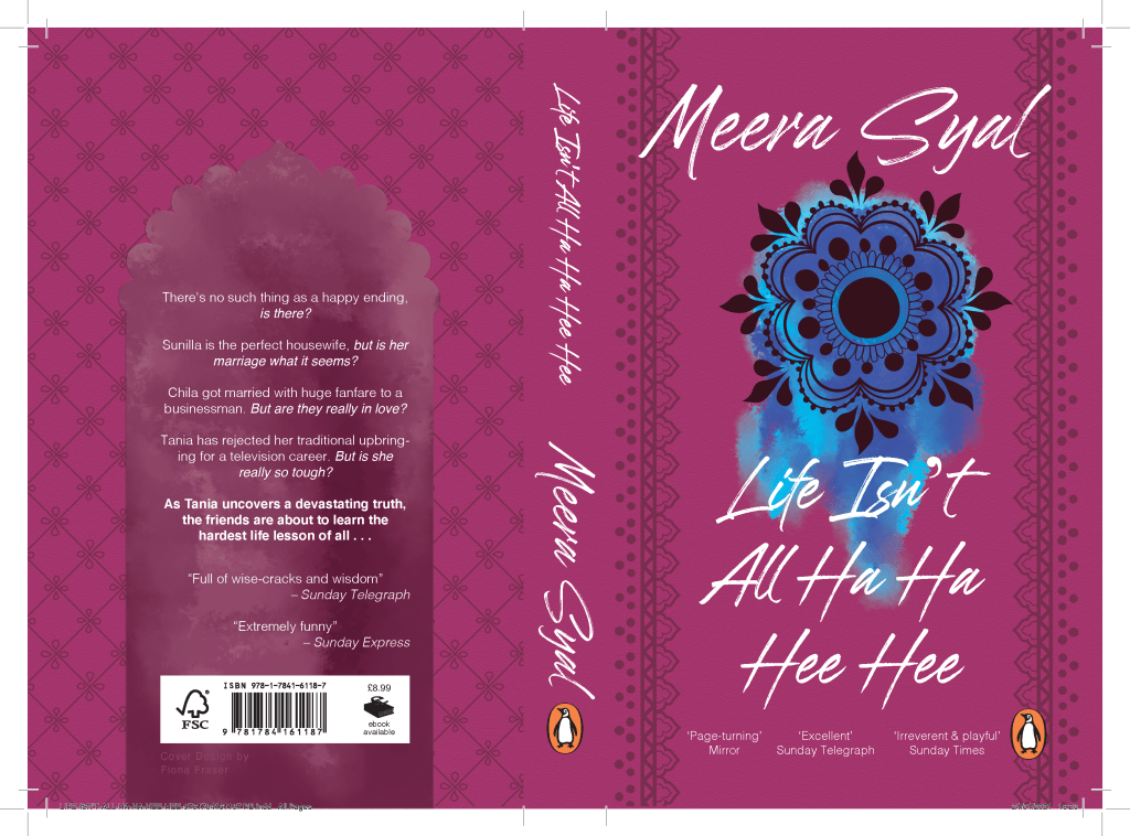
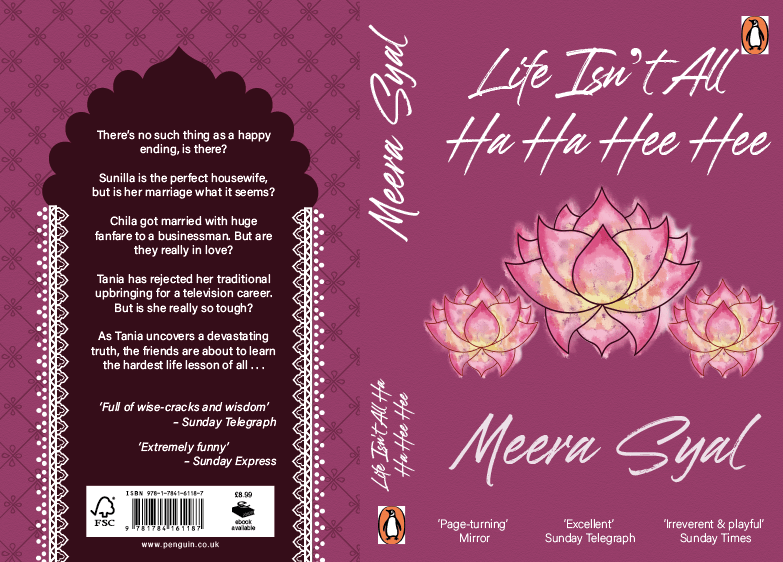
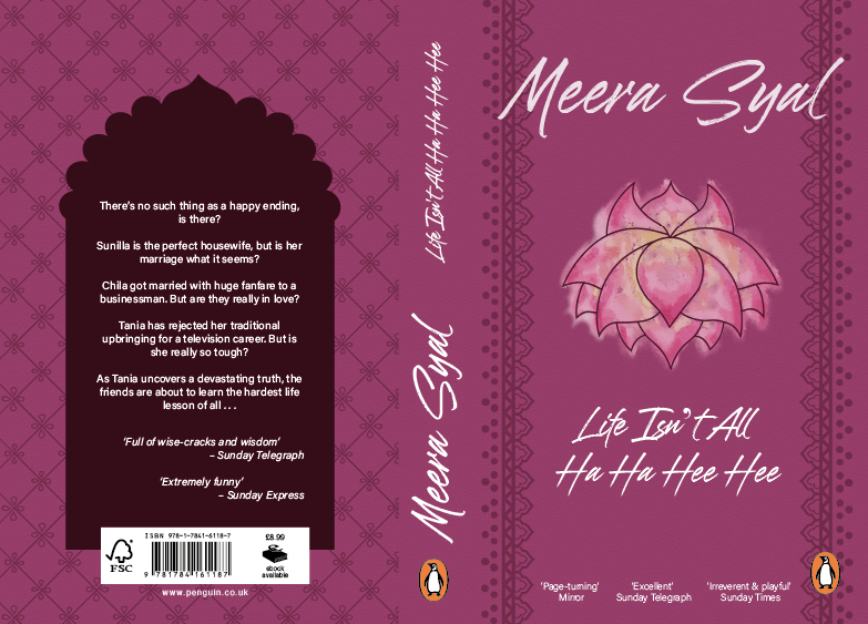
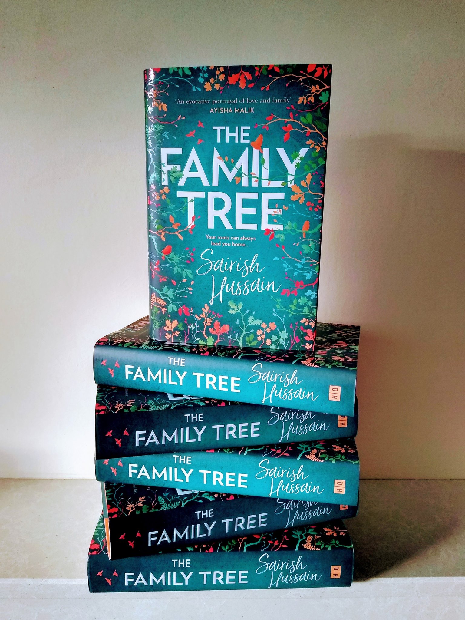
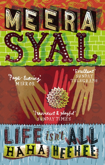
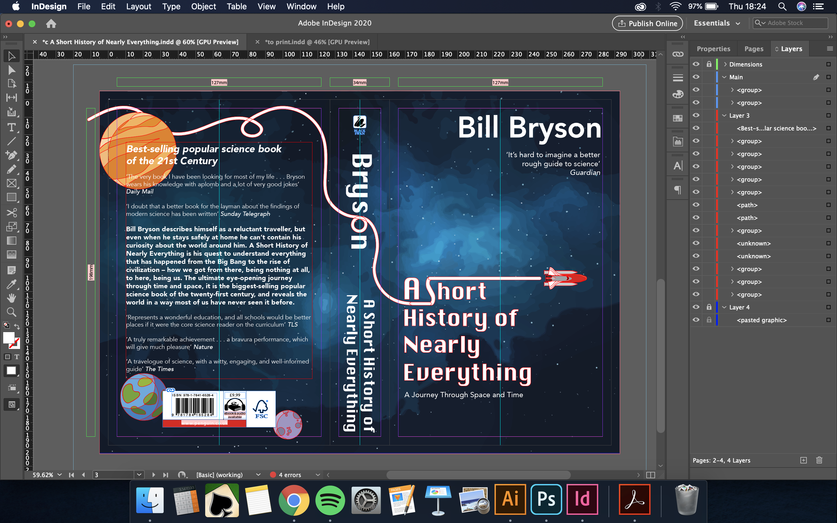
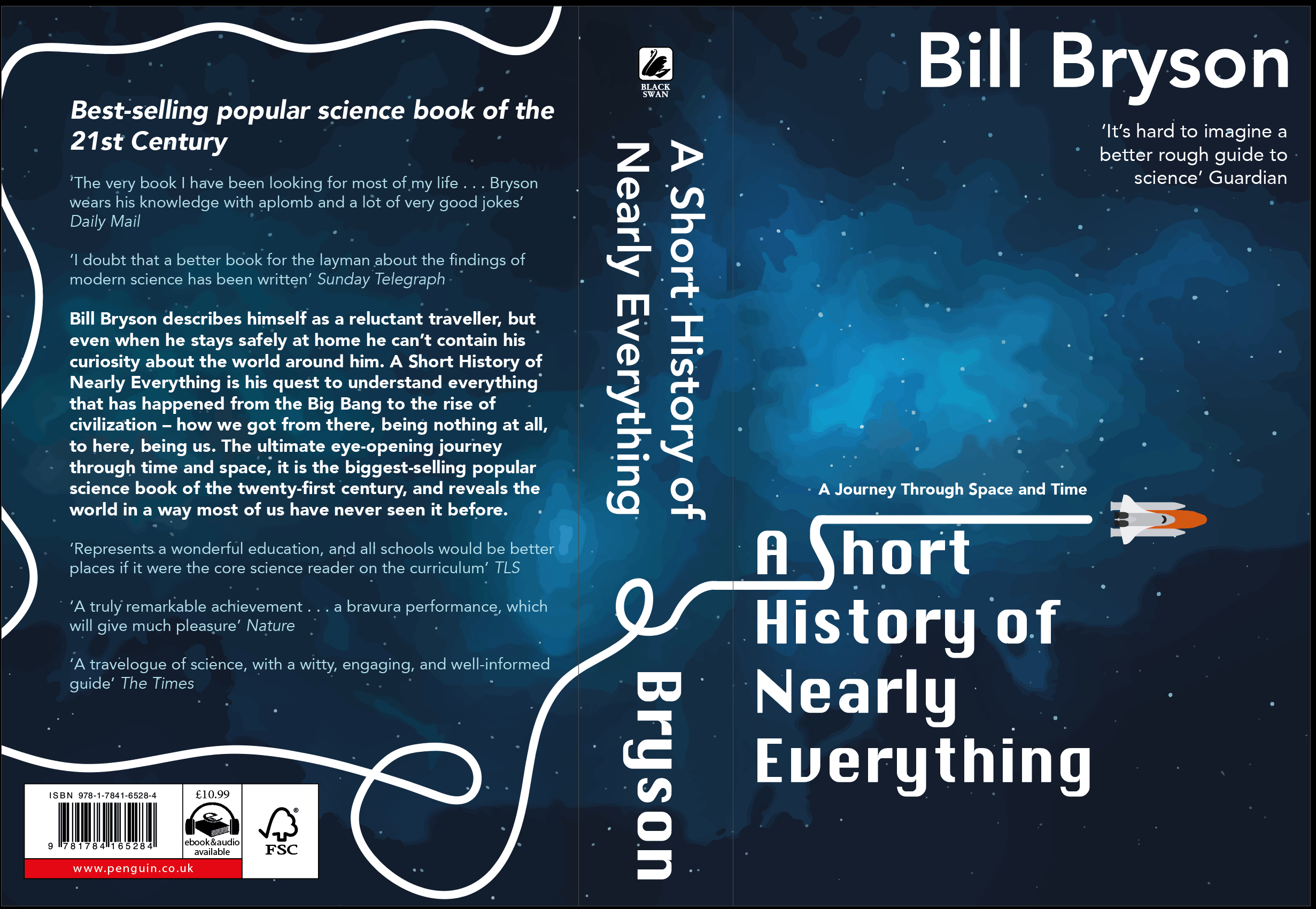
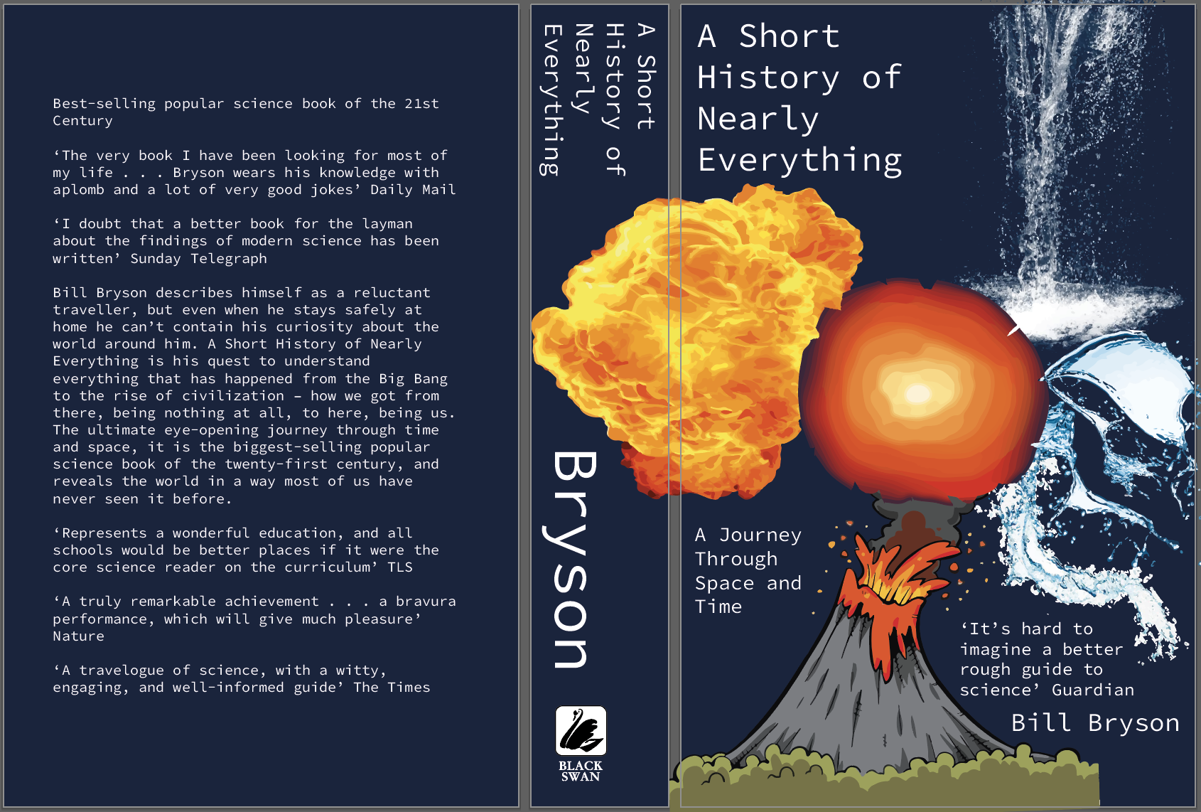
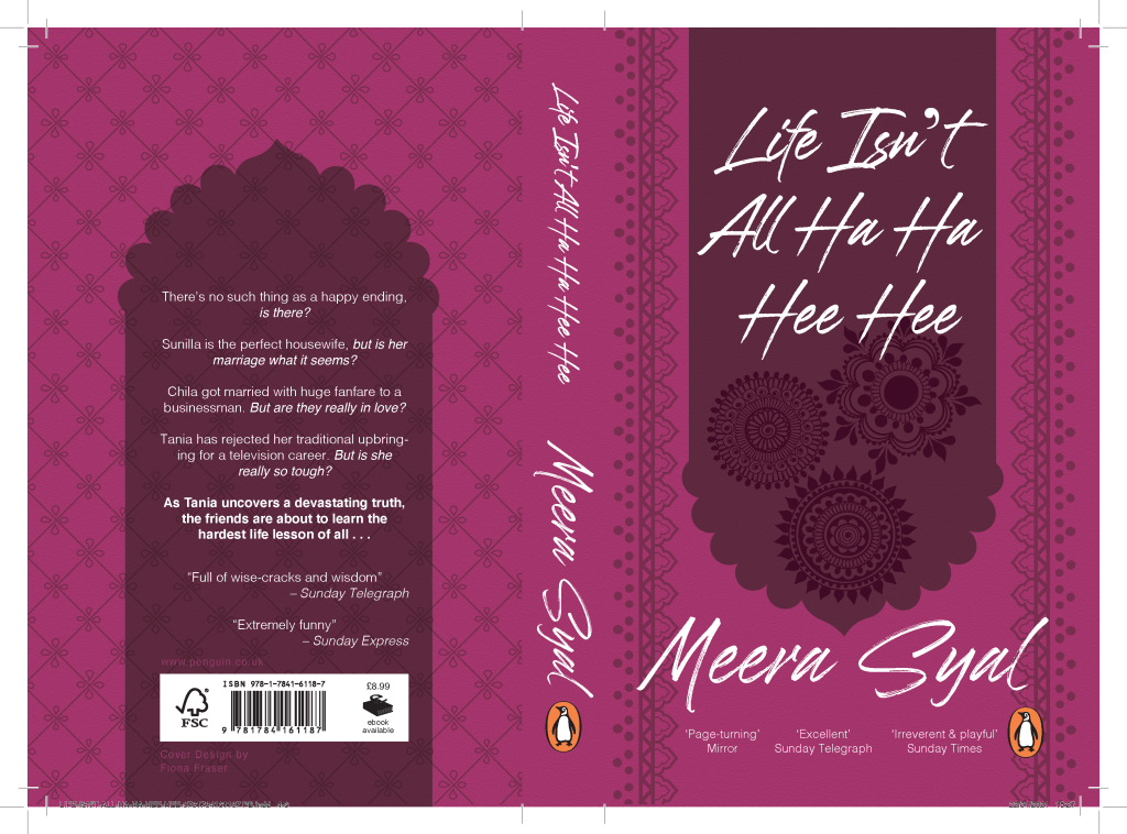
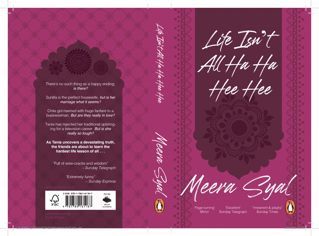
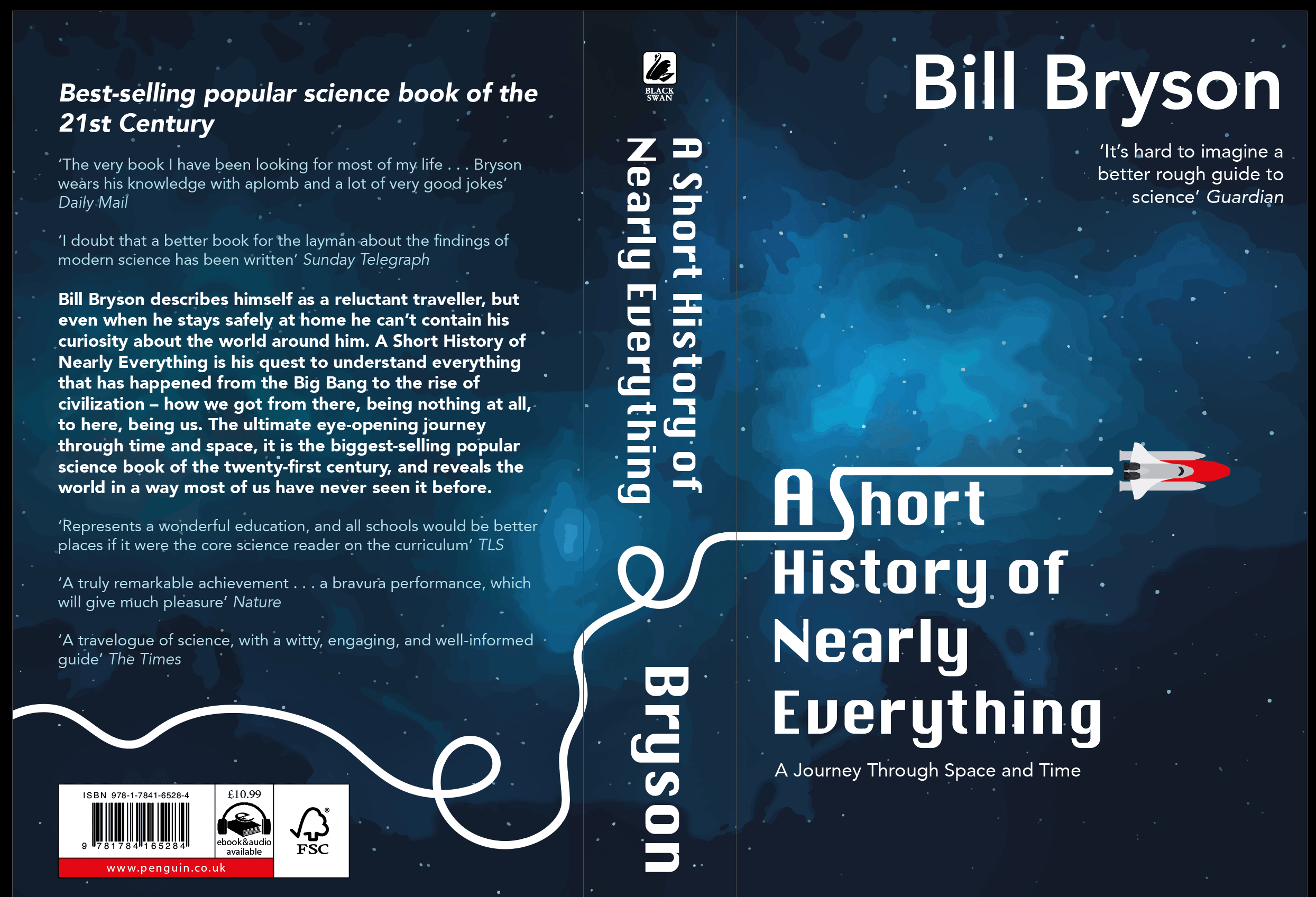
the typography and how that effected the dynamics of the piece – changing the type on the spine and blurb at the back. It was suggested that the off white tones from the quotes didn’t work and I agreed feeling they are already lower on the hierarchy through size so a colour change was not needed.

On top of that the rocket seemed off with the orange dull colour so using the colour given near the barcode I feel it is more cohesive and brighter. I then went on to add more depth and detail adding slight shadowing and highlighting in places.

I also decided to remove the extra line of the ‘journey’ that the rocket took. This opened up the space not letting the viewer become over whelmed. However, in a tutorial others suggested that the  lines were too simple and basic so maybe the rocket could pass some planets or space inspired cartoons. Adding planets the design now looks complete with all the elements and just the right amount of boldness and detail.

Screenshot 2020-02-26 at 23.47.25

Book Cover – Visual Ideas

Week of 17th Feb – Visual Ideation and Feedback

At first I visualised the ideas using other people’s designs. I also wanted to look at all the type needed to place within the specified areas. The first idea was a sort of explosion of different matter within the universe – taking water and fire into a main bang of life. The feedback was that it was a good idea but needed a lot of time and detailing of creating my own illustrations.

Screenshot 2020-02-20 at 17.36.15

Next idea I went for a more minimalistic idea of creating my own space theme background then adding strong bold type on top. The background needed brightening but overall they seemed pleased. However this design, if taken forward, would need a more depth to it. The design is plain and it needs that key feature.

Screenshot 2020-02-20 at 17.36.29

Liking both my ideas I decided to try and do both simply then see what one i preferred more. I created a vector image of a rocket that was basic and almost like a children’s toy to add playfulness – making the line of travel into the ‘S’ shape in the updated typeface of the title. I then lightened the image and brightened the stars/ dots making them bigger. This meant that the background was something to look at, creating more depth.

Screenshot 2020-02-26 at 23.29.17

Screenshot 2020-02-26 at 23.38.12

I then went to my first idea to create a waterfall meets volcano but this was time consuming and did not look the best. So scrapped this idea as I was on an extremely tight time schedule due to family reasons and the rocket with typography felt right to take forward.

Penguin Book Cover Competition

Tuesday 18th – Introduction and Research

The task is to design a book cover for our chosen book within the strict guide lines Penguin has supplied to enter their competition.

Before today I looked into the book covers existing for Bill Bryson’s ‘A Short History of Nearly Everything.’ There are the 5 main covers that has been used as well as I believe someone else’s work found on a simple google search. Also knowing Bryson was a well established author I looked into other covers created. These all either seemed over light hearted or like extremely heavy school text book. Neither of which would appeal to the masses that the book is aimed to.

Screenshot 2020-02-25 at 16.18.37

Within groups we thought about key themes that are in the book and having listened to a fair chunk on audio it was easy to state the main subjects. We then looked at the classic imagery we would assume that would link to the book – making sure we knew reasons not to use something or invent the idea in a creative new way.

I then looked into what concepts I wanted to take forward. Energy, growth and movement were the key factors I wanted to explore. I thought about stars and explosions in space as that is where the book begins.

Screenshot 2020-02-25 at 16.56.54

Design a site like this with WordPress.com
Get started