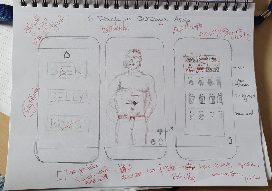
Week of the 25th March – Independent study
Moving on from choosing the app idea, I needed to look into what style choices are out there. I opened up the app store and simply searched for 6 pack in 30 days. A lot came up and the style was always very similar, with the red tones broken up with the back and white cartoon styles.
Next to get a better idea of how an app like this would function and what style choices would be made, I downloaded an app called six pack in 30 days.

The logo includes a very stereotypically masculine colour scheme. the colours represent blood and power, making the user think that they are those things. I want to use this within my own app but more tricking the user so that they want to show off their app instead of the users own abs.
The app itself was extremely basic. It loaded quickly with a man’s body, which I assume is what the end goal should supposedly be. I’m not sure if I like this as it is extra time wasted on loading and I feel that my target audience would not want to spend an extra few seconds on waiting as I feel they would most likely get bored if it was a constant thing.
This loading page went on to what training plan I wanted and onto each days training plan. Within the days it included what was needed to do which increased as each day progressed. On top of this it had a side panel that almost makes it personal with reports, plan options and reminders. For my own app I could personalise it with different sizes or colours so that each user has a different experience.
One this this app isn’t is cohesive. The logo is cartoon, with red and dark tones; whereas, within the app it uses photography with a blue and lighter tones. I feel that I can create something more cohesive, which includes either just photography or cartoons.
I’m thinking of just having a darker colour scheme of only a few simple bold colours, maybe black, white and a more masculine urban colour, like red, electric blue or a harsh orange. This should be an improvement from the exciting app as the photos use the darker more sinister tones that doesn’t at all work with the cool blue almost peaceful tones.


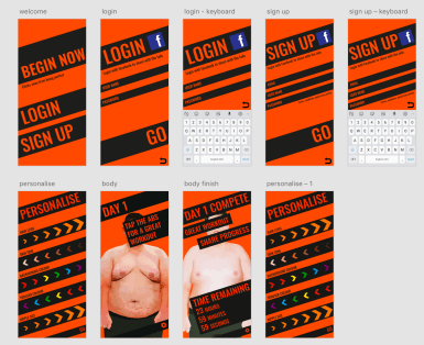


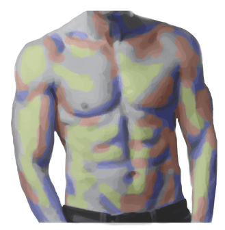


 From these websites I was able to create a base/start look and a final look. I used the image trace tool for the cartoon style and photoshopped the body parts together. This allowed me to make the personalisation elements such as the nipple size, trouser colour and so on. This also helped for when I had to make the person smaller as the app progressed.
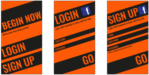


 Through using the ruff sketches I managed to create a simple design that used only two colours. I started with black and white to perfect the silhouette and the overall design. I began to use lowercase letters but I felt that the design needed to be more crisp and some how more bold. From this I decided to make the main parts capital letters for extra impact/ ‘power’.