What is the Story – Task 2
The task is to look into my era of now and what stories defines now.
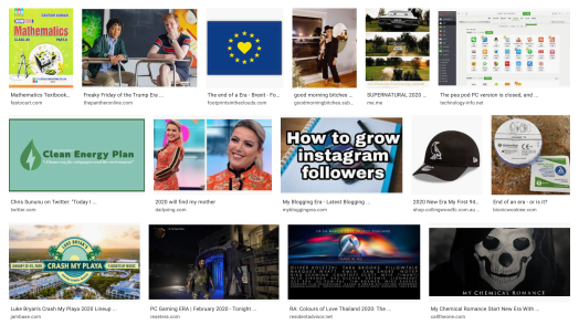
Doing the most basic thing of image search, is sometimes the most helpful thing. On there we have Brexit and all the politics that came with that. There is clean energy and being eco friendly to help the planet. We’ve got Instagram and all the social media, whether that is a good or bad thing to be so popular or not? There is online gaming, new songs, education, Netflix, TV series, merchandise, celebrity gossip and the main themes are memes.
Memes are a very recent thing and only came about from Richard Dawkins in 1976 with his book called ‘The Selfish Gene’. From then the mid 90’s had the first humorous piece but then with technology in the 2000’s it took off, to now anyone can create any meme they wish to voice their own opinion. The creator becomes the designer.
However, a meme isn’t always seen as persuasive with one clear voice so I decided to look into actual paid designers and the trends of this era.
One main factor I found was being minimalistic with little texture but bold in colours mixed with simple line work. 
I keep thinking back to when the Scouting association changed their classical logo and styling. This is a representation of how the times have changed and how aesthetic is so important to people. With the new branding of the fleur-de-lis emblem it is more useable and cheeper to print onto anything such as the uniforms and so forth. The design is to show a “more relevant image of Scouting,” meaning that the aim is to be contemporary.
The designs are aimed at both parents and children showing that scouting is “fun and exciting while retaining strong links to its heritage.” The message raises awareness of the impact scouting has on the masses. Knowing first hand the need for volunteers to give up their evenings and odd weekend, the organisation knows the power that perception is everything. since the rebranding my home town scouting group has opened a second evening and boosted up numbers in other sections too. Being the largest youth movement they want to keep being relevant and persuade adults to help as well as children to join and engage with them.
https://www.itsnicethat.com/news/scouts-rebrand-logo-visual-identity-notonsunday-graphic-design-160518
Another company is a skin care company – Consonant. They sell high end products and needed to persuade customers to walk into their store to buy products. They targeted people in the neighbourhood to engage and hopefully buy a product. This minimalistic typographic piece shows that a rough surface can be more, can be beautiful. Implying that their makeup can cover over the skin for a perfect, clear, pristine finish so why wouldn’t the a passing by person go to the store. After this advertisement the store saw a dramatic increase in local customers that continued to come back.
https://creativepool.com/zulu-alpha-kilo/projects/reskinning-queen-street-west-for-consonant-skincare


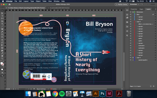


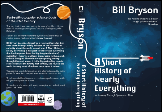
 the typography and how that effected the dynamics of the piece – changing the type on the spine and blurb at the back. It was suggested that the off white tones from the quotes didn’t work and I agreed feeling they are already lower on the hierarchy through size so a colour change was not needed.