Portfolio: The Interactive PDF; 1

First I wrote out the brief and solutions of each project that was a requirement then added the ones I want to show off. This gave me a platform to build and to select images from.

Being constant, I used the CV stying at first to be developed on later which sets the tone and gives my styling first.

Screenshot 2020-06-17 at 10.44.45

I needed a navigation so I kept it simple and added a sheen over the top of the images to make them look more cohesive.

Screenshot 2020-05-28 at 13.19.25

I kept the ending contact page simple and to the point in the same stylings as before.

Screenshot 2020-06-17 at 10.50.54

I decided I needed a constant through out my designs so took the bar/ column idea forward. Within this there is hierarchy and space to breath which I have struggled to manage in the past. All images are labelled and have equal spacing.


Portfolio: The Website

https://fionafrasergraphicdesign.wordpress.com/

The best way for me to explain what I have done is for you to experience it for yourself.

Watching the tutors tutorials helped a lot as I had no idea where to start or how to.

I struggled most with the main banner (left column on a desktop). I knew I wanted my logo at the top and then I added my name in different fonts. Experimenting with this my name in the design took away the simplicity of it. Taking it away looked neater and better; however I still needed my name somewhere and getting feedback they said it was needed.

I made sure there were several links to my instagram. I embedded some within a project as the project is on my instagram. I added my favourite insta images to both the contact page and about me page.

Portfolio: CV Development

Using my logo, I created a basic template. This includes all that is necessary and is very straight forward.

Screenshot 2020-05-16 at 15.29.55

Discussing this with my tutor, he immediately said you want the words to speak – don’t let the image get in the way. I needed to experiment with the image for the best result. Also looking into the paragraphs he said I need to add onto who I am as a person.

Screenshot 2020-05-16 at 15.30.31Screenshot 2020-05-16 at 15.30.41


Portfolio: My Style

My last portfolio, although was cohesive, it didn’t have a brand. At this point I have yet to created a logo to show off who I am. With the 100 ideas being over 100 miles away from me, I decided to recreate some and add new thoughts and experiments. From what I remember my 100 designs were not the best and I mainly only used my name in different orientations. But what I want to do is have a symbol that can be used and used again.

As I like the outdoors and camping, I went with a sunrise (or set) I draw several and these were my favourite.

Screenshot 2020-05-16 at 15.32.21

I digitalised my favourite 2 and then developed from there.

I started to play around with colour, texture and spacing.

Asking family and other students they felt this design worked the best. Asking a tutor what they thought, they felt that the type needed work and a hierarchy system. I am still not sold on the type at the minute but plan to try more variations. Or just remove it all together.

Screenshot 2020-05-19 at 12.51.39

Persuasion: Final Feedback

Sending my work to the tutors. My feedback was very positive but with only one major tweak. It was suggested earlier that I should add other characters and I was reluctant because time was limited. So with a smaller amount of time – 3 days – I created six singing fruits.

Applying these to the pre existing designs are easy so I went and made it harder by adding depth with block shading to make them pop.

Screenshot 2020-05-14 at 11.24.35Screenshot 2020-05-14 at 11.24.51Screenshot 2020-05-14 at 11.25.39

Persuasion: Client Feedback

After sending a simple slides to the client of the work so far they liked the idea of each raindrop having a spotlight each.

Screenshot 2020-05-14 at 11.08.09

Keeping with the same theme I developed the social media for an online presence as well as physical mockups to be seen across Cardiff.

Screenshot 2020-05-14 at 11.08.15Screenshot 2020-05-14 at 11.08.22Screenshot 2020-05-14 at 11.08.30

Persuasion: Feedback

24th March – Feedback on 3 main concepts 

Screenshot 2020-03-24 at 10.16.34

This design I believe is the weakest and people did not react at all to the designs, which is not great. So going forward I scrapped this idea to push forward one of my other designs. I needed to add the fact that all is welcome no matter what capabilities or lack of experience. Also I should of added the starting date or plan to start by October, if we are allowed back out.

With the feedback I then created a better version of the original draft. This version having a less dumped but but a nice hierarchy of text to image – drawn in and teased my the bright food then reading and quickly realising its a choir where you can eat as well.

By having the feedback they thought it would be better if the drops had some context and have a playful nature to them. By taking out the logo and moving it the faces became more of the forefront and the eye is taken along the rainbow of faces landing on the logo. I still kept the st-david hall’s logo in the raindrop to not over power or take attention away from the main Arts Active logo.

I struggled to find the right balance for the clouds and ended recreating them 3 times and the last time worked well with the simple lines and shadowing. I decided to add shadows to the drops as well for depth and texture. This makes them look 3D and brings them to life. I added more changing the sizing to really fill the page as feedback suggested to take it further and see what will happen. Pushing more I added the music notes to have that extra clarification of yes it is music that voices create.

Screenshot 2020-03-26 at 17.57.19

Going forward I need to pick one and create applications ready for the clients first reactions.

Persuasion: Initial Digital Ideas

Week 2 – Creating my first designs

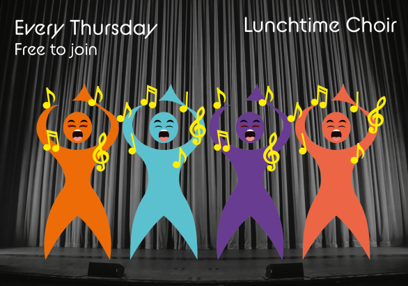
Having all the information I need, I fell ready to start creating and confident in what I will make. Using my initial sketches I created the singing person and then realised I could integrate the st-davids hall logo in the arms.

I placed these in a banner style with a simple back and white image from unsplash. After some simple feedback the people looked angry so I added music notes around the heads as if they were singing not yelling. I struggled with the colour choices on this one as we have been asked to use the purple tones throughout.

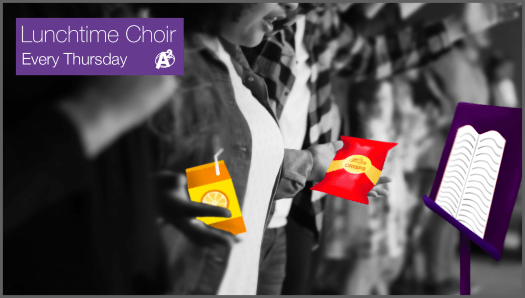
Moving onto my next idea I created a basic music stand with some snacky lunch items. Developing it to the purple undertones and added better detailing to the drink and crisps.

Screenshot 2020-03-26 at 22.25.33

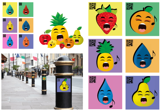
I remembered when talking to the client they liked photography a type so I thought to be wacky add the snack items to group of people singing. The image is from unsplash so free to use and I played around with the tones and shading. At the moment my least favourite part is the typography so that needs more and to change.

Screenshot 2020-03-24 at 10.26.47

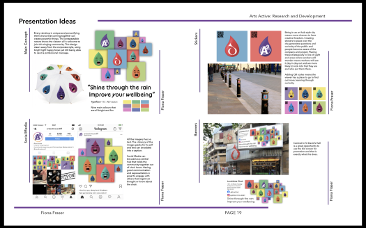
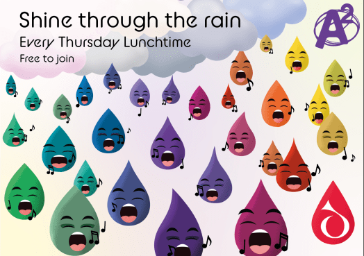
My final idea was just a create a shape and pop the face already created into it. After creating a few random shapes I most liked the water drop. I created a rainbow effect with the purple in the middle so that the logo can shine. This looks more enticing and friendly.

Screenshot 2020-03-24 at 10.32.46

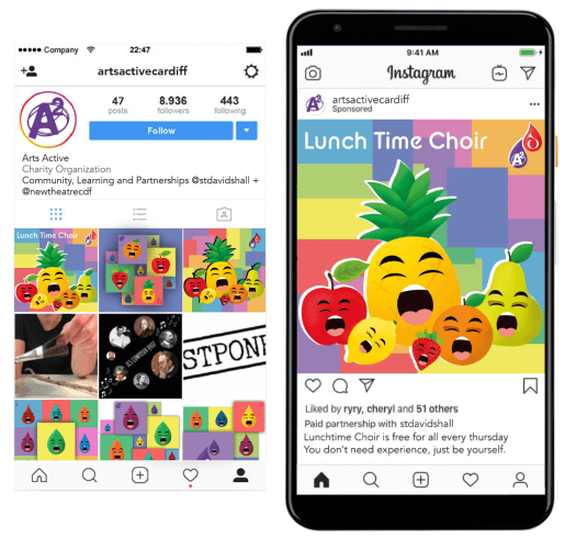
I then went to create a version that could go on their social media accounts. I am happy with the colour scheme and shaping. I might need to work on the hierarchy and flow of the images.

Design a site like this with WordPress.com
Get started