Research

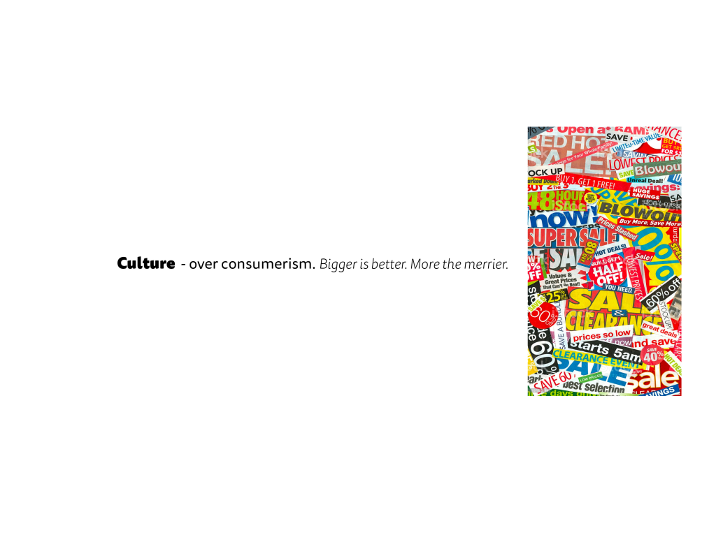
I looked into winners of D&AD about plastic as I remembered a lot of work has been done on this topic. I found several completely different versions of how to tackle the issue of plastic and especially the single-use bag. One was to add it to fashion and create extra sleeves that zip off and make a bag. Another was so sensor all plastic in celebrity (YouTube) videos, which show the mass of single use plastic in a simple 5 min video.

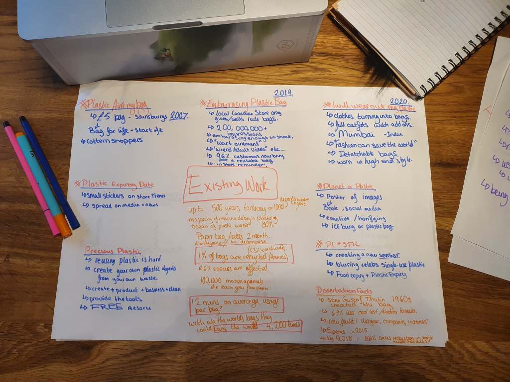
My favourite finding is a Canadian convenient store that no longer sells conventional plastic bags. Instead they sell embarrassing bags with funny logos, such as “into the weird adult video” or “Colon Care.” This lead to 96% of all customers now bringing a reusable bag to the store. This shock of embarrassment did the job amazingly and had the American media going crazy for it with 200,000,000 plus digital impressions.

Embarrassing Plastic Bags Are Shaming People in to Bringing Reusables

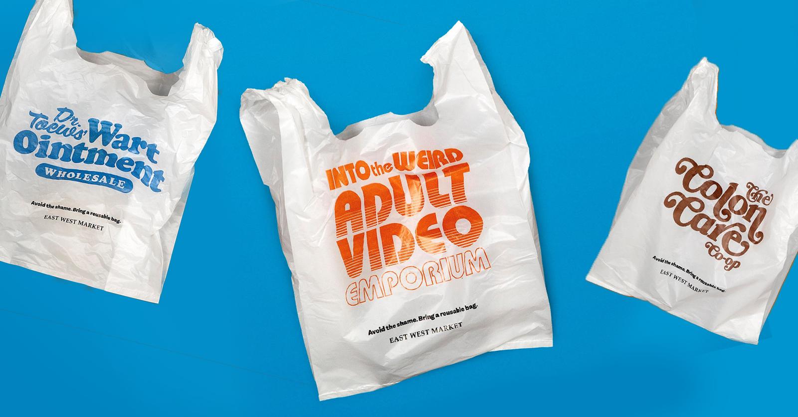
https://www.dandad.org/awards/professional/2020/232542/embarrassing-plastic-bags/

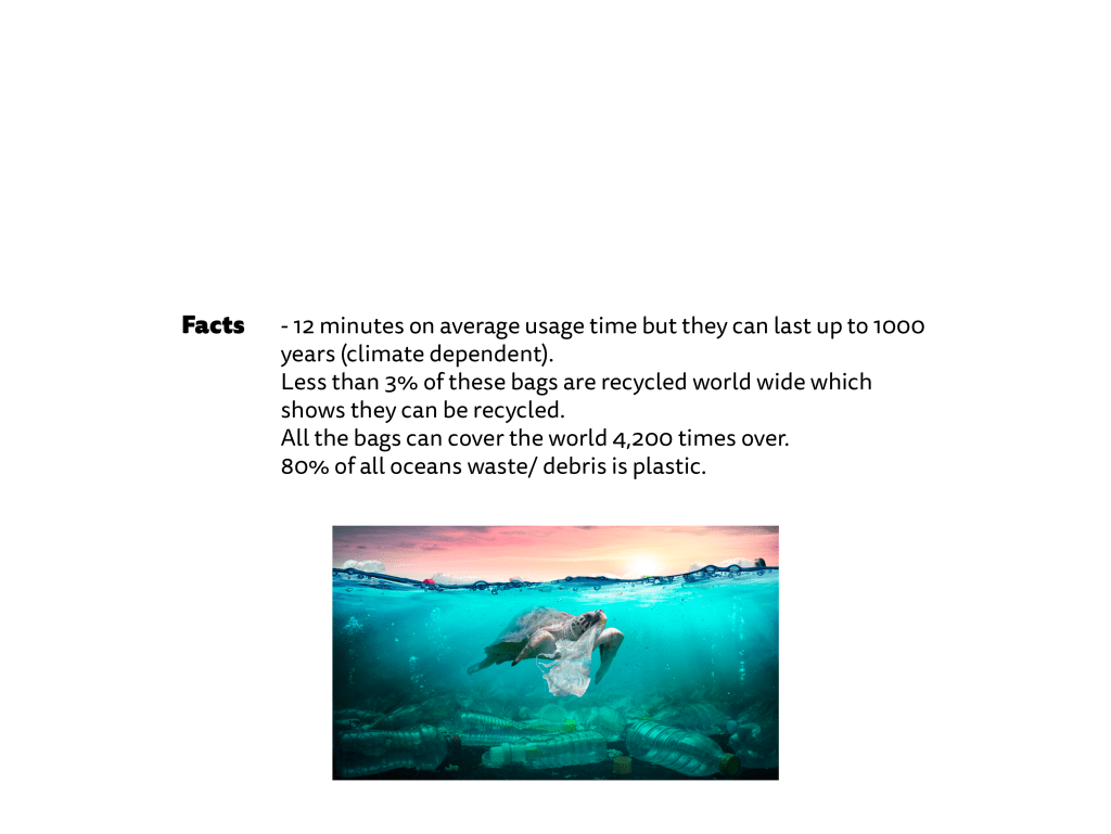
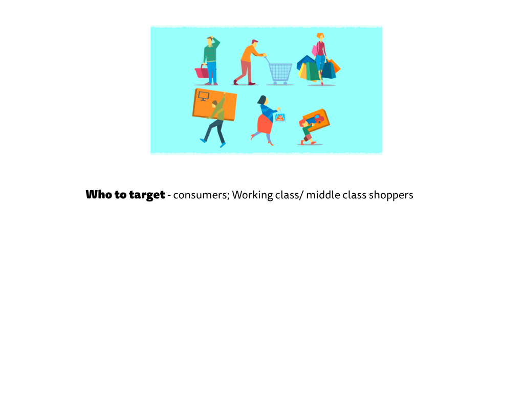
I also found facts on plastic bags and one that astounded me was the fact that a bag is used on average for 12 minutes (or 25 minutes from more official sources – https://zerowasteeurope.eu/products/plastic-bag-free-day/). This idea is that you engage with the bag at the store, putting the items inside, then you don’t engage with it in the trolley, as you don’t need bags in the trolly. Then you place the bags in the car engaging with them but you don’t need them in the car as the car is a reusable holding vessel much like the trolley. In current the world this is increasing as consumers realise that you have to pay for a bag so they are saving money but this stat still is shocking. 25 minutes usage with up to 500 years disintegrate (or 100 years plastic dependent). It is outrageous.

Criticality Group Talks

In a group tutorial the tutor said to create a sentence as your main point – what do I want people to think about? I had no idea so began to think.

Do you need another bag? This is one statement clear and to the point. I might add plastic in there but if the context is clear enough I want to keep it short.

The tutor also said my idea has been done hundreds, thousands of times so I need to think out of the box. I have done this before with the 6 Pack App, the Chicken Poxism Party so I need to think like I did in those projects. Due to lockdown I have found it hard to be creative and think like I have in the past but this is my final year and I need to concur it. To overcome this I need to do one of the creative techniques, such as the 100 ideas. The tutor said to think about lateral and liner approaches, the unexpected or different ways but link it all back to what I value. From all this I decided to write out clearly my approach.

I needed to back up my argument that it was a problem so I took my point and googled it adding facts along side my existing knowledge from my dissertation. I was shocked to find on average a bag is used for 12 minutes then discarded even though it can last for hundreds of years.

At first I assumed my challenge would be to reduce the amount consumed but that is not my task. Being a graphic designer I find solutions and this project is not to do that. My tutor told me I need to disrupt the perception on our topics. Thus, my new approach to challenge opinions on how easy it is to buy a bag is.

This would challenge the consumers directly. These would be an average person going to the shop like the middle and working class.

Overall the tutors kept mentioning different artists and their work. This means research is key to this project and before I can visualise my idea I need to research what is out there.

Afterlife; Renwick

First Afterlife – Jack Renwick & Susie McGowan

When I found out that Jack was talking I became very excited as last year I saw her at 4 Designers Conference in London. I had and still have a high opinion of her; she is engaging and confident. I always find her life story interesting as it is very different from the more typical schooling then into job work.

Through her unique journey she has a great perspective on how to engage with her clients. For instance, start by telling the client what branding is. Jack uses the example of a country side simple hand painted sign saying fresh eggs. You know and think these eggs have been laid this morning at a local family farm, but further down you see the same styled sign with flying lessons. You are less likely to go there as flying you want safety and professionalism, which the sign is not showing. Thus our job is to create something with the right impressions for the audience.

She also says give what the client needs and think how your work can help them in the long term. Using the example of a turnip farm needing business cards, Jack’s company decided to go the extra mile with creating all branding not just business cards.

Jack and her employee Susie answered some questions from us students to help us get a better understanding of the transition to the creative, job world. They said don’t ever go for an unpaid internship, value the work you do. But if you or I can get an online with courses and webinars. Network through these. BE BALLSYYY! Connect and message people in those calls and start a working relationship. “Your message… resonates with me because… I hope we can work with each other in the future.”

They answered a question of portfolios. They said go back and add past work and show how you have improved by polishing work. They also said add personal work. It is great to add competition work but that will also be seen somewhere else so make it personal and different.

Overall, she is a great role model and I’ve tried to connect to her on LinkedIn as by Christmas course told me to get connections with people you admire.

Concepts on Critical Design

To keep my outcomes personal, I created this list.

I then cut my thoughts to 3 different ideas of reducing buying plastic bags, asking why clothes are the floor not where they should be and why does everyone have a useless collection? I think the plastic bag idea has more opinions on the matter and is more global, which is backed up in my disseration. The idea came from my boyfriend coming home with 2 bags when he could have carried the items inside. I think this happens too often in other households as well. For the idea I could take loads of bags and bodge them together to make a monster bag that lurks in the cupboards of homes globally. There are many more visuals like these as well, so I’ve made my mind up and pushing with this.

What is Critical Design?

Lecture & Brief

Starting this I had no idea what critical design is and now I feel I have more of a grasp on the concept. By the end of the 3 weeks I am certain I will fully understand it.

The overall idea of critical design is to challenge opinions. The thought is not to come up with a solution like branded, client based design but to draw attention to most likely an issue. The lecturer uses the example of premier inn’s recognisable rooms. The do not change or differ no matter where they are in the world. The same paint, bed, wood fixtures, curtains and even the identical painting/ printed canvas design is used. I was told to think of this as affirmative design or the classic client/ brief based designs. But critical design is made to challenge these notions and come from a narrative.

I learnt that even designers in the field conflict on the theory. I agree most with Anthony Dunne and Fiona Raby (D&A). They say this type of design is finding problems for service of society to make us citizens think and debate usually about ethics of that medium.

The brief in my eyes is to change things up and be ambitious. I have freedom, which is daunting and scary, but a platform to finding issues and broadcast them in any way I want. I feel the brief needs to be personal and use my interests, which is where I will start.

Penguin; Final Desions

After some consideration on finding the meaning, I decided that I liked it pretty and purple. It focuses on the balance of making things look nice to please people. Thinking about my dissertation and manifesto on being an ethical designer, I have not listened to it. I have created a non-innovative piece that’s main purpose is to look nice. This week has challenged me as for once I am unsure, I am questioning my decisions and have no real answer. Is that a bad thing? I don’t know and it’s ok to say I am unsure.

I did play around with it adding vibrancy, and life of a wedding scene but adding took away from the calming, delicate design.

To make the colour pop I tried this. I don’t think it works as there is no balance. If it did work then there could be greater meaning with the lives are a bit dull (black and white) or for better words set in their ways until Tania comes along and turns everything upside down with the explosion of colour.

I didn’t like this design so reverted back with the calming presence and I like the feeling of safety and so did Chila and Sunita in the book.

Penguin; Development

My feedback was some what positive. I needed to add more depth and meaning to the design. It feels safe and what you’d immediately think of. I initially began to play with colours and shading.

I felt there was something missing so looked back at my first drawings and realised I wanted to go back for the rule of 3. I researched henna tattoos and drew 3 symbols from them to represent the 3 women. I liked the watercolour effect so added that in for texture.

In the past, I have not experimented enough so I wanted to try new things with these. I experimented with the text on the back because in my feedback they hinted that it was basic. I highlighted a chunk by making it in bold. I remembered that I was told to reread the sentences and pull the meaning out. Each sentence ended in a question so I wanted to bring focus to each of the nudging questions.

However, I am no happy with my cover as it doesn’t bring me anything. All my past work has had meanings but with this I am struggling to find any. Yes it is pretty but whats behind it. The book has so many emotions and I want the cover to show that.

Penguin; Ideation

Having a week project means I needed to get started right away and not think to crazy so I get onto my designs (this always takes the longest).

My first idea was to have rules of 3 as there were 3 women but after talking to the tutors this is what others talked about. I wanted to be different and use 3 visuals, so I looked at the idea of the henna and Indian decorations instead of the women themselves which opens the book. I began to look into and recreate the patterns on paper.

I quickly drew up the lotus flower as that holds a lot of meaning of purity and rebirth/ regeneration, which the book is about 3 women changing in their lives. I added the water colour element as the lotus flower lives in the water.

I placed 3 of these within the cover of the book and found this script font to go along side it, called Brushwell.

I thought this was plain and needed detailing to the back, as last years designs were simple and based around the typography I wanted to push myself to focus on my other elements. I added to the decorative theme by including a textured background.

Penguin; Book Reviews

Life Isn’t All Ha Ha Hee Hee by Meera Syal

Ahimsa Supriya Kelkar- the story of an Indian 11 year old bride in the 1857.

http://neilswaab.com/portfolio/ahimsa/

This book immediately tells the viewer it is about an Indian girl. It flows nicely with the symmetry and has balance with no over crowded spaces. The illustration and colour scheme is seamless. Its minimalistic tone makes it contemporary and youthful for the audience aimed at teens and adults. For my cover I need to push for an older audience and do this through the details.

The Family Tree by Sairish Hussain – the story of British Muslim family living life after losing the mother

Sairish Hussain on Twitter: "The Family Tree 💓 @HQstories @MsLisaMilton  @whitehorsemews @EmilyKitchin @LilyCapewell… "
https://twitter.com/sairish_hussain/status/1219282358307905536

Again the colour scheme is simple and uses the same colours. This book however has more autumnal tones using the blue/ green tone as the main colour. Overall this book is looks more for the older generations, which I believe is from the finer detailing and script lettering of the authors name. This cover has great hierarchy too but is a safe design. For my cover I need to think away from the first ideas and try not to be so safe.

The Vanishing Half by Brit Bennett – a story about identical twins living different lives in the 1950s as their skin colour defines them.

The Vanishing Half by Brit Bennett: 9780525536291 | PenguinRandomHouse.com:  Books
https://www.penguinrandomhouse.com/books/576782/the-vanishing-half-by-brit-bennett/

This contemporary design uses bright and colours that is only really used with female high-end fashion brands or Refinery 29. Instead using the fades to introduce the merging of sisters yet keeping their colours very different much like their opposite lives. The font is simple with no difference between the book and the author. But the image overpowers the text. This is a very stylish cover but holds a greater meaning. For my design I need to think about the greater meaning and rational behind my design.

We Should All Be Feminists by Chimamanda Ngozi Adichie – A short, effective essay about gender, the wrong ideas many people have about feminism, and why it is important.

Most of these books have different varients but one always stands out over another however, this book has 2 very different styles both of which are for sale. The right has an almost African feel to it with the complimentary colours and painted pattern style where as the left has geometric, almost futurist or constructivism style. This raises the question of how much I should add in the Indian styling to fit the book and the current market?

Taking these ideas forward I need to keep to bold type with good hierarchy. A simple, lighter colour scheme – no one used black but all use white? A repeatable pattern or style.

Penguin; The Book

Life Isn’t All Ha Ha Hee Hee by Meera Syal

Meera Syal best known as a comedian wrote this book in 1999 and then later published with Penguin in 2012. I recognised the actress from Doctor Who back in 2010 but she was most famous because of her culture and background as an Asian British woman finding success in many areas such as; comedian, writer, playwright, singer, journalist, producer and actress.

The book is about 3 Indian women in their mid 30s living in England. In a Bridget Jones style book it plays out their journey of stress and discovery. Chila, a nice Punjabi girl married Deepak in the first pages then we meet her 2 childhood friends; Sunita, the former activist law student, now an overweight, depressed housewife and mother; and the beautiful Tania, who has rejected marriage in favour of a great career in television and life in a trendy apartment with her English boyfriend.

Chila, Sunita and Tania grow as people as are expected to revert to being obedient mothers and wives but their world explodes when Tania makes a documentary, starring Chila and Sunita, about contemporary urban Indian Life. The result is an impactful story of friendship, marriage, betrayal, and the difficult choices woman face.

The book has many cover versions and the most recent is the textile, illustrative cover. I believe this to be more childish and not aimed at the adult audience. Whereas some of the others are very outdated and I could see fade into the background.

https://www.penguin.co.uk/books/1004976/life-isn-t-all-ha-ha-hee-hee/9781784161187.html
Design a site like this with WordPress.com
Get started