FMP; Brand Development

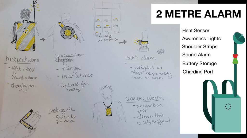
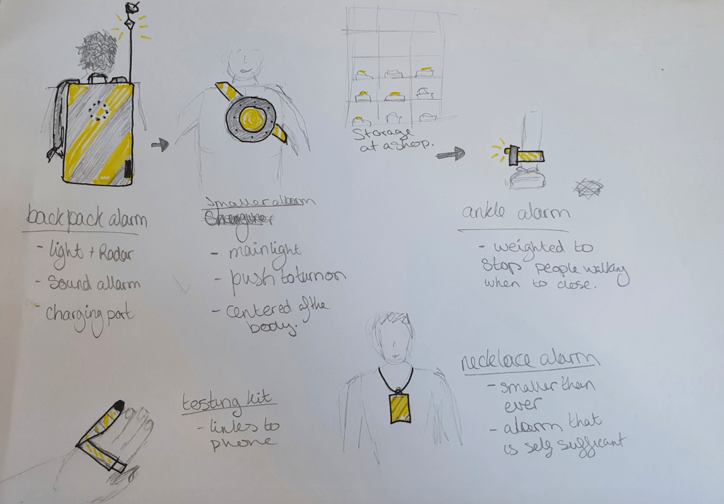
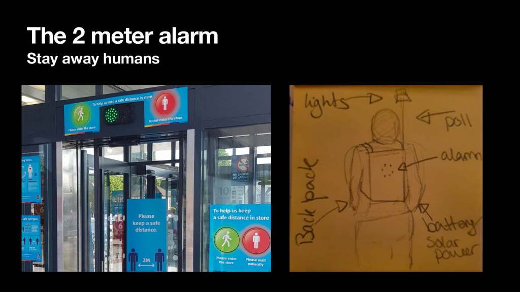
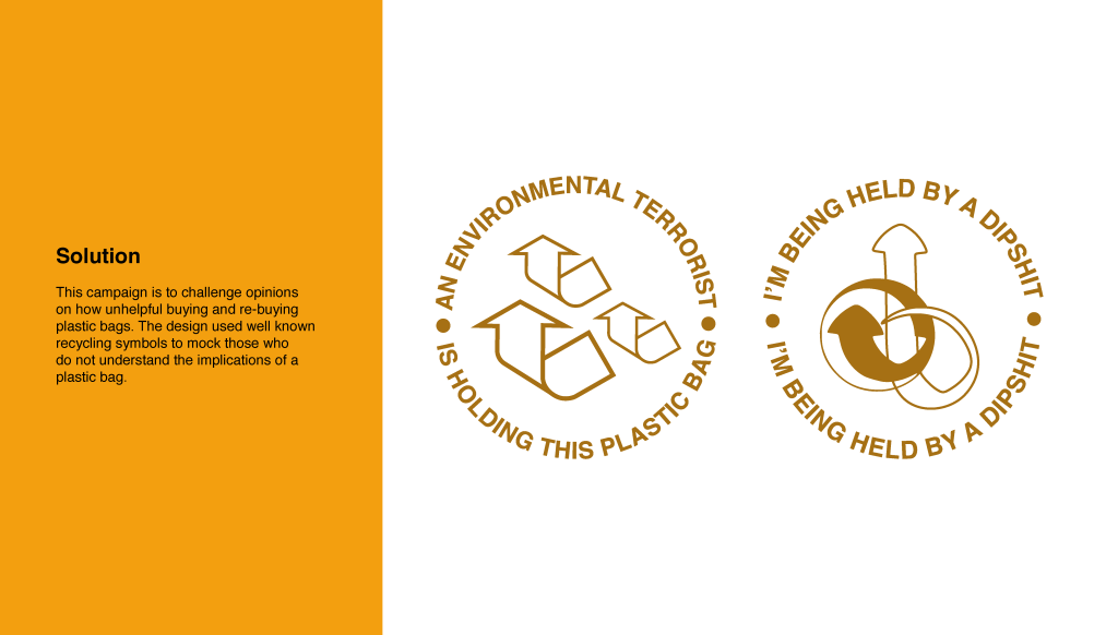
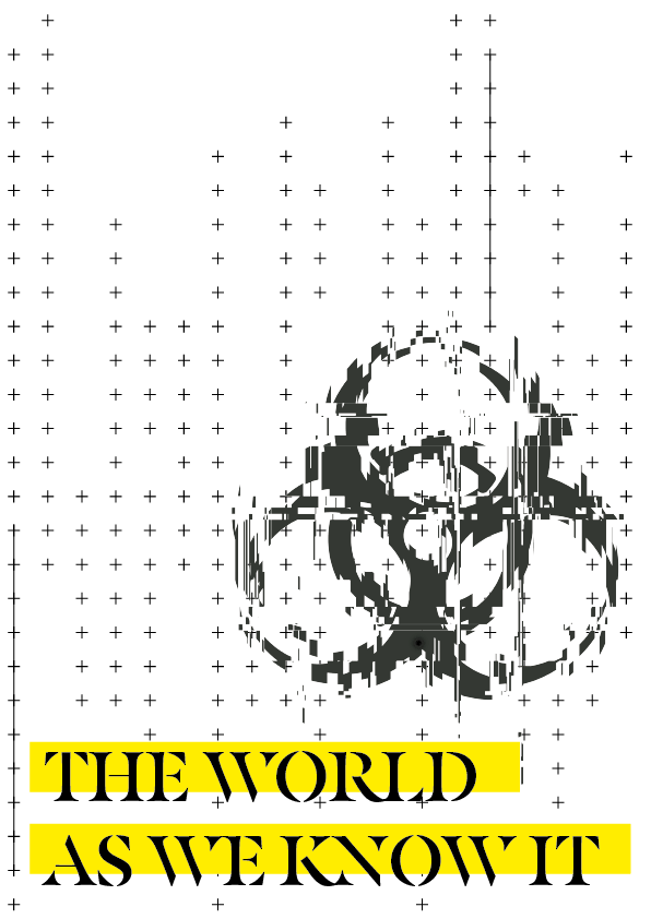
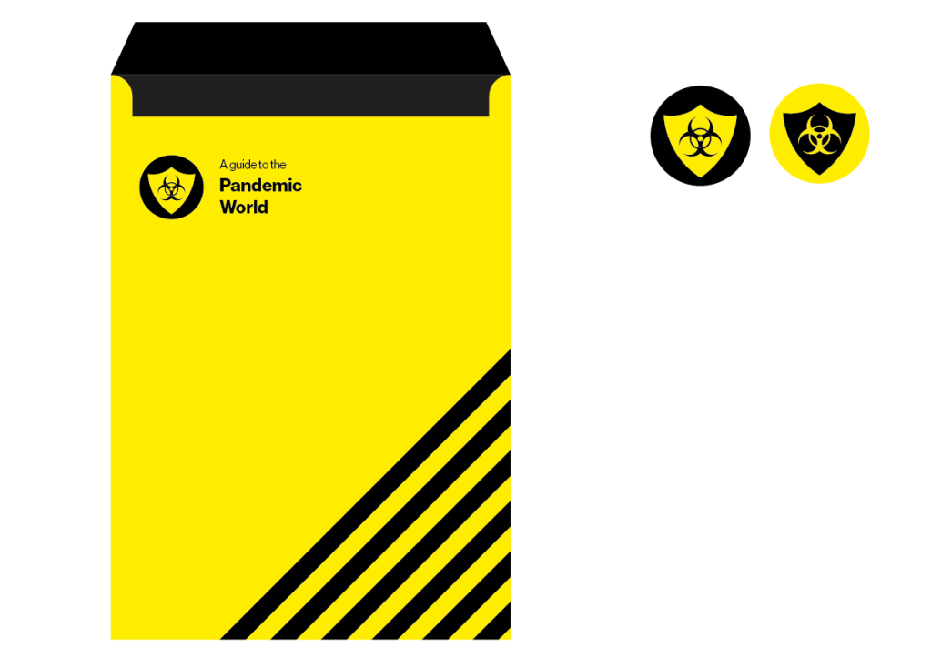
Following my feedback, I needed to work on what I will show and boost the visuals as the idea is there. How can I best show this idea, what is the outcome, how will people interpret it? First, I needed a logo or icon to keep going back to. I kept coming back to the hazards of humans and what we create such as the pandemic its self.

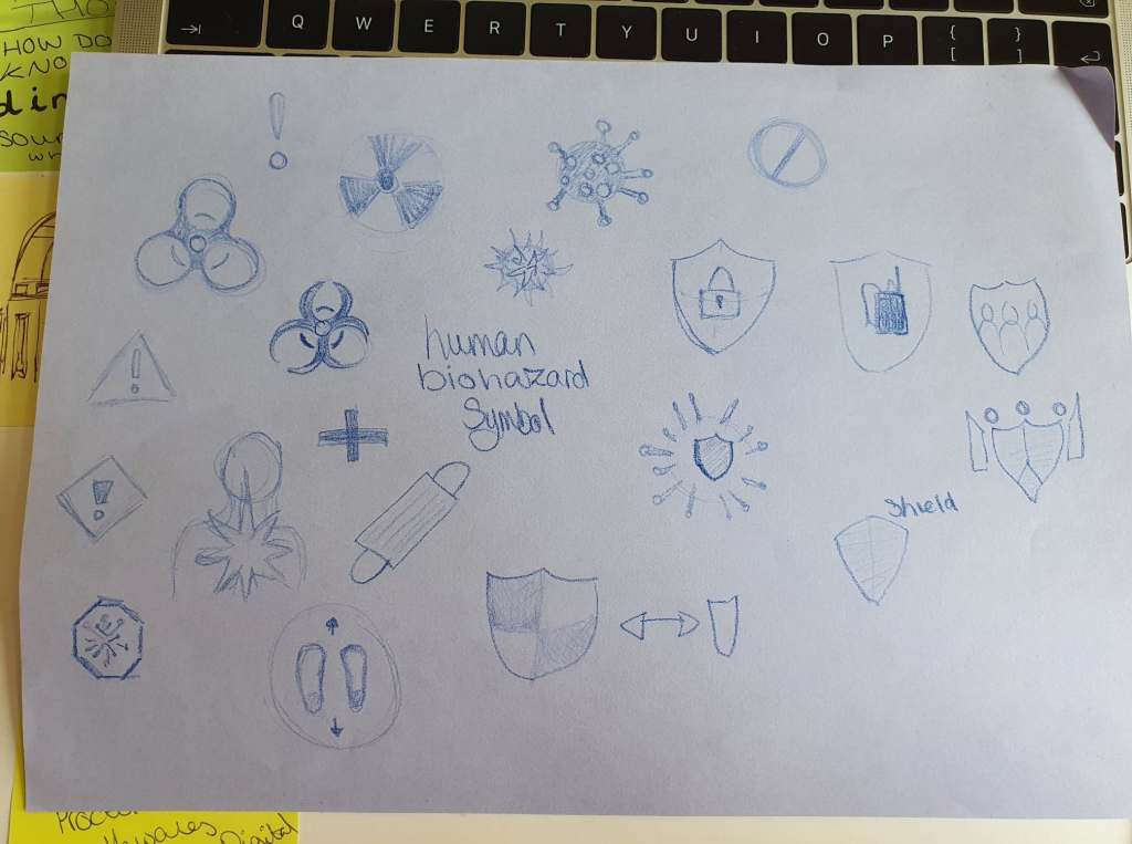
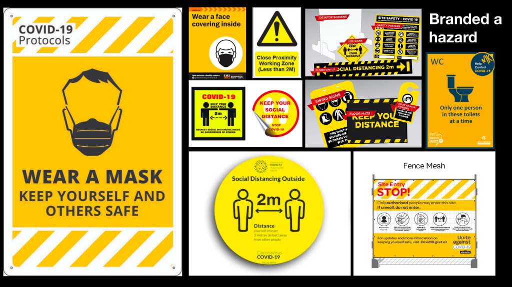
Using a biohazard symbol I created I started on the visuals and went against what is normally seen. In the current world there is speculation that the NHS will be privatised; how would that look and I kept thinking it would change everything. In this dystopian world, everything will be broken and futuristic.

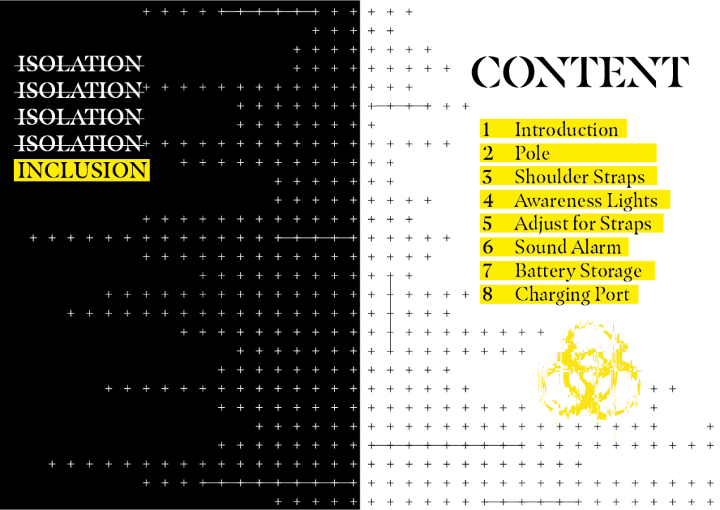
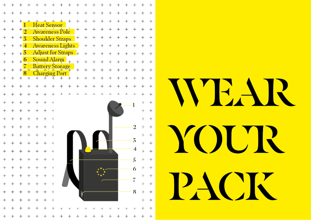
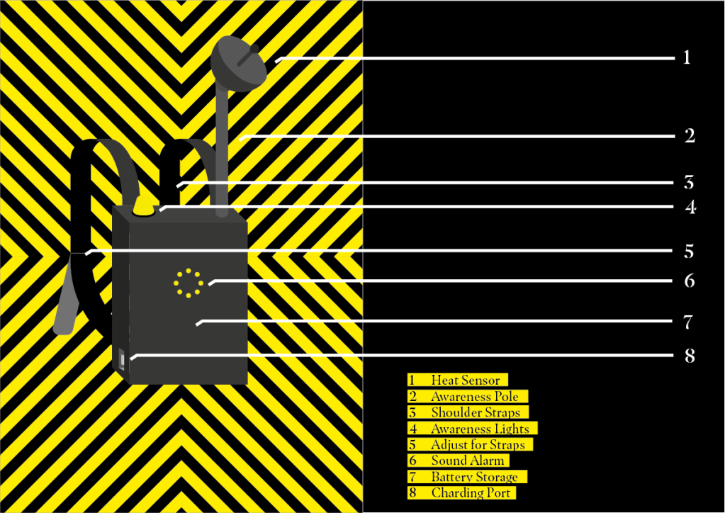
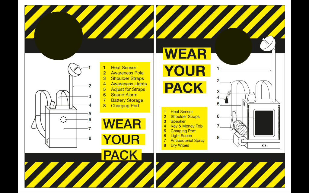
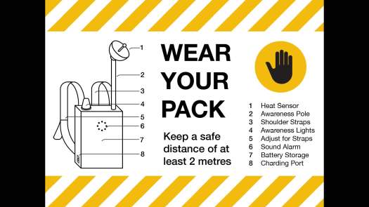
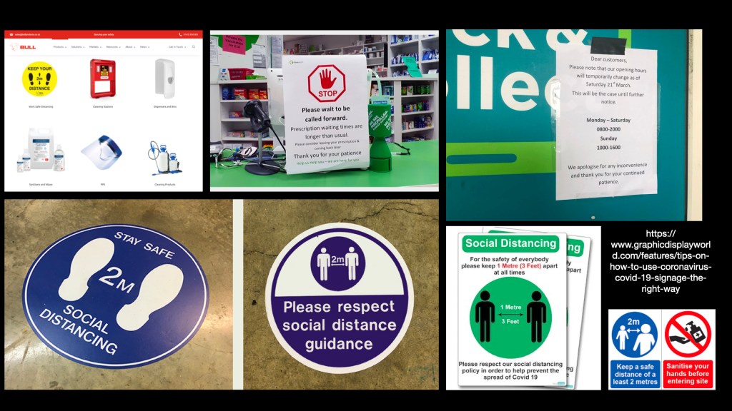
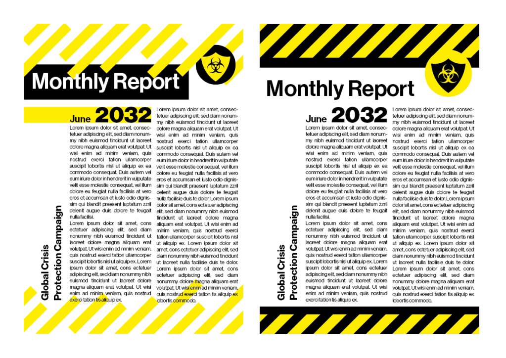
In a different dystopia everything is clean and lined up, orderly. This idea has a protection style with bold clear regulations. This concept is that everyone is sent this in the post with the packs.

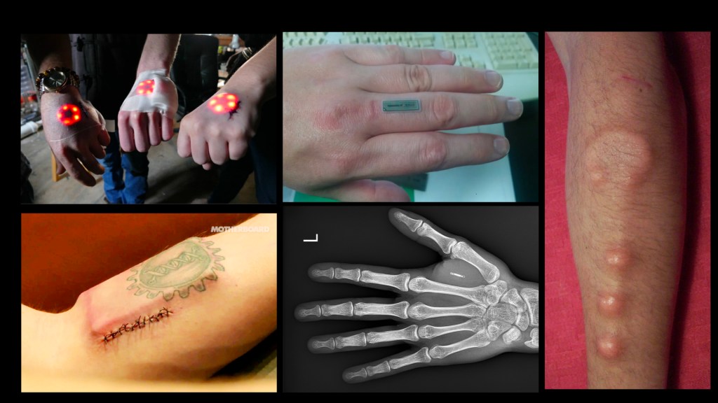
I wanted to add to the theme of the pack and add more elements for the theme of dystopian and add to the level of speculation. When you enter a store you are provided with blue paper and spray so what if that was attached in a different form. The paper design is taken from the great bulk buying and running out of loo roll. I also thought about how there is speculation that in 20 years we will be 100% cashless and we will pay with cards or our phones. I remembered back to 1st year in Plas Gwyn where I didn’t have a key it was only a card to buzz in. That was the same for the main door, the flat and even my bedroom. I speculate that the whole world might become like that so added the useful fob.

FMP; The Idea Emerging

I first created my backpack in a colour vector shaded way but then realised that it would not sit well within my chosen field.

Researching the pandemic and the designed responses, they fitted into 2 categories. The first a government lead basic, blue and white theme that you see in the motorway or everywhere outside. Or the second a bright yellow and black, hazard theme. Both however, used line vector deigns and filled the white space with information.

The word that keeps popping up is ghost-busters proving that my idea has humour and wit. However, I do need to improve and have an outcome. Feedback suggested a brand and asking how do I do things in this pandemic world. How do I hug?

FMP; Idea Development

My first thought was to create a brand for the pack and create a timeline of the future.

My Brand would sit in with the time frames but have an official government style.

The future could include implants of digital technology as I was reminded that even I have an arm implant so the digital world isn’t too far off.

The idea was to create the backpack big and over the top so that the making of it smaller is exaggerated. However, when discussing this it made me realise that this idea is not critical. It is only following the trends. The bag is strong enough to be by its self and be bold.

FMP; Initial Concepts

To start I looked at what is happening now to progress to the future or fiction. I came across a website that builds your own dystopian story through a few words you type in. Using that plot as a base line I began to mind map, getting out all the bad ideas to get to the better.

These basic ideas started to meld together a picture of what life could be like in a few years.

The feedback so far was positive so I’m on the right track but I just need to get the visuals and progress into the what type of outcomes can I make. The group loved the 2 metre alarm system and the course. They questioned the interactions and the story I could tell. Using the example of a cave man, how would they react if they found out they weren’t the only people to exist? How can my work visualise that.

Afterlife; Gavin Leisfield

Friendly Giants – aka little hawk

Gavin Leisfield started his career in travel and progressed into screen writing then found a way into digital design at Dare. After several years he then went freelance and set up a creative company with a partner. He now creates moving images and brand identities.

His company was called Little Hawk which myself and a few others visited on our London trip. I was intrigued as to why he changed their name. They did it because little has limitations and they were no longer little. They were growing and taking in inspiration from all fields. They wanted to still be approachable but have a big presence; hence, friendly giants.

The client the company works for are huge, with BBC, ITV and Lego. His favourites seem to be when he can go creative and do what ever he sees to be the best. Such as the ITV Be rebranding.

One thing I took away from this talk was how they approached the Go Ape rebranding. They dived into the research more than I thought a company would do. He said that a rebrand shouldn’t be scary for anyone but he adventurous as over the century large companies have done this but we forget and only think of the new branding. They also showed everything they created to the clients. They backed up every decision they made. This is how I want to work.

FMP; Disruption

DESIGN METHODS & METHODOLOGIES WORKSHOP

This workshop was to figure out what type of design world I would sit in. For instance, design fiction, typography systems, social or service design. Although, I had heard of all these it was great to look into them with more detail and pick out differences.

In my own time I looked into speculative design as I know I want to ask questions why and what if things were different. My brief is provocative and to challenge views. This lead me to design fiction, which I was not sure I understood till today. This methodology is to take real facts and link with fictional (generally over the top) ideas to stretch imagination.

Researching further, I summed up what I had to do; An everyday utopian world view is necessary as a stable core or base to build experimentation and create those unstable views.

Linking this back to my project; the box or somewhat utopian world is now and my work will fit outside of that box.

To get a better idea of where my design sits I looked into other dystopian ideas. They all has technology advancements even if they were in 5 years. After Earth is where people live on mars but came back to earth had now everything is out to kill them so they developed oxygen supplements. Valerian & the city of 1000 planets uses head gear to see a market instead of being there. Monsters, Inc has a special squat team to remove harmful elements. This makes me realise I want to keep it lighthearted and use humour and wit for a powerful statement.

FMP; Creative Brief

My initial idea was to look into the shops and only covid. However, it was stated that I could push further and think bigger so I did. I looked at major pandemics and how they ended. It wasn’t pretty. Covid-19 has been the least hit in terms of quarantine and vaccinations as previous pandemics have not been so lucky. However, we are still at risk so why are we not doing better and illuminating the virus quicker? For my brief, I will look from a critical angle of how the UK Government has handled the pandemic.

Criticality; Take 2

My feedback was really helpful with how they discussed direct elements that work and other elements that don’t. A tutor mentioned my previous work with my 6 pack fake app and said it is in simular light to this. I took a statement and added comedy to bring light to an issue in the world.

My design document was a bit of an issue as it didn’t flow and started with what seemed to be an end page.

Overall, my work was praised but one bag words better than another. The recycling logo works amazingly but the other seems off and not as strong so my focus was on that. I wanted to add to the arrow feel or calling someone out for doing wrong. I spent some time adjusting the curves and shaping of the lines and ended with something different and rude which I didn’t notice until I took a step back. I feel this rudeness only adds to the nature of the design.

Another element the feedback brought to light was the wording didn’t read as a circle. They felt I needed to remove the dots, however, I felt the dots added to the brand image and so I could rearrange the lettering to read better. They also congratulated me on using dipshit as it is a universal term so that no one can be directly offended by it

FMP; My Opportunities

My final major project needs to reflect who I am and if I’m doing it for several weeks I need to enjoy it, yet it must be ambitious and professional. This took me a while to do with several uncertain moments. My mind kept going back to things I cannot do because of the pandemic. It has stumped my mindset and changed my working process so why not make something to go against it.

Shopping after Covid. A critical exploration of UK stores and their Government Guidelines in Covid pandemic. The campaign will challenge these ‘Guidelines’ in the long term.

FMP; Where do I Sit?

In a workshop, I looked at other, previous degree shows to better understand where I fit in. Being a lead role of our show comity I know what our end plan will be but I needed to gage where I see my work. Thus looking at the overall webpages. However, my work can be in any form I wish it to be so long as the end result is digital.

The first work is a CD cover and printed media around music. This styling is very in trend with youth at the moment, but not quite my style. The next is visual animation on how to create a meal. The idea uses paper as the medium showing the Chinese culture in a different light. Next is a fine art students work where she uses critical conceptual and socially engaging ideas. This is mostly where I believe I sit. I like to challenge preconceptions through twisting and exaggerating what is out there. Hence, why I loved the criticality project.

Design a site like this with WordPress.com
Get started