Branding Initial Deliverables

Few days beginning 10th October – Printed exhibition ephemera – Poster/ Booklet

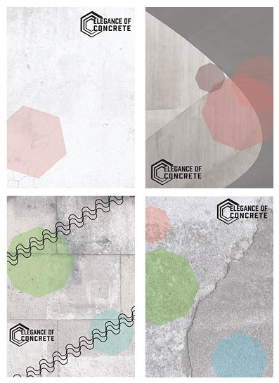
For the posters I wanted to keep to the minimalistic style through adding a white opaque screen to a bold concrete layer – which all came from a from unsplash. I continued to use the hexagon shape not just for the cohesiveness but as a symbol. The hexagon is meant to be the strongest shape known, which is much like concrete – both the strongest within their field being man made. To add to this I will need information telling the viewers where and when to go.

Fiona Fraser8

Throughout this project we are asked to break away from ‘the normal’ and mainstream ideas. So I decided to create a one sheet paper with folds to make the faces. One side of the sheet will have information within the exhibition whilst the other has details around the exhibition, such as where it is, what times you can see it or the creators information and facts behind why concrete is chosen.

However the brief asks for a 8 page booklet and the aesthetics for this would not be best suited for the style. I will have to discuss with my tutors to see how I can go bout doing this.

Fiona Fraser9

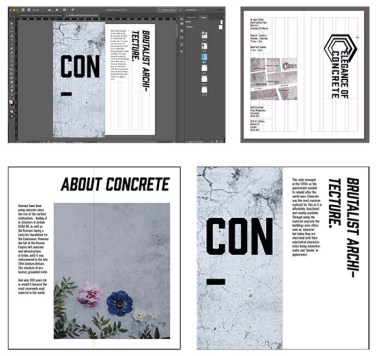
Using InDesign I created a mock up of the booklet with a clear grip system linking the free images in. I used the same typeface as the logo – Prohibition – for the bold word ‘CONCRETE’ and an oblique version for the page headings. From trying many different fonts for the body copy, the best match was Oswald.

On the back spread I created a map of the area of a local smaller gallery. This was created out of concrete blocks but I am not happy with the finish so I might have one image cut up instead of multiple for a more professional aesthetic. For a Welsh exhibition I added bilingual texts out of respect and fitting in with the gallery itself.

Fiona Fraser10

Branding Logo Generation

Week beginning 7th October – Research and logo development

To begin with I wanted a clear idea of what was out there already. This includes concrete manufactures and interior designs that use concrete as their main product. When searching I found a number of companies that used concrete as a word within their businesses names, such as a dance company and a french radio station. This makes me think that the material has a large impact on contemporary ideations.

Screenshot 2019-10-11 at 16.01.45

72856485_784483992003910_7782801819222147072_n

Doing very fast speed sketches I managed a few nice ideas such as my own type of concrete in a box as well as using existing type to make a box like shape from the type. I used the cut out idea on the “C” so that it looks like a block/ house is the silhouette. All of which led me onto creating more symbols with the lines built up to make a block building or the thin lined square to make almost a floor plan.

Screenshot 2019-10-11 at 16.03.27

My favourite design is the hexagon layered and cut into the shape of a “C.” I paired this with the typeface – Prohibition – so that it can be easily recognised. The symbol shows the continuous lines and unity of concrete and the thickness changing represents that you can add and add to concrete but overall it is one material.

Branding Research

Week of the 7th October – Initial Research

At first I looked into the styling of how an exhibition goes about their branding. This gave me a clear picture of what is expected. They use engaging colours and is very contemporary with logos printed on everything. Moving forward I will need a versatile logo that can be easily recognised and easily placed on a lot of items.

Screenshot 2019-10-09 at 18.15.44

One thing that I was very unsure about is the way to move forward. This small bit of research allowed me to see the minimalist style that I’ve always wanted to explore. I like the subtile textures and free flowing movement designs. I also looked over some interior companies and found the magazine called Elle Decoration where they provide “stylish and sophisticated contemporary homes” within the UK.

screenshot-2019-10-09-at-18.36.10.png

Branding Initial Feedback

Tuesday 8th of Sept – Group Critique 

This mini tutorial helped in clarifying my ideas being that concrete is same whether it is the largest dam in china to a minimalist plant pot within a house.

One thing to take forward is to go into depth with the name being elegance of concrete and how that links to the exhibition. Thinking in depth concrete is usually thought as a brutalist and regimented material but my thought is bringing it onto a happier free flowing material and change peoples views on it.

However I need to look into who is the creators behind the exhibition. A way I want to go with this is a concrete company wanting to show off their product so combines with a contemporary interior design company. This should help me with my logo ideation and the final things to place in the applications.

Furthermore, I have not decided whether to go corporal with the designs or a happier/ lighter hearted style. But I have decided on a minimalistic style with the use of a concrete texture.


Branding Project

Branding – Uniform

Uniform definition – Remaining the same in all cases and at all times; unchanging in form or character.

Through using the theme chosen word – being uniform – the project is to create a brand for an exhibition. At first I brainstormed in a mind-map with things that are the same such as soldiers leading onto more structural things that have the same meaning or use like a column as they all are straight up and are used to hold things up. This brought me to the idea of an urban city and how overall the sky scarpers all have the same thoughts of being taller than wider. A great example of this is the 60’s when designers had a revolution of using a strong yet cheap material of concrete in the brutalist, minimalism and contemporary styles.

All concrete is the same. Same texture, same colour, same ingredients. These similarities gives it uniformity. However, the way in which designers create difference is through the finish, whether being the moulding of the concrete, adding or taking away materials within the mixture or to polish over the solid material.

Concrete is thought to only be used in brutalist architecture from the 60’s but in recent years it has progressed into stylish household items for that “urban edge.” So my proposal is to create the branding behind an art gallery of physical objects, photography and videos to illustrate the beauty and historical values of this under-appreciated material.

https://www.theguardian.com/cities/gallery/2019/feb/27/mildewed-lump-of-elephant-droppings-brutalist-buildings-under-threat-in-pictures

https://www.independent.co.uk/life-style/design/10-illustrations-which-commemorate-britains-demolished-brutalist-architecture-a8325996.html

10 Modern Concrete Accessories

https://www.architecturaldigest.com/gallery/concrete-buildings-slideshow

48 hour project

3rd/ 4th October – Student Voice Branding

The Tuesday we had already decided the colour scheme and overall sense of the design. This included the use of black and white imagery with a brighter colour such as a bright green. Some of the group focused on the logo whilst I took and edited photos to the way we all wanted for the next designs.

The idea was that we use foot prints to illustrate the students moving forward in their lives as well as making a personal stamp within uni. The slogan we went with is make your mark, as this project is all about using your voice and making a change.

Also within the posters we made sure the information was all there and readable. The information placed in was all within the guidelines and regulations too.

We then went forward creating mock-ups that can fit in well with the awareness week when they give out freebies. I used photoshop applying the logo in to basic small cheep things so that the cost is kept at a minimal.

Finally one of the girls had a great idea of creating a little video of the logo darting around a darkened screen. This is a representation of the old school dvd paused screen or a computer that has gone to sleep, which is what our age group remembers very well.

Screenshot 2019-10-09 at 17.14.59

Portfolio Final Tutorial

Monday 3rd June – Sign Up Discussion + Independent study

With my final piece I just wanted to check with the tutors to see what I could think about and improve upon. The tutor was happy with my overall design but I just needed to look at the finer details which I had not noticed before.

Screenshot 2019-06-05 at 17.17.39

The first page he said the title seemed a little unprofessional being “Fiona Fraser’s Graphic Communication Portfolio.” Meaning that in the commercial world companies might think I’m unexperienced or simply doesn’t look through the rest of my work.

We also spoke about how the first page was a little simple and didn’t showcase myself with my work. I was unsure what work to place in as all my work has been so different.

Going through my work he pointed out the gaps between each part such as the type next to the work and how everything should be lined up. This gives the appearance that all the work has a purpose to it which has been thought out for effect.

Screenshot 2019-06-05 at 16.37.49

One comment that has made me think is the fact that I like the words cut and hyphenated. Looking further we noticed that some of my work was similar with the imagery in Design as Activism and the one model in different clothing. On top of this the tutor said that a lot of what I do is a little off the normal path which can be seen as a good thing when perfected. 

Discussing this further I realised that this could become my style with cut off elements, slanted text all placed in a precise place for impact. Thinking about this concept the app I created was mocking the mainstream so it was pushed away from the ‘normal’. To embrace this further I decided to make all of the headings slanted and I added in a few more hyphens to be a style choice not just a happy accident.

Lastly we discussed the final page and what impression that would have upon the viewer. My end page is very technical with the app having the links but is that the last impression I want to give them? Looking back over my work I decided not to change the last slide but add another about the app, showing off the humour and joy of the app.

Portfolio First Improvements

Monday 20th May – Independent Study

Screenshot 2019-06-04 at 14.33.30Moving on from my first mock up I retrieved all my work so far and placed them in order, being the best at the start and end with a few others in the middle.Screenshot 2019-06-05 at 16.47.05

Using InDesign I developed a simple aesthetic using only 4 colours that are not over powering. My first thought was to have the paragraphs over the top of the work however I needed that work to be the main focus as future agencies are most likely not read the text, meaning that the design should be clear and straight to the point of my work.

For my work I also had to create work that could be seen in context such as the app. this resulted me searching for a non-copy righted photo for the app to fit into. I also printed the editorial work and photographed it in the photography studio (which we were shown a few weeks prior). This makes the portfolio more commercial and professional.

CLICK ME – 1st mock up of portfolio


Portfolio Initial Feedback

Monday 20th May – Portfolio Speed Surgery

I spoke with a tutor that had not seen any of my work previously so had to explain the style. I found this incredibly difficult as all my work has been so different though out the year. Luckily some of the group had seen some of my pieces and they describes my work as playful, structured and modern. This was a new idea to me with my work being two opposing styles – having a childlike free flowing story leading the eye in a playful manor but still having structure and a mature presence with the placement. The layouts so far have not been showing it off as well as it could have, so moving forward I will take out the added in lines as they don’t represent me. I will keep to the lighter tones to keep it bright and open allowing for the work to be seen as bolder and more in charge for that balance.

When talking with the group the tutor used a an example, being that in a CV you would not write Curriculum Vitae as the title you would use your name. This means that it is more personal and straight to the point of who you are. In the context of the portfolio, I need to make it more me and have my name as the front, allow my own work and style to shine and not to be generic.

He continued to discuss how everything we design is a representation of us at that time and how we need to take this on using our skills to communicate what we want. For example I would show off my skills of the software used and over exaggerate my best work almost hiding and removing what I’m not so good at.

The tutor also mentioned to have all the work within context. Implying that my app should be on a phone held by someone and my editorial piece to be printed and have a photo of a magazine style.


Design a site like this with WordPress.com
Get started