Criticality; Take 2

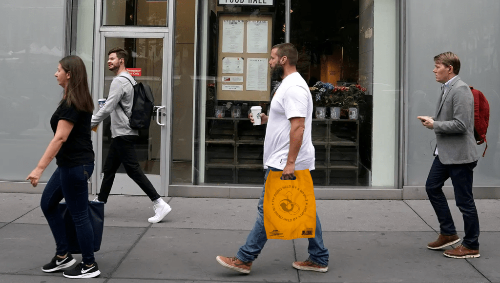
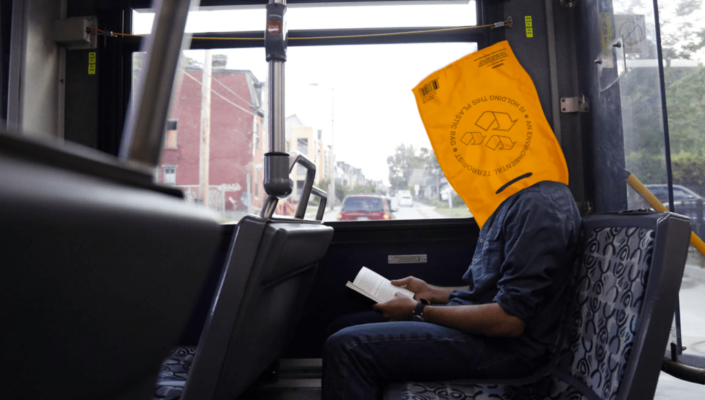
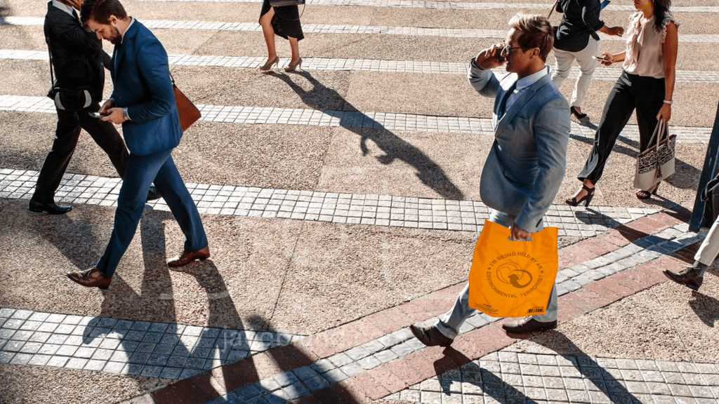
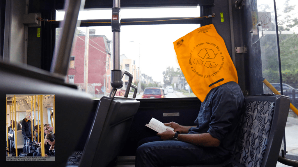
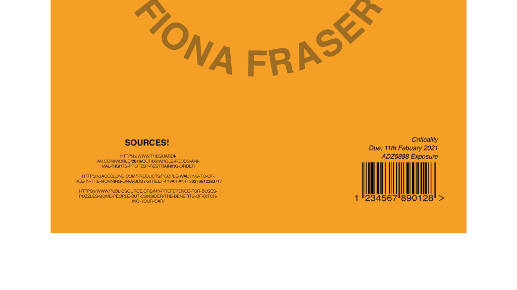
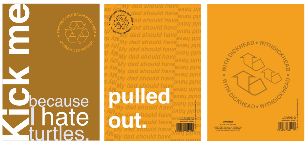
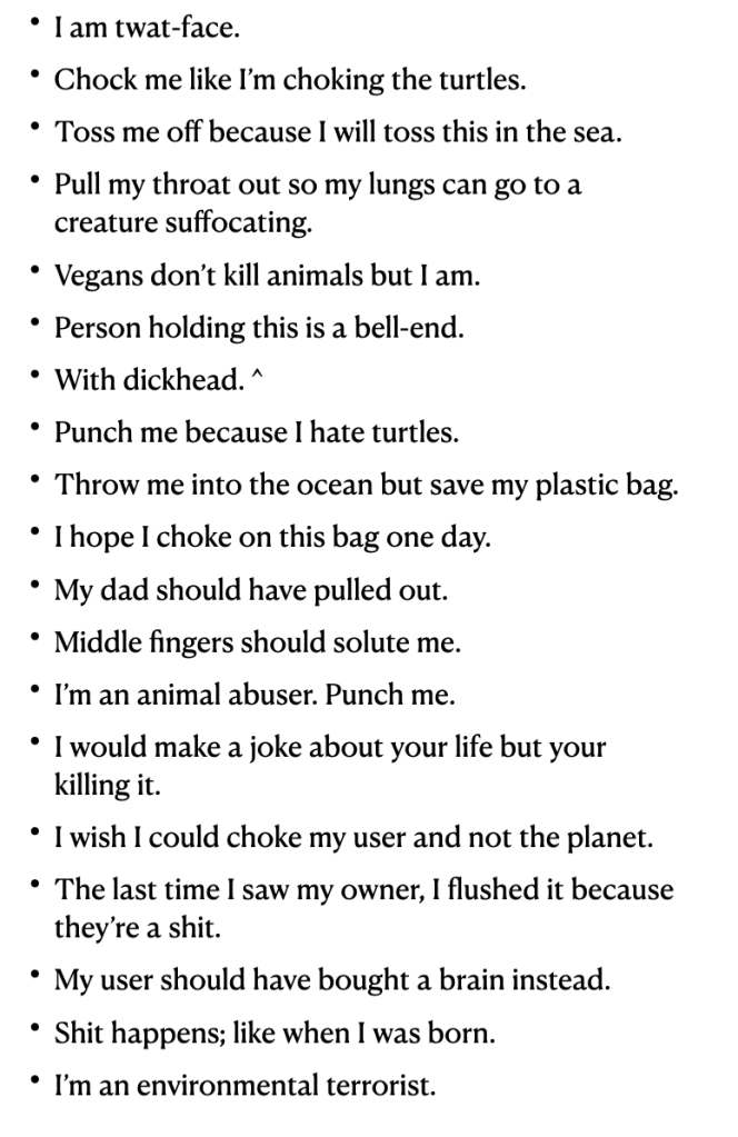
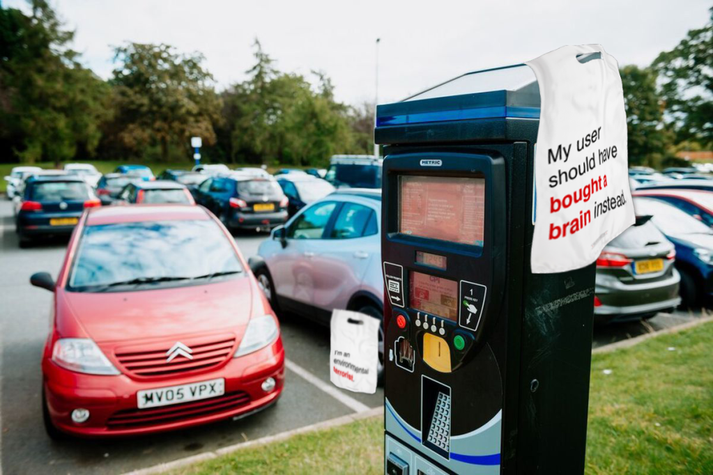
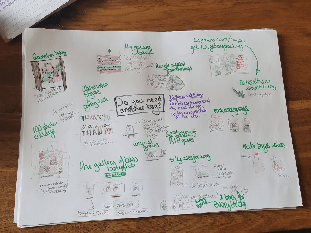
My feedback was really helpful with how they discussed direct elements that work and other elements that don’t. A tutor mentioned my previous work with my 6 pack fake app and said it is in simular light to this. I took a statement and added comedy to bring light to an issue in the world.

My design document was a bit of an issue as it didn’t flow and started with what seemed to be an end page.

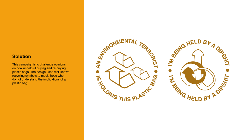
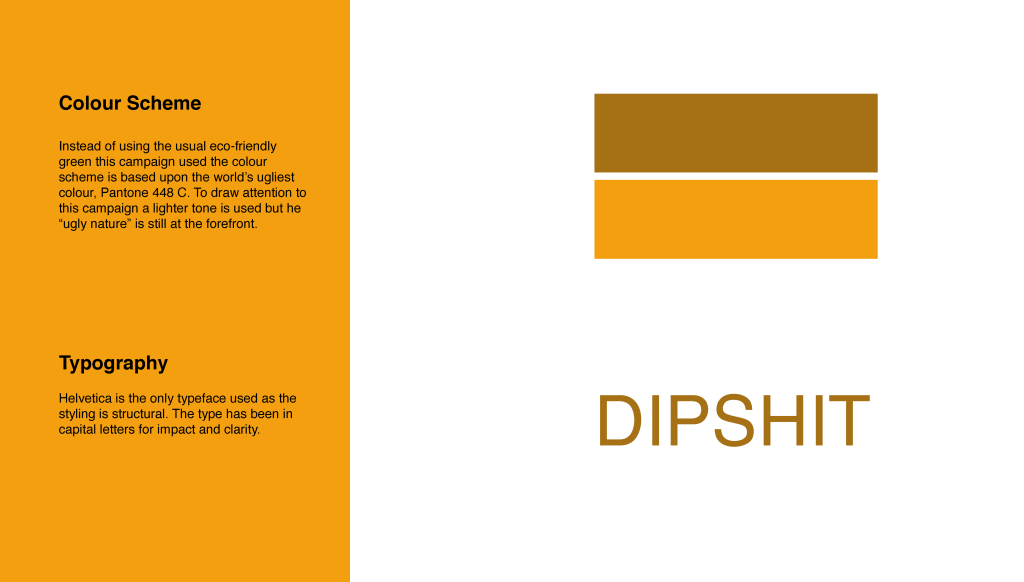
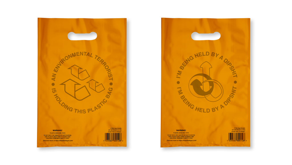
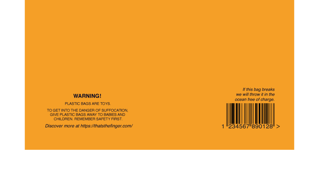
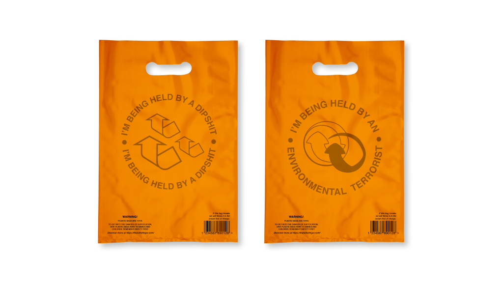
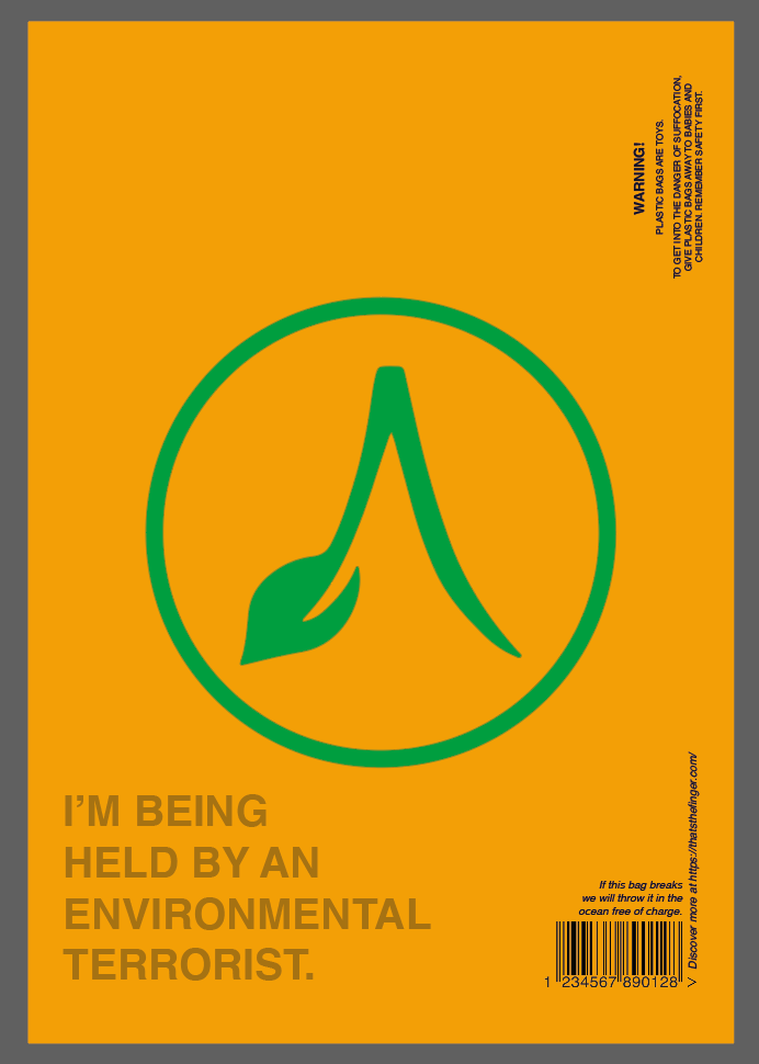
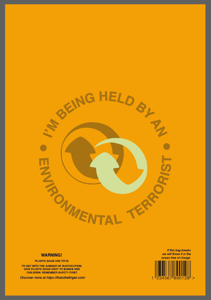
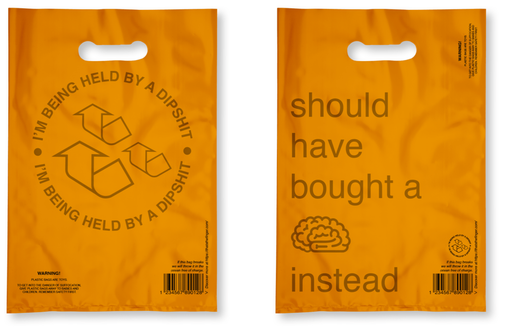
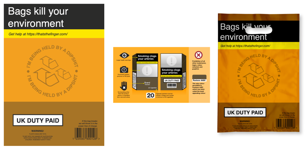
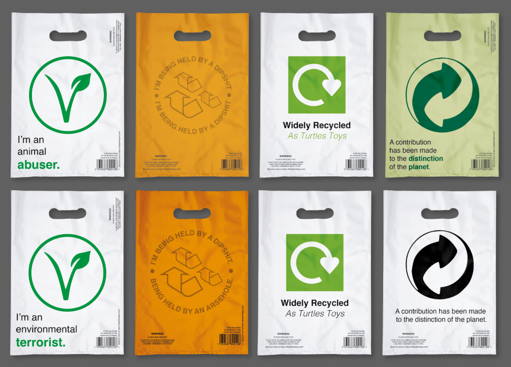
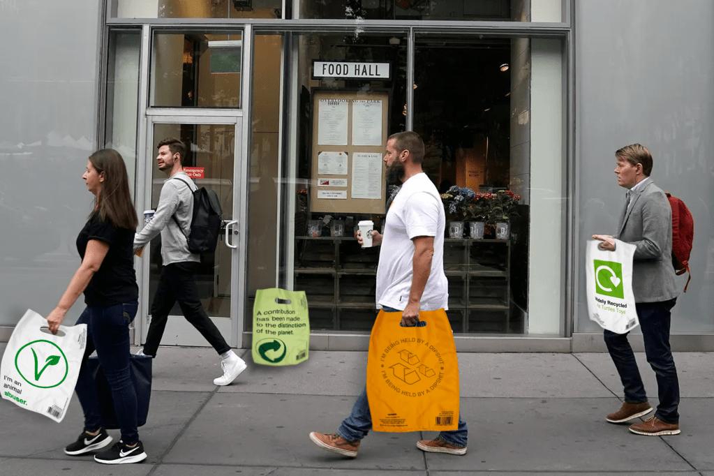
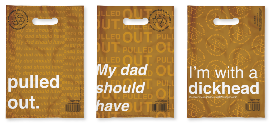
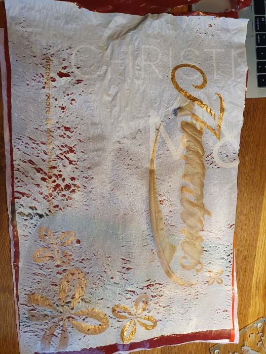
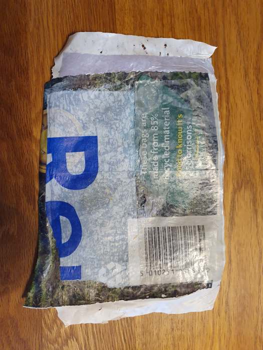
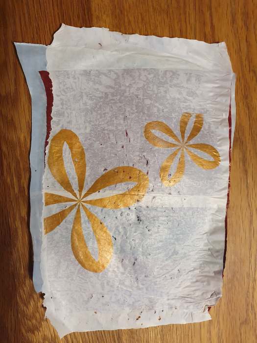
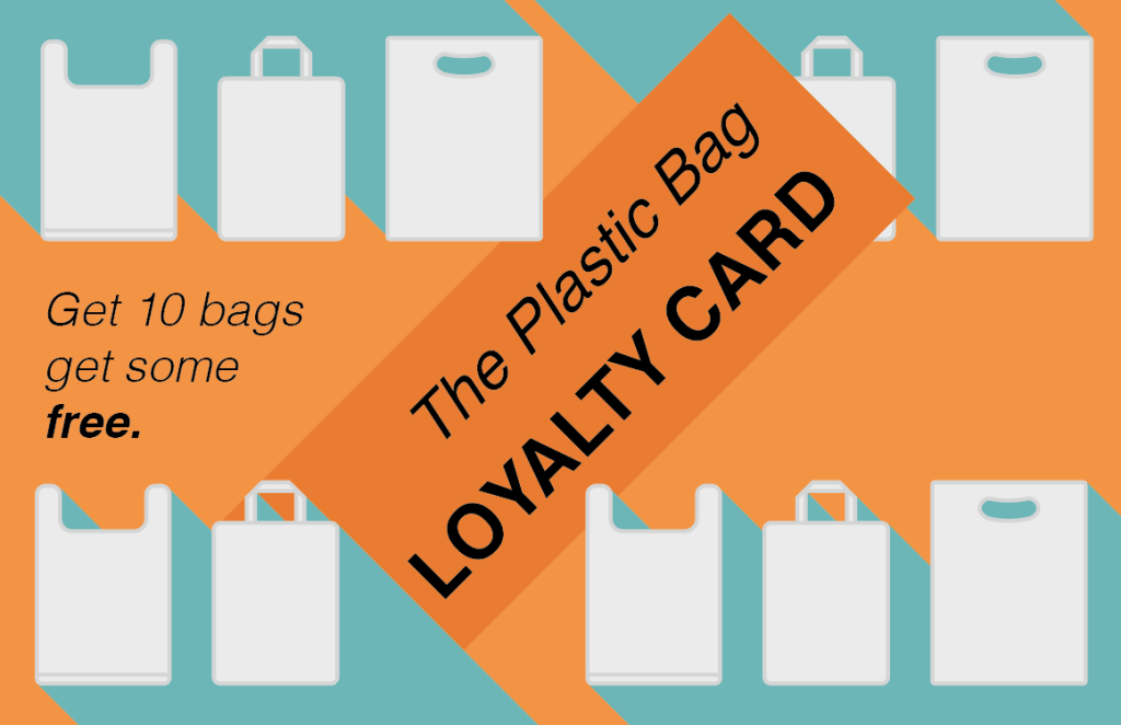
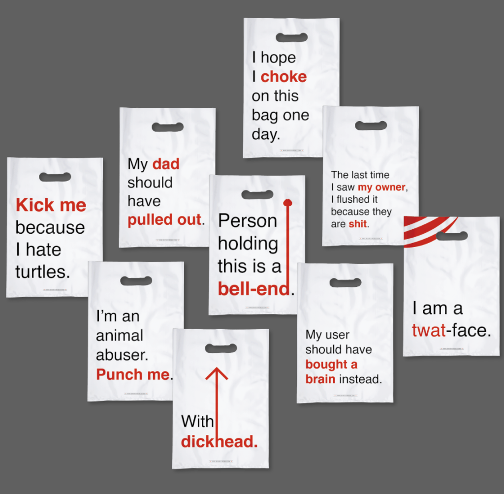
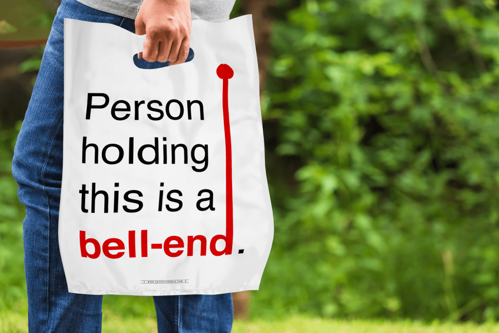
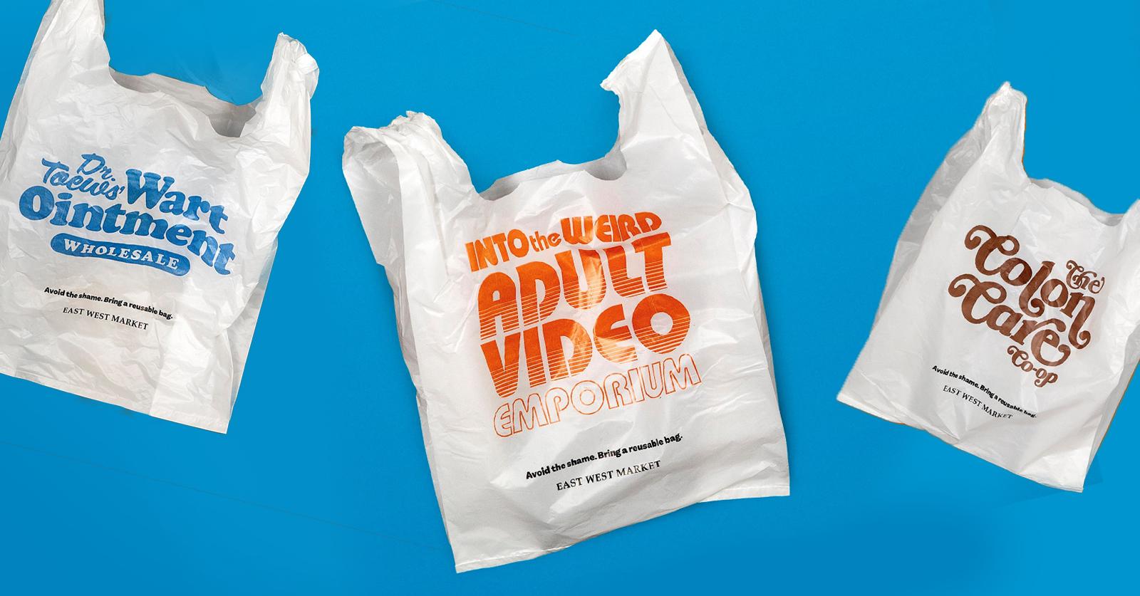
Overall, my work was praised but one bag words better than another. The recycling logo works amazingly but the other seems off and not as strong so my focus was on that. I wanted to add to the arrow feel or calling someone out for doing wrong. I spent some time adjusting the curves and shaping of the lines and ended with something different and rude which I didn’t notice until I took a step back. I feel this rudeness only adds to the nature of the design.

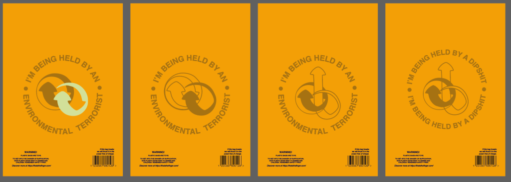
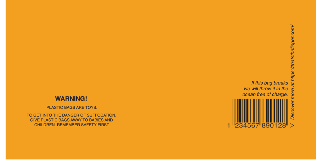
Another element the feedback brought to light was the wording didn’t read as a circle. They felt I needed to remove the dots, however, I felt the dots added to the brand image and so I could rearrange the lettering to read better. They also congratulated me on using dipshit as it is a universal term so that no one can be directly offended by it

Reflection of criticality

I have developed my mind set on this project. I fully understand where I sit in the world as a designer. I make things look good, which can draw people’s attention. I can use my skills to influence which is what my dissertation is about. I create brands that are constance. This project is no different. I have a colour scheme, a typeface, an image to change peoples perceptions. Through knowing this I took logos and other major brands into the world of criticality to twist preconceptions. As my manifesto says this work has a purpose, is innovative, is responsible, is humane and most importantly I am staying pure to myself. I like outcomes, I like logo design, I like typography and I like comedy. That is what I have done.

My only downfall in these outcomes are that the mockups are male based. From a google search I almost found it impossible to find a woman walking without her hand in someone else’s or as the main character. I would have liked different ages and different genders but being in lockdown restricted me to online images and it is a shame that it is mainly men in their 30s being photographed.

Concept Finalisation

I began to think about the orange bag and why it was effective. It used the logo of the recycling but it was adapted in the notion that it was no longer being recycled. I then thought about the image or branding of my designs and wanted to go down the route of being more cohesive. Using the orange bag and the idea of “I’m being held by…” I have created my brand image.

My tutor also mentioned that less is more and that it is ok if I reduct my outcomes to only show the best. Thus I have decided to only present the best 2 bags, cutting several other variations.

Pushing the Concept

First from the feedback, I needed to change the wording to be more appropriate. The tutors straight away said use the “dipshit” bag, we don’t like the other one. The arrows are recognisable, yet distorted with their weights.

I knew I needed to go over the top with this idea that a bag is harmful so I went with the cigarette packaging and making that into a bag with my language. However, it just wasn’t as good as before.

I went back to the ideas of taking recycling or good logos but changing the context. When doing the mundane task of the washing I noticed the recycle symbols on the bottle. I wanted to do something with that and other symbols with good connotations. Such as the Vegan icon saying I don’t kill animals but if you have plastic bags they kill animals. Thus meaning animal abuser.

I think each of these are strong but need something extra. Even in mockups they needed adjusting.

Feedback on Ideas

My ideas were liked but they needed refining. I learnt that criticality is about using what is out there and twisting it to raise an issue. So I looked at the collection of bags we have and used the working on it like the “WARNINGS” or “Love me until I fall apart, then swap me in the store for free.” Changing these to mocking words such as the “Get help at https://thatsthefinger.com/” – a website that is just an animated middle finger.

I also wanted to use what is seen as an ugly colour. This being simular to the UK cigarette pantone. Meaning the bag will be even more unattractive.

I showed my family the quotes and they felt most attracted to these. I continued my search with what is on a bag and realised the recycling logo is on almost all. Pushing with criticality I arranged it so the arrows point to the user calling them the rude words.

Overall the tutors felt the insults were heavily male oriented and needed to be thought through not use targeting one type of person.

Developing Ideas

To start with I wanted to experiment with texture and the physicality of a plastic bag. However, it did not do well. I had this idea that I could use the plastic a the prize for the loyalty card. The card being the prize as they don’t need any more bags. I ironed layers together. The layers were not shining through and the plastic kept burning even through parchment paper and a tea towel.

So, on to the next idea. Digitally made, printed Cards.

This didn’t have the kick or criticality I wanted so I went back to the ideas and with a discussion with my tutors they suggested the rude bag idea. I have to make it different to what is out there not make it embarrassing make it soul destroying. They also mentioned that I need to challenge the idea that I am a kind person? Reflecting on the first lecture, I need to not expect opinions I do not want. I come up with ideas. That is what I like to do. I want people to know that.

So I wrote a list. I don’t want people to hate me so I will not be using some.

I wanted to use Helvetica on a simple backing because the text is the most important and it needs to be timeless. I highlighted the main words from each to emphasise the actions or opinions of the person holding that bag.

I wanted to add context to these bags and show how they could be used. For instance, a middle class man walking with these and he is being called rude words.

Initial Ideas

Before my research I noted my ideas down, adding to them when the research inspired me. These included a woven Frankenstein bag, a collage of tones of different single use bags. Bags that are useless and are unfunction-able or impractical, bags that are every where and use a bag for everything (one item one bag) or bags that yell abuse at you (“I’m a twat”).

I discarded my favourite embarrassing bags as they had been done before so I went and picked my top 3. This includes the monster in all our cupboards. Using the line do you really need to feed it.

This idea was when I was asking where I would find critical design. Well a gallery or art studio. So I could make a protest, following one person (my family’s collection) and display it with a plaque.

This is simply a loyalty card where you get free bags to mock the over consumerism.

Research

I looked into winners of D&AD about plastic as I remembered a lot of work has been done on this topic. I found several completely different versions of how to tackle the issue of plastic and especially the single-use bag. One was to add it to fashion and create extra sleeves that zip off and make a bag. Another was so sensor all plastic in celebrity (YouTube) videos, which show the mass of single use plastic in a simple 5 min video.

My favourite finding is a Canadian convenient store that no longer sells conventional plastic bags. Instead they sell embarrassing bags with funny logos, such as “into the weird adult video” or “Colon Care.” This lead to 96% of all customers now bringing a reusable bag to the store. This shock of embarrassment did the job amazingly and had the American media going crazy for it with 200,000,000 plus digital impressions.

Embarrassing Plastic Bags Are Shaming People in to Bringing Reusables

https://www.dandad.org/awards/professional/2020/232542/embarrassing-plastic-bags/

I also found facts on plastic bags and one that astounded me was the fact that a bag is used on average for 12 minutes (or 25 minutes from more official sources – https://zerowasteeurope.eu/products/plastic-bag-free-day/). This idea is that you engage with the bag at the store, putting the items inside, then you don’t engage with it in the trolley, as you don’t need bags in the trolly. Then you place the bags in the car engaging with them but you don’t need them in the car as the car is a reusable holding vessel much like the trolley. In current the world this is increasing as consumers realise that you have to pay for a bag so they are saving money but this stat still is shocking. 25 minutes usage with up to 500 years disintegrate (or 100 years plastic dependent). It is outrageous.

Criticality Group Talks

In a group tutorial the tutor said to create a sentence as your main point – what do I want people to think about? I had no idea so began to think.

Do you need another bag? This is one statement clear and to the point. I might add plastic in there but if the context is clear enough I want to keep it short.

The tutor also said my idea has been done hundreds, thousands of times so I need to think out of the box. I have done this before with the 6 Pack App, the Chicken Poxism Party so I need to think like I did in those projects. Due to lockdown I have found it hard to be creative and think like I have in the past but this is my final year and I need to concur it. To overcome this I need to do one of the creative techniques, such as the 100 ideas. The tutor said to think about lateral and liner approaches, the unexpected or different ways but link it all back to what I value. From all this I decided to write out clearly my approach.

I needed to back up my argument that it was a problem so I took my point and googled it adding facts along side my existing knowledge from my dissertation. I was shocked to find on average a bag is used for 12 minutes then discarded even though it can last for hundreds of years.

At first I assumed my challenge would be to reduce the amount consumed but that is not my task. Being a graphic designer I find solutions and this project is not to do that. My tutor told me I need to disrupt the perception on our topics. Thus, my new approach to challenge opinions on how easy it is to buy a bag is.

This would challenge the consumers directly. These would be an average person going to the shop like the middle and working class.

Overall the tutors kept mentioning different artists and their work. This means research is key to this project and before I can visualise my idea I need to research what is out there.

Concepts on Critical Design

To keep my outcomes personal, I created this list.

I then cut my thoughts to 3 different ideas of reducing buying plastic bags, asking why clothes are the floor not where they should be and why does everyone have a useless collection? I think the plastic bag idea has more opinions on the matter and is more global, which is backed up in my disseration. The idea came from my boyfriend coming home with 2 bags when he could have carried the items inside. I think this happens too often in other households as well. For the idea I could take loads of bags and bodge them together to make a monster bag that lurks in the cupboards of homes globally. There are many more visuals like these as well, so I’ve made my mind up and pushing with this.

Design a site like this with WordPress.com
Get started