Changing Faces Improvements

Week of 13th May – Changing faces editorial feedback + improvements

The feedback received was overall very positive as I feel I feel that I had a connection with the work and I took my time thinking about the spacing and finer details.

Screenshot 2019-05-15 at 12.27.56.png

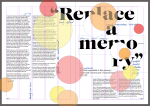
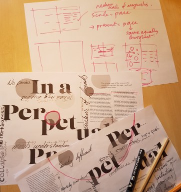
To improve a major part was the widows, for which I had to learn the term that is at the last line of a paragraph there is only one or two words that makes the design look off/ alone. To fix this I adjusted the sizes of the boxes ever so slightly and placed a few extra spaces to allow other words to drop down or up.

It was suggested that I look into the ligatures, which is where some letters link. I feel this should only be seen on the main quotes and from this only the last page has applicable letters, “fu.” For this I simply pulled the letters closer and minimised the tracking, which made this easier to spot yet still fitted in with the aesthetics.

One part that I was unsure about with the feedback was the folios. When talking to the tutor he explained that I add to add in magazine features that could link to the rest of the hypothetical articles. I knew that I had to add in page numbers but didn’t want to add in anything else that can retract from the design. I started by looking at the 3 spreads looking in the corners for empty space and luckily all the designs had no major elements in the bottom out corners, hence the placement. I simply added numbers as this was minimal and non intrusive of the piece as a whole; however, just having numbers didn’t make sense so I added the word page. I feel this gives a more professional quality as I can now see this in the industry.

For industry standards I forgot to add the bleed marks for the PDF when packaging so that was an easy fix.

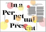
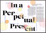
A final element in the feedback about was the pace of the 3 spreads. They all have the same font, colour scheme and over all they look the same to be cohesive. I am least happy with the final spread as it hasn’t got that final power moment. To over come this it was highly suggested that I take away power from the first and second to trick the mind into thinking the final one has a bigger impact. The first spread I only lowered the opacity of the circles and made the odd one smaller. The second spread I kept fairly similar only changing a few circles opacities instead of them all.

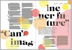
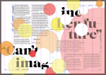
Next was the biggest change of all. I wanted all the words to be legible but distorted through the lens of the women in the article. To create a better version I pulled the white circles forward as if to say more is missing than just the words the circles/ bubbles of memories are/ have disappeared. I added more to show progress from the previous spread.

Also the tutor and a few peers were saying that the large red bubble needs to be more pronounced and not cowering away, which I realised is similar to the article which shows how strong the lady is and still able to live her life.

Overall I feel that this piece is better and more of a visual representation of the article. I now has refined details up to industry standard and over all better flow.

This slideshow requires JavaScript.

APPlying APPtitude – Refining Ideas

Week of Monday 18th – Initial Ideation Tutorials 

In the Tuesday group tutorials it was clear that I liked 3 ideas – being locking apps/ messages, design app and 6 pack in 30 days. To really get one main idea I knew I had to think more thoroughly about the concept, ect.

The design app

To differ from what is out there I want to create something bad and that isn’t at all good. I can use comic sans, impact, curlz fonts. I can make spelling mistakes, the quality can be extremely bad. Then I looked into what sort of designed templates can be used. These can include posters, logos, business cards, flyers, invitations or even social media styles. All of this will have to be done correctly even if it is meant to be wrong, this will be extremely hard to find the balance of what is bad as everyone interprets design and art differently. Over all I feel some of the other ideas can be better suited to my style.

Locking app

This app would be to stop others from getting in/ out. The target market would either have to be parents to stop their child getting onto banking ect, or teens not wanting the parents or friends getting into their private messages, photos or social media. To create this I think I’ll have to do more on the promotion and marketing of this, due to the app being simple. Maybe come up with a few different scenarios that include both target audiences. However, looking back through the research and talking to the tutors this concept has already been created and I feel that I want to design something that is unique.

6 Pack in 30 Days

My first though is to create an app that has one touch a day and once you ‘do the workout’ or tap the screen once you can not use the app till the next day. The target audience would be simple as it would be fore young men between the ages of 16 to 29. Stereotypically they are showing off to their ‘lad’ friends and want to look their own best self to impress their potential partners. This app would feed on their need to impress and be the best and more attractive they can.


Overall, I feel that I’m most interested in the 6 pack app. This gives comedy in an almost ‘fuck society’ way, where the app itself is almost mocking the users for not going to the GYM or actually getting their own six pack. I feel that this simple idea can let me branch out into a variety of elements, like the way I can market this, the design elements, the personalisation of the app.

APPlying APPtitude – Initial Thoughts

Week of 18th March – Initial Ideas + Tutorial

When in the Monday’s lecture I was highly inspired with different routes I could go down, whether that will include cultural, social, political, technological or environmental element is up to me. Immediately had some ideas and noted many simple concepts down. Some of these include;

  • blocking people at certain times from contacting you
  • tracking your social media profile and who looks at it
  • temporarily removes all cookies from your phone (10/20 minute intervals)
  • the graphic designer app
  • the pointless games – pen clicker/ fidget spinner/ hot wheels/ ect.
  • Dad joke central
  • locking apps – staying in/ keeping out
  • fake 6 pack in 30 days

20190327_161056

I decided I needed to research into these ideas and see whether they are in the market already. To do this I simply got my smart phone and opened google play store and began to search for the different existing apps. Through this I started making larger decisions and cutting them down. This included whether they exist, if they are possible or whether I would find it interesting to create and research into.

I immediately removed the thought of tracking someone online as this would have to be dealt with sensitivity and I feel I couldn’t take it as far as I want to go. With removing all previous cookies, this is essentially going back to software basics and the day you got your own smart device, which in theory might seem great but I feel the general public does not want it. Moving forward, the pointless mind numbing games are out there and has a wide range of types existing it will be very difficult to find a niche market or something that hasn’t already been done a million times. This all is the same with the dad joke idea.

Along with this the locking app will need to be marketed differently as some already exist. These include locking certain pictures or blocking you messaging people at certain times. The market I was thinking about which is different to whats out there is teens and young adults that pass their own phones around to their friends and be really jokey. These phone owners might not want their friends to message certain people, so the app can have a finger print scanner or use a builtin one.

The last two ideas I did a little more research on as I thought they were better than some others. The first I looked into was the designer app. There is so much out there saying each one is the best and you should get their app. The set up of each app is fairly similar with 4 or 5 presets that you can adapt and personalise to what you want; these include flyers, posters, business cards ect. Once you have created the design you can download it to your phone to share. The money is made from a few different ways; some of the apps you have to pay to download the app, others you have to pay to download the design and some are free with adds.

The final idea I researched into was the 6 pack in 30 days. So may of these exist and have a very specific target market for each app. These include men from 18 to 24 years wanting a perfect body, a woman wanted to lose a few pounds around the stomach area and so on. The way I want to go is have it as a joke where the users don’t have to actually lose the weight it is just on their own screens. This has not been done but I can see the potential users out there through scrolling through the comments. On the “splits in 30 days” app there are a few funny comments saying things similar to what happens if i cant do the splits in 30 days, do I restart the whole app? and other comments mocking the app in a sarcastic tone.

Changing Faces – Final Interpretations

Week of the 11th March – Independent study 

After having tweaked my designs from tutor feedback I printed the pages and looked through for the finer details. I noticed that some of the bubble were not cut out and overlapped. Although this started as a style choice I decided to remove any overlapping parts of the circles, which as well as looking more refined it added to the metaphor of the memories not fully coming together.

On top of this I was still unconvinced on the last spread as the large red bubble still didn’t fit as much as I wanted it to. After spending slightly too long adjusting each and every bubble I am finally happy with the outcome and overall flow of the piece.

This slideshow requires JavaScript.

Overall I feel more confident with InDesign both with the help from the workshop and my own development and experimentation. At the start of this project I could easily say that InDesign was one of my least confident Adobe software due to the lack of previous use. But now I am confident to present my work knowing that I used the program to the best of my ability.

Changing Faces – Tutor Support + Development

Monday 11th March – Studio Support + My development

At first I wanted to print off my work and check overall the design to see if I was happy with it. The main thing I wanted to look at was the scale of the type, which I feel is just about right.

When talking to the tutor he had many suggestion on the page spreads. Straight away the tutor said that the type needs to start on the line. Also on the first spread there is a single sentence paragraph and he mentioned that this looks plain and as if its not meant to be there. Another type detail he looked at was on the last page spread where a single column is used, he said it didn’t work well with the other paragraphs and doesn’t read easily. To combat the type detailing, I started by rearranging the paragraphs so that they line up at the top and adjusted the last few paragraphs for the two column style used throughout. Then I looked at the single line paragraph and decided to simply make it bold to stand out and have its own presence.

We briefly mentioned the colours of the bubbles and I explained that the colours can represent fire as the memory is burnt away leaving distorted or even nothing behind. We both seemed very happy with this and I just looked over the opacity of some of the circles making each one fill the space with balance.

The next improvement he suggested was to look at the scale of the marginalia. This has been a topic of many of the feed backs I have got from both peers and tutors whether to scale up or down. Through looking back at some of the original designs with the hand written in a larger scale I feel now that the smaller and more subtle things work better. Also looking at the research they also used a lot of smaller styles so that it didn’t over power the design. When changing my design made them all smaller but each one still had a different scale to seem more hand written by more than just two people.

My tutor also mentioned the flow of the piece saying the although each page is good on their own the look very similar so it doesn’t progress enough. When looking through the sheets even I got confused to what one was the 2nd and which one was the 3rd. This meant I had to rethink parts of the design. One simple suggestion was to change the headings on each page as this would not be a repetition of the first title. Another suggestion was to play around more with the scale of the bubbles. This should increase the sense of curiosity of the reader as they flip each page.

To correct the flow I first removed then added new headings to the second and third pages. I found it hard to pull out a quote as I didn’t want to repeat any of the quotes used in the marginalia. Through looking back at my printed, note filled article I found some great snippets. When placing them I wanted to keep them in the same distorted style of the first page, with the breaking up of the words through new lines.

20190317_161442

Next I thought about the positioning of the bubbles and with the sketches and ruff ideas the tutor gave I was able to be more experimental. I knew I wanted to keep the first spread very much the same but the progression needed to be big and powerful. So I started on the second design making certain bubbles bigger and changing the opacity of some of the smaller ones. The final spread I found this a lot harder to try do more experimenting with and be creative so to overcome this I took off about half of the circles. When placing them back I made sure they had a greater presence. 

Changing Faces – Deans’s 1 to 1

Monday 4th March – One to One with Olwen Moseley + Improvements

The dean was very helpful as she gave very precise feedback on my work so far.

At first I showed her the original blank layout with no add ons. She was happy with the look and liked the font choice as well at the heading placement. Although she did mention the actual words of the title might need changing as its just a repeat.

Next we looked into the next layer with the hand writing. She advised me to look at scale of the words. I thought about this and decided to have one feature quote with the others much smaller. I decided to make all the script different scales so that the eye can flow and it almost seems like a metaphor for each memory size she has and some has lost connection to her so doesn’t remember the feelings behind it. Through Doing this I noticed that I prefer it showing off and highlighting the digital type behind.

Finally we looked at the third layer of see-through bubbles. She decided that I should include the circles and agreed to keep going with the theme of them. Overall she liked the concept but she felt it needed more thought to it because currently they are just placed in a random arrangement. To achieve a deeper meaning and a better look we came up with the idea of blurring and distorting the elements behind, cutting out the circles so that none or only some over lap or another improvement I could try is to make the circles from old photos. 

9.0From this I took on board the element of cutting out the bubbles but leaving some to overlap like a memory would. I feel that because the circles are over the body text to distort the view to behind even if its only some of them the design would not look crisp or some what refined. Although I did take on board the element of using old photos. So I searched through my holiday photos and made a few testers then placed them on the design. Looking at both designs I prefer the sty;e without the photos. Through having no photos the design will collaborate the fact that the main woman doesn’t like photos and she has to force herself to remember certain elements of her life such as her wedding day. 


Changing Faces – Digital Designs

Weekend leading up to 4th March – Independent Study

My base has been created, I just need all the extra parts with the layers. To start with I wrote out a list of words/ quotes that I wanted within the design as I didn’t want any of my own words used to seem un-bias.

I started writing out my words trying to get the handwriting up to a high standard. I wanted an old fashioned script style to have the most contrast to everything. Unfortunately my writing is anything but. I had plans to meet up with my dad so kindly asked him to note some things down. After him being very confused and slightly weirded out, I had some good quotes to use.

From this I used illustrator to create line images and neaten up some of the non-straight lines.

I then placed selected phrases within the design, adjusting the angle and size of the script. At first I didn’t add many handwritten elements in as I wanted the digital type to be the main elements but as I looked I decided to make the script the main image so added more and made it bigger.

Through looking back at the research and my initial ideas I wanted to go a step forward and create another layer. This would be created through circles that have a lower opacity. The meaning of having these are to visualise the different memories and some are faded more than others and some are bigger than others.

Changing Faces – Initial Digital Design

Week leading up to the 4th March – Independent Study

To develop and achieve my layering ideas I knew I needed to get the base down so that’s where I started.

I recreated the designs opening up a new document to start a fresh and to just make sure every detail was thought out and precise. As I feel the grid system so far has worked I kept it the same throughout, with 5 columns.5.0 I wanted to keep the font style the same with the heading as well as the body text.

With the heading already decided as Lust Regular I needed to focus on the styling of the text. The type face has been decided with Cardea OTCE so I looked at the sizing, leading and the overall paragraph layouts. Through printing and adjusting I decided on size of 10 and leading of 12.5. The styling of the paragraphs I felt were more tricky as I was unsure whether to go with indentations or spacing between each paragraph. After looking into the meanings and origins of both I realised that having an indentation is faster for the reader and has been used more commonly as its been around a lot longer. where as the white space between the paragraph that I now know to call blocking is more modern and used regularly online. http://bbebooksthailand.com/blog/block-first-line-indent-paragraphs.html Through this I decided that blocking will fit my design better due to the modern style. It also helps to break up the paragraphs so that they look miss jointed much like her memory.

Changing Faces – Initial Digital Experiments

Week leading up to the 4th March – Independent Study fonts cut out

From the conversation with my tutor I wanted to start with the least favourite just so that I know it is not the route that I wanted to go down. I chose Azo Sans in black so that the cut out elements could be seen though a very strong bold typeface.  When looking at the design I truly realised that this was not the style I wanted to create, thus decided not to go any further with the other page styles.

Moving forward to my other designs I felt more confident with the research done on marginalia and some artists who like to use layering. From using my typefaces chosen I started with the Bodoni URW in medium, placing the text in a simple layout and then did the same with the Lust in regular. Looking at both fonts Lust stood out to me as more attention grabbing as it has more of a greater depth. The font has an extremely varied weight which I feel gives the design a kinder look.

Moving forward I waned to cut up the word as I discussed earlier for the metaphor of the memory loss. On top of that I wanted to play around with the scale, placement and angle of the heading. Through using a 5 column with 5 mm gutter and a 15 mm margin I was able to use the space for balance of the positive and negative areas.

When creating the other sides I adapted them slightly through adding pull out quotations. I wanted to keep them in the same style with a main heading and then the type. I knew I didn’t want any extra little illustrations as that could ruin the simplicity of the elements.

Changing Faces – Type Research

Week of 25th February – Independent Study

814d0362477461.5a91cc4cd1ae8

To begin with I wanted to find some type that I have not used before to prove to myself that I am developing my skills and learning new ways to do things. Through using my research I wanted to find a feminine serif typeface that can go with another very different font for the heading and the body text.


Through looking at Adobe Font packages I found several that looked like the style that I wanted to go for. My favourites are Bodoni URW in medium and Lust in regular. When it came to choosing the body text typeface this was harder. Through experimenting and discarding the bad fonts I decided on Cardea OTCE. fonts3


Design a site like this with WordPress.com
Get started