Persuasion: Creative Brief

Task 3 – Writing our Creative Brief

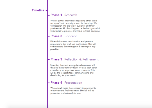
Starting this I have no idea what one was nor that they were essential part of the communication between our client and ourselves. The brief forms creative boundaries that a designer or myself can follow within the creative process.

By creating this brief it sets guidelines of what we understand the client wants/ needs are. It sets a time scale, what we aim to do and how we are going to do it and so forth. Through having this clearly written in front of me it clarifies whats in my mind so that I am ready to go forth and create ideas. This also helps the client understand our work process so that we can take them on a journey with us.Screenshot 2020-03-26 at 12.58.07Screenshot 2020-03-26 at 12.47.59


Persuasion: First Thoughts

Task 3 – Client Briefs + Brainstorm in a Box

Looking at the long list of clients and work i quickly pinned 3 down all with the over arching mental health platform. Having a lot of personal/ family experiences with difficulties in the field I felt a stronger pull and connection. But reading the briefs in greater detail I felt Art Active would be a better fit as their aim is to boost wellbeing without thinking you are through being/ joining in a choir. Singing helps the mind stay focus and being in a team helps stay connected, thus boosting personal moral.

The main presentation opening our minds went on about how we can create ‘good design’ to help for positive causes. But we need ‘good’ social responsibility by understanding and researching. The main thing what we need to know/ understand is the need of the client. I learnt that there are different needs and understanding these will help in the future.

  1. Imposed – commercial/ dreams
  2. perceived – triggering/ what you think
  3. actual – survival instincts/ reality

The over arcing theme was the question – “How might we persuade *** [who] to do ++ [what]?” Meaning what process and actions do we have to go through to get connections in an optimistic manor. Creating 10 framed questions we then moved on to listing 50 things on what we know can help us answer these questions. There were 5 categories what we can bring, persuasive words we know, knowledge about the target audience, then client and finally about the subject/ message. The did the opposite to what we don’t know. All of which is in the following photos.

By having a list of what we don’t know raised questions and we became confused on what the final outcomes will be – meaning we can think of ideas but without talking to the client in person and finding out what they want/ need from us it is had to move forward.

Persuasion: First Client Meeting

Tuesday 10th March – Arts Active Communications

I have been tasked with the communications between our group and the client. This is a very important role and so far I have been on top it, making sure everyone is understanding.

Due to the current global situation we had a virtual meeting. There were only 3 of us on the call due to an internet problem and a few illnesses. So I decided to type up the notes we made throughout the meeting so that everyone was informed on what was said as well as clarifying our understanding of what the client said.

Screenshot 2020-03-26 at 13.24.48

Sending this to our client she amended a few parts explaining more on what ‘eventbrite’ is and how they plan to use it. I had never heard of this before so they were very helpful in there response educating me on this.

Persuasion: What is the story?

What is the Story – Task 2

The task is to look into my era of now and what stories defines now.

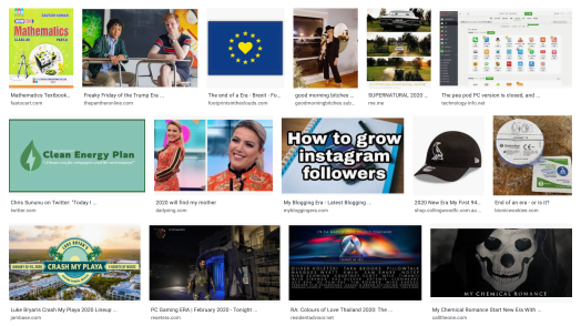
Doing the most basic thing of image search, is sometimes the most helpful thing. On there we have Brexit and all the politics that came with that. There is clean energy and being eco friendly to help the planet. We’ve got Instagram and all the social media, whether that is a good or bad thing to be so popular or not? There is online gaming, new songs, education, Netflix, TV series, merchandise, celebrity gossip and the main themes are memes.
Screenshot 2020-03-05 at 16.34.11

Memes are a very recent thing and only came about from Richard Dawkins in 1976 with his book called ‘The Selfish Gene’. From then the mid 90’s had the first humorous piece but then with technology in the 2000’s it took off, to now anyone can create any meme they wish to voice their own opinion. The creator becomes the designer.

However, a meme isn’t always seen as persuasive with one clear voice so I decided to look into actual paid designers and the trends of this era.

One main factor I found was being minimalistic with little texture but bold in colours mixed with simple line work. Image result for scouts branding

I keep thinking back to when the Scouting association changed their classical logo and styling. This is a representation of how the times have changed and how aesthetic is so important to people. With the new branding of the fleur-de-lis emblem it is more useable and cheeper to print onto anything such as the uniforms and so forth. The design is to show a “more relevant image of Scouting,” meaning that the aim is to be contemporary.

The designs are aimed at both parents and children showing that scouting is “fun and exciting while retaining strong links to its heritage.” The message raises awareness of the impact scouting has on the masses. Knowing first hand the need for volunteers to give up their evenings and odd weekend, the organisation knows the power that perception is everything. since the rebranding my home town scouting group has opened a second evening and boosted up numbers in other sections too. Being the largest youth movement they want to keep being relevant and persuade adults to help as well as children to join and engage with them.

https://www.itsnicethat.com/news/scouts-rebrand-logo-visual-identity-notonsunday-graphic-design-160518

Another company is a skin care company – Consonant. They sell high end products and needed to persuade customers to walk into their store to buy products. They targeted people in the neighbourhood to engage and hopefully buy a product. This minimalistic typographic piece shows that a rough surface can be more, can be beautiful. Implying that their makeup can cover over the skin for a perfect, clear, pristine finish so why wouldn’t the a passing by person go to the store.  After this advertisement the store saw a dramatic increase in local customers that continued to come back.

https://creativepool.com/zulu-alpha-kilo/projects/reskinning-queen-street-west-for-consonant-skincare

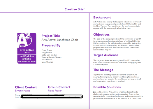
Image result for Reskinning Queen Street for Consonant Skincare


Persuasion: Themed Research

Themed Research – Task 1

We had a presentation outlining the ways in which designers create work to persuade others to that cause. Persuasion can change many different things such as beliefs, attitudes, intentions, motivations, or behaviours. With this power ethics was  questioned, bringing up how we as designers need to have this awareness and understanding of the designs we produce.

After the in-depth presentation a task was given. In small groups we collect related to the given theme that does what the presentation outlined.

Disability/discrimination

I quickly came across a few facts explaining the sheer some of people in the uk has a disability. Of those people most of them felt they weren’t excepted within society. Also a law was not placed in until 1995. So 25 years only has there been an actual law against discrimination. With all this said research found the last 20 years in Britain has been revolutionised in the way that the fully abled treats and respects the disabled.

“Disabled people make up about 1in 5 of the British population.”

“1 in 3 disabled people feel there’s a lot of disability prejudice.”

“The Disability Discrimination Act came about in 1995.”

Disability Discrimination_Page_02

Disability Discrimination

Book Cover – Final

Last week – Finalising Design 

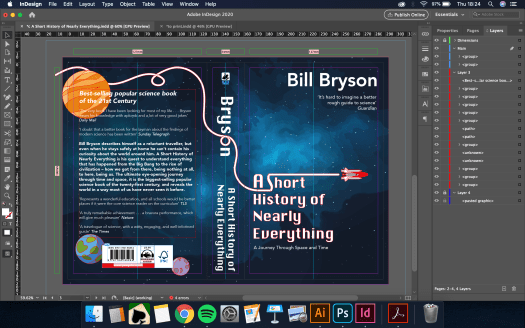
Screenshot 2020-02-26 at 23.47.25Having gone to the last tutorial not many things were needed to teak. The only suggestion given was to place the planets better. They need to link in with the page not just be placed on top of everything. I keep going back to depth and layers like the book building on the readers science knowledge, adding steps and curiosities to the go further your own education. My design is showing the layers of research Bryson has put into the book from the blue background then adding light and stars then the typography, vector images and all coming together for a cohesive easy viewing. 

Moving the planets solidified my design and took the white line back behind the blurb and behind the planets. This changed the hierarchy so the ‘Best selling….. Century’ typography is the main feature at the back.

Screenshot 2020-02-27 at 18.24.15

The last element was to export with bleed and crop marks then send it in and now I’m just waiting in anticipation.

Book Cover – Development

Going into week 2 – Developing and Detailing 

Screenshot 2020-02-26 at 23.29.17

With the feedback given I looked into Screenshot 2020-02-26 at 23.46.02the typography and how that effected the dynamics of the piece – changing the type on the spine and blurb at the back. It was suggested that the off white tones from the quotes didn’t work and I agreed feeling they are already lower on the hierarchy through size so a colour change was not needed.
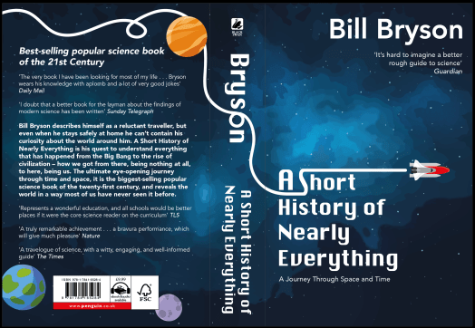
On top of that the rocket seemed off with the orange dull colour so using the colour given near the barcode I feel it is more cohesive and brighter. I then went on to add more depth and detail adding slight shadowing and highlighting in places.

I also decided to remove the extra line of the ‘journey’ that the rocket took. This opened up the space not letting the viewer become over whelmed. However, in a tutorial others suggested that the  lines were too simple and basic so maybe the rocket could pass some planets or space inspired cartoons. Adding planets the design now looks complete with all the elements and just the right amount of boldness and detail.

Screenshot 2020-02-26 at 23.47.25

Book Cover – Visual Ideas

Week of 17th Feb – Visual Ideation and Feedback

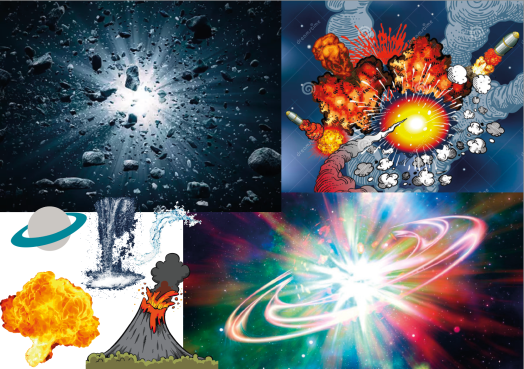
At first I visualised the ideas using other people’s designs. I also wanted to look at all the type needed to place within the specified areas. The first idea was a sort of explosion of different matter within the universe – taking water and fire into a main bang of life. The feedback was that it was a good idea but needed a lot of time and detailing of creating my own illustrations.

Screenshot 2020-02-20 at 17.36.15

Next idea I went for a more minimalistic idea of creating my own space theme background then adding strong bold type on top. The background needed brightening but overall they seemed pleased. However this design, if taken forward, would need a more depth to it. The design is plain and it needs that key feature.

Screenshot 2020-02-20 at 17.36.29

Liking both my ideas I decided to try and do both simply then see what one i preferred more. I created a vector image of a rocket that was basic and almost like a children’s toy to add playfulness – making the line of travel into the ‘S’ shape in the updated typeface of the title. I then lightened the image and brightened the stars/ dots making them bigger. This meant that the background was something to look at, creating more depth.

Screenshot 2020-02-26 at 23.29.17

Screenshot 2020-02-26 at 23.38.12

I then went to my first idea to create a waterfall meets volcano but this was time consuming and did not look the best. So scrapped this idea as I was on an extremely tight time schedule due to family reasons and the rocket with typography felt right to take forward.

Penguin Book Cover Competition

Tuesday 18th – Introduction and Research

The task is to design a book cover for our chosen book within the strict guide lines Penguin has supplied to enter their competition.

Before today I looked into the book covers existing for Bill Bryson’s ‘A Short History of Nearly Everything.’ There are the 5 main covers that has been used as well as I believe someone else’s work found on a simple google search. Also knowing Bryson was a well established author I looked into other covers created. These all either seemed over light hearted or like extremely heavy school text book. Neither of which would appeal to the masses that the book is aimed to.

Screenshot 2020-02-25 at 16.18.37

Within groups we thought about key themes that are in the book and having listened to a fair chunk on audio it was easy to state the main subjects. We then looked at the classic imagery we would assume that would link to the book – making sure we knew reasons not to use something or invent the idea in a creative new way.

I then looked into what concepts I wanted to take forward. Energy, growth and movement were the key factors I wanted to explore. I thought about stars and explosions in space as that is where the book begins.

Screenshot 2020-02-25 at 16.56.54

M.Y.O.B. – Summery

Prickles Overall

Screenshot 2020-01-19 at 11.56.06I am very please in the way the project went. Working with others from different fields taught me a great deal when it comes to my future. Being with non-graphic designers but still artists made me think differently and explain my methods not using technical terms but in meanings. For instance, the typography chosen was due to the feelings or emotional reactions not just this is the style that links well the cartoons own style.

However, I was not please due to personal reasons I had to take time away. Finding this a challenged I still managed to realise I can still do my job under strong pressure and thrive. Such as having to do the slash screens before I went off and to come back to complete all 50 stories to go on the passports.

I mainly used Adobe Illustrator and decided not to take on the digital stitch workshop as I tried to be a team player and told others take on roles they had not yet grasped at. Upon reflection, I regret handing my place over as I could have taken this skill into my own practise for when I design logos to place on materials. But one skill I have learnt is the Adobe software Premiere Pro. Asking a fellow Graphic Communication Student he taught me the basic steps to create a flowing video. I then experimented and created the 30 second advert with ease. Being able to take this back to my field will give me an advantage or a personal skill that can help me in the future.

I am also glad that I painted some pots showing others and myself I am capable of more than just simply the digital aspects. When painting it became apparent that we are a happy team with few disagreements. In reflection I believe this was because of the happy products; making joyful things makes you joyful yourself. The concept shone through on sales day as customers always left with a smile on their face. Whether that was from the cheep pricing or happy staff, it can’t be determined, but without a good idea we wouldn’t engage with each other or to the customers. Taking this forward I would keep to the most engaging briefs or twist them so they become engaging and fun for me.

If I were to redo this project I would make sure we have more products to sell. Leading up to the sales day we were unsure on how many will sell and then all of a sudden lots of team friends asked for certain orders. This took about half of our stock for pre-sales only leaving around 25 products to sell on the day. At first glance this is great as we became sold out extremely quickly but means we should have calculated how many our friends would buy and then calculate how many we needed to sell to others. Over all I am still happy with our achievements and our means to get there.

Design a site like this with WordPress.com
Get started