48 hour project

3rd/ 4th October – Student Voice Branding

The Tuesday we had already decided the colour scheme and overall sense of the design. This included the use of black and white imagery with a brighter colour such as a bright green. Some of the group focused on the logo whilst I took and edited photos to the way we all wanted for the next designs.

The idea was that we use foot prints to illustrate the students moving forward in their lives as well as making a personal stamp within uni. The slogan we went with is make your mark, as this project is all about using your voice and making a change.

Also within the posters we made sure the information was all there and readable. The information placed in was all within the guidelines and regulations too.

We then went forward creating mock-ups that can fit in well with the awareness week when they give out freebies. I used photoshop applying the logo in to basic small cheep things so that the cost is kept at a minimal.

Finally one of the girls had a great idea of creating a little video of the logo darting around a darkened screen. This is a representation of the old school dvd paused screen or a computer that has gone to sleep, which is what our age group remembers very well.

Screenshot 2019-10-09 at 17.14.59

48 Hour Project

Tuesday 1st – Brief and initial thoughts

Having 48 hours only to create a whole new rebrand of the student voice was going to be challenging. With the group of 5, I made sure we had a clear grasp of what the Cardiff Met’s Student Voice is about and where they want to go. So our key objectives are to;

  • Increase awareness and engagement with campaigns for both staff and student
  • Create a brand image of them to apply into both digital and physical items
  • stay within the guidelines of Inappropriate influence rules
  • Have the designs bilingual as well as their personal requests

Diving straight in we looked into who the target audience and how that links to this project. Being our own audience we looked into what we like and what we want, searching through trends and patterns.

In conclusion we found that the style is usually black and white with one or two accent colours representing the person. To use this in design we decided to have vivid, aluminous green as our stand out colour as this brighter colour was trending and is just the right level of punch to grab the attention of walking by students.

100 Ideas

Tuesday 24th September – 100 designs

The brief is to create 100 designs in a week. This is simple yet time consuming and will need a lot of brain power. When creating these designs I knew I would not manage within one sitting so I started with a plan to create 25 in each sitting. Once completed the first 25 I found it hard to get back into the rhythm of the designs. Thus the ideas were not the best or excited well enough.

With my 100 designs I was confident with a few of the designs, but looking at a few others I know they thought about the layout a lot more.

Discussing and placing marks next to our favourite the designs we noticed that bolder more bright designs stood out. This meant that the designs in pens and colours and overall bigger had more of an impact when looking at the whole class.

If I were to do this again I would create some more digitally as well as having some hand drawn elements.

71293330_472013136719705_7150651936843235328_n

Writing The Senses

Friday 27th September – The Frame and the senses within.

The ruff and textured red brick is a contrast to the lighter brown of the soft wood. A sharp metal nail sticks out ready to catch anyone who wonders past as it blends into the rustic surroundings of the bar.

The room is heavy and has an aroma of beer and other alcoholic beverages. With each breath I can taste the stale air of morning coffees and last nights drinking.

The sudden sound of the chairs moving echos the room making ears wince but the overall noise is busy with distance chattering from the other cafe.

All of this is framed by a single sheet of paper ripped out of a sketch book.

This piece is a short 100 words on the simple framed photo that I wrote. Going back to class after this we analysed 2 other pieces. The way we looked at it was interesting with different peoples interpretations. The learnt how all the experiences we go through we learn and continue to learn as the answer is never final.

Summer Branding Research

screenshot-2019-09-22-at-14.13.30.png

Rudd Studio – https://ruddstudio.com/project/itv-rebrand/

The creatives in Rudd Studio won over the ITV company to work with their in house team for a large scale re-branding of the television company. The brief was clear to be a “positive part of people’s lives.” This means that their use bright colours were thought through along side their playful curvature of each of the logos letters.

This very visual based company had their logo designed so that it could be versatile within each genre of their shows. Such as the moody dramas had a darker toned down almost cold colours of blue and greys. This compared to the main logo used on the happier chat shows like this morning as well as laid out across the headquarters and merchandise. This communicates that the company is versatile for all audience members.

The designers made a new typeface which reflects upon the full title of the company being Independent Television. Each of the 3 letters touch, so by using ligatures the design is showing how the content from the business brings all sort of people together. The letter font is also sans serif, which is modern and clean. This helps for the versatility and fresh new look as well as showing the global audience that its bright and friendly to be the “heart of popular culture.”

The placement of this variable logo is always in the same position and always has the same dimensions with in the different designs. This will allow the brand to be in unison as it is all produced and broadcasted by them showing the audience that they are proud to be all together. 

Super Union – https://www.superunion.com/work/bbc-two/

This design agency linked with BBC creative team in an effort to update one single channel. BBC 2, much like ITV, is a versatile TV channel which will have a range of programs however they all have a message and meaning behind each program.

An advert free channel meant that between each program had the ability to either intrigue the view or make them switch so it was important that the designer thought about a great way to grasp the viewer with the next program. However, these programs could be very different with the genres and thus the target audience watching. Luckily all the audience should be enticed by their emotions so that was the main theme throughout their rebranding. The designers thought would be to use “one unique shape” which structures the overall look and allows the viewers to be brand loyal. This shape is in constant state of movement with many different variations so that the mood can be reflected from the next program. The theory being that the audience is attached to the feeling of the short animation and thus continuing to watch.

This sense of emotion is continued through the sound affects. Different to their competitors, like ITV, they had a key focus on the acoustics, hiring a composer. This meant that the viewer not only could watch for the emotion they could hear it giving a better experience, which the BBC is expected as the UK’s longest run television company.

When I visited Little Hawk in London I remember them saying that the worked with the BBC designing Doctor Who’s new branding. They mentioned the strict guidelines that the BBC have created to uphold their integrity and brand loyal customers. From this I believe that the main companies logo is always in the middle not to add more emotions but to inform the viewer that the program is made by a larger scale company not just BBC 2, thus encouraging the audience to look up other parts of the company, online as well as on the tv screen.

Pentagram  – https://www.pentagram.com/work/building-cycles

Being one of the largest design companies Pentagram create both digital designs as well as physical ones. Using this experience the business designed the interior and rebranding of the independent, non-profit company called Storefront for Art and Architecture. This place was created to show what the power of a good design has for a community and the future of a city. The new spring exhibition had the theme of the of cycles. This could be interpreted in many ways, one being a life cycle or as simple as a bicycle. All these elements are in a constant state of movement so the designers wanted to keep that fluidity going throughout their designs.

Screenshot 2019-09-22 at 15.28.18

Their unique typeface created shows the movement of 4 lines in unison making up each letter. This can imply that the viewers can work together for a greater meaning, much like the individual lines built together creating something solid and impactful.

The single colour background also emphasises the type allowing all the emotions to be expressed fully. Another impact the colour has is being yellow with black almost stripy type is a visual metaphor of a bumble bee. This tone is what spring is about and the bee hive working together for one goal.

Work Experience with Hex Week 1

Week starting Monday 24th June

This week has been a whirlwind of exciting elements – some that I am familiar with and others that are brand new to me.

As the first day approached I was told the essentials but little did I know that I was diving straight into client work. Monday morning was relaxed with a meeting discussing last weeks progress and this weeks aims, where I met the whole team. They were really chill and easy to get along with. The team has a lot of knowledge that they shared throughout the week so far. 

As I’d only ever worked for one client before I was apprehensive to work with a digital agency but with the calmness of the team I was able to understand the brief and get straight to work. This being a research task on the competitors of one of their clients, discovering the patterns of the social media posting. Leading onto the making of a spreadsheet including the caption, image and date of release which would then be pitched to the client.

Next I was tasked with working with another colleague – Jai. This project was very interesting with new elements, being that the company had strict brand guidelines. Jai was able to talk me through these regiments and keep me on track. I was able to design and create 3 pull up posters from the website information and the guidelines. The task followed through and lead onto the making of banners, which I found simple as the design was already made. 

On one day I was invited to join a client meeting – this is where I had no experience. From the meeting I learnt the ways of talking to a client correctly, which means that I have the ability to go forth through uni and into my career having an advantage over others without clientele experience. 

This meeting lead onto my next task to create a catalogue with all of his products. Through using the clients website (created by Hex themselves) I was able to easily find the information on each product placing them within my design. Due to the original order form being a little off from being sent over various different softwares I really struggled finding the correct balance to fit in with the catalogue. I asked many questions mainly on the order form that goes on the end page to be ripped out and sent back to the company after handed out to the customers. Once designed the whole Hex team came together and offered suggestions and tips to adjust the finer details for a more impactful design. They all helped with deciding the fonts, the colour scheme and how to go about the pixelation within the client’s logo. With all of these features thoroughly examined we were ready to send to the client. 

Awaiting for approval I was set another task to help out the company quickly with their up and coming project. I had to do a very basic task of re-arranging some words so that it fits within the design Hex has created. This proved to be more difficult as the main typeface chosen was not compatible with the software I was using. After finding the secondary font I was able to create an almost cluttered infographics of words placed within the given measurements. This fast pace work has given me more of the idea in what a real world work environment would be not just a simulated version within Uni.

Overall, I am excited to start another week within We Are Hex and get stuck in more with each project. I have learnt how to brand myself when talking to clients, keep on track in a fast pace environment and how to be around other creative minds on an intellectual level instead of the tutor and student style at University. Therefore, I feel more confident as a designer going into the dangerous world of creation.

Portfolio Final Tutorial

Monday 3rd June – Sign Up Discussion + Independent study

With my final piece I just wanted to check with the tutors to see what I could think about and improve upon. The tutor was happy with my overall design but I just needed to look at the finer details which I had not noticed before.

Screenshot 2019-06-05 at 17.17.39

The first page he said the title seemed a little unprofessional being “Fiona Fraser’s Graphic Communication Portfolio.” Meaning that in the commercial world companies might think I’m unexperienced or simply doesn’t look through the rest of my work.

We also spoke about how the first page was a little simple and didn’t showcase myself with my work. I was unsure what work to place in as all my work has been so different.

Going through my work he pointed out the gaps between each part such as the type next to the work and how everything should be lined up. This gives the appearance that all the work has a purpose to it which has been thought out for effect.

Screenshot 2019-06-05 at 16.37.49

One comment that has made me think is the fact that I like the words cut and hyphenated. Looking further we noticed that some of my work was similar with the imagery in Design as Activism and the one model in different clothing. On top of this the tutor said that a lot of what I do is a little off the normal path which can be seen as a good thing when perfected. 

Discussing this further I realised that this could become my style with cut off elements, slanted text all placed in a precise place for impact. Thinking about this concept the app I created was mocking the mainstream so it was pushed away from the ‘normal’. To embrace this further I decided to make all of the headings slanted and I added in a few more hyphens to be a style choice not just a happy accident.

Lastly we discussed the final page and what impression that would have upon the viewer. My end page is very technical with the app having the links but is that the last impression I want to give them? Looking back over my work I decided not to change the last slide but add another about the app, showing off the humour and joy of the app.

Now What! Degree Show

Cardiff School of Art & Design Summer Show 2019

20190531_185405

Cardiff Metropolitan University held an exhibition, showcasing all the graduates work across the School of Art and design. These included Textiles, Illustration, Ceramics, Fine Art, Product Design and in the heart space Graphic Communication.

I made sure that I looked at all the exhibition across all the fields which gave me a greater understanding of the differences between each course. At first I thought Fine Art and Illustrations were very similar and in a way they are but the main difference is the concepts behind them. For instance one fine artist created a darkened room which was a representation of his own mind making the viewer/ me think more about the meaning. Whereas an Illustration student created a room showcasing their work and making it feel like a punk teens room, meaning they have a clear visual, up front representation instead of a metaphorical work.

When looking through the graphics section one project caught my eye. Joe Topham-Taylor created a funny controversial piece, showing off wales. One quote saying “Wales is just a worse version of England.” For someone very English like me I found this very funny and almost ironic. However, my Welsh friends thought the opposite and got a little annoyed as the classic “everyone hates the English” quote pops out. This shows me that even very simple photos taken amazingly added with short phrases can spark such emotive conversations.

Portfolio First Improvements

Monday 20th May – Independent Study

Screenshot 2019-06-04 at 14.33.30
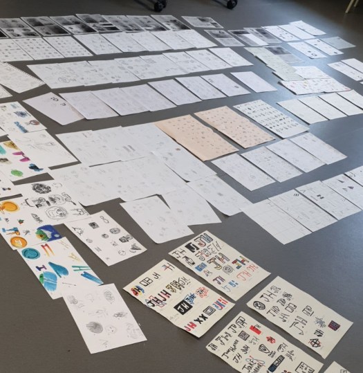
Moving on from my first mock up I retrieved all my work so far and placed them in order, being the best at the start and end with a few others in the middle.Screenshot 2019-06-05 at 16.47.05

Using InDesign I developed a simple aesthetic using only 4 colours that are not over powering. My first thought was to have the paragraphs over the top of the work however I needed that work to be the main focus as future agencies are most likely not read the text, meaning that the design should be clear and straight to the point of my work.

For my work I also had to create work that could be seen in context such as the app. this resulted me searching for a non-copy righted photo for the app to fit into. I also printed the editorial work and photographed it in the photography studio (which we were shown a few weeks prior). This makes the portfolio more commercial and professional.

CLICK ME – 1st mock up of portfolio


Design a site like this with WordPress.com
Get started