Branding – Animated Identities

Starting Tuesday 8th October – Moving Identities Workshop + Development 

The workshop about using After Effects was extremely helpful. From last year I feel this was more in-depth and I am more confident in the software.

The most helpful I learnt was how to animate a vector so that it draws its self, creating visuals that are simplistic yet are so great to watch. My animation could be on repeat like a gif showing off the structure of the elements.

This slideshow requires JavaScript.

I also learnt many other things such as motion blur – which I decided not to use as the design needed to be more structured  –  and easy ease – that I did use to change up the speed for a better flow.

The most complex part was the masking of a video. I found this hard to get my head around but it gives a great effect if you want to see the video behind that could be blurred out or in a different shade.

Branding Logo Refinement

Wednesday 16th – Independent Study

After the feedback from yesterday I decided to trial development of both the existing logo and a new version.

Screenshot 2019-10-16 at 15.57.29

Adding it with the type I decided to play around with the sizing and the white space between the letters and the image. Resulting in a more professional logo that fits in more with the theme on unison.

Screenshot 2019-10-18 at 00.51.07

This is my favourite design as it is minimalistic yet has depth. When you look into the hexagon it’s as if you’re looking down at a tunnel or tower making you the viewer gain confidence and power. All of this leads the eye down to the name which has been adjusted for a better ambience.

Screenshot 2019-10-18 at 01.18.57


Branding Feedback 2

Tuesday 15th October – Interim Critique Presentation

The feedback given was very helpful and progressive – making me want to change and adapt further. Through having a well thought out idea everyone was able to grasp the concept and made me think about wanting to really dive into the meaning to progress. The conversation lead to the name changed to ‘Elegance “IN” Concrete’, instead of using “of.” This should put more emphasis of having the exhibition show that these products can go “in” a home as well as being more eloquent and rolling off the tongue.

Screenshot 2019-10-11 at 16.06.02Moving forward the logo needs to be perfected by adjusting the white space of the hexagon and making sure they are ‘uniform’ and over all experimentation with the curvatures, thickness and placements.

Fiona Fraser8

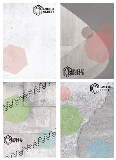
With the posters I had sort of hit a stump and wasn’t a huge fan of them as they all fell into the background. The group decided the use of colours and opaque almost took away from the styling of the concrete and I should make the texture the main focal point. 


Branding Initial Deliverables

Few days beginning 10th October – Printed exhibition ephemera – Poster/ Booklet

For the posters I wanted to keep to the minimalistic style through adding a white opaque screen to a bold concrete layer – which all came from a from unsplash. I continued to use the hexagon shape not just for the cohesiveness but as a symbol. The hexagon is meant to be the strongest shape known, which is much like concrete – both the strongest within their field being man made. To add to this I will need information telling the viewers where and when to go.
Fiona Fraser8

Throughout this project we are asked to break away from ‘the normal’ and mainstream ideas. So I decided to create a one sheet paper with folds to make the faces. One side of the sheet will have information within the exhibition whilst the other has details around the exhibition, such as where it is, what times you can see it or the creators information and facts behind why concrete is chosen.

However the brief asks for a 8 page booklet and the aesthetics for this would not be best suited for the style. I will have to discuss with my tutors to see how I can go bout doing this.

Fiona Fraser9

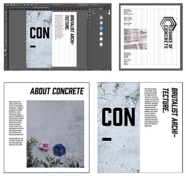
Using InDesign I created a mock up of the booklet with a clear grip system linking the free images in. I used the same typeface as the logo – Prohibition – for the bold word ‘CONCRETE’ and an oblique version for the page headings. From trying many different fonts for the body copy, the best match was Oswald.

On the back spread I created a map of the area of a local smaller gallery. This was created out of concrete blocks but I am not happy with the finish so I might have one image cut up instead of multiple for a more professional aesthetic. For a Welsh exhibition I added bilingual texts out of respect and fitting in with the gallery itself.
Fiona Fraser10

Branding Logo Generation

Week beginning 7th October – Research and logo development

To begin with I wanted a clear idea of what was out there already. This includes concrete manufactures and interior designs that use concrete as their main product. When searching I found a number of companies that used concrete as a word within their businesses names, such as a dance company and a french radio station. This makes me think that the material has a large impact on contemporary ideations.

Screenshot 2019-10-11 at 16.01.45

72856485_784483992003910_7782801819222147072_n

Doing very fast speed sketches I managed a few nice ideas such as my own type of concrete in a box as well as using existing type to make a box like shape from the type. I used the cut out idea on the “C” so that it looks like a block/ house is the silhouette. All of which led me onto creating more symbols with the lines built up to make a block building or the thin lined square to make almost a floor plan.

Screenshot 2019-10-11 at 16.03.27

My favourite design is the hexagon layered and cut into the shape of a “C.” I paired this with the typeface – Prohibition – so that it can be easily recognised. The symbol shows the continuous lines and unity of concrete and the thickness changing represents that you can add and add to concrete but overall it is one material.

Branding Research

Week of the 7th October – Initial Research

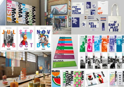
At first I looked into the styling of how an exhibition goes about their branding. This gave me a clear picture of what is expected. They use engaging colours and is very contemporary with logos printed on everything. Moving forward I will need a versatile logo that can be easily recognised and easily placed on a lot of items.

Screenshot 2019-10-09 at 18.15.44

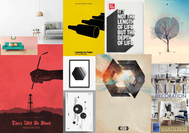
One thing that I was very unsure about is the way to move forward. This small bit of research allowed me to see the minimalist style that I’ve always wanted to explore. I like the subtile textures and free flowing movement designs. I also looked over some interior companies and found the magazine called Elle Decoration where they provide “stylish and sophisticated contemporary homes” within the UK.

screenshot-2019-10-09-at-18.36.10.png

Writing with the senses

Wednesday 9th October – Group tutorials

In a group of five with only one tutor this was a key opportunity to get a more personal grasp on where I want my essay to go. We discussed the broader aspects of constellation, such as the simplistic idea of philosophical meanings to where one thing or an object is never just as it seems. This idea links back to the theory that everything is never pure as everything always has an interpretation.

We moved on to discuss the ways in which we can move forward on our own. The tutor has a great way of describing a dinner party with 12 people and myself being the host. As the host can only take a conversation so far our job is to listen and investigate the hot topics that arise in conversations. This should build a mood, themes and a narrative which is supported by the statements investigated. The tutor was clear that although he wanted others theories, his main focus was our opinions. As the name of this years constellation was critique he wanted us to make judgements – or our interpretations – backed up with those hot topics of references.

Next we discussed how we go about finding these 12 sources. This could be through artists and their work, ted talks and school of life websites or met search with a main idea. We all wanted to find things that link to our own practise that led me to think about design spaces that are out in public which uses more senses than just the sight. An example would be an outside exhibition space with sounds or an advert with sound. The idea of a store front and how they attract people in, such as the sweetie store that puffs out flavoured fog to entice people in.


Branding Initial Feedback

Tuesday 8th of Sept – Group Critique 

This mini tutorial helped in clarifying my ideas being that concrete is same whether it is the largest dam in china to a minimalist plant pot within a house.

One thing to take forward is to go into depth with the name being elegance of concrete and how that links to the exhibition. Thinking in depth concrete is usually thought as a brutalist and regimented material but my thought is bringing it onto a happier free flowing material and change peoples views on it.

However I need to look into who is the creators behind the exhibition. A way I want to go with this is a concrete company wanting to show off their product so combines with a contemporary interior design company. This should help me with my logo ideation and the final things to place in the applications.

Furthermore, I have not decided whether to go corporal with the designs or a happier/ lighter hearted style. But I have decided on a minimalistic style with the use of a concrete texture.


Branding Project

Branding – Uniform

Uniform definition – Remaining the same in all cases and at all times; unchanging in form or character.

Through using the theme chosen word – being uniform – the project is to create a brand for an exhibition. At first I brainstormed in a mind-map with things that are the same such as soldiers leading onto more structural things that have the same meaning or use like a column as they all are straight up and are used to hold things up. This brought me to the idea of an urban city and how overall the sky scarpers all have the same thoughts of being taller than wider. A great example of this is the 60’s when designers had a revolution of using a strong yet cheap material of concrete in the brutalist, minimalism and contemporary styles.

All concrete is the same. Same texture, same colour, same ingredients. These similarities gives it uniformity. However, the way in which designers create difference is through the finish, whether being the moulding of the concrete, adding or taking away materials within the mixture or to polish over the solid material.

Concrete is thought to only be used in brutalist architecture from the 60’s but in recent years it has progressed into stylish household items for that “urban edge.” So my proposal is to create the branding behind an art gallery of physical objects, photography and videos to illustrate the beauty and historical values of this under-appreciated material.

https://www.theguardian.com/cities/gallery/2019/feb/27/mildewed-lump-of-elephant-droppings-brutalist-buildings-under-threat-in-pictures

https://www.independent.co.uk/life-style/design/10-illustrations-which-commemorate-britains-demolished-brutalist-architecture-a8325996.html

10 Modern Concrete Accessories

https://www.architecturaldigest.com/gallery/concrete-buildings-slideshow

Writing with the senses

Friday 4th October – Looking at art (study visit)

Visiting the space made me think about what it means to look. The tutor explained that as a viewer we look at objects and interpret the meanings/ uses of these but as designers and creators they supply a meaning and want the views/ us to think what they think/ feel within that moment or their journey. So looking is all about getting the balance of supply and interpretation right.

Linking this theory to Graphic Communication we design for instance a poster – a highly visual thing that ‘supplies’ information to that viewer. Although interpretation is limited the viewer can always think differently to another. Thus concluding this theory with looking is never pure.

When in the space I was drawn to one piece which my first ‘interpretation’ was that this hole in the ground with a small almost reddy, orange and yellow shiny almost glass like blob is an inverted volcano. However, once knowing the title of the piece I was shocked to find that the name was Portal. And one of the students sniffed the central mass clarifying the central mass was in fact jelly. Through using all her senses she was able to get a better interpretation than I was from just looking. This shows that looking isn’t just a visual thing, much like the name of the constellation looking is about all the senses. But the question I ask is the 6th sense the others around us and is the 6th the supply?


Design a site like this with WordPress.com
Get started