Research into National Museum Cardiff

Independent study – Visualising the space

After a lot of self debating and trialing ideas I decided upon the changing of the National Museum Cardiff, where I recreate the way finding systems.

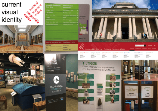
The museum is part of a larger, national scale presence within wales so the place focuses on their ideas and their bands. The website includes all the other areas so doesn’t have a true focus on the one museum or even an about page.

I also looked at research including looking into the current systems of way finding within the space. It is apparent each collection has its own personal styling and nothing is cohesive. there has been other students take on this museum before showing that there needs to be slight changes within the space.

http://www.studentshow.com/gallery/7937473/Cardiff-National-Museum-logo-flyer-and-website

Making a basic mood board of the current visuals you can see the difference across the museum. How somethings are mounted onto the wall and others free standing.

identities-01

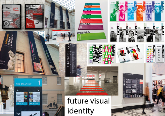
Looking into other museums and how they style the space for the visitors. some have way finding on the floor so that a person can follow the simple design to the space. others have hanging items showing what is on as well as what direction they are. Cardiff museum can incorporate all of these traits as one whole museum instead of a smaller collections taking up the space. They can be able to create a brand, an identity that is memorable and making the public wanting to come back to the museum not just the items within.

identities-02

Ideas

Week starting 12th Nov – Independent Study 

The initial idea I keep going back to is the idea of personalising a hospital for one patent and their family. A while ago my graphic tutor showed a 6 minute video of how it would be like to be laying in a bed all day with only the nurse or a family member to keep you company for a short period of time but that patient would mostly be alone. With having friends and family members in and out of hospital I know how much they dread going in even if it is for a day or two.

My thoughts are having a poster or banner on the ceiling above these places. Some other thoughts to develop this are;

  • colour therapy – make the patents happier and calmer
  • design stimulation – get the patents better quicker and give them motivation
  • have it night and day – have change though-out the day?

Another Idea I have is the way finding in the National Museum of Cardiff. The current state is very chaotic and has no set plan that is used through out the museum. The idea of way finding I feel it would not challenge me as much as the hospital concept.

Overall I will continue to research both and decide soon on what path I would like to take forward.

Inspirational Trip

Thursday 14th Nov – Dyffyrn Gardens + National Museum Cardiff

First up was Dyffryn Gardens. This was a beautiful grand manner with hidden gems throughout the extensive gardens.

Talking to the staff they feel dedicated to the place with restoration and progression of the place within the world. Being a national park the place has rules and regulations as well has strict budges. Having this talk first it lead me to think through the ideals and logistics of creating a design/ art work there.

When moving around the garden’s space the use of exploration was great however the likely hood of the public (mainly children) of loosing one another is great. looking around there was little to no signage of what the nature is as well as way finding. For this space I felt as if my work skills can only be used in that manner for directional signage.

Changing from this peaceful, explorational space to the National Museum where I found this chaotic and distracting. When looking at the art I found myself distracted by the signage and shire scale of writing. This was because the art was surrounded by words and everything was distracting with 3 tones of lighting creating more shadows as well as the overall designs of the space. The sight lines were over powering and there was no room to breath and just look at one artefact and one time. I could recreate the space with more negative space for that balance. This should allow the children to not be overloaded thus not disinterested or allow for more time spent within that space instead of being over whelmed and wanting to leave half way though.

77234344_587214505348989_5069210678103900160_n.jpg

Over all the idea of taking the art and artefacts within NM Cardiff is more engaging but I want to look as more idea that I have come up with.

Sites, Spaces and Public Places

Tues 12th Nov – Introduction

On the first day I was unsure of a lot of aspects from going in blind. I found out this was a makers field, which is highly daunting as my safety blanket is my laptop and printable computer work.

Moving forward we looked into the idea that a designer, a maker can create a piece to effect the space. But how can we define a space? Currently looking into public spaces, the generic idea is a place that is open and accessible to people.

Looking deeper the tutor discussed how would we experience that space? including thoughts of what the space is, how the senses react and what effects it makes to the emotions.

when creating my own work i have to think from both the designers point of view and the view of the public. questioning; why am i here? what got me here? does it (art work) change? timing? can i leave traces of mine, of others, human or other?

After the lecture I looked into the submissions of what is needed, progressing onto the art’s effects and how I should think moving forward.

76644622_2169377350031556_2870705971133415424_n

some work that are examples of what has been discussed:

hiroshi nakamura – http://www.nakam.info/en/ – how can things nurture other things – shape prays to the forrest – more concerned about the space and the nature than the design- how can the design change/ adapt to the surroundings. are things soft? the design? the materials?

Rachel whitread ghost – https://www.nga.gov/collection/art-object-page.131285.html – personal space that are familiar, yet ghastly with the inability to be used as the original object/ place was intended.

Branding Reflection

Independent study 

After completing the brief I am happy with the elements I have created and proud that I did go back and change the logo. This helped shape the new brand and become more elegant like the title.

With more time I would have liked to develop the animation adding in details – this would mean its less of a gif and more of an advert. Through making it longer shows my after effects skills and how they have improved from last year, being non-existent.

I would also like to develop upon the way-finding by creating an arrow from concrete instead of just an engraving. As well as designing a creation with the logo made from concrete showing the level the exhibition is at.

Overall, I am pleased with the printed word as I took my time and looked at the finer details for perfection. Where I will improve in the future is the digital designs.

Branding Wayfinding

Independent study 

The usual way to do signage is to have words/ symbols and an arrow on card mounted to a wall. To adapt this simple concept into my exhibition using concrete block as the sign would increase the appeal and showing diversity of concrete. This also allows the space to be changed and adapted if the viewers wanted to buy or to change up the space.

At first I proposed using spray paint on bollards, much like the outside promotions this is simple and a cheep option for the creators. Then I thought about the title elegance and how everything needs to show off the various art forms concrete can take to. So by engraving the cast of concrete the distinguished element becomes the art within the exhibition. A photo by “Hello I’m Nik” on Unsplash shows the simple elegance that concrete has.

hello-i-m-nik-MAgPyHRO0AA-unsplash


Branding Outside Promotions

Starting 16th October – Independent study 

The idea I had was clear – to have my logo spray painted across a well designed concrete wall/ building but this was too basic and wasn’t showing off what the exhibition is and how concrete can be pleasant and homely.

Moving forward  I looked into businesses that sell concrete objects in a unique way, suck as betonfusio – a German design and construction company. This gave me the idea that the staff can have necklaces and the viewers can buy them to be warm outside showing off the brand.

https://www.instagram.com/betonfusion/

Casting Thin Concrete Furniture with GFRC

https://www.instagram.com/arcflydesign/

To improve upon the spray paint stamp idea I thought that a concrete slab can be the banner. Much like a typical banner it will be placed up on a wall but be 3D with concrete plugs hiding the bolts. This also allows for more information and design. I only added 3 of these deigns in as I believe that the target audience would only react if it looked pleasing within the space, such as the underground train station.

Branding Digital Presence

Independent Study – Week starting 22nd October

The best, most professional way to communicate from a digital platform is through a website. When designing I used the simple black and white colour scheme with a 5 column grid so that the outer 2 columns allowed the space to breath making it professional. 

website.1.png
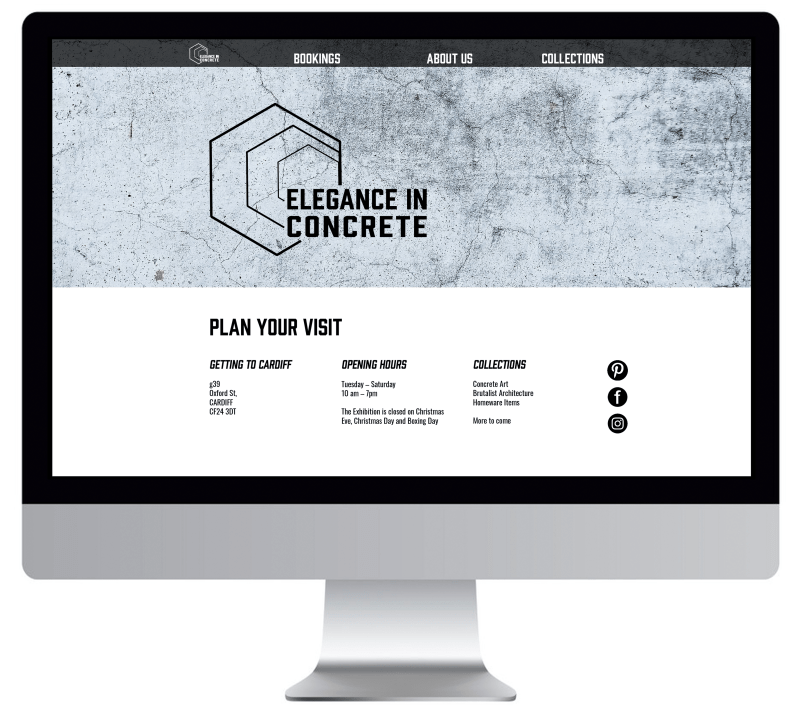
The target audience of younger current stylish people are always on a form of social or online media. After designing a website, I decided upon the use of instagram to show a modern visual that can easily get the name out with the use of hashtags and sharing.

With time I would like to fully complete the website, showing off the exhibition. Also gather more photos within the instagram page instead of just my work show off whats inside and how a personalised home can look.

Branding Booklet

Independent Study – Week of 21st October 

So far I have created individual spreads for a 12 page minimalistic leaflet. To help me along I looked up exhibitions and how they word and layout designs. #thisisconcrete is a great example of the exhibit showcasing the variants concrete can be used for.

https://rodicdavidson.co.uk/exhibition/thisisconcrete/

Refining my design even more the tutor suggested making both a 12 page and an 8 page design to complete the brief and add a little extra for the design decision to be placed on the company and their wants. I took away the “about us” page as this is an exhibition not just to sell the companies products but its about learning how far concrete has come to be personalised in a home.

To finalise the 12 page booklet I created the correct size sheet with margins outlining the pages within. Copy and pasting the designs in I changed a few variants so that the design had more uniformity. Placing it all together I noticed that the back and front were not the best in comparison to the other pages. So I changed the back typography details and the front cover for more impact.

Screenshot 2019-10-29 at 15.51.55

Screenshot 2019-10-29 at 15.52.32

Branding – Poster Finalising

Independent Study

From feedback I improved by making the new logo the focal point, changing the tone so it stands out against the black of the darker concrete blocks. I also toned down the white layer and removed it from the darker poster allowing the background to stand out for what it is as the main concept. 

The more toned down colour choices worked better not taking away any power from the background. Also the pinky almost skin tones are currently in fashion so will appeal to the target market of trendy people. 

Furthermore, adding the information helped in giving the posters a professional touch, giving the viewers the opportunity to understand what is going on. 

Design a site like this with WordPress.com
Get started