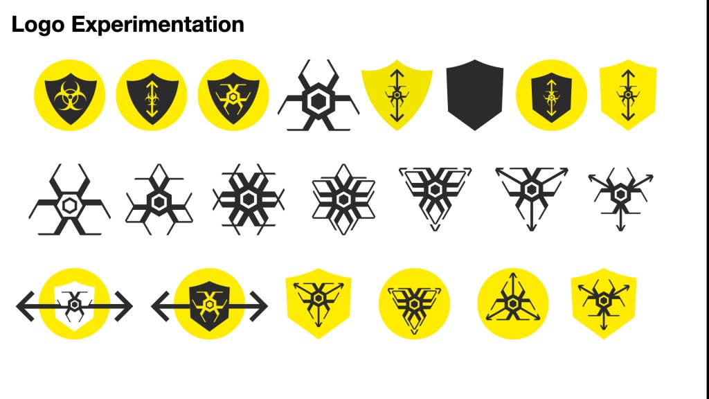
My feedback was a little confusing at the time and I didn’t really have any idea of where to go and what to do. So I took some time off to get my head together and figure out what is needed. The feedback mentioned the logo seemed disjointed to the rest of the styling. It needed structure and panic. The arrows worked the best. I recreated the shield with sharp cutting lines as if it was protecting us more from the greater evil, creepy biohazard virus.
This had a stronger response but the bottom right logo utilised the arrows and the feel of pushing away or spreading like a virus.
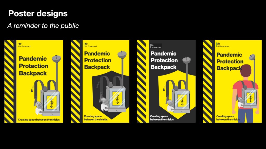
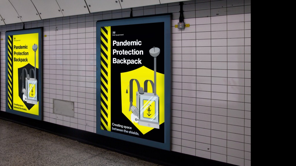
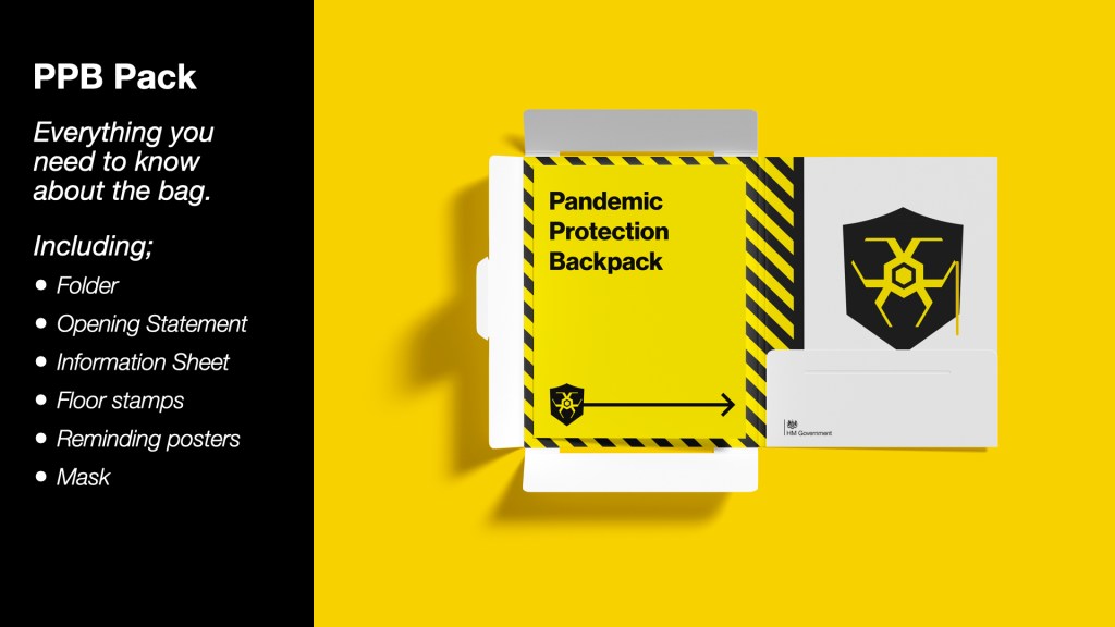
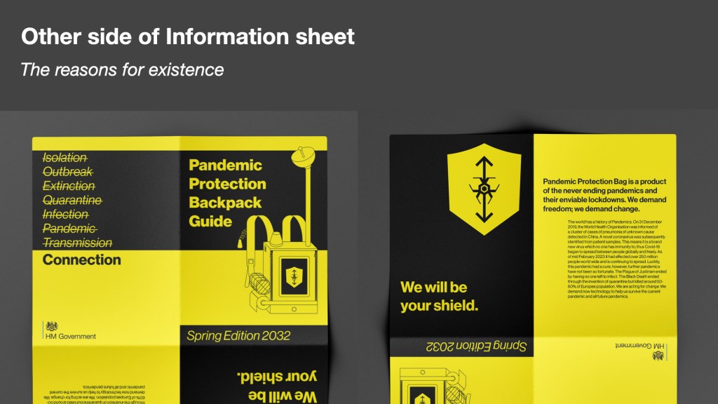
I then thought about the pack. The idea of having an information print out was greatly liked however, the design was off. I needed something easily recognisable and cheap to mass print. I took the idea from Suits and seeing tip sheets from stock markets only printed on red paper so that they cannot be copied easily. So what if all my print was on yellow sheets to be easily replicated and for a Government ran scheme the print will only be in black ink for the cheapness.
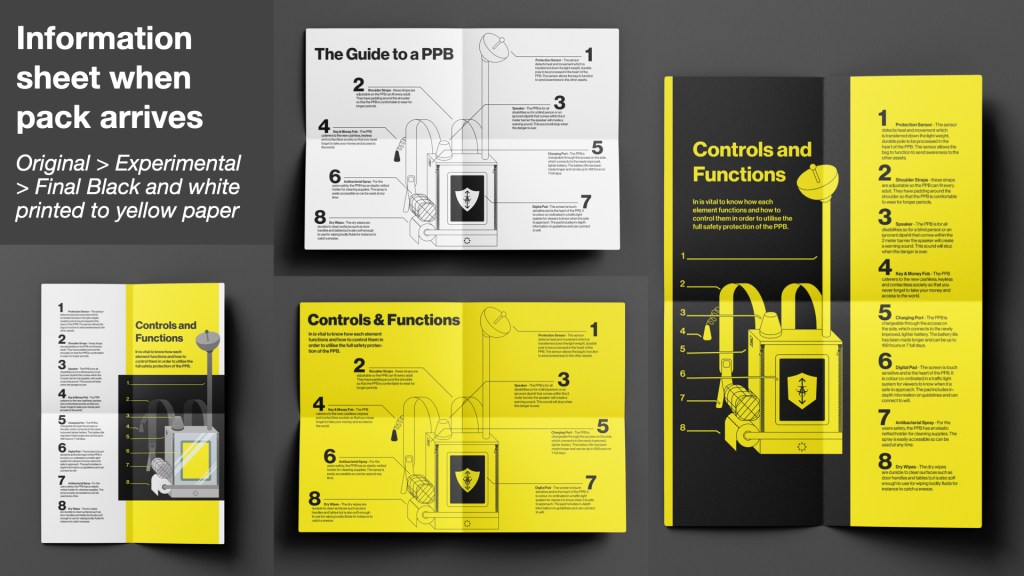
In the formative feedback it was said that I needed to adjust the hierarchy of the functions and controls page. By removing some elements and making the information travel directly to the backpack the page flows better.
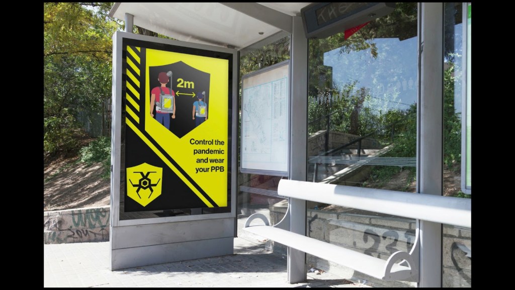
I kept thinking from my other projects add context, bring it to the real world. What better way than posters. These are used as simple reminders in public places to wear the PPB, such as public transport where they are crowded.