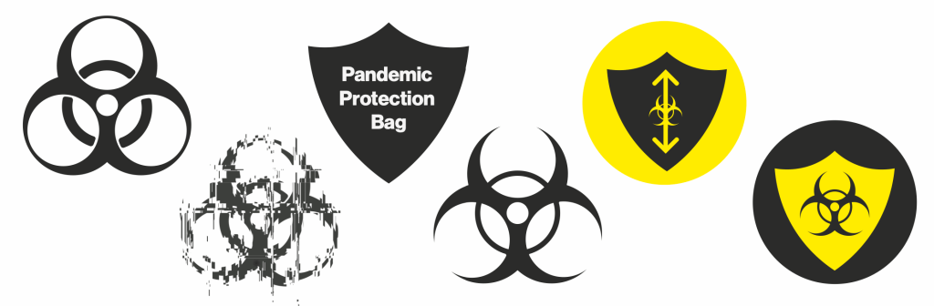
Unsure about the logo, I created this shield idea that the pack will protect against enemies such as the other people with their illnesses. This sparked the idea of how PPE is a shield we must wear thus the PPB was created.
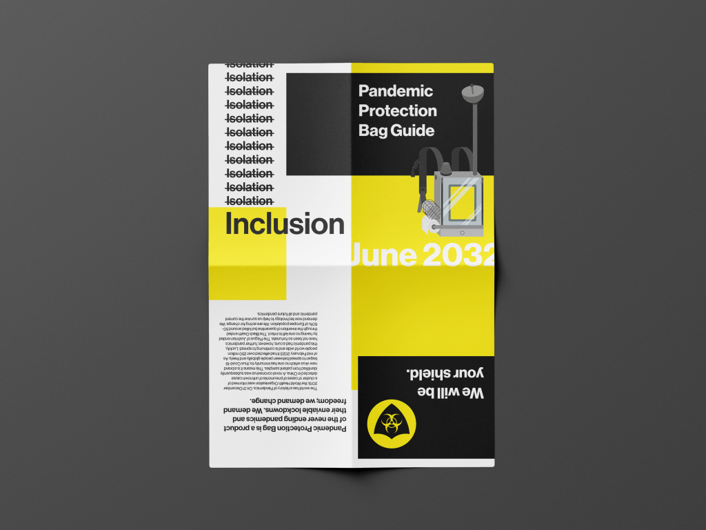
I wanted to be sure on the styling of my FMP as the more decorative broken style was more interesting yet the sans serif is clearer and is simular to other government campaigns. Going back to design fiction it uses what is out there (the facts) and adds the the speculation (with fiction). The simpler design holds to that stable core of criticality so that my idea can be read easily.

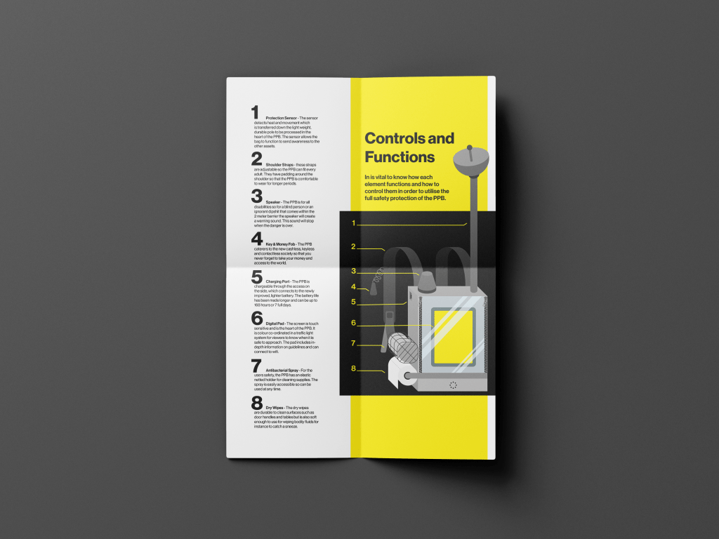
This is an A3 foldable leaflet. The idea for this outcome is to join the bag to explain what each element does. I spent some time on the wording of each element on this sheet so that they could fit into the world of survival and information booklets.