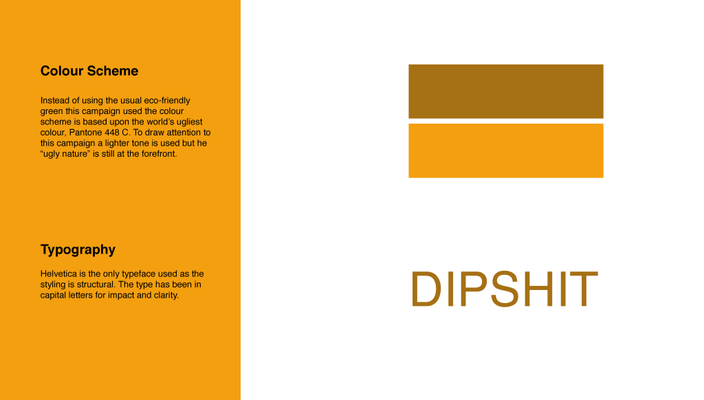
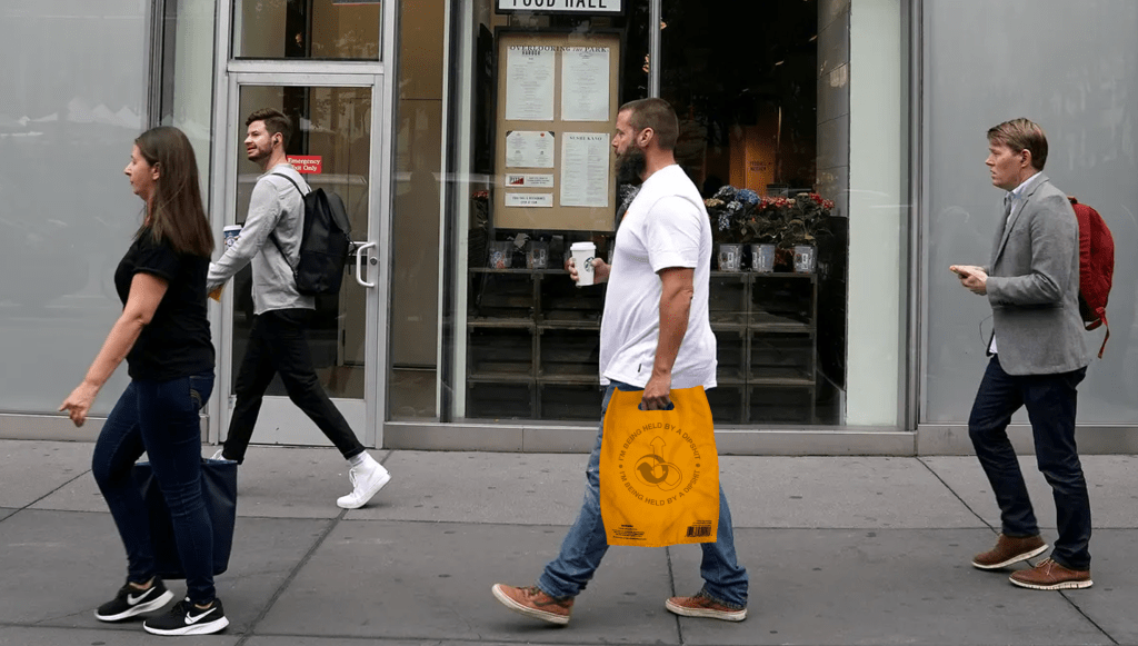
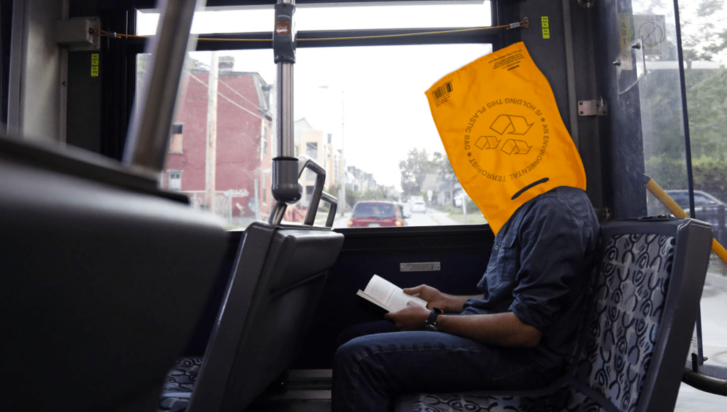
My feedback was really helpful with how they discussed direct elements that work and other elements that don’t. A tutor mentioned my previous work with my 6 pack fake app and said it is in simular light to this. I took a statement and added comedy to bring light to an issue in the world.
My design document was a bit of an issue as it didn’t flow and started with what seemed to be an end page.
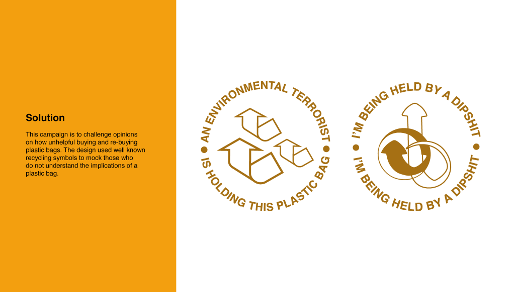
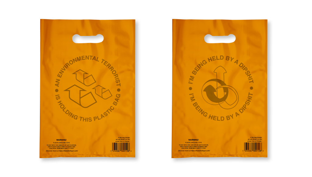
Overall, my work was praised but one bag words better than another. The recycling logo works amazingly but the other seems off and not as strong so my focus was on that. I wanted to add to the arrow feel or calling someone out for doing wrong. I spent some time adjusting the curves and shaping of the lines and ended with something different and rude which I didn’t notice until I took a step back. I feel this rudeness only adds to the nature of the design.
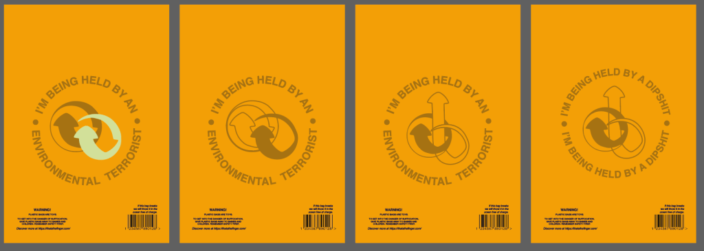
Another element the feedback brought to light was the wording didn’t read as a circle. They felt I needed to remove the dots, however, I felt the dots added to the brand image and so I could rearrange the lettering to read better. They also congratulated me on using dipshit as it is a universal term so that no one can be directly offended by it

