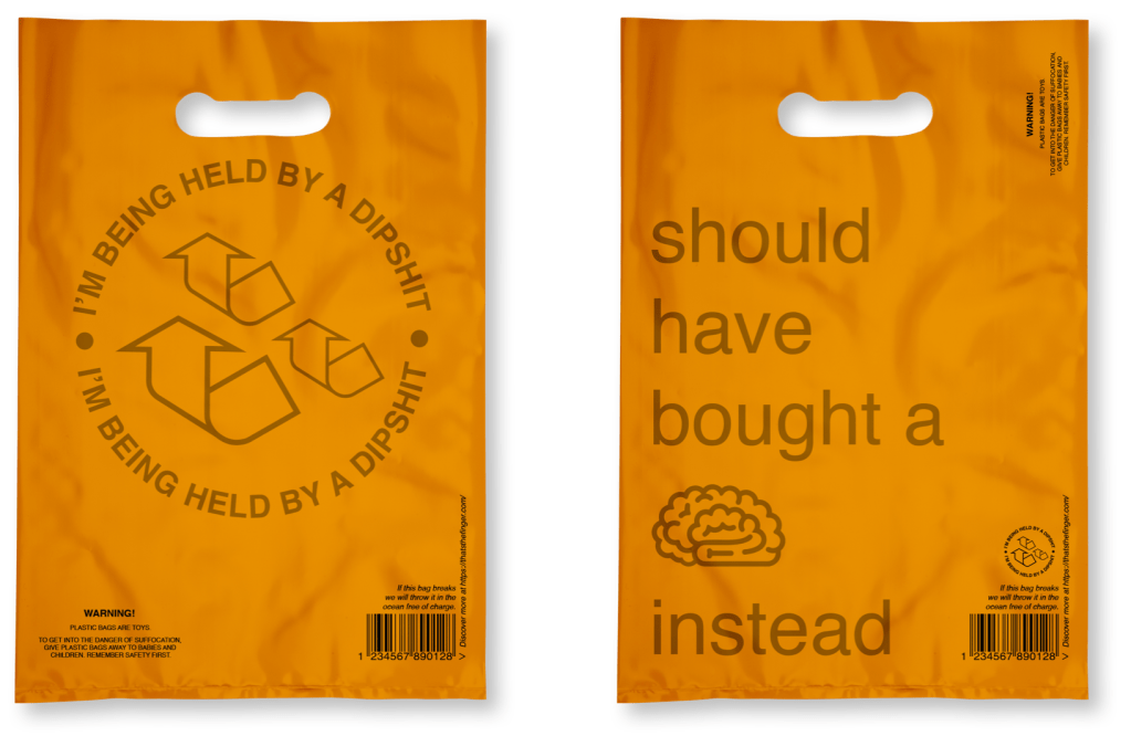
First from the feedback, I needed to change the wording to be more appropriate. The tutors straight away said use the “dipshit” bag, we don’t like the other one. The arrows are recognisable, yet distorted with their weights.
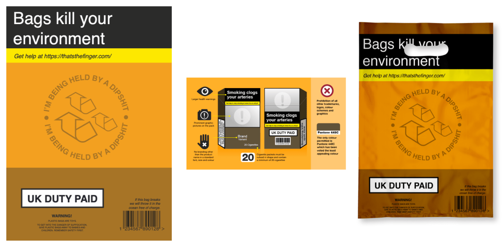
I knew I needed to go over the top with this idea that a bag is harmful so I went with the cigarette packaging and making that into a bag with my language. However, it just wasn’t as good as before.
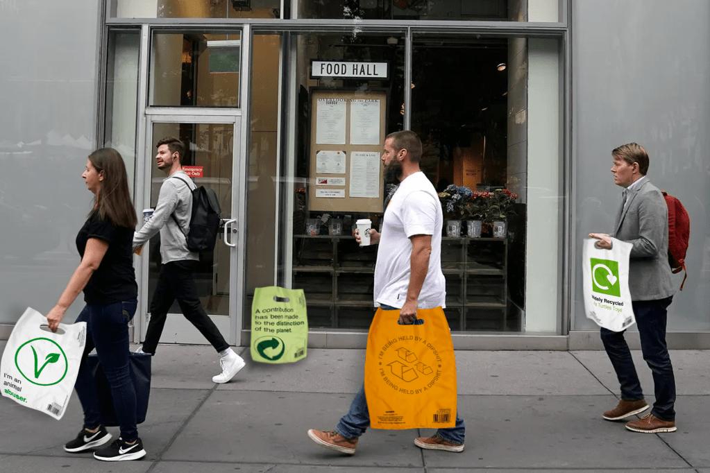
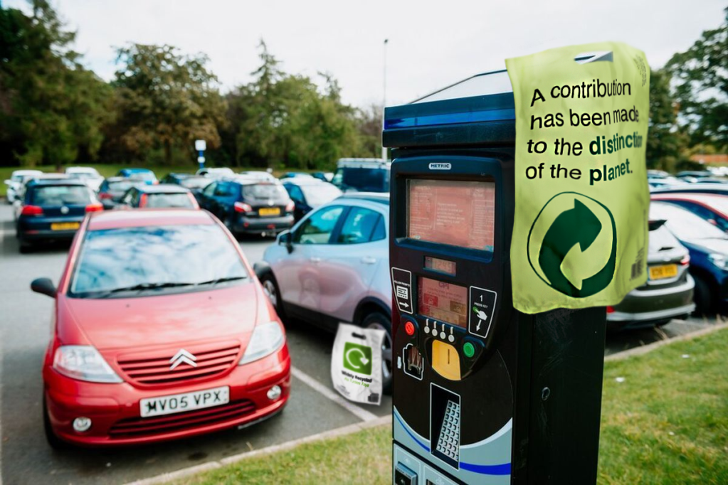
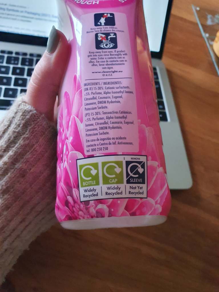
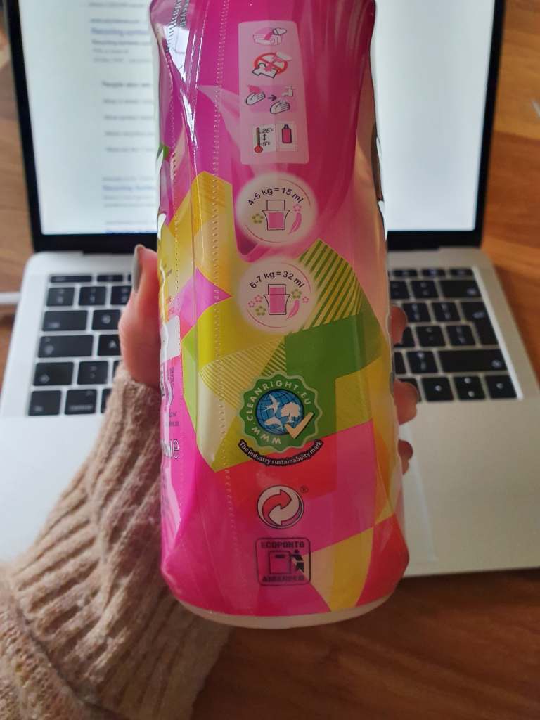
I went back to the ideas of taking recycling or good logos but changing the context. When doing the mundane task of the washing I noticed the recycle symbols on the bottle. I wanted to do something with that and other symbols with good connotations. Such as the Vegan icon saying I don’t kill animals but if you have plastic bags they kill animals. Thus meaning animal abuser.
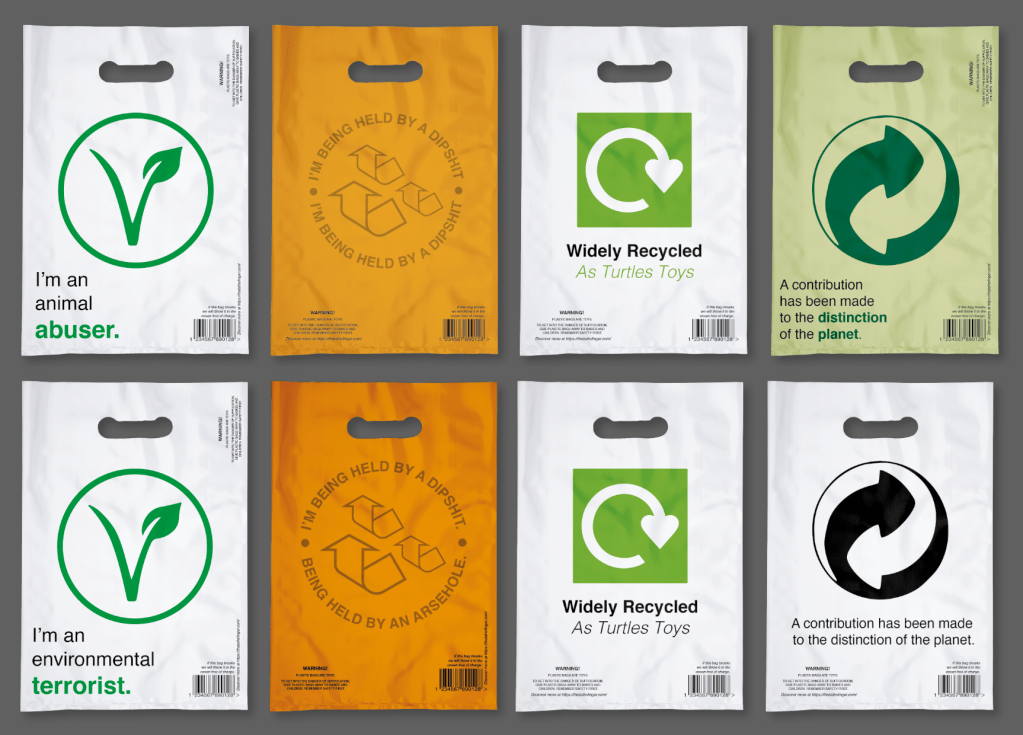
I think each of these are strong but need something extra. Even in mockups they needed adjusting.