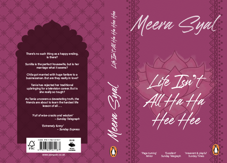
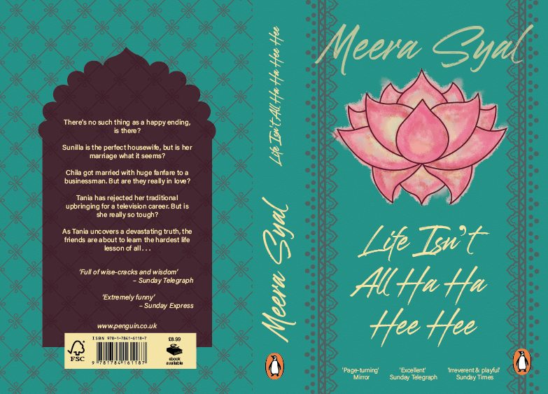
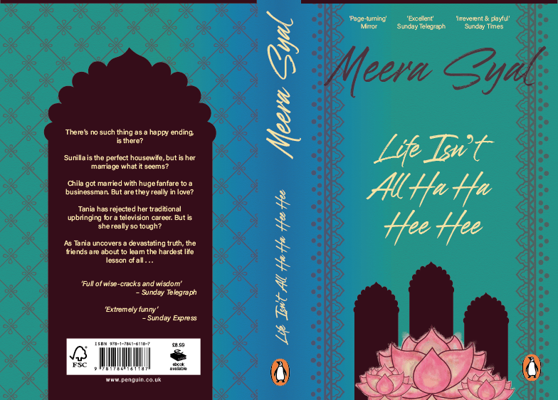
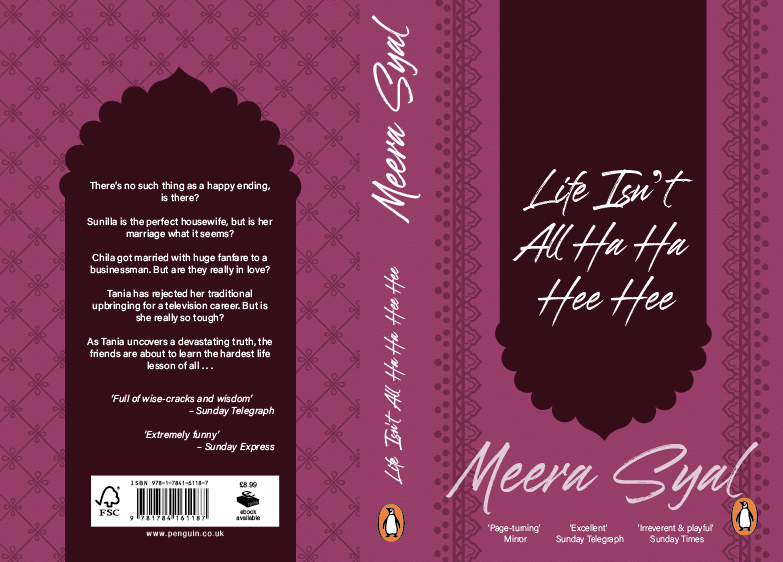
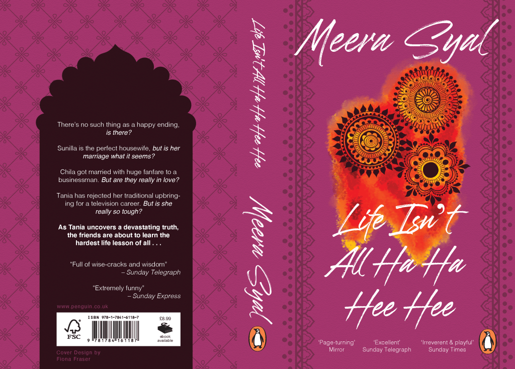
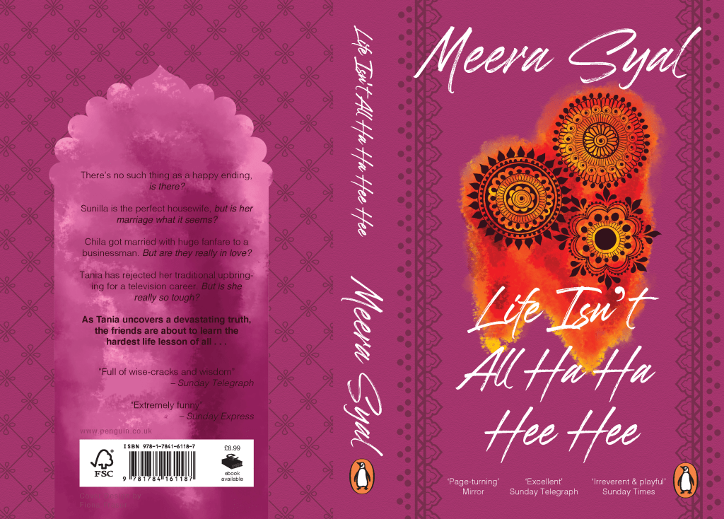
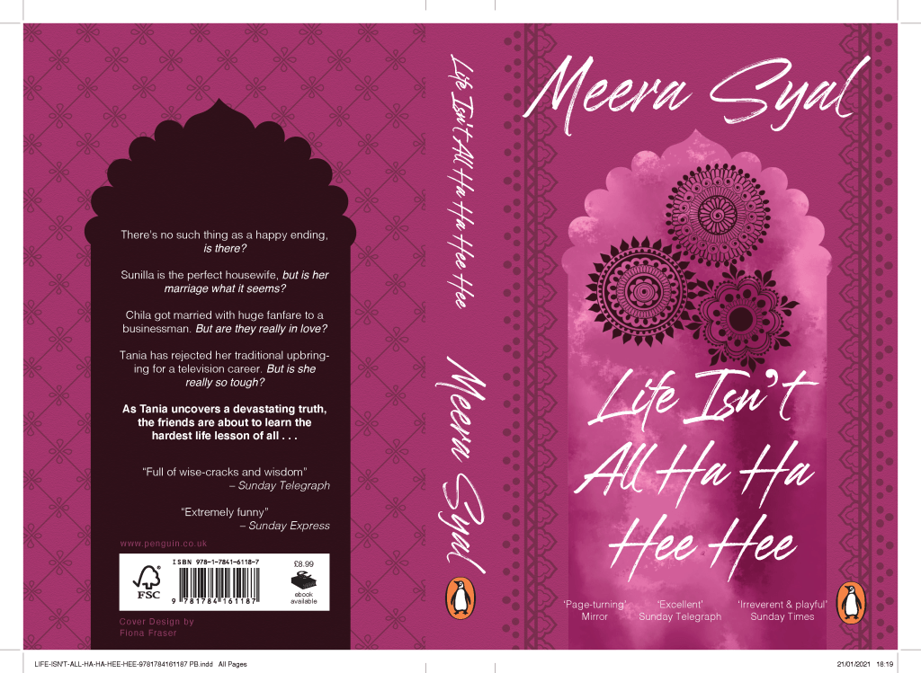
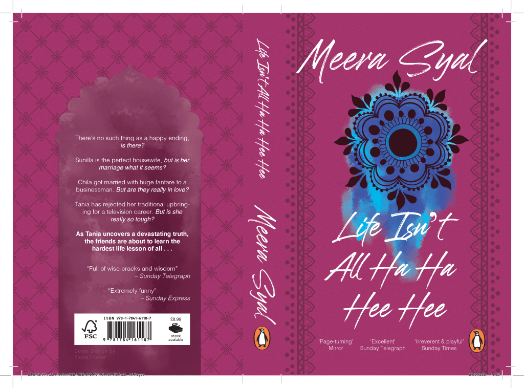
My feedback was some what positive. I needed to add more depth and meaning to the design. It feels safe and what you’d immediately think of. I initially began to play with colours and shading.
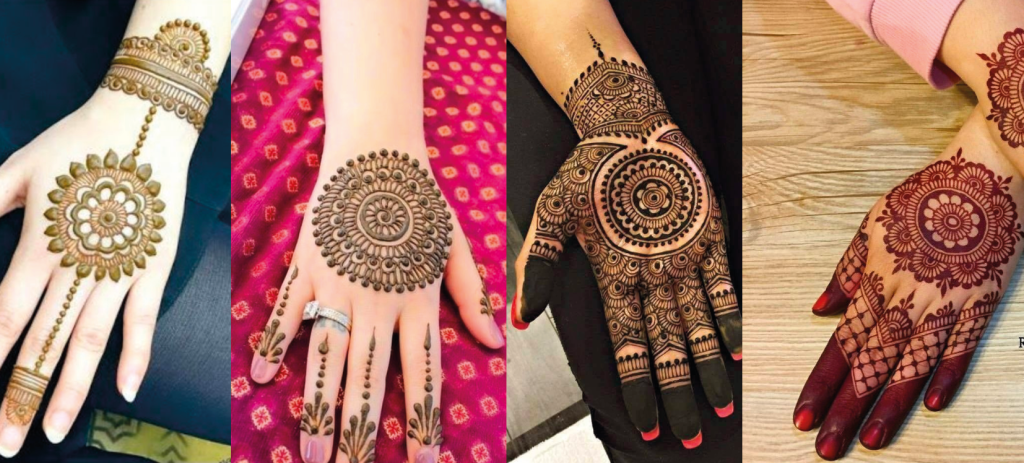
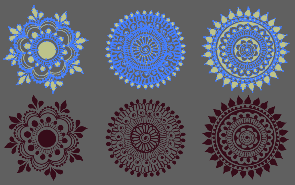
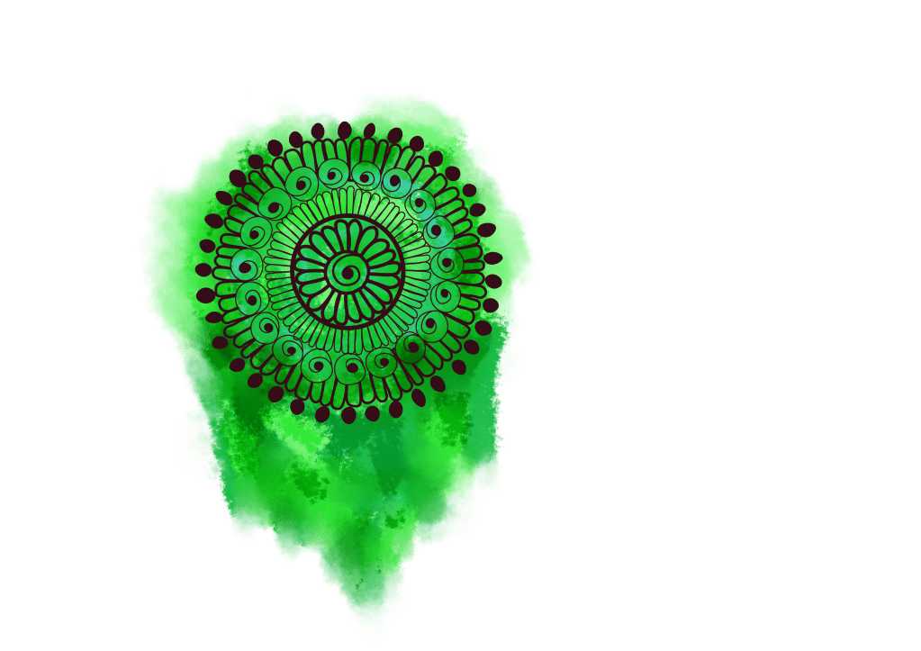
I felt there was something missing so looked back at my first drawings and realised I wanted to go back for the rule of 3. I researched henna tattoos and drew 3 symbols from them to represent the 3 women. I liked the watercolour effect so added that in for texture.
In the past, I have not experimented enough so I wanted to try new things with these. I experimented with the text on the back because in my feedback they hinted that it was basic. I highlighted a chunk by making it in bold. I remembered that I was told to reread the sentences and pull the meaning out. Each sentence ended in a question so I wanted to bring focus to each of the nudging questions.
However, I am no happy with my cover as it doesn’t bring me anything. All my past work has had meanings but with this I am struggling to find any. Yes it is pretty but whats behind it. The book has so many emotions and I want the cover to show that.

