
Life Isn’t All Ha Ha Hee Hee by Meera Syal
Ahimsa Supriya Kelkar- the story of an Indian 11 year old bride in the 1857.
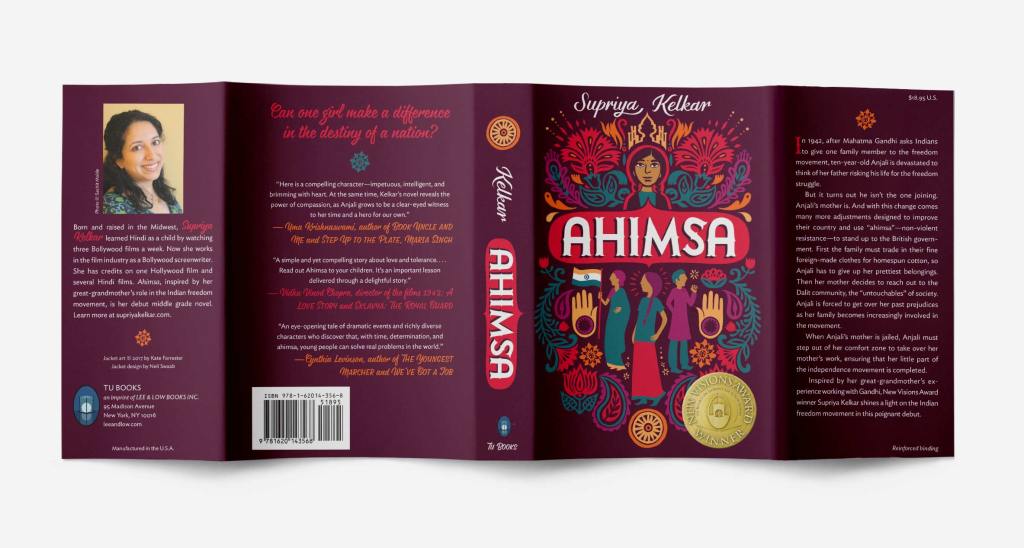
This book immediately tells the viewer it is about an Indian girl. It flows nicely with the symmetry and has balance with no over crowded spaces. The illustration and colour scheme is seamless. Its minimalistic tone makes it contemporary and youthful for the audience aimed at teens and adults. For my cover I need to push for an older audience and do this through the details.
The Family Tree by Sairish Hussain – the story of British Muslim family living life after losing the mother
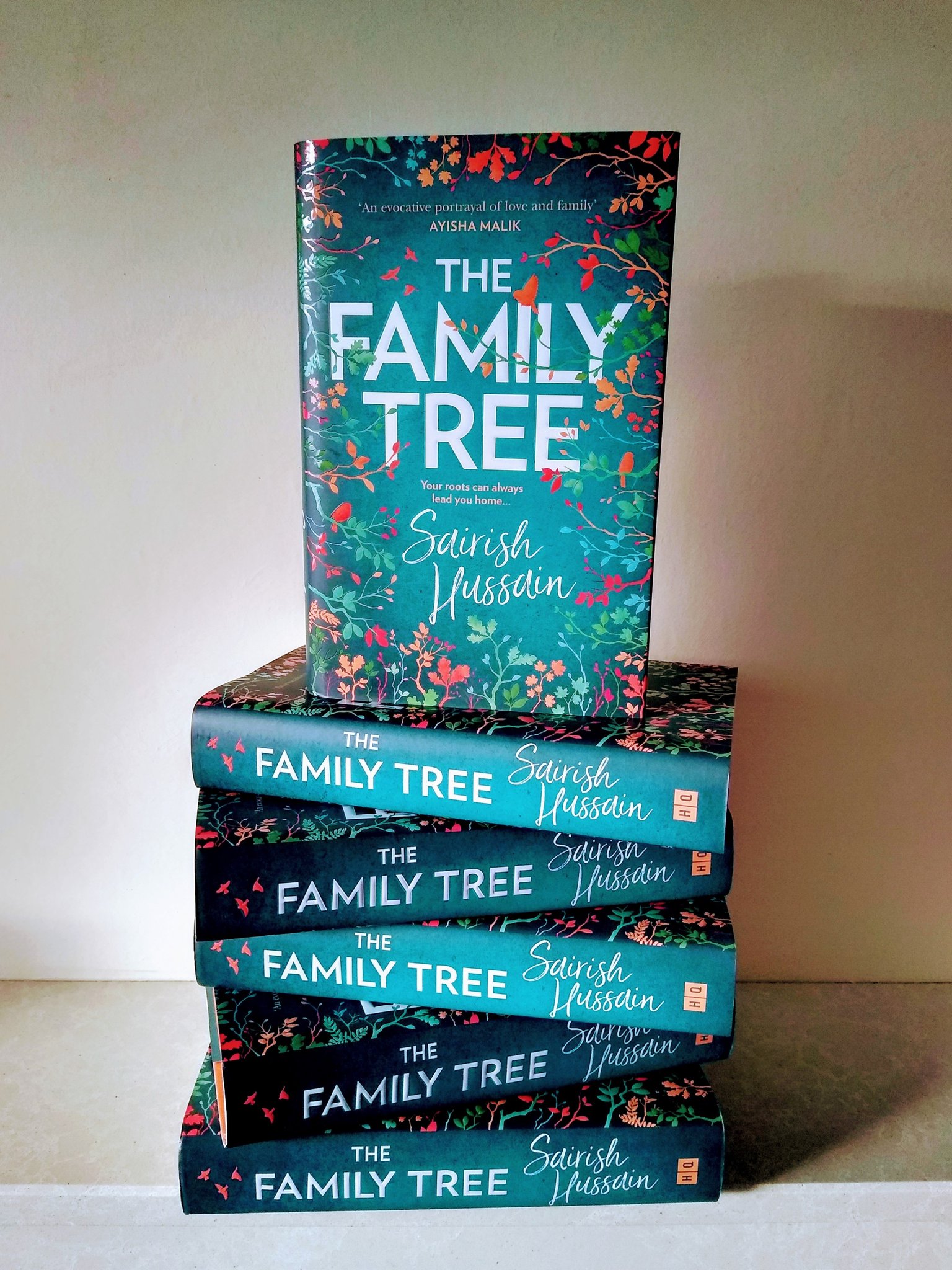
Again the colour scheme is simple and uses the same colours. This book however has more autumnal tones using the blue/ green tone as the main colour. Overall this book is looks more for the older generations, which I believe is from the finer detailing and script lettering of the authors name. This cover has great hierarchy too but is a safe design. For my cover I need to think away from the first ideas and try not to be so safe.
The Vanishing Half by Brit Bennett – a story about identical twins living different lives in the 1950s as their skin colour defines them.
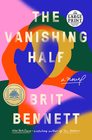
This contemporary design uses bright and colours that is only really used with female high-end fashion brands or Refinery 29. Instead using the fades to introduce the merging of sisters yet keeping their colours very different much like their opposite lives. The font is simple with no difference between the book and the author. But the image overpowers the text. This is a very stylish cover but holds a greater meaning. For my design I need to think about the greater meaning and rational behind my design.
We Should All Be Feminists by Chimamanda Ngozi Adichie – A short, effective essay about gender, the wrong ideas many people have about feminism, and why it is important.
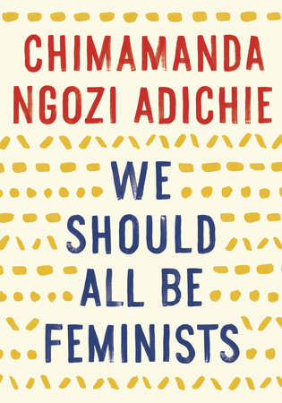
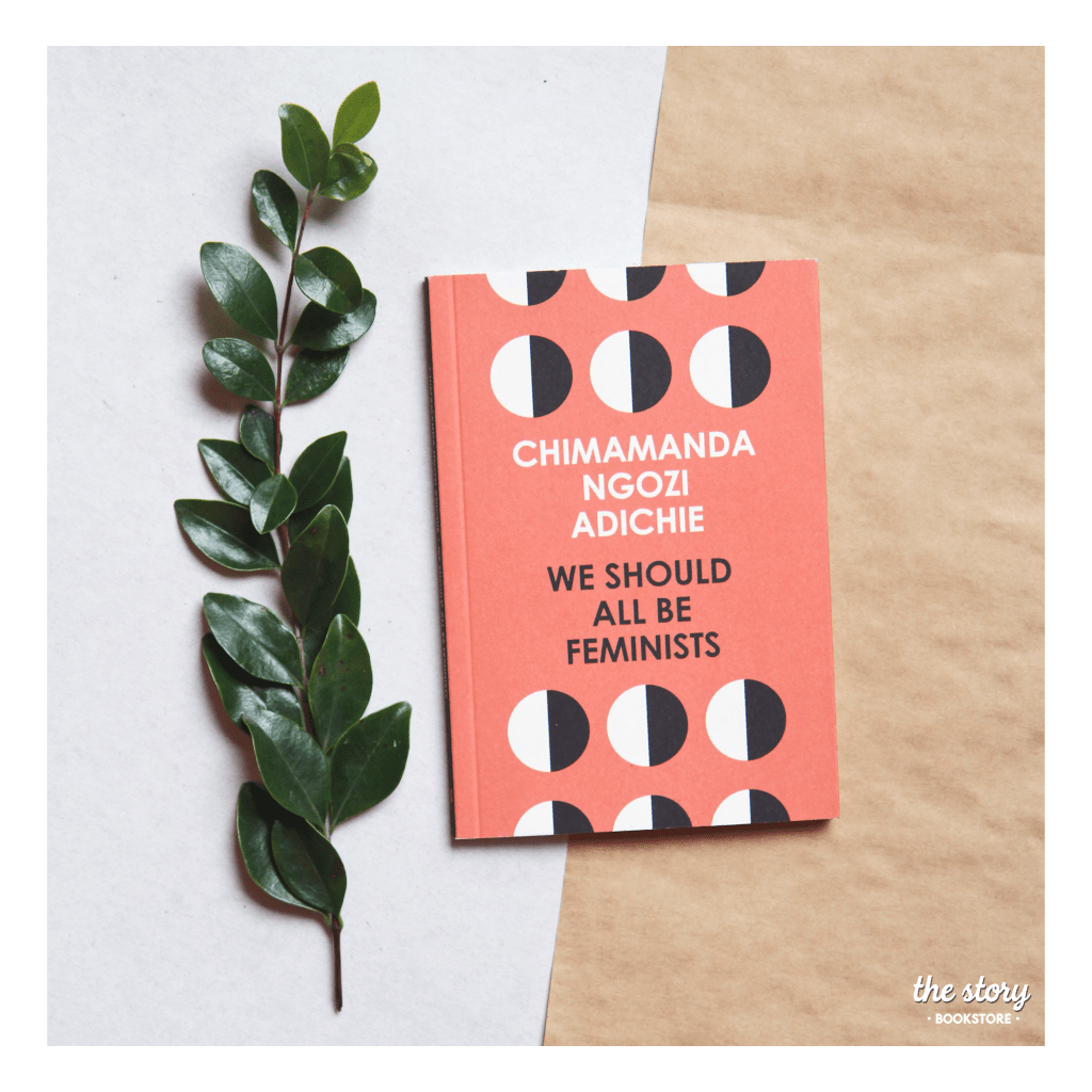
Most of these books have different varients but one always stands out over another however, this book has 2 very different styles both of which are for sale. The right has an almost African feel to it with the complimentary colours and painted pattern style where as the left has geometric, almost futurist or constructivism style. This raises the question of how much I should add in the Indian styling to fit the book and the current market?
Taking these ideas forward I need to keep to bold type with good hierarchy. A simple, lighter colour scheme – no one used black but all use white? A repeatable pattern or style.
