
Week 1 – mood boards/ research
At first I wanted to look into designs and logos that exist. These are all to do with people coming together with music notes. The weaker ones I feel have only music notes or books. The ones with quirkier outline symbolism I believe work better such as the riverside logo with shapes becoming a collection of people.
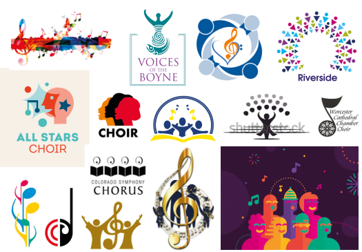
I then looked into actual marketing designs that have already been used. Being an admirer of Gareth Malone I looked into what things he uses But there was not much available or it just wasn’t the best. From this I branched out looking at other choir organisations but none of these are the most creative. Thus I want to go out of the box and be a bit wacky with my ideas so that its not boring for the client seeing the same classic styles of a singing photo or music notes and nice text.


