Going into week 2 – Developing and Detailing

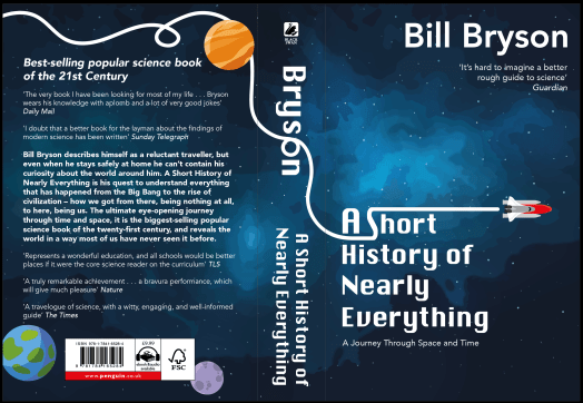
With the feedback given I looked into  the typography and how that effected the dynamics of the piece – changing the type on the spine and blurb at the back. It was suggested that the off white tones from the quotes didn’t work and I agreed feeling they are already lower on the hierarchy through size so a colour change was not needed.
On top of that the rocket seemed off with the orange dull colour so using the colour given near the barcode I feel it is more cohesive and brighter. I then went on to add more depth and detail adding slight shadowing and highlighting in places.
I also decided to remove the extra line of the ‘journey’ that the rocket took. This opened up the space not letting the viewer become over whelmed. However, in a tutorial others suggested that the lines were too simple and basic so maybe the rocket could pass some planets or space inspired cartoons. Adding planets the design now looks complete with all the elements and just the right amount of boldness and detail.