
Week 2 prep – Logo designs
As the Graphic Communicator I was nominated to create the logo. But I wanted the whole team to be involved so we discussed what sort of styles and colours would be used and noted these down. While an other did sketch ups of what we were discussing. 
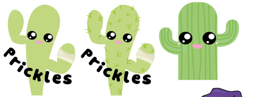
Using all this information I created a mock up of two simplistic cacti and asked for feedback from my team. They suggested adding details and texture. where I added the spikes and bandage symbolising the broken, unwanted plants being restored to become personalised and cared for.
Taking this further I wanted to add a background so that the image can be placed anywhere with ease. We felt the yellow was almost like a baby store colours and the team wanted to stay with a sunset theme and pastel colours so used the orange.

Being a Typographer I looked into what different fonts would look like experimenting with the opposite extreme and realising the bigger bolder fonts are more eye catching and engaging. a student at a glance will know immediately what our company is called.

