Week of the 6th May – Independent Study
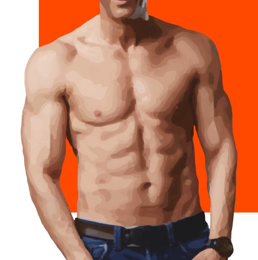
The feedback was very positive with only a few tweaks that I had to make. The main issue being the logo. I struggled to improve this and was really unsure on what way I wanted to go down. This included looking back at my very first sketches, which are very basic but they gave me incentive to stick with the idea that I had with using the body but refining it.
To do this I started with the logo of just the body and added a few layers that softened the design but this was still not right. I added background colours and still the image was not quite right.
Overcoming this I got the original person in colour and played around with backgrounds. I feel this last design although simple showcases the traits of the app precisely. This is because the lines are crisp and detailed. along with the back ground not fully taking hold of the space, meaning it is different from the mainstream.


