Week of the 1st of April – Studio Support + Independent Study
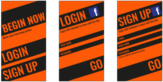
Creating the next two designs were easy as I used the first page as a template, copying the font, colours and aesthetics.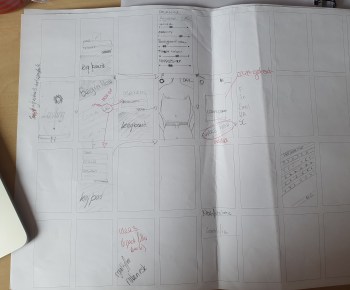
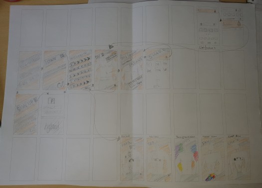
Moving on from this was a struggle but from the quick yet detailed workshop I was able to draw and map out my ideas for each page. This is called the wire frame. My first draw up had some issues including coherence. The initial digital design was not seen through out the app. This meant that I had to rethink the aesthetics of the rest of the app or the first page. To over come this I decided to draw some more designs that included the style of the first pages. Through redrawing the design several times it managed me to think through smaller details that I wouldn’t have thought of the first time from drawing such as the personalise page, where I changed the style of the slider/ button style. 
I wanted to keep the wonky style with sharp lines but wasn’t sure on how to physically make the interactive part slide. So I thought that buttons could be easier to create and work with the software we’ve got.
I knew that I didn’t want a simple design that would just be very basic lines so to upgrade this I changed the dash lined design from the drawing to the slightly different chevrons. These first didn’t show the range of the personalise parts so I added extra ones on top that had the traits within the design so that they function. However, through showing this to peers and tutors they though I needed to keep it simple. From the feedback I just removed the back detail, which added negative space balancing out the details.