
Bibliography
https://abduzeedo.com/elegant-editorial-design-project-cities-and-names

I like this style with the bold cut off type and the element of chopping up a word to lead the eye across the page. The simplistic colour scheme allows the type to stand for its self.
https://mattwilley.co.uk/AP34-Book
https://mattwilley.co.uk/NYT-COVERS
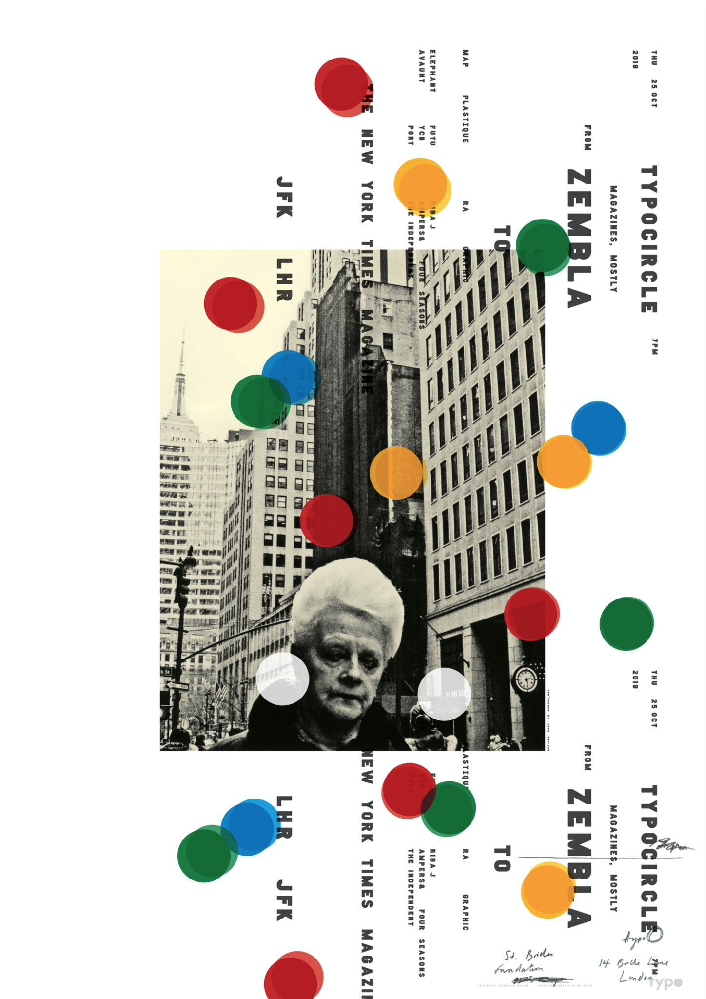
This is one of my favourite pieces of work as it utilises both messy hand draw script and very contemporary sans serif fonts. The off white image give the art a historic edge yet we know its from a modern time period. The circle makes me think of a camera in the direct sunlight with the lens flare style. Going forward I am inspired to use my own hand writing in use with strong digital type.
https://www.typocircle.com/portfolio/matt-willey/
http://indexgrafik.fr/wolfgang-weingart/
https://www.google.com/search?rlz=1C1CHBD_en-GBGB710GB710&biw=1280&bih=610&tbm=isch&sa=1&ei=-qVkXLfEFo6P1fAPyqmv4Ac&q=wolfgang+weingart+typography&oq=wolfgang+weingart+ty&gs_l=img.3.0.0j0i30j0i24.30426.33419..34965…0.0..0.57.160.3……1….1..gws-wiz-img…….35i39j0i67.fYd4cTi6agc#imgrc=_
http://www.chinablueart.com/paintings/memory-networks/
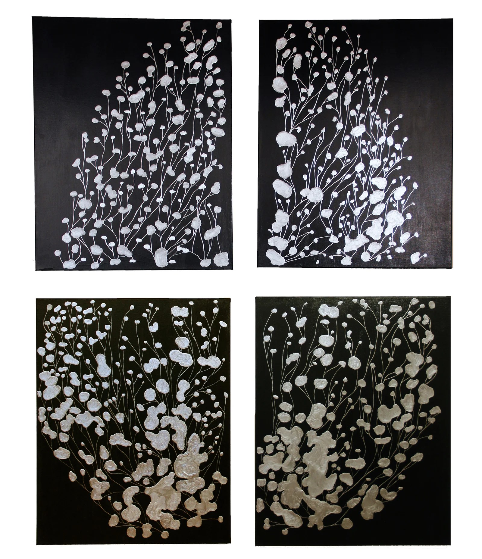
I really like the elements of free flowing almost like a brain is flowing with ideas/ memories.
